09.15.22
Sighted
Sarah Ellison’s Float Sofa — In a New Luscious, Chocolatey Brown — Forms the Perfect ’70s Conversation Pit
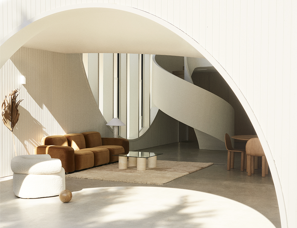
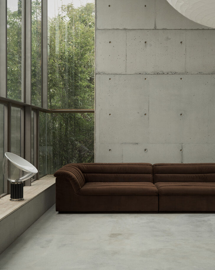
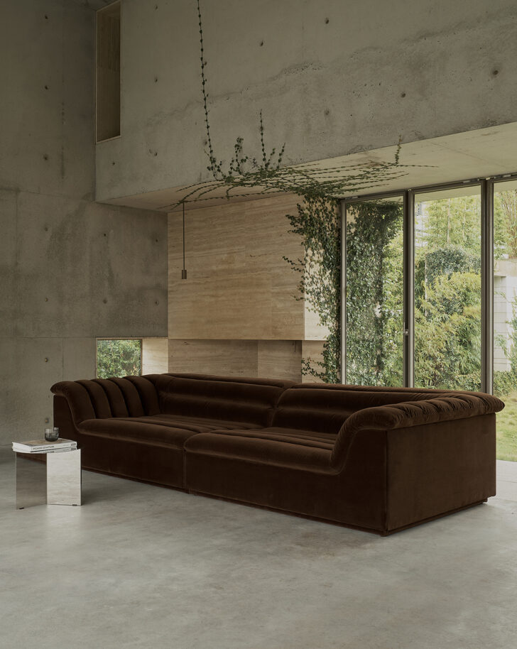
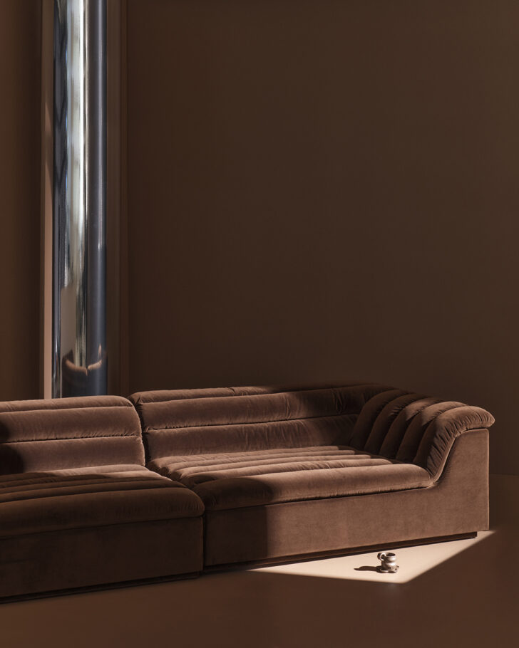
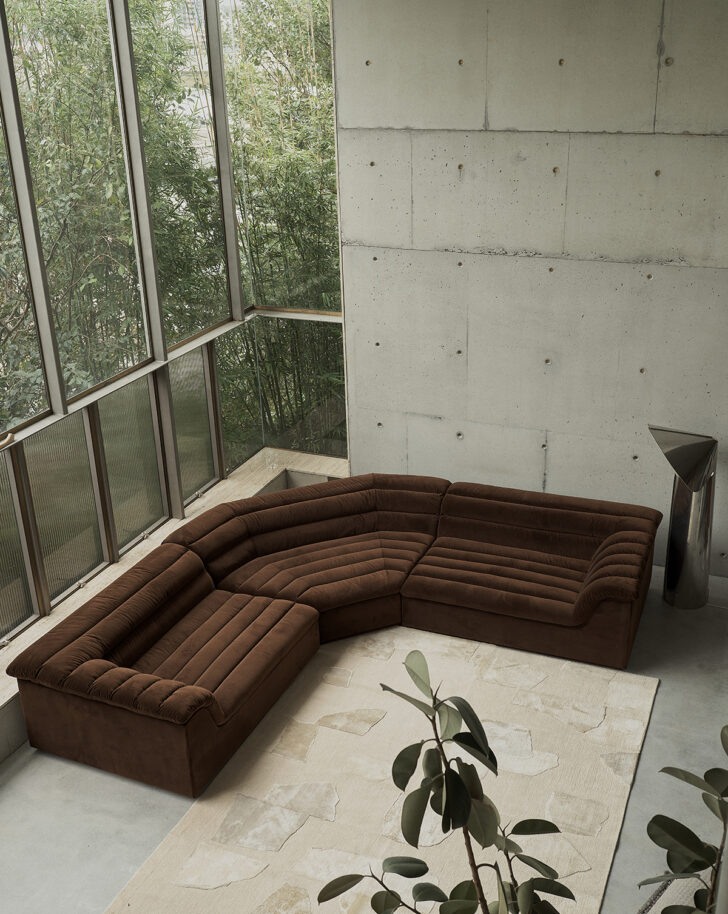
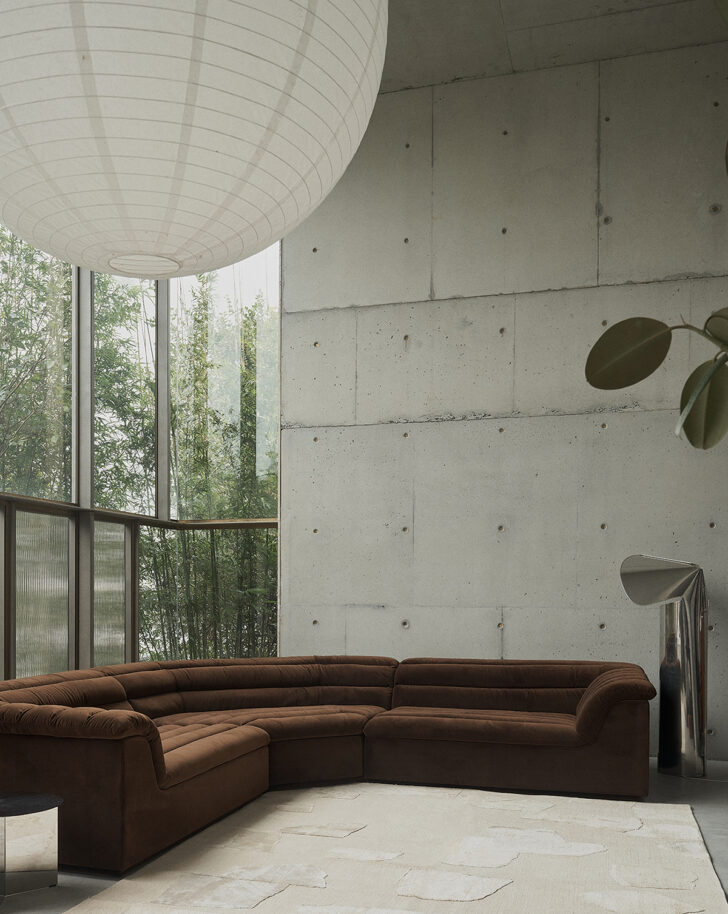
There’s no escaping the influence of the ’70s on today’s interiors and now, at long last, we get something from that era that’s long overdue for a renaissance: the return of the conversation pit. Australian designer Sarah Ellison has long been influenced by the ’70s and ’80s, so when it came to designing her latest sofa series, the idea for a modular piece quickly developed into a system that could be implemented as a giant sunken area for large homes or hospitality spaces.
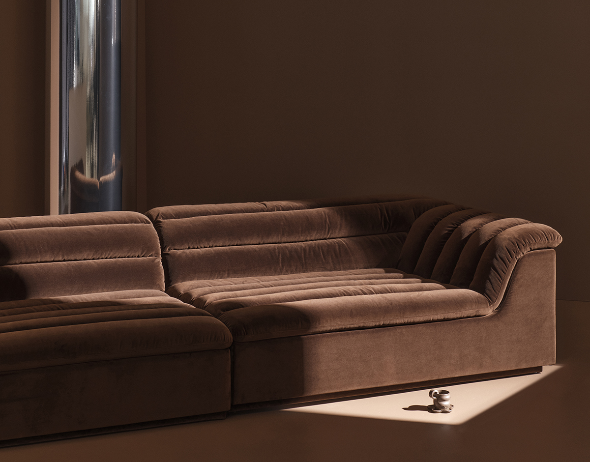
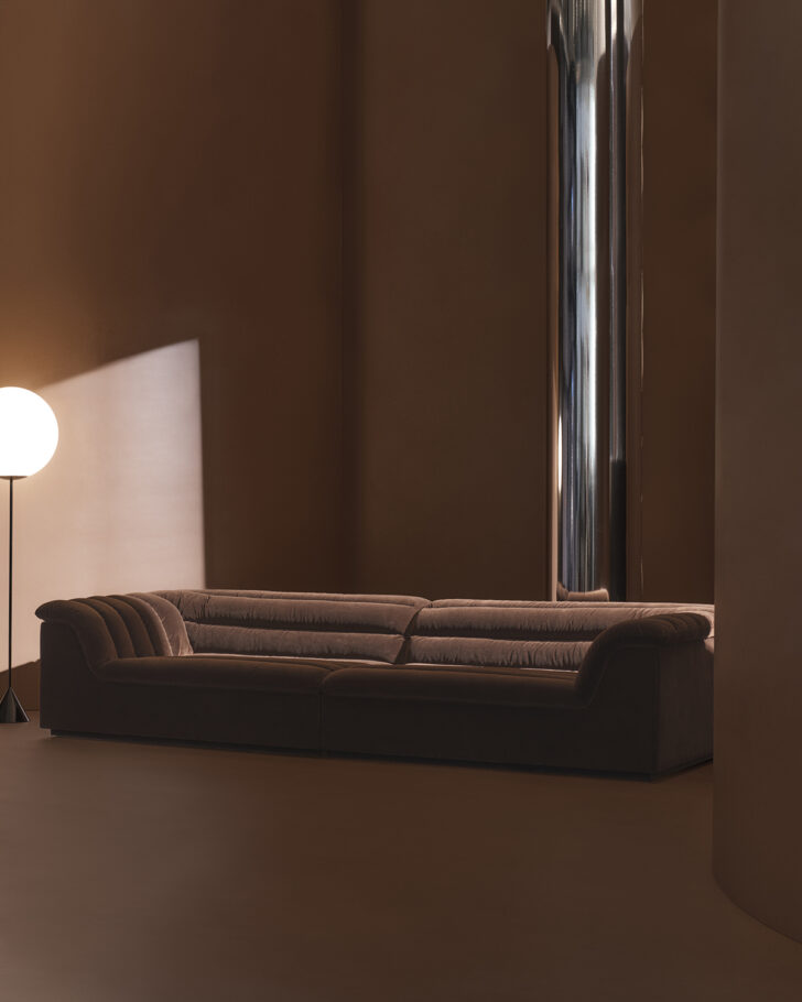
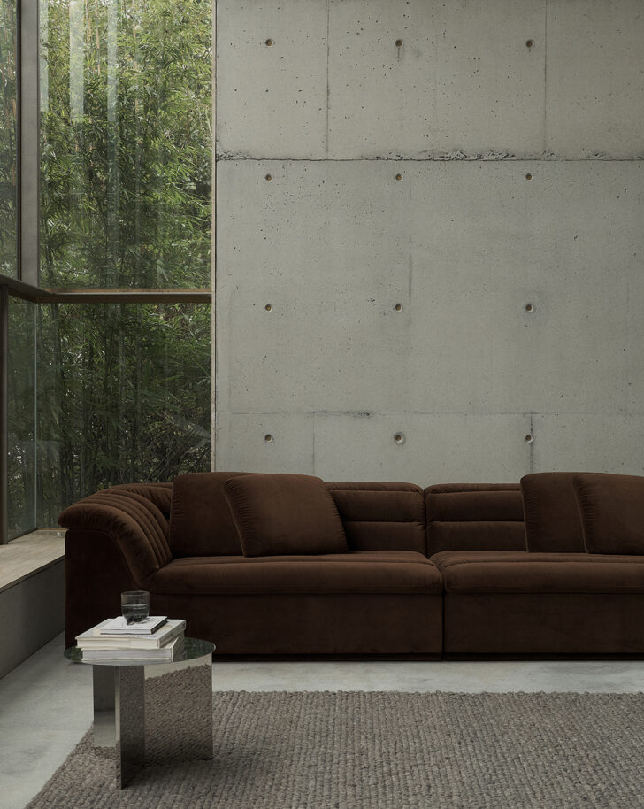
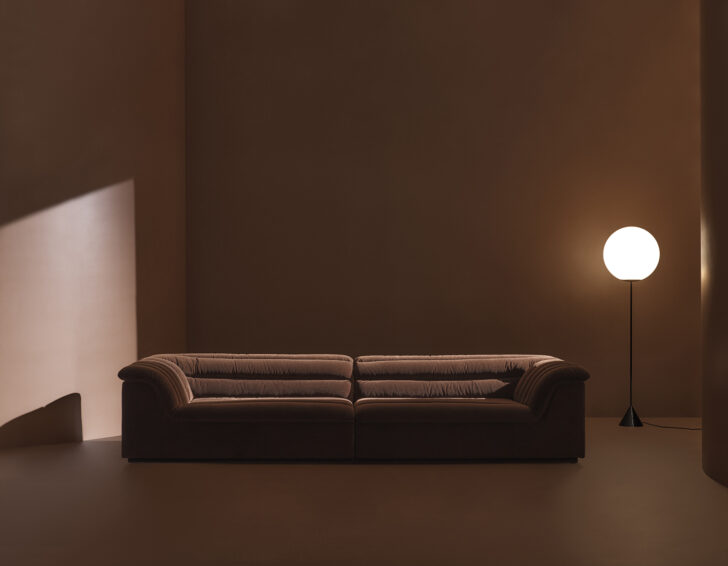
The new Float sofa features distinct horizontal channeling that typifies the era and adds to the comfort factor. “We wanted the channels to be very, very puffy,” said Ellison, who was intent on blending a ’70s aesthetic with shapes and proportions from the early ’80s, too. Also nodding to these decades are the sofa’s velvet upholstery and distinct launch color: a warm brown that’s somewhere between chocolate and coffee, dubbed Piccolo. “You really can’t get more grounded than the color of the earth,” Ellison said “There’s also not really anything better than a first coffee in the morning and that feeling that comes with it.”
To sweeten the pot — no pun intended — Ellison has collaborated with Pantone, who will incorporate the Piccolo into its rotation for a limited time to celebrate the launch of Float. Ahead of the color and the sofa’s launch, we spoke to Ellison about how her background as a style editor influences her work, the difference between the US and Australian design markets, and how she picks the perfect neutral tones for her pieces.
Tell us about the Float sofa. What was on your mood board when you were thinking about the design?
I’m very inspired by the ’70s, obviously, but with this piece it was: “How do we do that, but make it very comfortable?” We wanted to make the most comfortable sofa we’ve ever made. So depth and proportion were probably the starting point. Not the most exciting and glamorous, but very functional! I knew I wanted to do channeling. And I wanted to do something within the ’70s, but moving into the ’80s as well, so the proportions and arm shape come from early ’80s furniture design.
We tried a bunch of different channels: vertical, horizontal, off-center, all different techniques, and we settled on this horizontal and very fat, very puffy channeling. There are a lot of channeled sofas out there, but we really wanted this one to be very, very puffy. The puffy appearance is not just a design feature, but it also helps with the comfort. We designed it, to start with, as a modular two-piece, but then the idea developed of creating this awesome conversation pit situation. So it’s turned into this giant modular system, where you can configure it into a big ’70s or ’80s-style conversation pit.
Where do you envision the Float sofa being used? Is it mostly residential? Could it be in hospitality spaces?
It could really crossover. The launch color, which we’ve done in collaboration with Pantone, is this chocolate velvet brown, but we’ve also done an off-white linen, which would look incredible in an Australian coastal home. And then we’ve done colors for some more fun spaces, maybe in the city. The fact that it’s modular means you could configure it to different apartment sizes, or it could be the big conversation pit, which would be amazing if you had the space for a big media room. And then, most definitely for hotels it would be great as well. You could really build it out as big as you want it to go. It does need a certain amount of space because of its proportions. In Australia, we have these bigger suburban homes that have a really big lounge room. Everybody has an open-plan lounge and kitchen. And it is a good sized sofa for those spaces.
Designing for your home market in Australia seems like an important throughline across your work. The pieces that you create have a very Australian sensibility, so it seems right that it would be important for them to fit nicely in Australian homes.
Yeah. I guess I’m always designing with that as my starting point. What’s funny is that we started selling through DWR in the US, and when we visited earlier in the year, we went to a lot of the showrooms to suss everything out. I really started to kind of think about both markets, and the US is such a different market. The colors and the fabrics that sell in the US are so different from what we sell here. But going back to what you actually asked me, yes I very much think about how I live when designing. At the end of the day, it comes back to me and what I like, and how I can translate that into something that’s palatable and commercial enough that people get it. I think that comes from my background in magazines as a style editor, where I was finding the cool thing, but always trying to bring it back so that it’s relatable and people understand it within the context. There’s not much point in designing these crazy things that you love, but nobody else gets. I really love the idea that for people who would normally go to IKEA or a middle-of-the-line kind of brand, we can elevate their living experience by giving them something that’s just a little bit different than what they’re used to. So that’s where we try to sit in the market, which is much bigger in the US than it is in Australia.
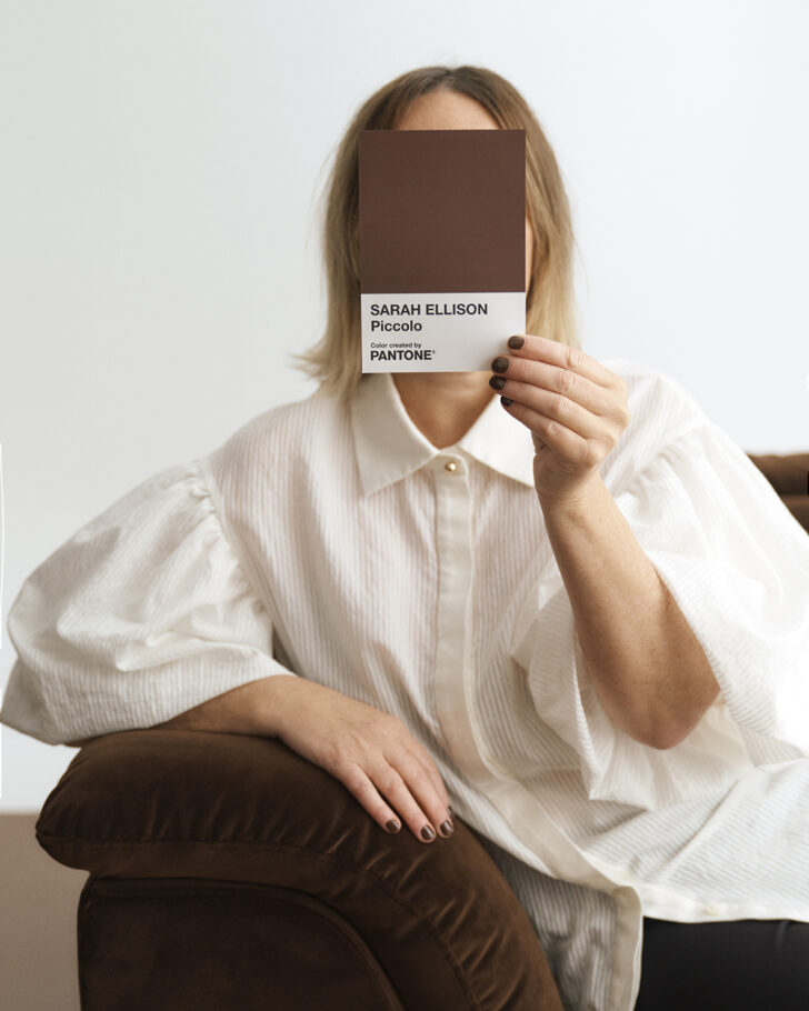
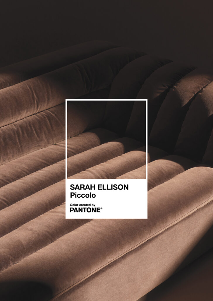
You mentioned the chocolate brown, called Piccolo, which will launch in collaboration with Pantone for a limited time. Do you have personal resonance with that particular shade? Is that one that you grew up with, or simply found intriguing when you came across it recently?
We love to work in neutrals. I actually find it hard to use color. And with the Piccolo velvet, I think more than anything, it was just that it looks so good on this design. Velvet looks really good in photography and it looks really good on the channeling, and there’s definitely something I love about the earthiness and the grounding feeling that chocolate brown can bring to a room. We have done it in a bunch of other colors too. But that one was just really a showstopper.
Why the name Piccolo?
We were going through all these different names to do with browns and chocolates and colors like that. And Piccolo just felt like such a sweet name. It also ties into the idea of nurturing, and getting up in the morning and having a coffee, and back to that idea of comfort and grounding, which is very much what we’re about. You really can’t get more grounded than the color of the earth. There’s something about it. There’s also not really anything better than a first coffee in the morning and that feeling that comes with it.
You’re one of the first Australian designers to collaborate with Pantone. Is that right?
Yeah! We reached out to them, we were looking for some international collaborations, and we just thought it was a bit pie in the sky. And they loved the brand. We showed them the design that we created and how we wanted to use a color. They haven’t worked much in the interior space, so I think it was interesting for them to work in a new-ish area. We’re super excited, it’s pretty crazy, actually. I’ve worked with Pantone across my career, through magazines, and every day we’re using a Pantone book to pick colors. So it felt like a really natural but interesting collaboration, outside of just the furniture sphere.
You mentioned that you struggle to use color and that neutrals are really your go to. But choosing the perfect shades within that palette can be even more challenging, since going slightly one way or another can completely change the feeling of a piece. How do you go about selecting the neutrals that are just right?
That’s so true. It’s funny, because the designers in my team are always laughing because they ask “Well, what color can we do it in?” and it’s always within a very narrow band of colors, with tiny variations in between each one. We use a color called Dune, which is a beautiful sand-dune beige. Even though I don’t like to call it beige. But if we were to go two or three shades either way, it completely changes it and turns it into a daggy beige, as opposed to this cool, contemporary-feeling, fresh dune color. I think it’s probably just a gut feeling that comes through my experience in fashion design. I started doing fashion and then magazines, and now this, so I think it’s a bit of an innate process of thinking “oh, no, that’s too this. And that one’s just a little bit too that.” Especially with browns, because you can go into the poo brown and it can go bad quickly. So selecting involved a lot of conversations and opinions from the team as well. I like to get opinions on what everybody else thinks. But I think at the end of the day, it’s an innate decision for me.
Do you also consider the colors you choose for new pieces in relation to others in your collection?
Yeah, I love the idea of everything working together. But that becomes harder and harder as the collection grows. We also want to be able to offer different things to different types of customers, too. But yes, I love the idea of the whole color palette really being very seamless, and all working together in some way, shape, or form. There’s definitely a language that we speak in terms of color that is very much Sarah Ellison. And then texture as well, like doing things as simple as having a white but using a texture, which can almost give white a color in a way. We’re starting to use more and more textural fabrics to give some colors a new spin.
You said earlier that the Float sofa will come in some different colors for the US market. Can you expand on which those will be?
So we have the Piccolo, which is the beautiful velvet. We have a wheat color, which is a golden tone. We have another velvet, which I don’t know if we’ve named yet but it’s a beautiful warm, oyster gray. That one is interesting because we probably wouldn’t sell that in the Australian market. But for some reason the US loved that color. And then we do our very clean, crisp white linen, and also a warmer white with a bit of texture as well. We’ve also done some boucles, since people are still loving boucles, so there’s that option as well.
Do you foresee releasing any other iterations of the Float series?
Most of our pieces we can take down the line into a bed or a lounge chair, or something like that. But this piece is definitely a standalone piece, with the technique of the channeling. The channeled top of the sofa is almost like a duvet cover that sits on a base, but it’s attached. Because of the proportions and stuff, I think this would be a hard design to translate into other products. Never say never, but at this stage, it’s just the sofa.
Is there anything else you’d like to mention?
I’m really excited about the collaboration with Pantone. It’s such a big opportunity for us, and Pantone was so excited about it as well. We’ve done some beautiful content and some amazing photoshoots. One in particular, in probably my favorite house in Australia called La Scala. It was designed by Richards and Spence architects in Brisbane, and we did an amazing photoshoot there. There’s one shot in which all we did was put the sofa in the space, because the architecture of this place is sort of like this soft brutalism, because they’ve used lots of travertine and interesting angles. It’s an unreal space.
We’ve also done some studio content, we’ve done some video. There’s really a lot that has gone into not just the design, but the whole scope and the whole process of putting it out there. That comes from my background as a stylist and working with photographers. It’s not just about having the product, but also creating the beautiful content that comes along with it that can inspire people and really show them how to use it. It’s been a long process, we’ve been working on this for most of the year. So I’m just excited to have it out in the world.
The Float sofa is available exclusively through DWR in the States, coming February 2023.