03.26.25
Sighted
A Swedish Artist Known for Her Vibrant Florals and Seductive Line Drawings is a Perfect Match for Marimekko
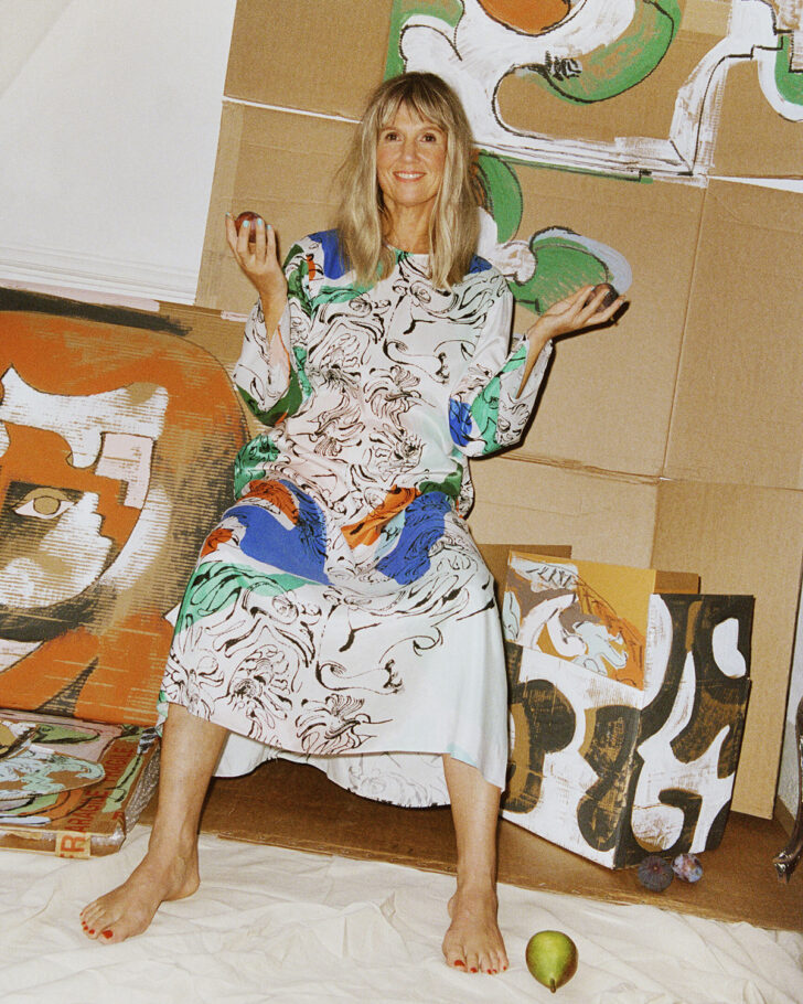
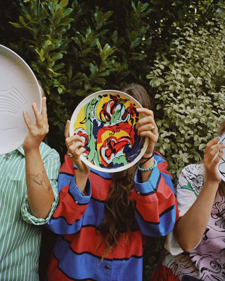
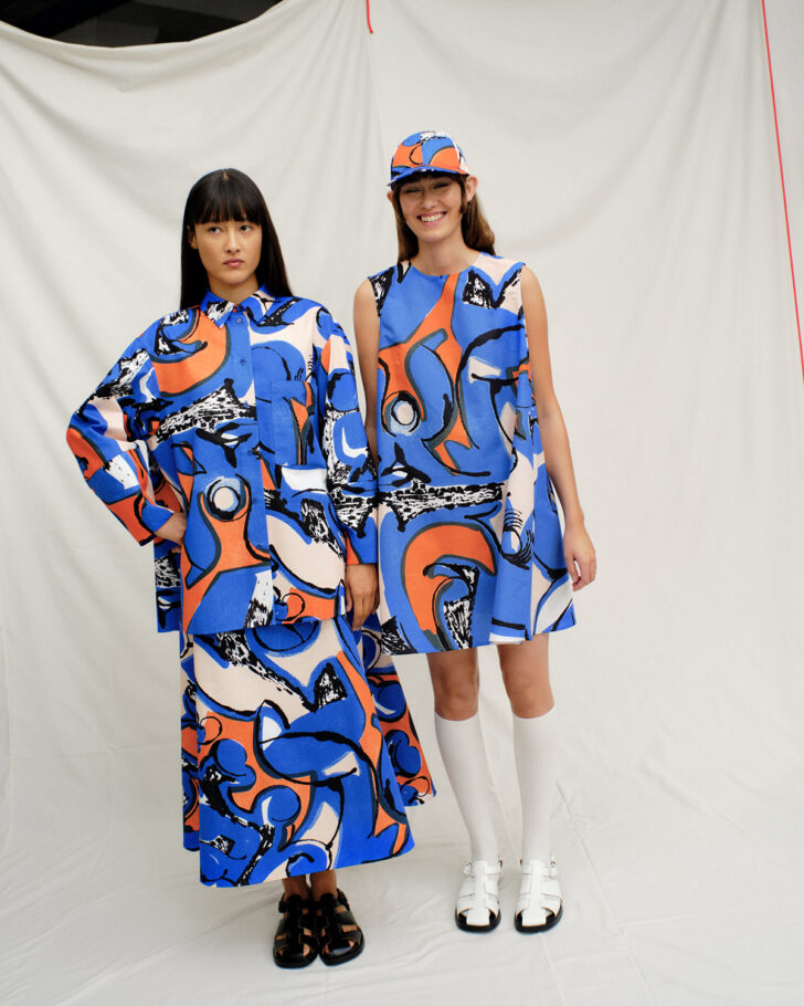
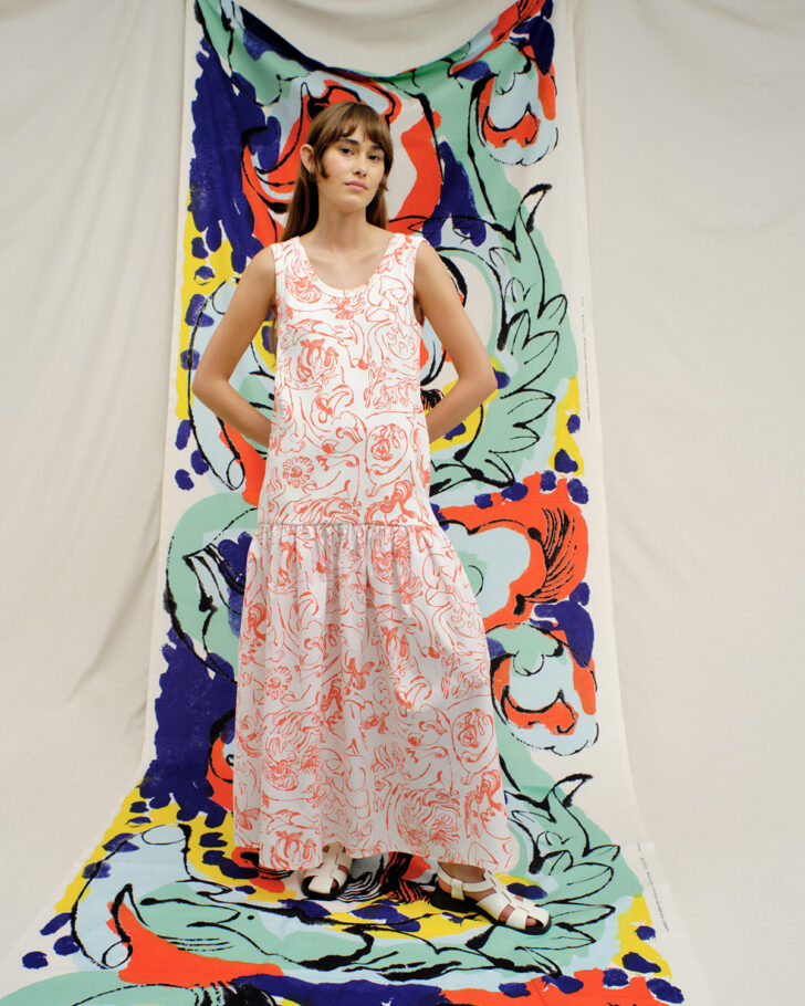
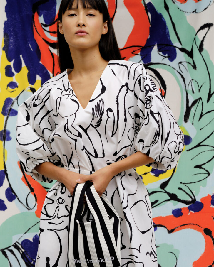
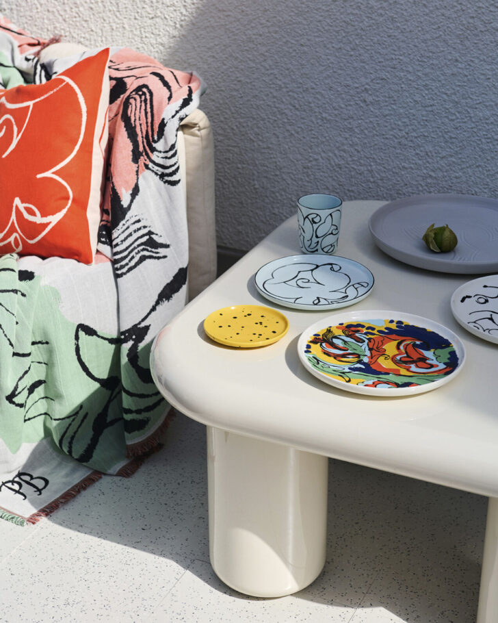
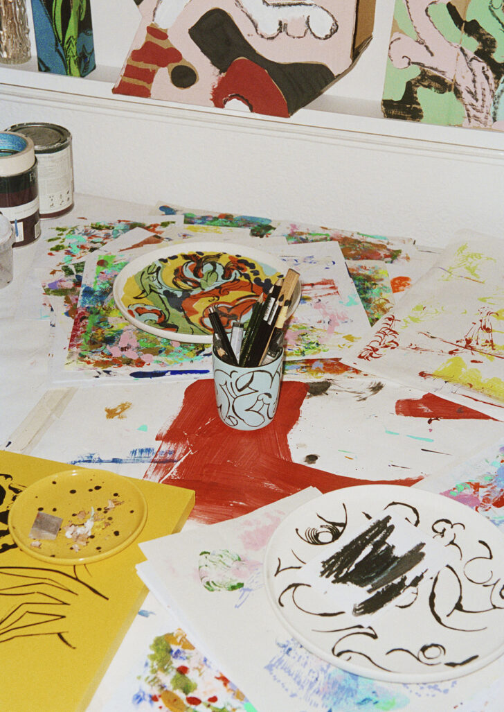
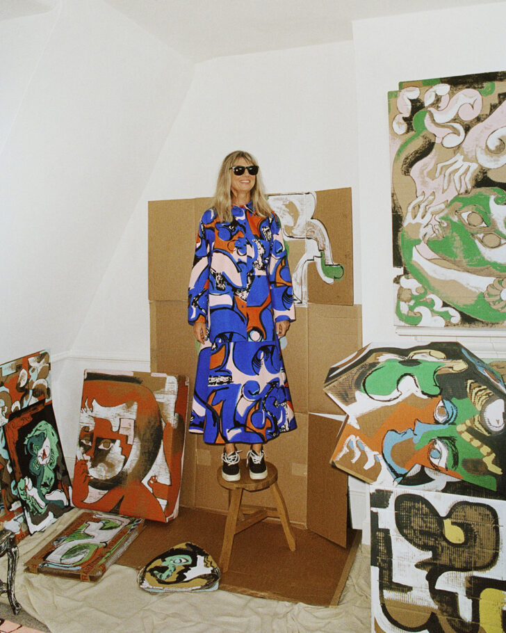
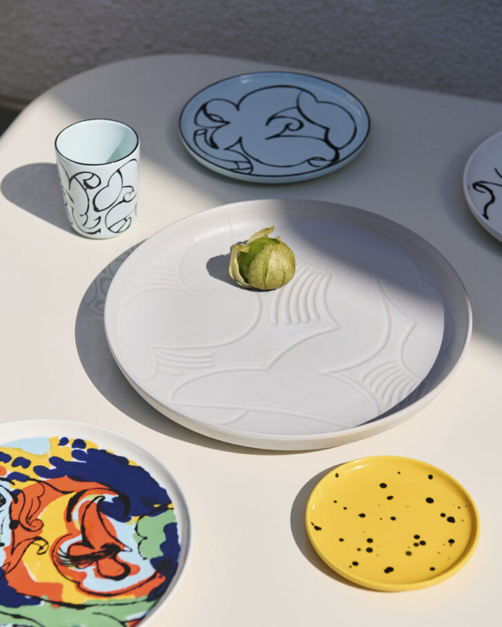
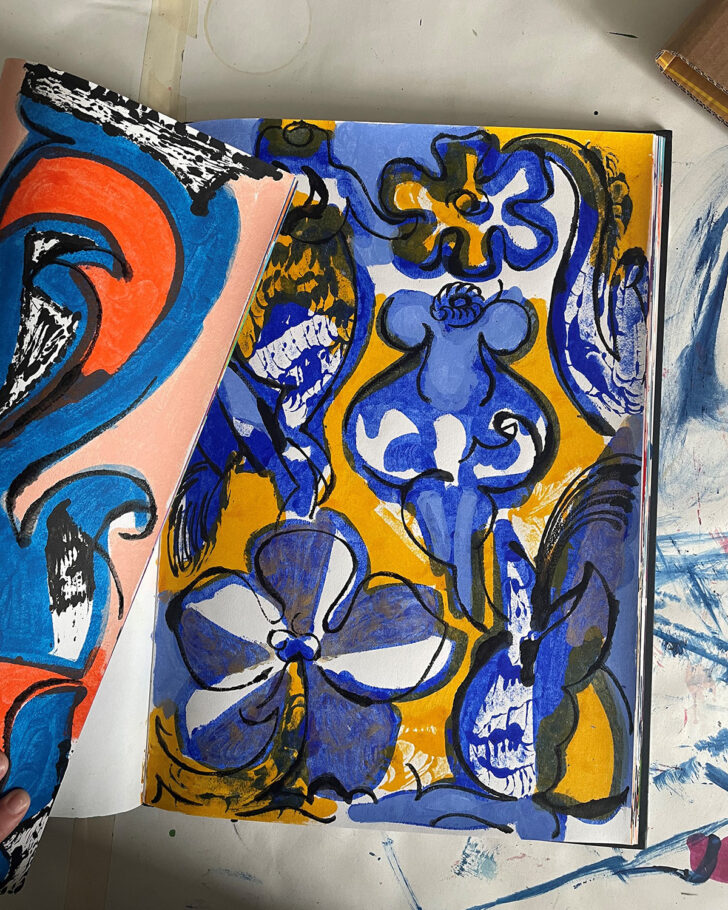
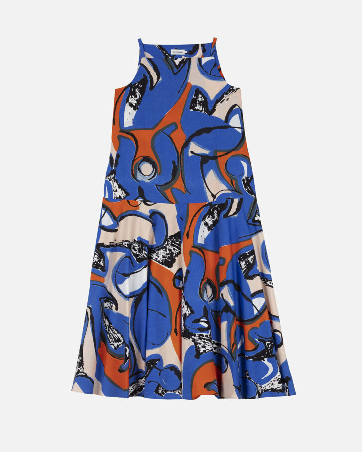
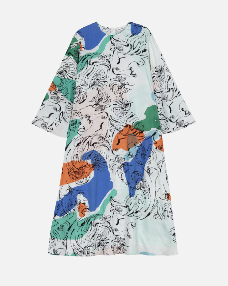
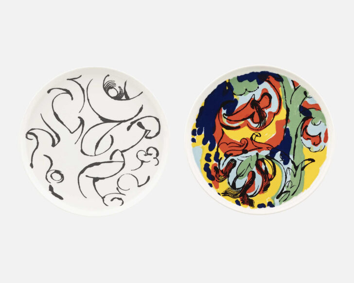
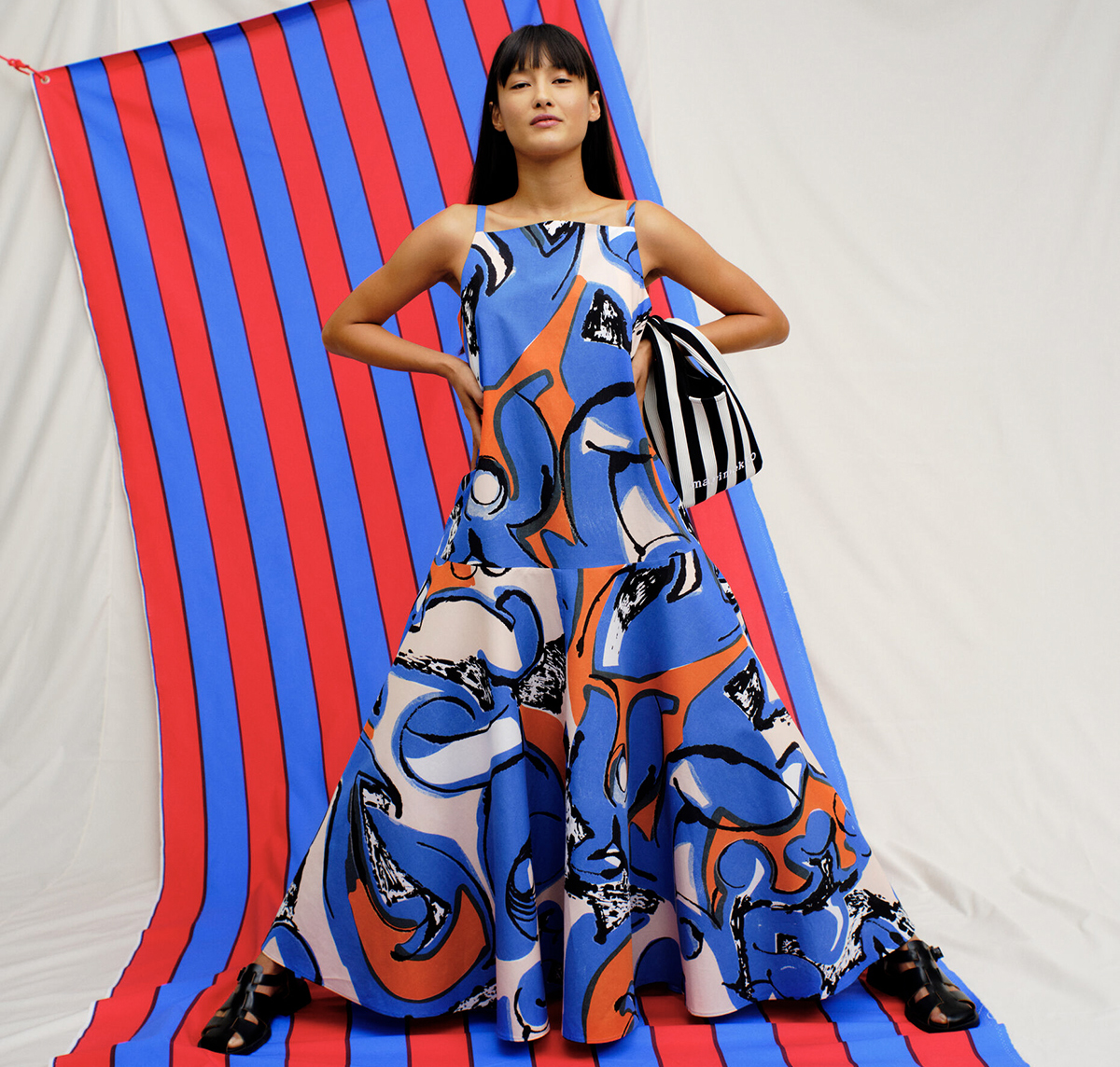
Marimekko has long been a go-to for those seeking joyful bursts of color and pattern in their clothing, accessories, and home décor, from the oft-searched 1980s-era Dan River Tulip bedding to the ever-stylish (and, frankly, ahead of its time) gender-neutral shirting of the 1953 Jokapoika. Over the last few years, the Finnish design brand has expanded that vision with its Marimekko Artist Series, a collaborative opportunity “to provide artists with a canvas — in the shape of Marimekko products — to present their work,” as Marimekko’s creative director Rebekka Bay puts it. The series makes artwork accessible to a broader public while paying homage to an era when Marimekko’s founder Armi Ratia would invite artists and other creatives to design prints, Bay adds. The theme of this year’s series, the Anatomy of a Flower, was a perfect fit for Petra Börner, a Swedish artist who lives in London. Börner’s work often nods to floral subjects and motifs, cyclical growth and constant transformation, and this beautifully translates into a capsule collection of dresses, skirts, tops, scarves, stoneware dinner plates, a ceramic mug, a throw blanket, a pillow cover, and yards of cotton fabric. The natural world, in general, is a constant source of inspiration for Börner, who says she’s “obsessed by its messy harmony and continuous movement.”
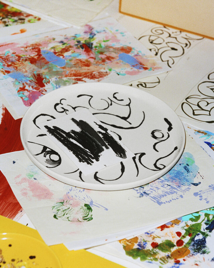
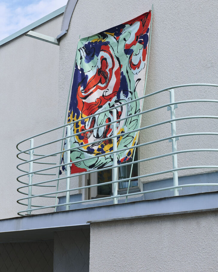
In keeping with the Anatomy of a Flower theme, initial reference points for this collection included Karl Blossfeldt’s black and white botanical photography and Georgia O’Keeffe’s colorways. “Colors feel central to me,” says Börner, “and without being able to explain why, some hues just seem to pair better and this is what I attempt to get to.” Those combinations — mint green, watery blues, warm oranges, and yellows in the Vildstjälk pattern gracing some of these pieces — serve as a vivid backdrop for her line drawings, which are elegant and fluid but also strong and present. “I apply color in quite an intuitive way and often apply layers of color in a kind of print-painting method. It’s energetic, letting the paint take its own place. My ink lines are a response to these palettes or surfaces, like a kind of repetitive handwriting,” she says.
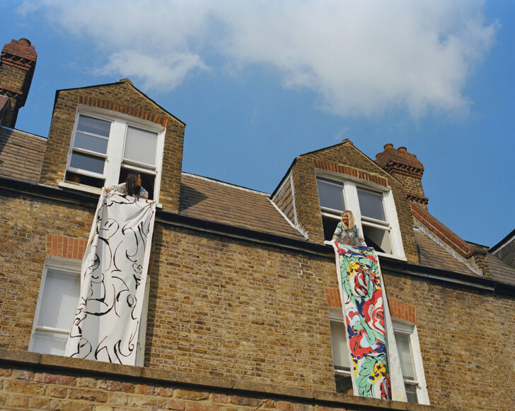
If a collaboration between Marimekko and Börner seems almost inevitable — they share something of a visual language as well as Scandinavian roots — it also provided a creative challenge, opening up new approaches for both Marimekko and Börner. Marimekko pushed its printmaking capabilities to materialize Börner’s artwork into ready-to-wear items, home décor, and textiles which were printed at Marimekko’s factory in Helsinki. Going from two dimensions to three inspired Börner, as well. “I love to see my work take new forms, spilling onto surfaces and materials, applied with a different technique. The tone of the color and texture changes depending on the material, and it gives it a different feel,” she says. For the collaboration, Börner selected pieces from a wider series of continuous work, and parts of the pieces then had to “be adapted and elements added to create a flow and natural repeat for the new context,” she explains. “Seeing my artwork as super-sized repeat prints has been incredible. In fact, it makes me want to get a bigger studio so I can create bigger works and sculptures. Scaling up a small artwork in this way has such a bold effect and all of a sudden it functions in a new space. As a ‘more-is-more’ person, this very exciting to me.” Took the words right out of our mouths.