07.30.26
The Weekly
A Hotel in a 6th-Century Monastery, an Office Channeling 90s New York, and More
Welcome to the new Sight Unseen, a weekly newsletter that delivers the best of the design world — news, trends, shopping advice, interviews, travel recs, and more — straight to your inbox. If you’re not subscribed, follow this link to sign up. Want to partner with us, advertise, or submit your work (guidelines here)? Email us at hello@sightunseen.com.
Art and Architecture Find a Perfect Dialogue Inside a Modernist Connecticut Landmark
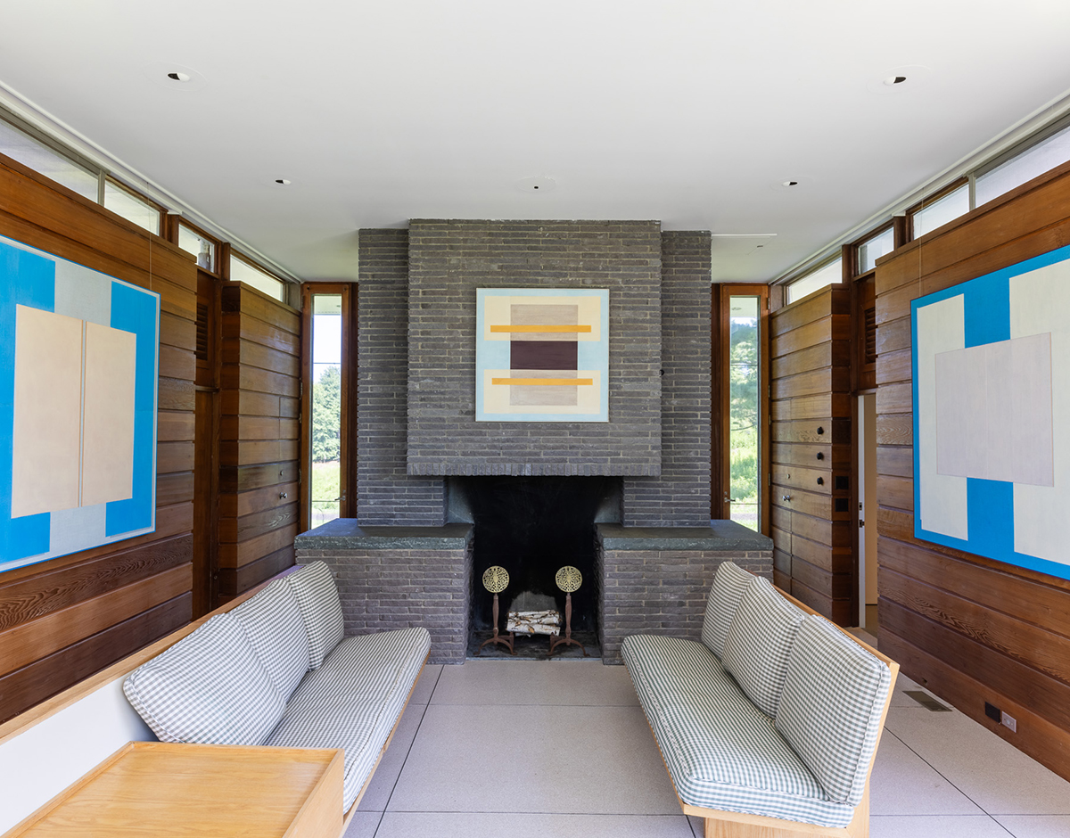
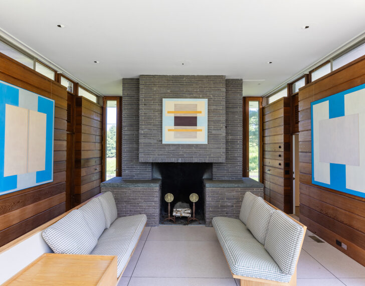 Artworks made from paper layered on top of linen canvases by Kim Bartelt, on view through tomorrow at the 1960 John Landis–designed Gores Pavilion in Connecticut.
One downside of taking an annual summer break from our newsletter: We sometimes miss the window for exhibitions and other time-sensitive projects. This site-specific exhibition of new work by Berlin artist Kim Bartelt is only on view until the end of the day tomorrow, but assuming most of you aren’t anywhere near New Canaan, Connecticut, anyway, we figured we might as well enable you to enjoy it from afar. For “Exhibit No. 2,” presented by Arden + White Gallery, Bartelt installed 8 of her understated-yet-colorful paper-and-linen compositions inside the Gores Pavilion, a landmarked home designed by modernist architect — and Philip Johnson collaborator — Landis Gores in 1960. The artworks resonate with both the colors and the geometries found in the home, but they weren’t so much inspired by the architecture as chosen to complement it; if you know Bartelt’s work, you know this has been her visual language for years. As the gallery puts it: “This exhibition is not about illustrating architecture, nor about placing contemporary art within an iconic building. Rather, it reveals a shared architectural sensibility, one rooted in proportion, restraint, and the thoughtful orchestration of material, light, and space.”
Walker Street Market Is Turning the Berkshires Into a Contemporary Design Destination
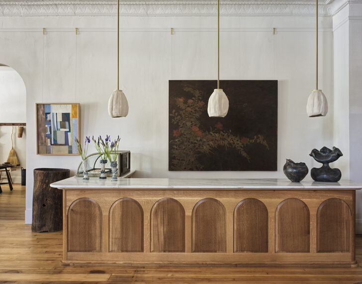
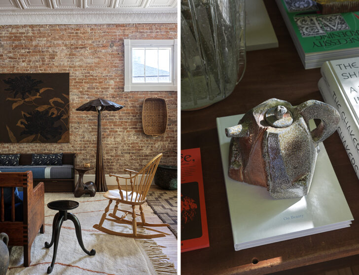 At Walker Street Market in Lenox, Mass., the craft-forward fare includes a custom counter by Brian Persico and painting by David Silverstein (top), a side table by Simone Bodmer Turner and lamp by Ashley Joseph Martin (above left), and a teapot by Akira Satake (above right), among many others. Photos: Chris Mottalini
Out of all the reasons to visit the Berkshires — a woodsy region of western Massachusetts that many New Yorkers escape to in the summer — I never really considered design to be one of them, unless we’re talking about MASS MoCA or modernist architecture, I suppose. So it’s honestly a little bit wild that something has popped up in the area like Walker Street Market, a sprawling design showroom full of commissioned work from a roster of talents that could rival The Future Perfect’s. Opened in mid-July inside a 3,000-sqft early-1900s former department store building, by fashion-designer-turned-interiors-guru Matthew Ames, the project is pretty much exactly how you might imagine a Berkshires version of The Future Perfect that’s lovingly attuned to its own context: lots of gallery-level studio crafts, with a contemporary edge, culled from the best new talents who still work with their hands and venerate, as Ames does, the beauty of pieces that make that fact obvious.
Since Ames is working with over 70 makers on the store’s wares — which also span flowers, jewelry, beauty products, and kitchen supplies — it’s impossible to give the full scope, but some favorite pieces when I visited a few weeks ago included a wall of multi-colored ceramic tiles by Shane Gabier, beautiful paintings by David Silverstein and Dan Bruinooge, ruffle-shade lamps by Studio Ford, textile still-lifes by Andrew Pierce Scott, glass vases by Dana Arbib, andirons and chairs by Simone Bodmer Turner, and some absolutely epic wooden floor and pendant lights carved intro trompe l’oeil frills by Ashley Joseph Martin, a name that was new to me. Obviously anyone who recognizes some of the other aforementioned names might note that not all of Walker Street Market’s designers are local to the Berkshires/upstate New York area, but highlights in that department include delicate floral lamps by Jake Coan and several monumental shelves, benches, and tables by woodworker Lily Thorne and her father Peter, some of them topped with ceramics by Natalie Weinberger.
The project is so ambitious, and the work it contains so meticulously crafted, that one can only hope that if and when the good people of Massachusetts descend upon it, Ames can keep the shelves stocked.
A Sixth-Century Priory Becomes Burgundy’s Most Atmospheric New Hotel
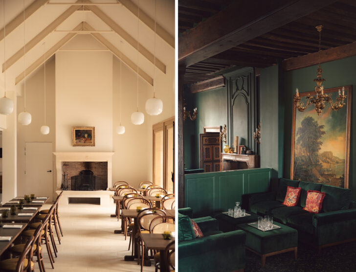
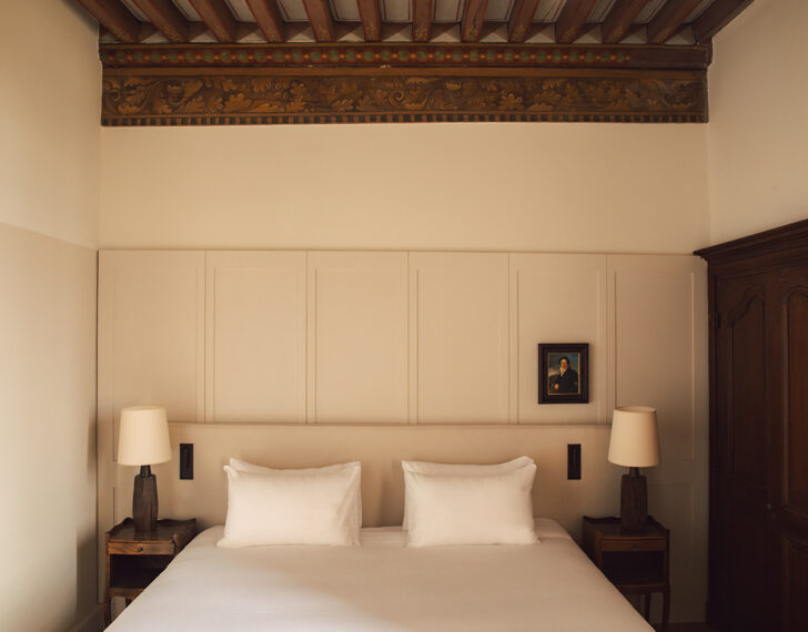
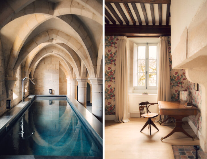 (Extremely) old meets new at Les Sources de Vougeot, a hotel in Burgundy, France. Photos: Jules Focone
It’s certainly true that, given the tragic outbreak of wildfires there right now, it’s a strange time to be talking about vacationing in France, in this case to a new hotel called Les Sources de Vougeot, with interiors by the Paris firm A.S.L. But at the same time, France will forever be a prime holiday destination, and for what it’s worth, this latest Les Sources — the third in a growing boutique chain, all three in different French wine countries — just so happens to be in Gilly-lès-Cîteaux, Burgundy, and thus far from the worst blazes. Anyway, whether you make plans to go or just want to join us in admiring the design, it is a very nice one; the building was constructed as a priory in the 6th century before being transformed into a country house in the 1600s, and then into Les Sources earlier this year. Because it’s a landmarked property, the hotel team had to tread carefully with their renovation, hiring historic specialists Chevalier & Guillemot to preserve original details in the process, like the indoor pool room’s stunning vaulted ceilings and a pair of fireplaces in the lobby, which used to be the priory kitchen. A.S.L accordingly focused on classical details like antique paintings, tapestries, and chandeliers, adding complementary touches like floral wallpapers, rich velvets, and vintage furnishings. Not to mention a maximalist all-green bar off the lobby that, were circumstances a little different, I’d certainly like to be cozied up in right now.
This Madrid Office Finds Glamour in 1990s Corporate New York
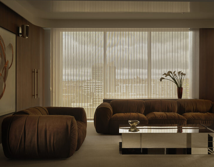
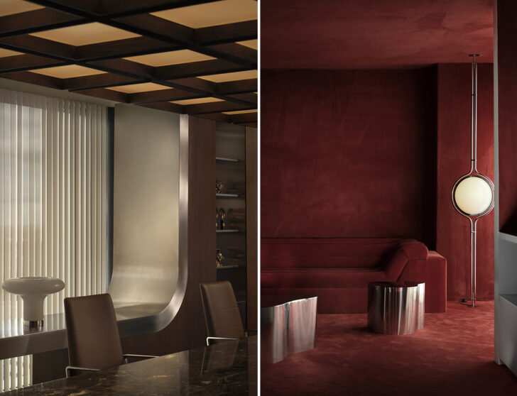 The Madrid offices of Jungle, a creative agency, were intended to channel New York interiors from the 1990s. Photos: Germán Saiz
I first arrived in New York City in 2000, and moved here for good in 2001. I saw a lot of important things — Williamsburg before it turned into a lame suburb, the fall of the World Trade Center, one of the first Strokes shows and pretty much everything else you might have read about in Meet Me in the Bathroom — but I did not get to witness 1990s NYC office culture. Very specific reference, yes, but that’s the aesthetic that inspired the project above, which is not only not in New York at all, but across the globe in Madrid. The designers, MIL Studio, clearly have a thing for this city’s lore, describing the vibe as: “corporate offices and creative studios where structure and culture coexisted, control and expression in constant dialogue … A restrained, understated aesthetic, where minimalism shaped refined, quiet spaces.” They left out the part about cocaine and clubbing, but sure, we get the appeal.
The offices — which span four floors and nearly 30,000 square feet — are for the Spanish creative agency Jungle, and are much sexier than the company’s client list might suggest (Ikea, Pepsi, KFC). There are long expanses of galvanized- and oxidized-steel walls, rooms lined entirely in cherry-red carpeting, and coffered ceilings that somehow find a way to glamorize a throwback to the hideous asbestos-laced drop panels of yore. On one floor, MIL actually does reference 90s club culture, saying they built dark, moody conference rooms and music rooms to channel those iconic spaces. The photos I happened to select above maybe have more of a ‘70s flavor to them, but if you want to see the whole project in its how-did-they-afford-this glory, head here for the full spread.
Cast Sardines, Mask Sconces, and Other Details That Make Palma’s First Restaurant Design So Special
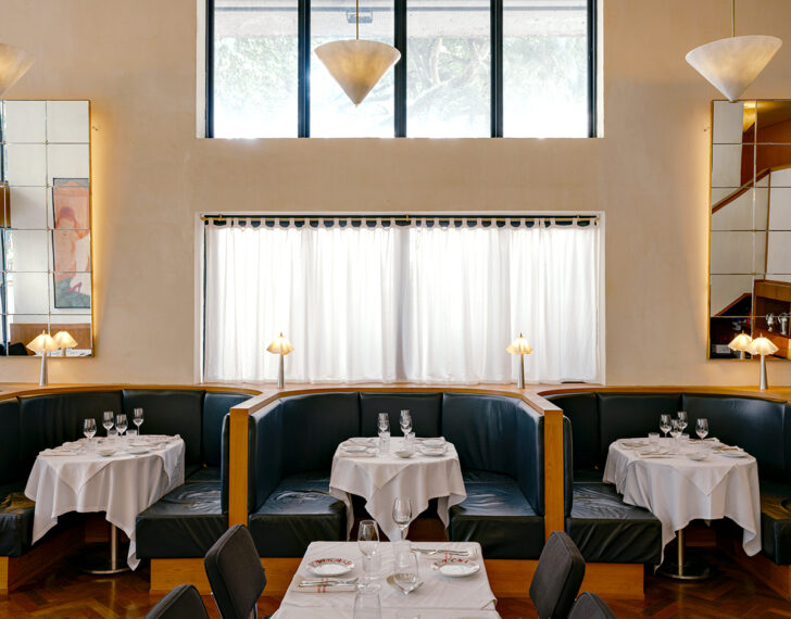
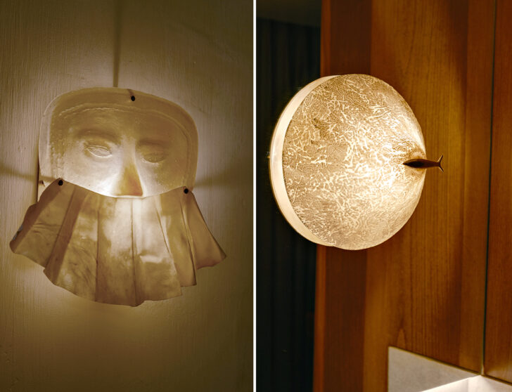 For their first restaurant interior, Le Freak in Sao Paulo, Palma filled the space with perfect custom details like mask sconces and sardine lamps. Photos: Fran Parente
Normally when we choose to feature interiors on Sight Unseen, we ask for dozens of photos showing the entirety of the space so we can evaluate whether it’s a beautiful, interesting, layered, and cohesive project that we can publicly get behind. With Le Freak, my approach was the complete opposite: I was idly doomscrolling a few weeks ago when I saw a post by the Brazilian design studio Palma featuring a single wall sconce, with a caption explaining they created it as part of a new restaurant interior. That was literally all it took. Most restaurant interiors live or die (for us, at least) by the strength of the materials used, the chairs and lighting chosen, the color palette, an overall concept that visually sets them apart. For Le Freak, it’s entirely about the details — a single pastel painting found at auction with no attribution, mini metal lamps between each booth adorned with tablecloth shades, cast sardines clinging to the apex of each light fixture, tiny metal birds perched in the intersections of large mirror grids. And then there’s that strange, striking sconce that looks like a mask wearing a mask, a flouncy apron stretched across the lower half of its translucent face. While the overall design is also quite nice, it’s plainly obvious to me that when actually eating at Le Freak in person, part of the joy of the experience would no doubt lie in all these lovely little discoveries.
Editor’s List
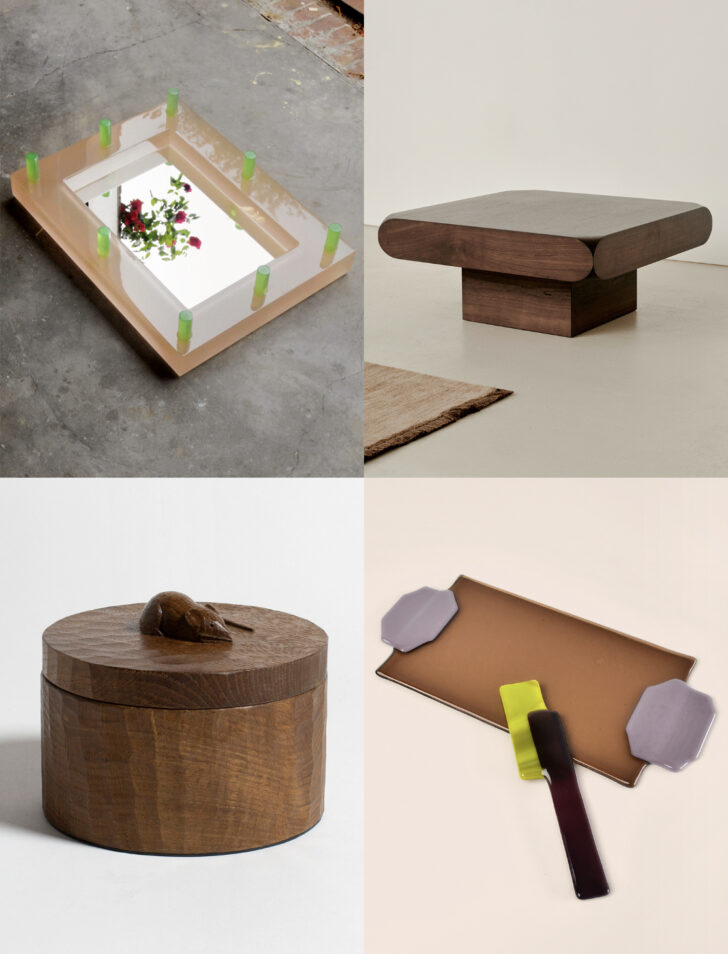
CLOCKWISE, FROM TOP LEFT:
–
Around a year ago, Dutch designer Boris de Beijer — probably best-known for his expressive many-colored goblets — started making fun, wonky resin mirrors out of leftover material from a nearby workshop. Now he’s given them a glow-up for the Amsterdam furniture purveyor The Frozen Fountain, with a new series that’s more perfect and polished, but just as statement-making, as the first. I love this peach and chartreuse combo.
–
Much more subtle is this new walnut coffee table by the Melbourne outfit Sabu Studio, which I might not have even noticed had I been paying less attention. But somehow those cutout corners caught my eye and I just think it’s such a thoughtful detail — quiet but impactful.
–
My internal monologue this week went something like this: I should buy this butter set! Ugh, no I shouldn’t; I never entertain. I should buy it anyway, it’s a cool object! No, I have nowhere left to put it. As of press time I was still undecided, but the good news is that the maker, Dutch designer Fleur Peters, currently has several stocked in each colorway, so I’m not afraid to share this find with all of you! Lots of her multicolored spoons are in stock right now, too.
–
If you’re in London anytime soon, the JW Anderson store in Pimlico has just introduced a special series of mouse-adorned housewares — trinket boxes, salad bowls, cutting boards, candle holders — carved in oak by the workshop of the late furniture maker Robert Thompson (1876-1955), aka Mouseman. The workshop still produces furnishings with Thompson’s signature rodent accents, and it’s always nice to see a brand giving heritage crafts a platform.
News
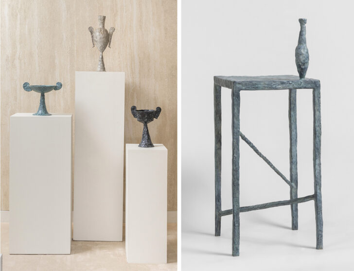 Vessels and a table in cast patinated bronze by Silver Sentimenti, recently on view at Galerie Scene Ouvert.
–
It’s been a bit of a quiet summer on the design gallery scene, but I took a shine to some of the works in a recent show at Galerie Scene Ouverte in Paris (shown above), which are made from patinated bronze and look sort of like a cross between ancient artifacts, Giacometti sculptures, and F. Taylor Colantonio pieces. They’re by Silver Sentimenti, a maker heretofore unbeknownst to me who is Italian-born, Paris-based, and used to be a costume designer for operas and couture houses. They’re a departure from his past work, but it’s working for him.
–
I had to chuckle this week when I saw this piece in the New York Times about the furor over Cracker Barrel redesigning its logo a year ago, which some people likened to a cultural attack on all things Southern and old-timey. The new logo was ugly, I’ll give you that, but I can’t believe people got so upset over a dumb corporate rebrand? Though I did laugh, it’s actually sad that someone has now lost their job over it. That’s the power of design I guess!
–
Chef and cookbook author Julia Sherman of Salad For President launched her first branded product line awhile ago — salad toppers — and though I loved the idea, the line quickly folded because it was too expensive to produce. Now she’s back with a new idea, salad dressing mixes that you shake with an oil and an acid, and I’m excited to try. They’re all vegan and gluten free, and the fun packaging was designed by Polonsky and Friends.
From the Collection
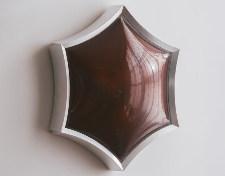 SUN FLUSH MOUNT BY ANNA DAWSON:
New to the Sight Unseen Collection, Anna Dawson’s Sun Flush Mount is a dimmable surface mount with an unexpected shape whose slumped glass and machined metal contrast one other. The metal frame also has a slight pleated-skirt effect on the corners, lending it a bit of feminine delicacy. The fixture can be ordered with custom-color glass as well.