09.21.12
Fair Report
At The London Design Festival, Part III
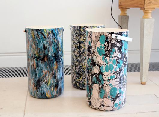
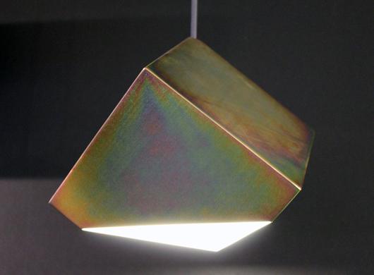
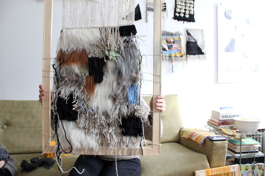
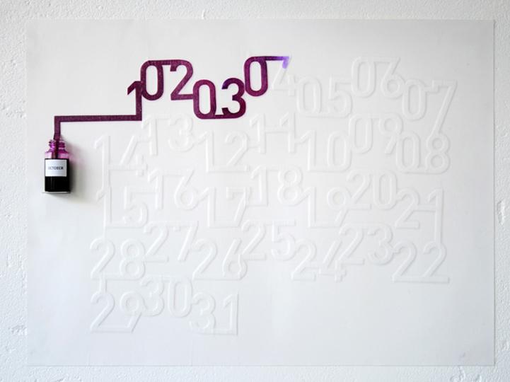
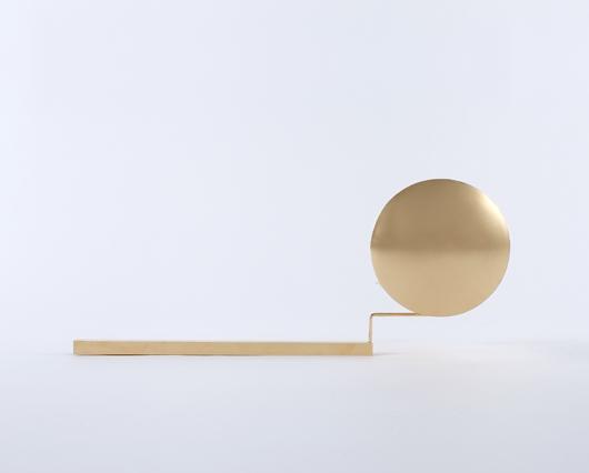
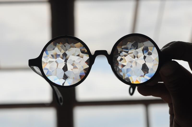
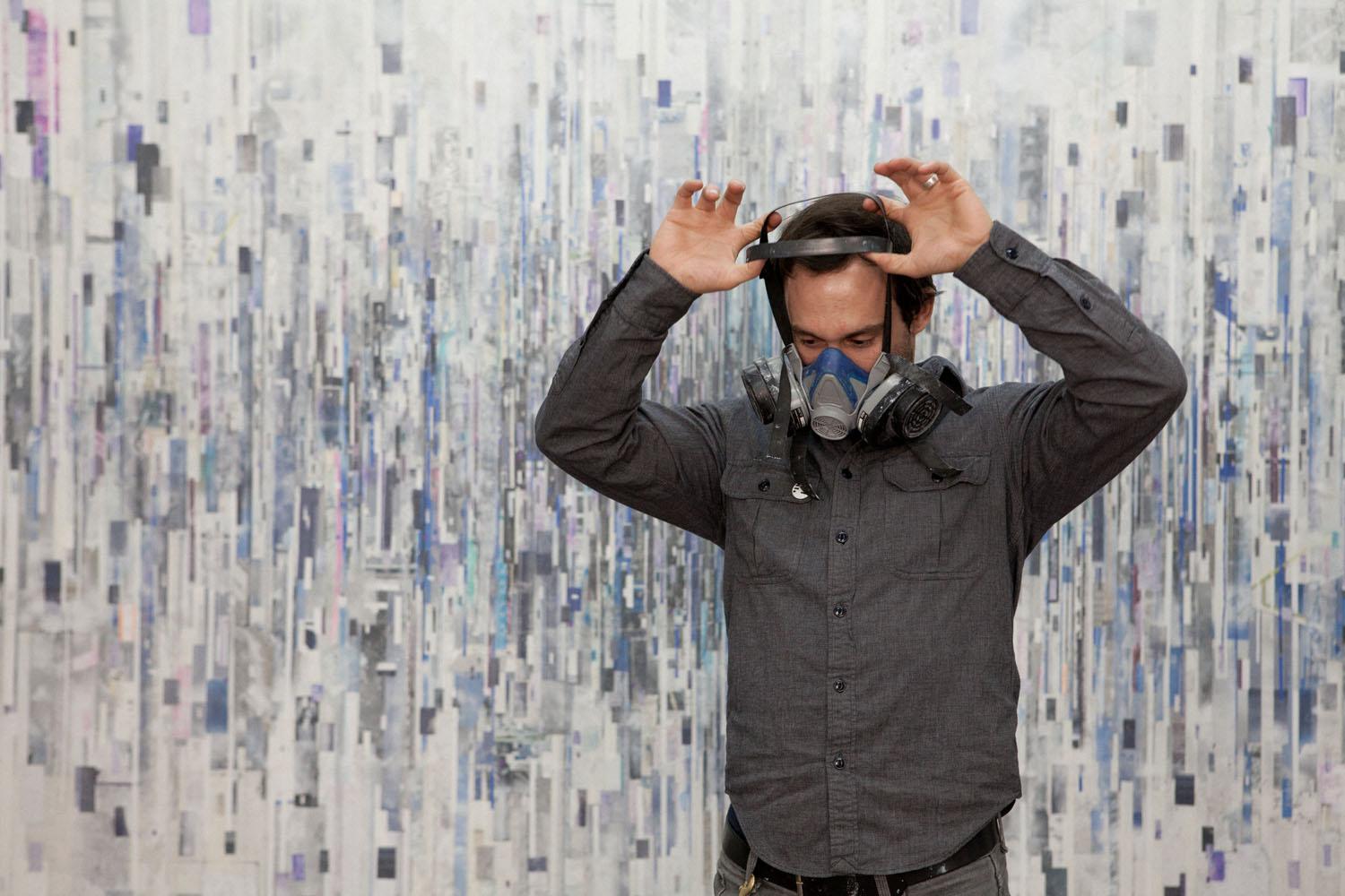
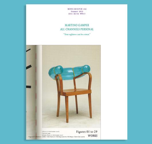
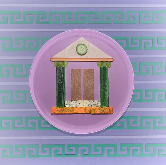
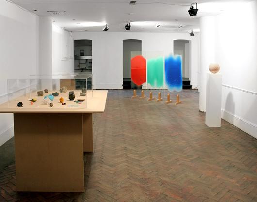
When you visit the show Image for a Title, curated by Study O Portable as part of the Brompton Design District, you can just about conjure the illusion that you’re in a world-class design-art gallery in some chic back alley of Paris, rather than a sunlight-starved basement at a hard-to-find address that happened to be printed incorrectly in this year’s Icon Design Trail guide. The show looks — and reads — so impressively that you start to believe what you want to believe rather than the reality, which is that many of the LDF’s visitors are likely to inadvertently miss out on seeing it, and that when it's over many of the pieces will, shrugs co-curator Bernadette Deddens, probably just wind up in storage. Welcome to the placebo effect, or at least our crude metaphorical approximation of it: the ability of humans to bestow a pill, an object, or in this case an exhibition with the qualities they expect or desire it to have. Deddens and her partner in crime, Tetsuo Mukai, invited a handful of designers to join them in exploring the possibilities of placebo thinking, producing an installation so well resolved that we’re going to go right on insisting it’s one of the top gallery shows on offer this week. Although, being more realists than dreamers, we’ve decided to help actualize our version of events by publicizing the show here on Sight Unseen. Check out each of its five projects below, and if you still have time to go see them before it closes at the end of the weekend, make sure to map your way to 8 Edgerton Gardens Mews.