07.24.12
Sighted
The 2012 Parsons Thesis Site
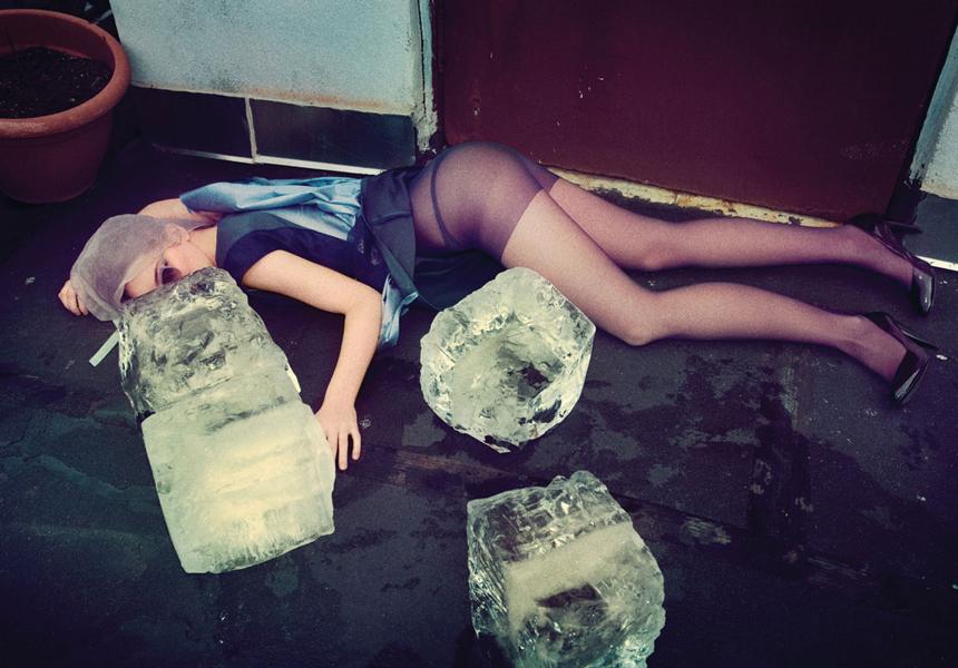
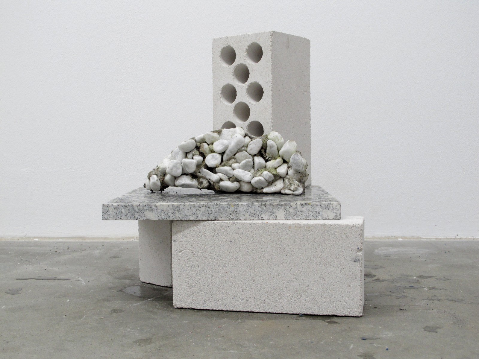
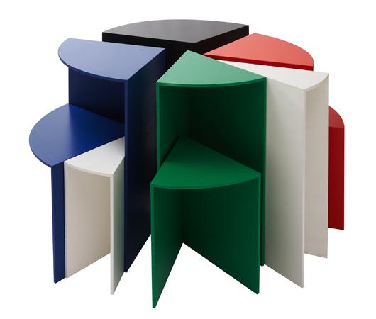
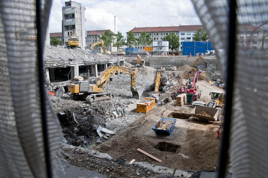
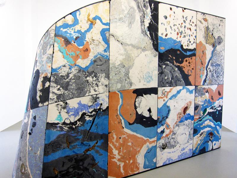
As curatorial hunter-gatherers, we're always on the lookout for new and unseen talents, and there's no better place to spot them than at school thesis shows. But as workaholics who seldom have time to leave our home offices, much less attend these shows, they all too often remain off-limits to us. It's a rare yet celebrated occasion any time we're either sent a clear, comprehensive accounting of projects by graduating students, or become aware of a website that successfully catalogs them. Last week, we received an email from Parsons with just such a treat — the new multi-disciplinary Parsons thesis site, part of the two-year old Parsons Festival which flings open the doors of the school to the public each May for three weeks of exhibitions, workshops, and fashion shows. Grateful to have access to the event's couch-potato version, we sifted through all the projects on the site and found the six we liked best: humorously cloying photographs of weird dollar-store finds by Antonia Basler, a series of poured-concrete side tables made in fabric molds by Isaac Friedman-Heiman, dresses that pay homage to Muybridge and Noguchi by Kaoru Oshima, photos by Charlie Rubin that blur the line between the real and the artificial, and minimalist versus maximalist origami garments by Yingshi June Lin and Si Lu. Have a look at the slideshow here, which is annotated with selections from the students' thesis statements, then clear your calendar for next May so you'll have no excuse not to join us at next year's festival.