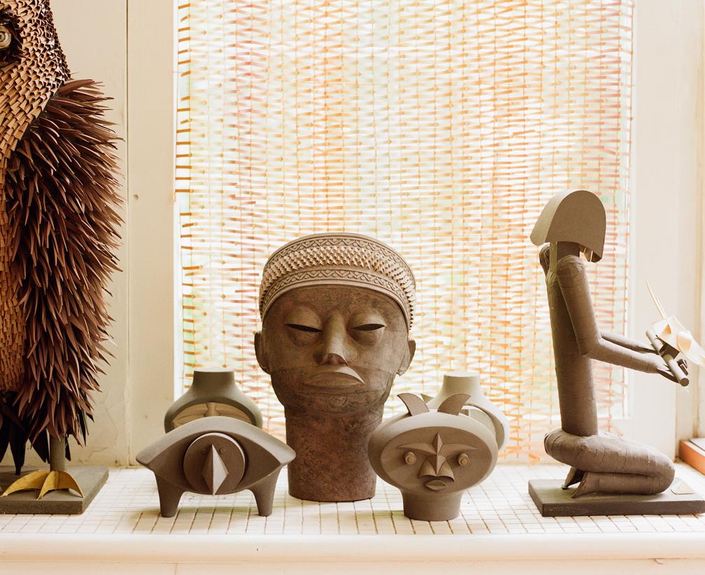
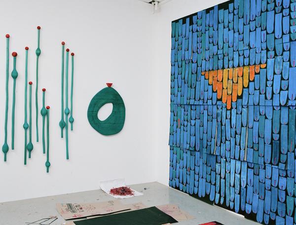
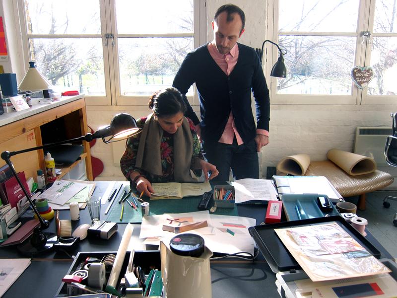
Matthew Shlian, Paper Engineer

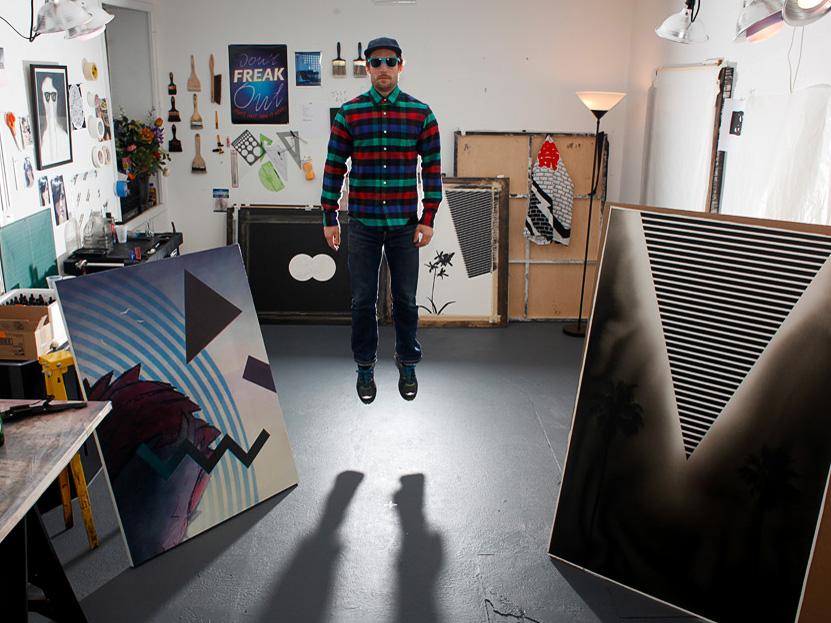
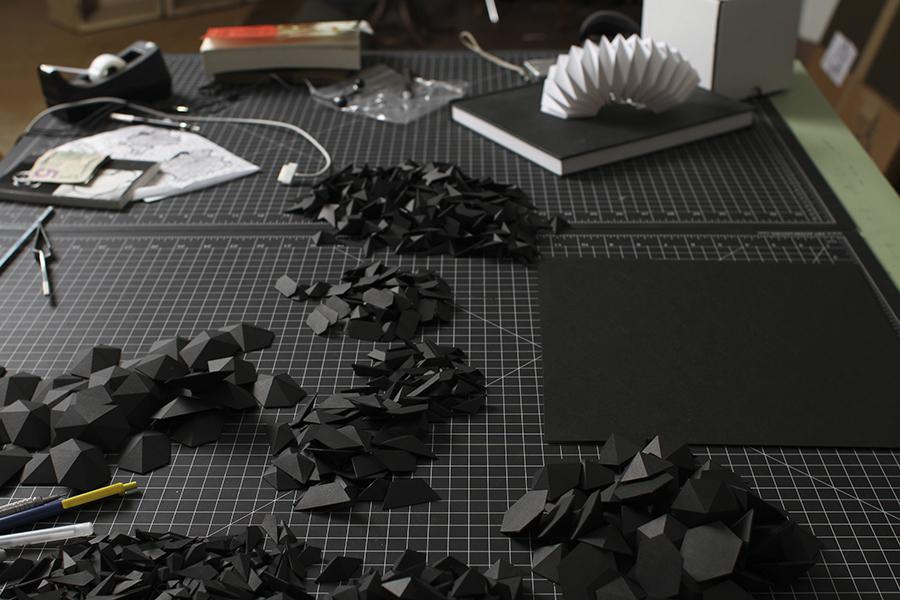
Knowing what we do about Matthew Shlian, it’s hard to believe that the Ann Arbor, Michigan–based artist ever thought he wanted to be a ceramicist. Ceramics is a medium of imprecision and risk, full of frequent failure and a high degree of unknowability. Shlian, on the other hand, can be found these days doing one of three things, each of which requires an almost uncanny amount of precision: drumming; working with scientists at the University of Michigan using paper to visualize structures at the micro and nano scales; or folding and gluing paper into intricate sculptures that range from 11x11-inch editions for Ghostly International to an 8-foot installation in the window of a New York Levi’s flagship. “I’ve always loved geometry,” Shlian says. “I understand spatial relations and I can envision the leap from 2D to 3D pretty easily. That kind of led the way to paper, and paper became the medium by which to execute a lot of my ideas.”
More

Irving Harper: Works in Paper

To say Irving Harper once worked in the office of George Nelson is kind of like saying Hillary Clinton once worked in the office of Barack Obama — Harper’s contributions were almost too many to count. He worked under Nelson for 17 years and was responsible for some of the studio’s — and design history’s — most famous works, including the Marshmallow sofa and Herman Miller’s still-current logo. Rizzoli recently published a book on Harper, but it wasn’t to set the record straight about who did what (there’s long been controversy over Nelson receiving credit for things that were actually authored by Harper.) No, the book, Irving Harper: Works in Paper, reveals Harper’s even more secret life.
More

Matthew Ronay on You Have Been Here Sometime

Long Island City, New York, is a vibrant up-and-coming neighborhood, home to MoMA PS1 and more than a few buzzy new restaurants. But it's also quite industrial, and prone to long, lonely stretches of aesthetic drabness that can alienate the casual visitor. The last time I toured an artist's studio there, nearly a decade ago, it was a woman who painted eye-poppingly bright, striated color fields almost compulsively, as if to insulate herself from the world outside her door. I don't purport to know Matthew Ronay's relationship with his adopted surroundings — he was born in Louisville, Kentucky in 1976 — but his paintings and sculptures certainly add up to one big escapist fantasy: His last big show in New York, at Andrea Rosen Gallery in 2011, was a three-dimensional enchanted forest populated with unidentifiable creatures and eyeball trees, while his latest work revolves around a wall that he imagines to be a portal to another world, perhaps one that looks less like a dreary factory yard and more like a sunny idyll. Maybe that's why Los Angeles designer and Sight Unseen pal David John is so drawn to it? John interviewed Ronay last week on his cult blog, You Have Been Here Sometime, and invited imminent Sight Unseen contributor Brian Ferry to shoot the artist's studio.
More

Peter Nencini’s “Beginnings”

We’ve been known to practically beg designers to put their sketchbooks on view for the world to see. But with one of our favorite London-based graphic designers, Peter Nencini, it was much easier than that. Nencini’s sketchbook is basically an open browser window: For nearly five years, the designer has been running one of our favorite inspiration blogs, where among the uncovered gems, he periodically posts direct source material, drawings, schematics, and studies for new work. Nencini trained as an illustrator and says drawing is what comes most naturally to him, even though his work has ranged from designing sets for television to creating amazing found object heirlooms for Partners & Spade to collaborating with wife Sally, a fashion designer, on embroidered and appliquéd upholstery.
More

With Eric Timothy Carlson, Artist

Certain people, whenever they mention an artist or a designer or an exhibition you've never heard of, make your ears automatically prick up — some might call them tastemakers, we suppose, though that word sounds too jargony to our ears. Regardless, we here at Sight Unseen like to believe that maybe, just maybe, we fulfill that type of role for even just a few of our more devoted followers — and of course we have our own hallowed sources of information, like Kristin Dickson of Iko Iko and Patrick Parrish of Mondo Cane/Mondo Blogo, both of whom have a knack for sending us into a flurry of OMGs. When Parrish announced he was mounting a fall show of art by Eric Timothy Carlson, whose name we only barely recognized from a collaboration with our friends at ROLU, our first thought was, "We need to interview this man!" Our second was, "But we know nothing about him," and so in the spirit of discovery, we devised a series of top-five lists by which Carlson might introduce himself and his Memphis-inflected work to both us and our readers. Check out his incredibly detailed responses here, then rush over to see Building Something: Tearing it Down at Mondo before it closes this Wednesday.
More

Misaki Kawai, Artist

Misaki Kawai's work is insane. In a good way. When Sweden's LOYAL gallery sent us these images from her new solo show, "Wet Shiny Surprise," we were taken with their use of geometry and pattern — not to mention their resemblance to Memphis design — but we had no idea the Japanese-born, New York–based artist also made paintings of weightlifting robots, surfing octopuses, and people pooping in the woods. What unites all of Kawai's art, from the beautiful to the bizarre, is her talent for blending childlike imagery with absurdist humor, a quality she suspects might have something to do with spending her childhood in Osaka, the center of Japan's comedy scene. But to the extent that her pieces seem like windows onto a strange and addictive parallel world, she gets most of her inspiration from navigating this one: After a post-graduate trip to Turkey, Nepal, and Thailand left her "greatly influenced by handmade dolls, textiles, and low-quality manufactured objects," Kawai began traveling regularly, collecting both physical and experiential scraps and incorporating them into her paintings and sculptures. When we interviewed her for this story, she had just finished opening the show at LOYAL and had moved on to Beijing and Mongolia, where she was riding camels and investigating the local dress. What she'll do with that fodder, we can only imagine.
More

Doshi Levien, Product and Furniture Designers

If you'd expect anyone to spend their days working amidst a snowdrift’s worth of process and ephemera, it’s London designers Doshi Levien. What you see piled atop the shelves and pinned to the walls of the couple’s Shoreditch studio, after all, is the product of two very different yet equally prolific minds working through their own approaches to the same tasks — Nipa Doshi being the Bombay-born lover of handicraft who collages, paints, and draws her way towards ideas from the ground up, and her Scottish husband Jonathan Levien, who spent his childhood in his parents’ toy factory and developed the more exacting methods of an industrial designer, prototyping proclivities and all. While both enjoy surrounding themselves with collected objects like Italian ice cream cups and Chinese pencil boxes, it’s impossible to understate the importance of the couple’s divergent interests to their work’s unique point of view; the designs that made them famous, after all, were daybeds and sofas for Moroso that combined industrially produced furnishings with hand-embroidery and textiles sourced from Indian artisans. It would be a cliché way of characterizing the pair if it weren’t so overwhelmingly true, even by their own admission: “After ten years of working together, I see it as an essential ingredient in what we do, almost a layer in the approach without which it would feel naked,” says Levien.
More

An Interview With Dan Funderburgh from WRAP Issue #2

Though it was never intended that way, Wrap magazine might just be the perfect racket. With each 11.7 x 16.5–inch editorial spread backed by an illustration meant to double as wrapping paper, it's practically compulsory to buy two of every issue — one to keep forever, and one to dissect into packaging for your best friend's birthday present. As far as the London-based magazine's founders, Chris Harrison and Polly Glass, are concerned, either approach is perfectly valid. "As designers, the most satisfying feeling is seeing people using and enjoying what you've made," they say. Both began as jewelry designers for brands like Matthew Williamson and Paul Smith, with Glass venturing into furniture design for Innermost before leaving to devote her time to Wrap, which they hope will eventually blossom into an illustration-driven housewares and stationery brand. The pair's first issue launched last fall with stories about and contributions from up-and-comers including Merijn Hos and Sam Harris, and the second issue came out last week, its size bumped from A4 to A3 and its designer interviews even more in-depth. Sight Unseen secured permission to reprint here an interview with the Brooklyn-based illustrator and William Morris disciple Dan Funderburgh, whose wallpaper design pictured above was adapted especially for Wrap.
More

Architects’ Sketchbooks

In the context of the hysteria currently surrounding all things old-fashioned and handmade, it makes a certain sense to mount an examination of architecture's low-tech roots: those hand-rendered sketches and schematics that still tend to quietly precede even the most digitally advanced structures. It's debatable whether the practice as a whole is consciously returning to those roots, as the new book Architects' Sketchbooks argues, but when the architects who find joy in committing their thoughts to paper open their notepads for all to see, the appeal runs deeper than any cultural trend. "For me, the process is often more fascinating than the end result, and at the heart of architecture, which is part of the process of building worlds, lies the language of drawing," writes Narinder Sagoo of Foster + Partners in the book's foreword.
More

Evan Gruzis, Artist

Evan Gruzis explored altered states of awareness a few years back, and while he was wigging out, managed to scrawl down such revelatory thoughts as “there once was a movie, it was amazing”; “welcome to the temple of showers, please take a shower in one of our many showers”; and “no bother, it’s just the remix.” Having rediscovered the notes recently, he turned them into a series of works on paper by scanning and enlarging them, cutting out the individual letters, then sweeping over the cutouts with the flat, ’80s-style gradient that forms the background for many of his works, including semi-photorealistic still lifes and geometric abstractions inspired by Saved by the Bell and Memphis. Rather than using an airbrush — “blasphemy!” according to the 31-year-old artist — Gruzis builds up the gradients in meticulous layers of India ink, spreading upwards of 20 separate washes across wet paper with soft squirrel-hair paintbrushes until the effect is practically flawless. “It’s about taking a moment that isn’t even remembered and turning it into this layered, highly crafted, highly rendered thing,” he explains of the acid notes, the kind of process that keeps him locked away in his studio six days a week. “It’s about taking meaninglessness and glorifying it. That’s another way of putting what I do: Making absurdity seductive, and making the seductive vapid, so you get caught in this feedback loop.”
More

Jason Rosenberg, Artist

The first time I met Brooklyn artist Jason Rosenberg, I brought him a present. It was nothing fancy. Earlier that day, I’d gone to the doctor and left with a prescription tucked inside a tiny plastic pharmaceutical bag, printed with a picture of a pill and the name of a generic medication. Lest my gift-giving skills be called into question, I should explain that I was headed that night to Kiosk, the New York shop where Rosenberg was hosting a Plastic Bag Happening: The idea was to bring a bag and either exchange it for one of the many Rosenberg has collected over the years, or to have the artist, equipped with his vintage White sewing machine, transform the bag into something totally different — a hat, a pencil case, a coin purse, a wallet. I walked away with two slim sacks from Systembolaget, Sweden’s chain of state-sponsored liquor shops; Rosenberg, when I visited him in his Greenpoint studio last month, was still holding on to the bag I’d brought, though where to find it in his heaps of pseudo-organized boxes, bins, and file folders was another story.
More

A to B at Toronto’s MKG127

There’s no object too mundane to catch Micah Lexier’s eye. He collects scraps torn off cardboard boxes, envelopes and papers lying in the street, even bathroom-cleaning checklists at restaurants — anything that deals with the passage of time or with systems, the driving forces behind his own work as an artist. “I love garbage day,” he says. “It’s hard for me to walk home and not find things. I keep a knife in my pocket just in case.” It’s not that Lexier necessarily uses these found items in his own pieces, like the 1994 series in which he photographed 75 men from age 1 to 75, all of whom were named David. They’re just another part of his lifelong fascination with the aesthetics of order, a way of seeing the world that was mapped out perfectly in the show he recently curated at Toronto’s MKG127 gallery, where curiosities from his collection sat alongside sequentially themed works by other artists.
More