Matisse-Inspired Prints Marleigh Culver

Matisse-Inspired Prints By a Graphic Designer On the Rise

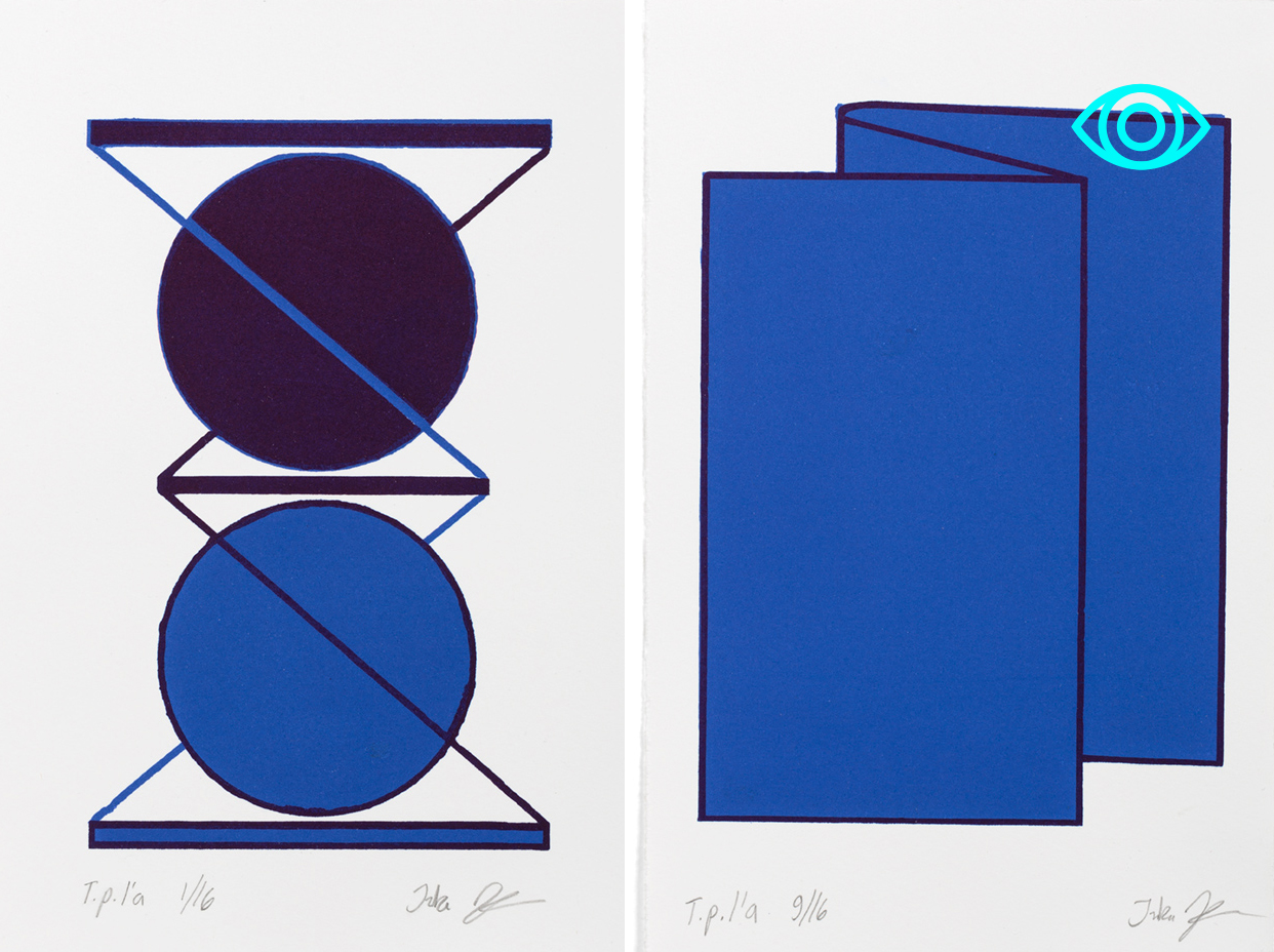
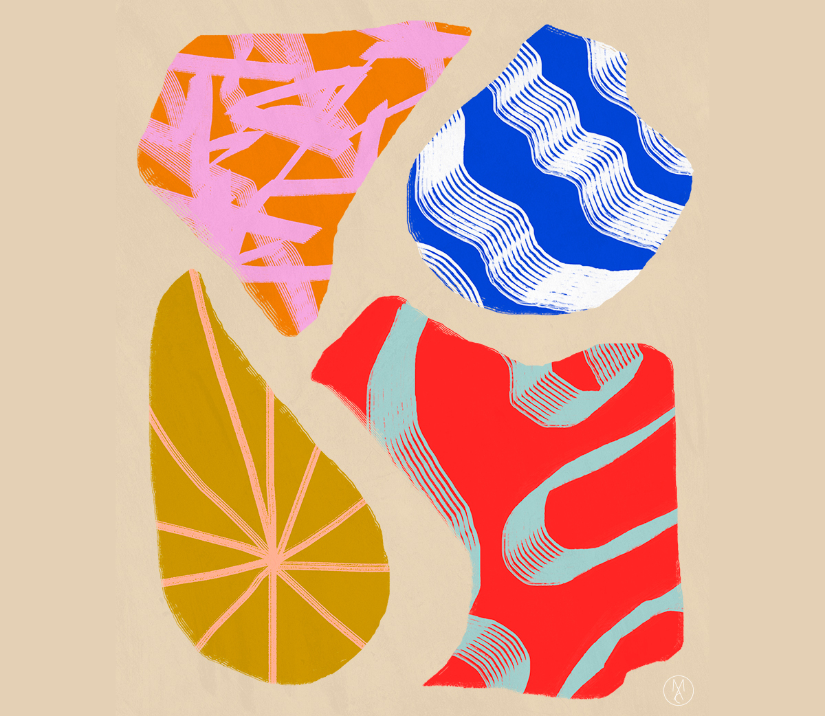
Much in the way our love for a book is evident in loose binds and worn-out pages, there's a certain value in the way we let beloved things blemish or roughen overtime. The Japanese call this permission of imperfection wabi-sabi — wabi denoting a singular, often uncontrolled uniqueness akin to a flowing streak of paint, and sabi literally meaning "chill" or "withered," which references the beauty of corrosion. Marleigh Culver, a graphic designer at Need Supply by day and visual artist by night, feels a certain kinship with this design approach. "I like sloppy shapes and rough edges, and for my pieces to look like they’ve been moved between houses for generations," Culver says.
More

Inka Järvinen, Graphic Designer and Printmaker

Finnish graphic artist and designer Inka Järvinen began her career with a degree in fashion from Helsinki University of Art and Design in 2005. But after graduating, she quickly discovered she preferred designing in two dimensions to three. So what do you do when you hold a diploma in something that doesn't suit your true passion? You follow those dreams back to school and get yourself a second degree! Armed with a BA in graphic design, Järvinen went on to co-found Tsto, a design agency whose hotshot clients include Artek, Levi's, and Nokia, and she continues to work on solo projects in her spare time. We especially love her graphic prints, controlled yet unpredictable. They're clean, and perfectly executed by someone that clearly understands the principles of balance, line, and pattern. We've excerpted some of our favorites after the jump.
More

Sigrid Calon, Visual Artist

For some reason, this is the week we finally put our money where our mouth is: First we took home one of Fort Standard's beautiful, mint-colored standing bowls, and then, on a whim last Wednesday, we picked up a risograph by Dutch visual artist Sigrid Calon, who we've had on our radar for quite some time. The hardest thing about buying Calon's work is narrowing down your options to just one — each print, which is based on the Tilburg artist's interpretation of an embroidery grid, is beautifully layered, using eight gradated colors, dots, and lines to achieve endless variations. Which one would you choose? See more after the jump.
More

Marine Duroselle, graphic designer

For the young, French graphic designer and Royal College of Arts grad Marine Duroselle, a relationship to pattern and shape is both instinctive and intuitive, owing in large part to the vast array of objects she was exposed to as a child. Growing up in Peru, her mother an anthropologist specializing in pre-Colombian textiles, Duroselle was continually surrounded by rich fabrics, threads and other types of South American crafts; a period of post-adolescence spent living in New York, on an exchange program at the School of Visual Arts, only further emphasized her interest in textiles and color.
More

Prince Ruth for Urban Outfitters

When we first got wind of the new Scandances by Prince Ruth textile collection for Urban Outfitters, we had two questions: Who is Prince Ruth? And what the heck is a scandance? The latter question, we found, was easy to answer: It’s that jittery, seismograph-through-the-lens-of-an-acid-trip effect you get when you manipulate an image while it’s in the process of being scanned. As for the former, we assumed that Prince Ruth was some under-the-radar designer we somehow weren’t cool enough to have noticed. And in a way, that’s exactly what it is: Prince Ruth is the name of a Brooklyn-based surface design studio run by Zoe Latta, a 24-year-old textile artist and RISD grad whose work is more famous than her pseudonym would suggest.
More

David Lynch’s workshop in The Chronicle #2

It wouldn’t be totally wrongheaded to view The Chronicle — a new biannual publication produced by the cultish Copenhagen ready-to-wear brand Rützou — as a fashion designer’s mood board, come to life. For each issue, the creative team — which consists of Rützou’s designer, founder, and namesake Suzanne; her husband, creative director Peter Bundegaard; and editor-in-chief Frederik Bjerregaard — selects a thematic framework and then collates together visual inspiration to support it. Called “Poetic Realism,” the first issue was abstract and moody, with photographic essays on pattern or urban decay and collages of the magazines’ own diverse inspirations, including Luigi Colani, Matthew Barney, Ernst Haeckel, melancholy, and a Mott Street acupuncturist in New York’s Chinatown. The latest issue, called Sense and Sensibility, more literally serves as a scrapbook for creative inspiration: “Sketches, abstractions in watercolor, visual logbooks, black-and-white imagery, personal portraits, simple doodles, this vast collection is a glimpse into a range of international artists’ creative processes and their final work,” the team writes. By international artists, they mean the likes of Marc Newson, Julie Verhoeven, and David Lynch, who offers a glimpse into his Parisian printmaking lair in the excerpt we’ve reprinted today on Sight Unseen.
More