08.15.16
Graphic Design
Matisse-Inspired Prints By a Graphic Designer On the Rise
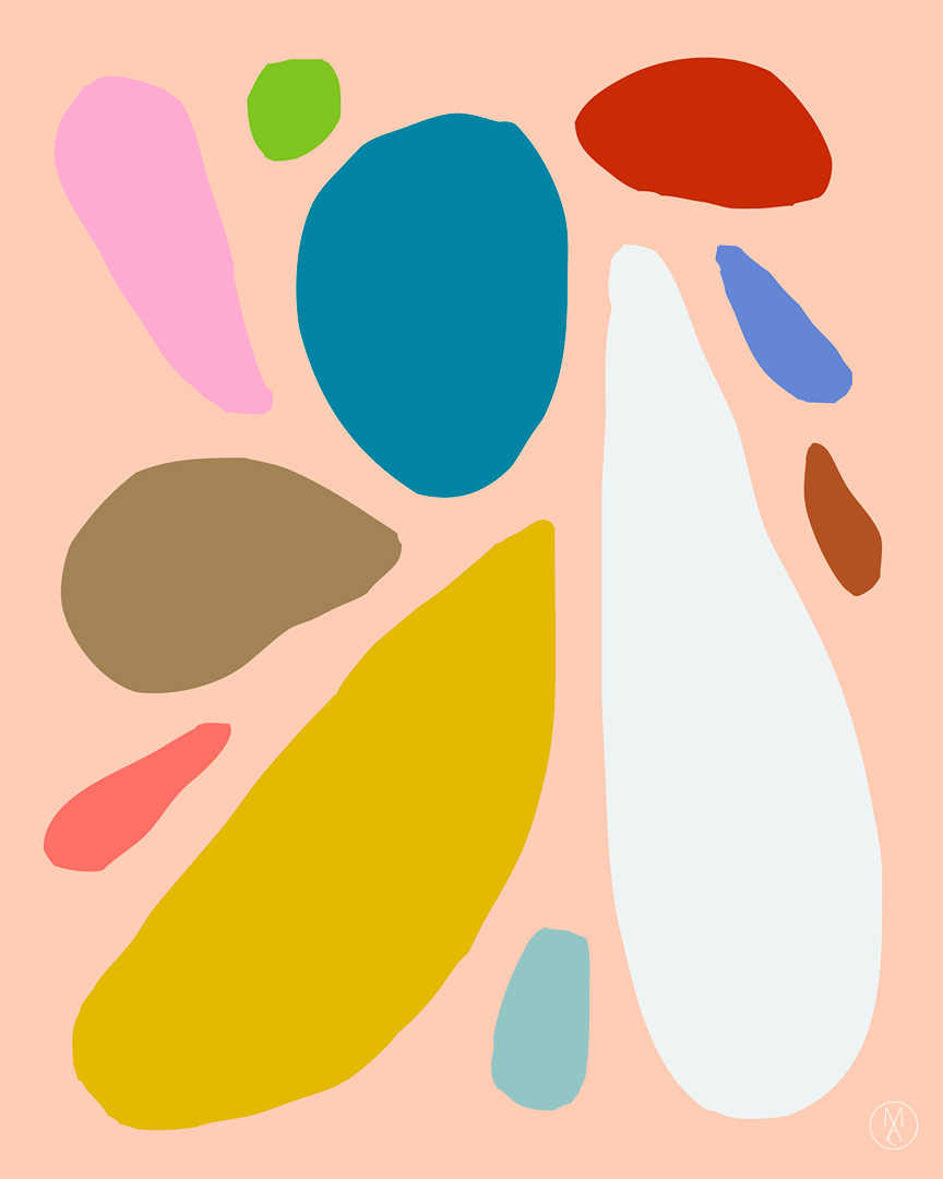
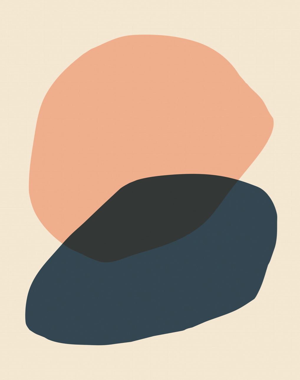
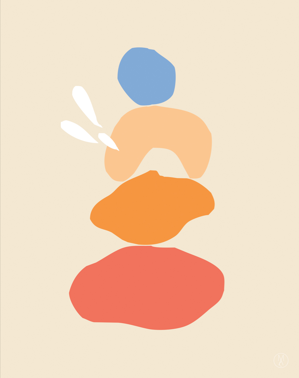
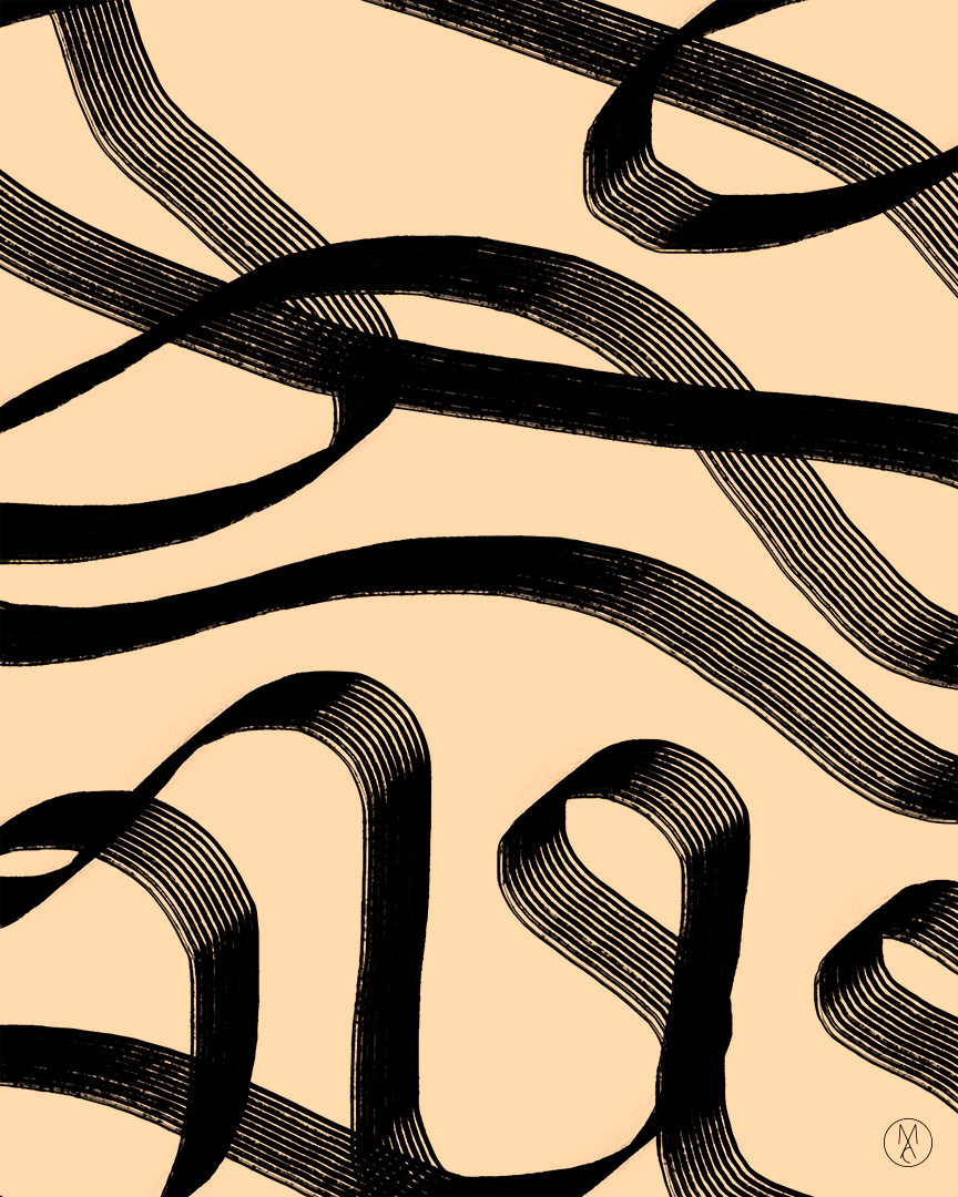
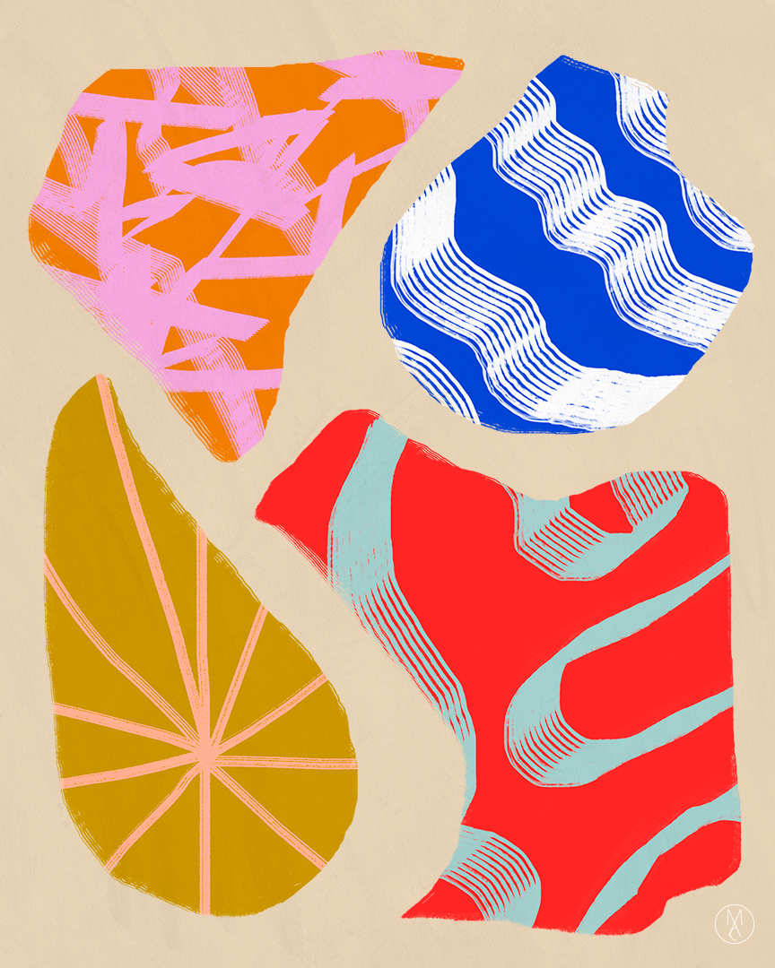
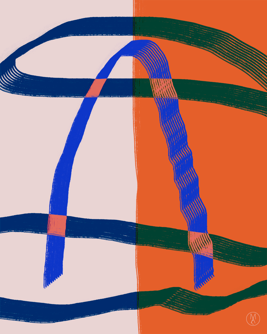
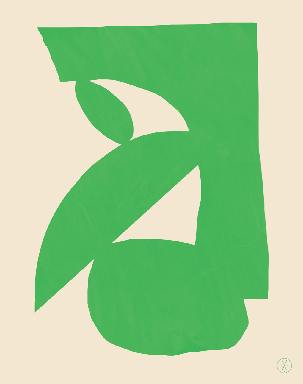
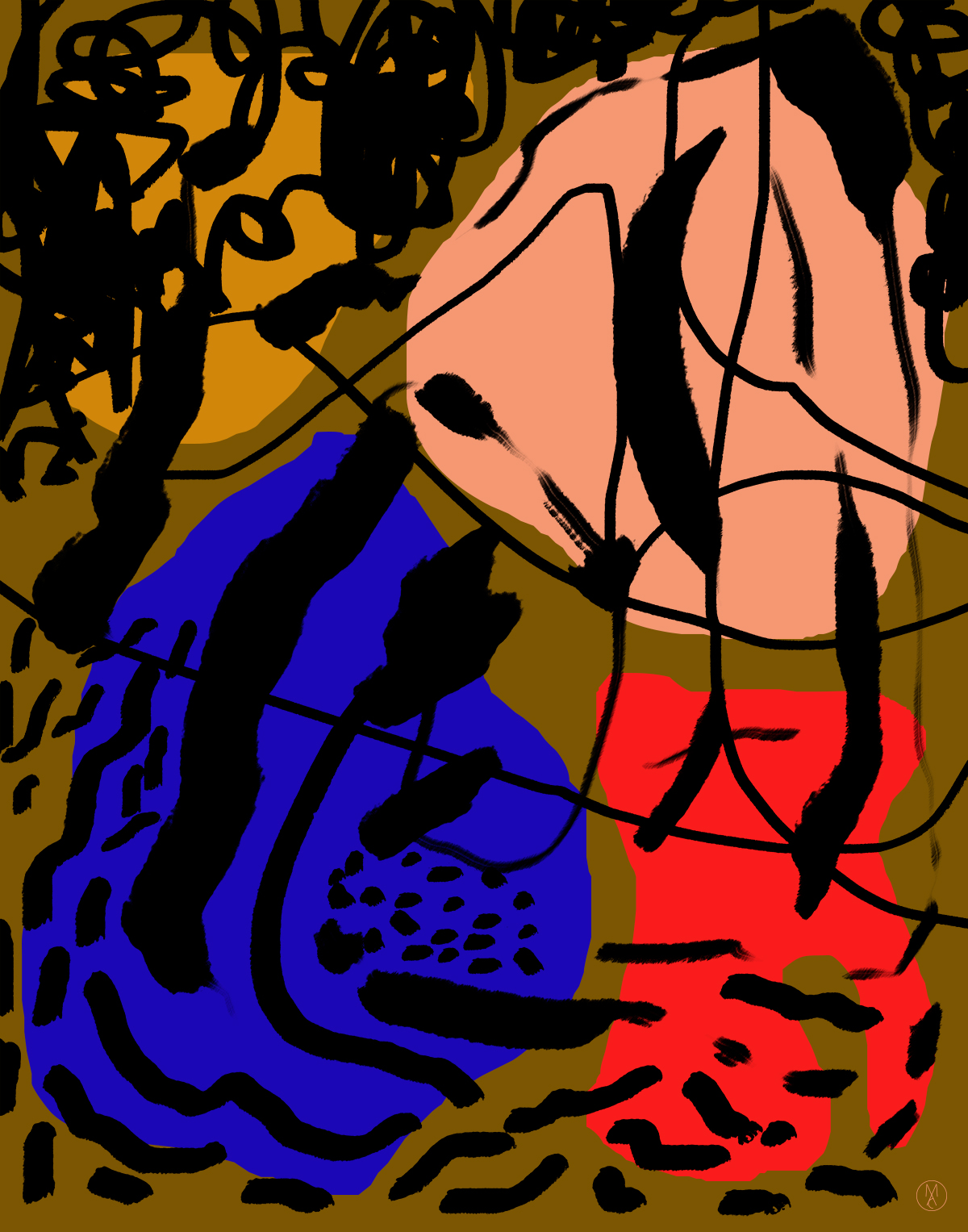
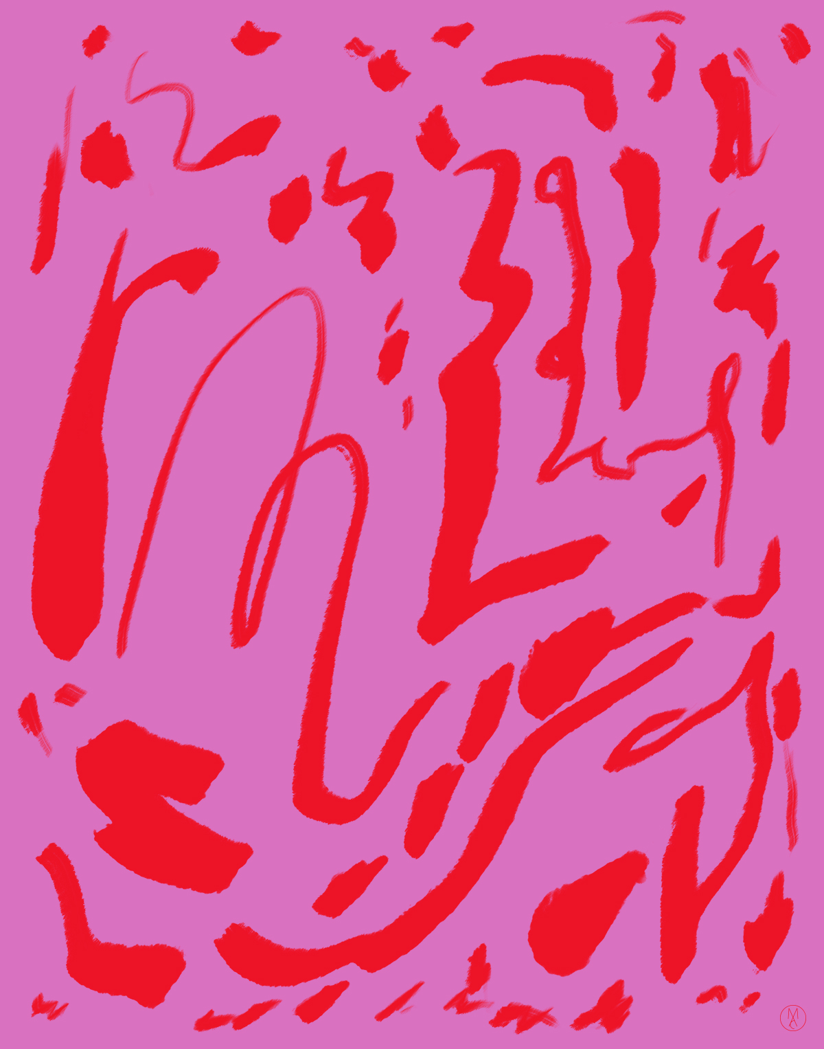
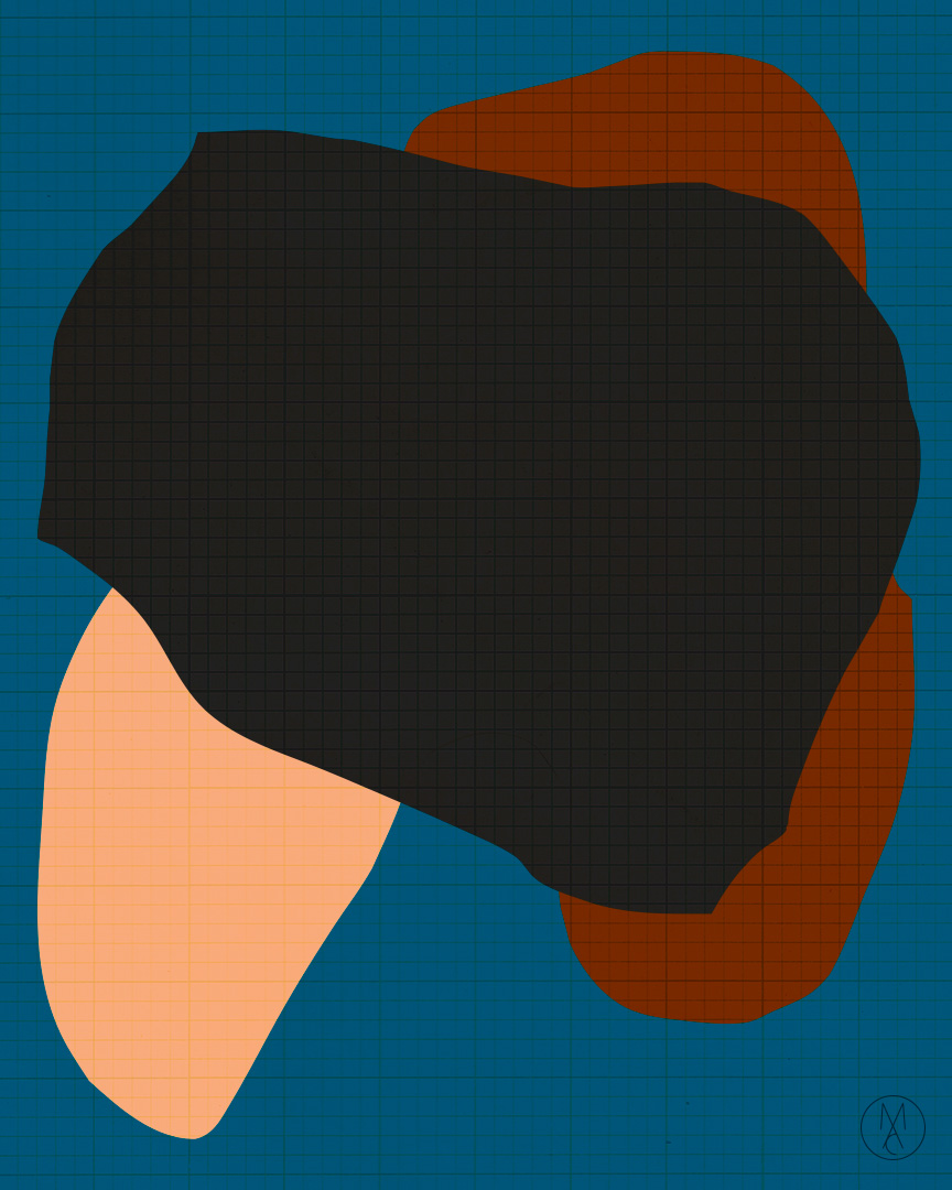
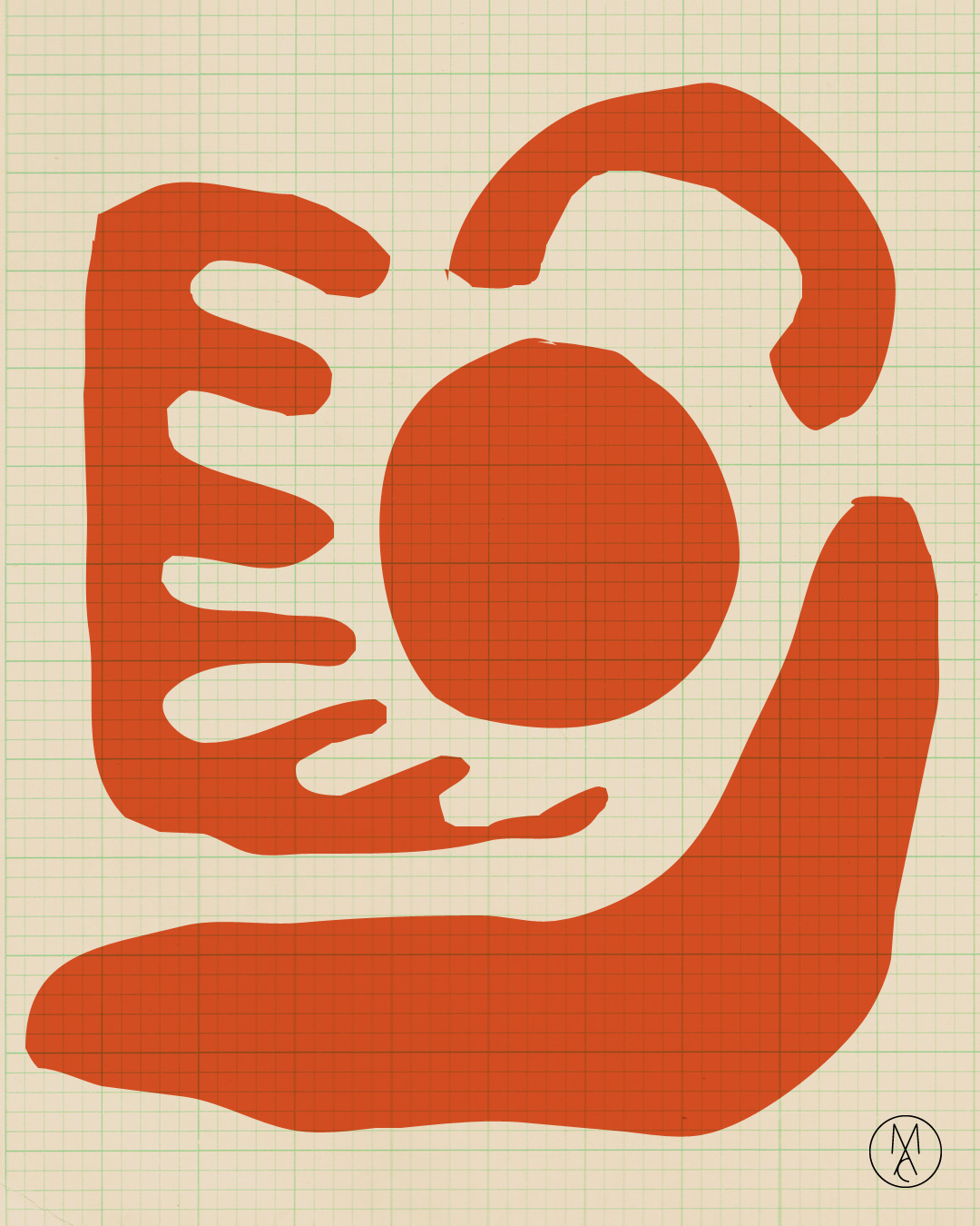
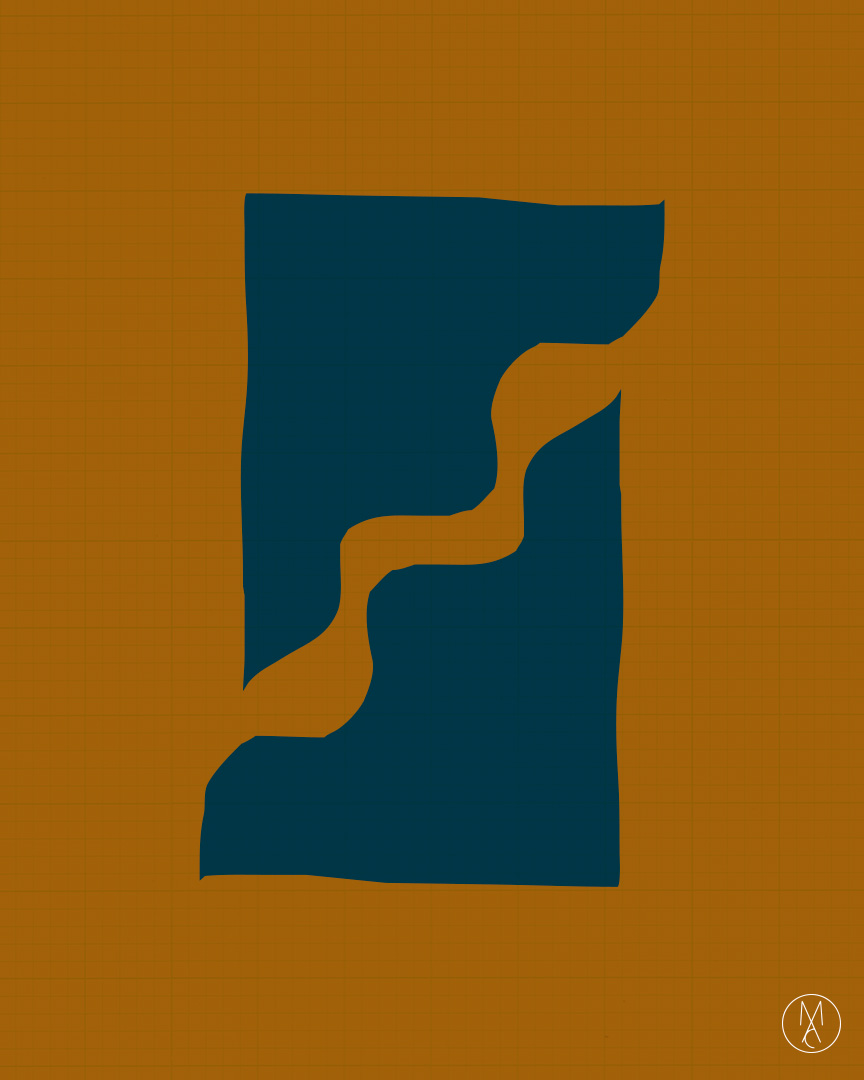
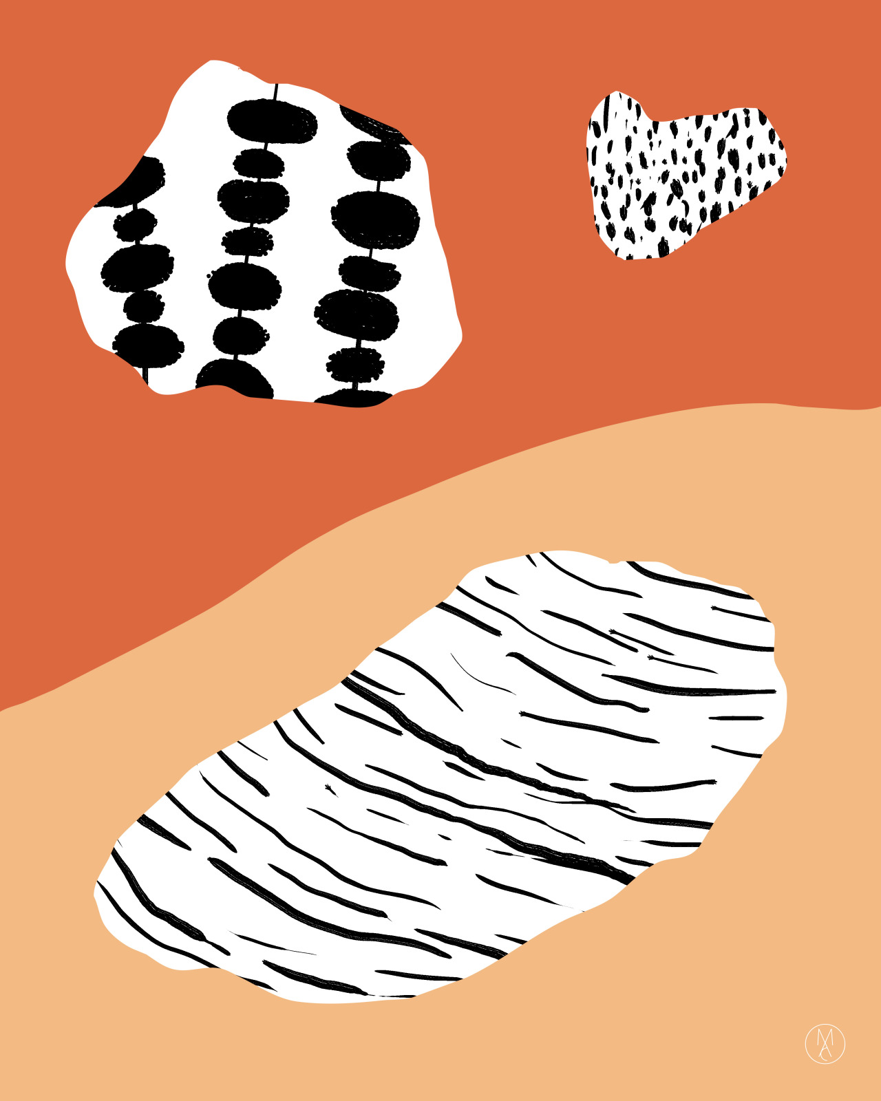
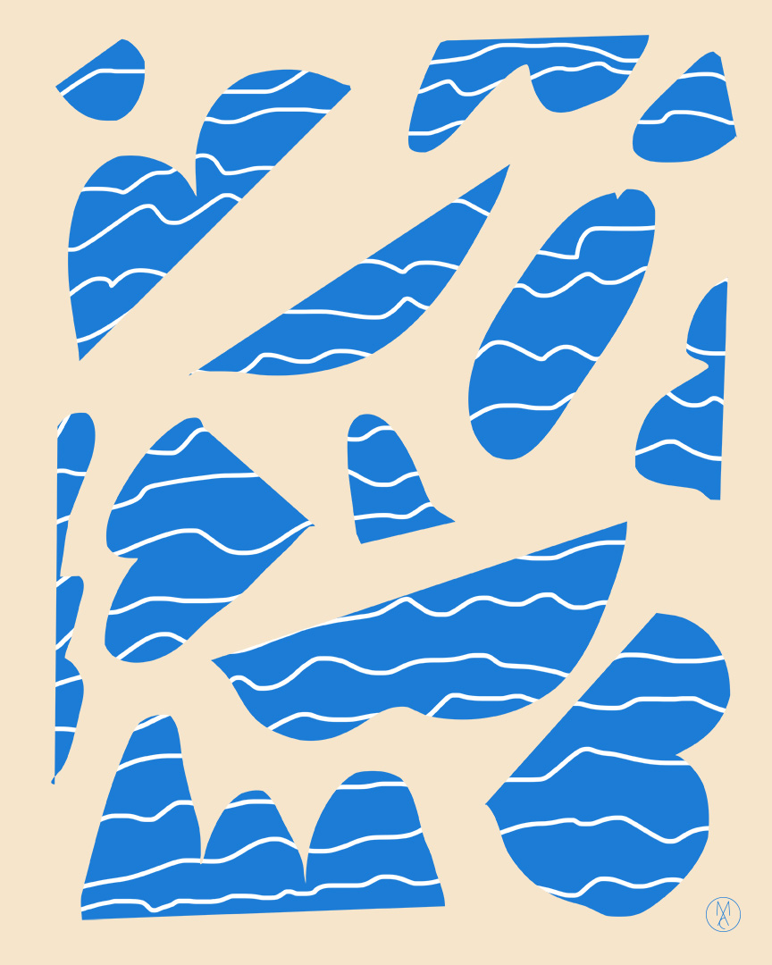
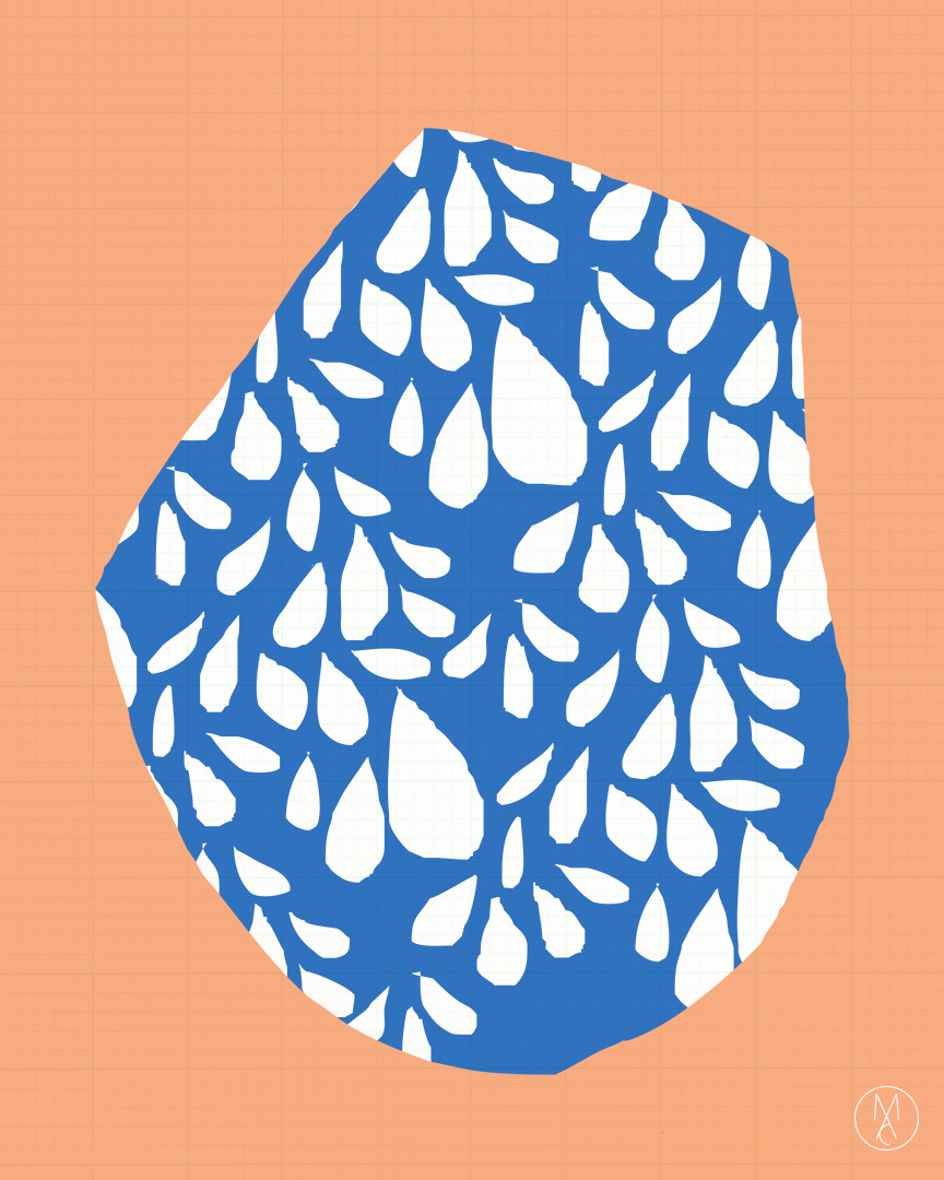
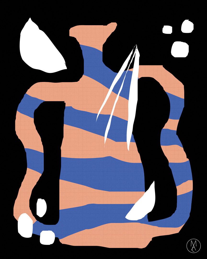
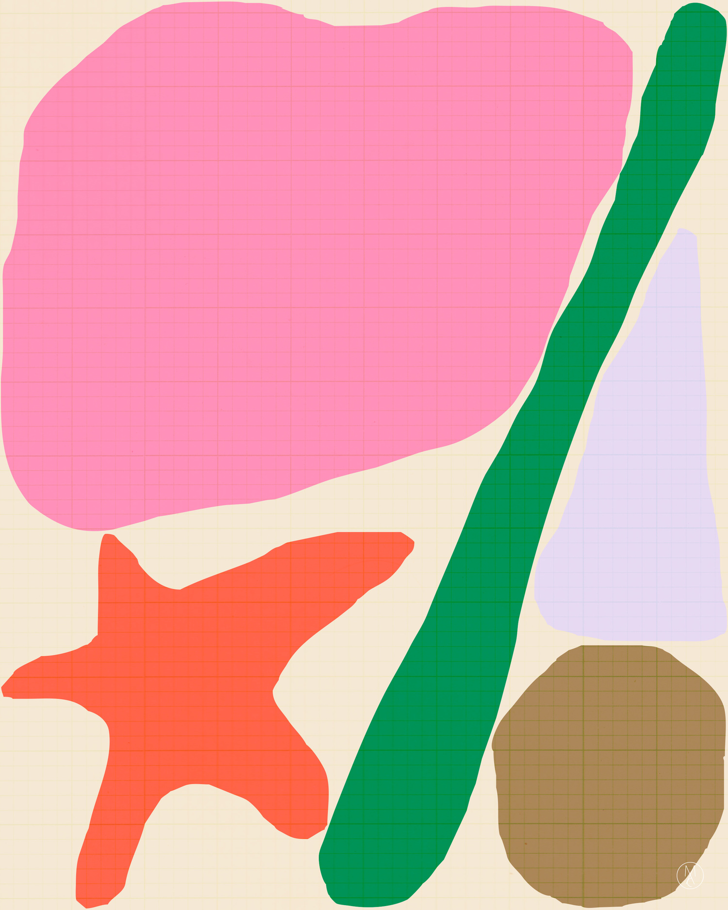
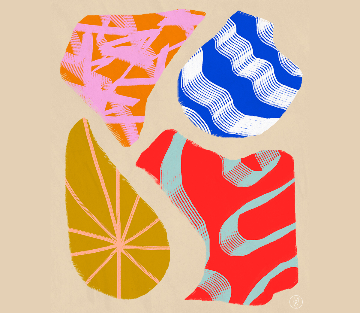
Much in the way our love for a book is evident in loose binds and worn-out pages, there’s a certain value in the way we let beloved things blemish or roughen overtime. The Japanese call this permission of imperfection wabi-sabi — wabi denoting a singular, often uncontrolled uniqueness akin to a flowing streak of paint, and sabi literally meaning “chill” or “withered,” which references the beauty of corrosion. Marleigh Culver, a graphic designer at Need Supply by day and visual artist by night, feels a certain kinship with this design approach. “I like sloppy shapes and rough edges, and for my pieces to look like they’ve been moved between houses for generations,” Culver says. Marked by bold, saturated tones and influenced by Herb Lubalin’s logotypes, her prints reveal color as their focus, expressing their nature as objects themselves without the need for much else. “Color is really emotional to me. It’s tricky to find a voice in a genre of fauvism and modernism — when the most amazing things are the simplest colors and shapes — but I like having the challenge,” she explains. See more of her work below then head on over to her shop and Tumblr for more. (Incidentally, Culver makes a pretty badass wedding invitation if you’re in the market for such things!)
