08.13.14
Up and Coming
Marine Duroselle, graphic designer
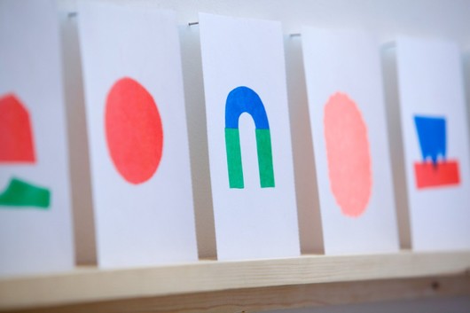
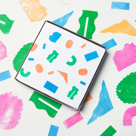
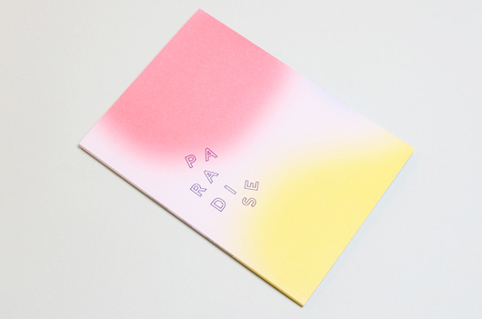
For the young, French graphic designer and Royal College of Arts grad Marine Duroselle, a relationship to pattern and shape is both instinctive and intuitive, owing in large part to the vast array of objects she was exposed to as a child. Growing up in Peru, her mother an anthropologist specializing in pre-Colombian textiles, Duroselle was continually surrounded by rich fabrics, threads and other types of South American crafts; a period of post-adolescence spent living in New York, on an exchange program at the School of Visual Arts, only further emphasized her interest in textiles and color. It’s this varied pool of references that Duroselle draws upon when working, giving her the confidence to play with different palettes and to build her own language. As a graphic designer, systematically ordering and classifying information is essential to her practice, and the alphabet is a frequent toolbox element for her work. A recent collaboration with the Saturday Market Project, for example, resulted in a colorful set of rubber stamps that unite Duroselle’s more experimental representations of letters and words as shapes or images. We spoke to the now London-based designer about the inspirations behind her rich language of pattern, color, and shape.
Describe your most recent project and how it was made:
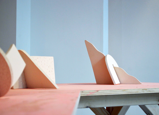
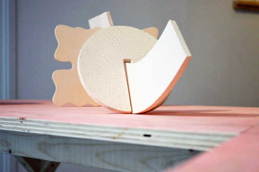
“My first solo show at Marsden Woo gallery, A Preview of Shades, has just finished. The pieces shown were part of a new series made especially for the event, but the development of this family really started a while back. The show was divided into two parts: one was the development of a project about the celebration of paper flags, a 2-dimensional inquiry into texture, transparency and the chromatic qualities of saturation and luminosity. This I started five years ago while living in Paris. The second series, the ceramics pieces, are part of a body of work initiated during a residency in Denmark three years ago. Because I mainly have a graphic design practice, I don’t get the opportunity to play with materials for myself that much, and so having the opportunity to show at Marsden Woo was a much-needed break from my graphic designer real life. Being able to assemble, cut, throw away, change and manipulate as much as I wished and without having to please anyone else other than myself, was a rare thing.”
Describe your next project and how you’re currently making it:
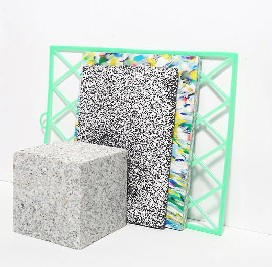
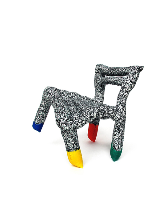
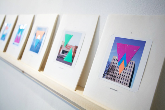
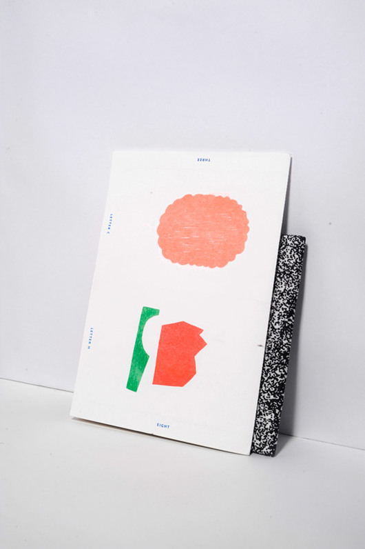
“Lately I’ve been working for some friends, Silo Studio (above), redesigning their website. Working from their design studio in London has made me realize what a great energy they convey. I find them truly refreshing and how the idea of experimentation is at the center of their practice. They use so many different materials: glass, PVC, wood, and metal, and always come up with unexpected results. They have a shelf in particular filled with test pieces, prototypes, and failures of their different processes, sitting alongside other bits gathered from their travels. It’s like a massive collection on display: I can’t help but scan and pick up these expressive objects each time I visit. It’s a great insight into their design process and inspiration fuel when designing their graphics. I’m also currently working on the graphics for an exhibition that will open at London’s Design Museum in September, of which I can’t reveal too much before the Design Festival starts. But I’m also planning on taking some time off this month to see as many exhibitions as possible and feed myself with new images, as I’ve been quite secluded lately focusing on commercial work. I’d also like to continue the work I started for Marsden Woo; I’m curious to see where these initial sketches might take me.”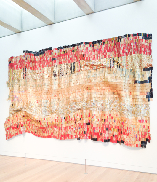
Tell us one thing that’s been inspiring you lately and why:
“Absolutely all of Ghanaian artist El Anatsui’s amazing found-object tapestries. I’m so surprised every time I discover one of his complex, large-scale sculptures. They’re made from simple and discarded materials that, once assembled, morph into these rich tapestries that visually interrogate history. I enjoy the fact that they appear so free and flexible — that they can be shaped in any way and also altered to fit various installation space so you’ll really never see the same piece twice.”
“I think these intricate works have had a real impact on my practice, too, due to their colorful, dense and luminous appearance. The rich, almost ceremonial, fabrics also remind me of Brazilian artist Arthur Bispo do Rosario’s embroidered banners and garments that I find astonishing. I could be here all day unfolding this topic of inspiration.”
What’s your favorite piece of design and why?
“Staying in the same textile vein, I would have to say Gunta Stölzl’s wall hangings. The way she decided to organize and assemble shapes and colors has allowed these weaves to be so magically textural, complex, and contemporary. Yet a lack of technical guidelines allowed her to form a new style and technique of weaving that surpassed traditional techniques. Perhaps I really should’ve have studied textile rather than graphic design!”
Rae Blunstone is a London-based creative writer and assistant editor at Stylus.com. When she’s not writing about design, she likes to play with clay.