If you’re wondering why we chose to kick off a story about a graphic designer with a series of objects that fall squarely in the art/furniture realm, there are two reasons: First, they were our first introduction — via Pinterest — to Till Wiedeck‘s work, and second, they illustrate perfectly what’s so great about the Berlin-based talent. Though he refers to himself as a hyper-functionalist, preoccupied with detail and simplicity and too serious to answer our sillier interview questions about Google searches and fictional characters, somehow he’s still the kind of guy who would take a sizeable chunk of time out of his client schedule to build a suite of semi-useless objects like these. You’ll find the same juxtapositions in the portfolio of his graphics studio, HelloMe, where he might pair spare typography with lush hyper-color flower arrangements, creepy Photoshop smears, or experimental acid-trip paintings he and his cohorts have made by hand. It all comes together in our interview with Wiedeck, who has a thing for both Bauhaus and Memphis, modernist chairs and tchotchkes. Whatever it is, it’s working.
First thing you remember making: “I started drawing very early. I recently got a lot of mine and my brother’s early childhood paintings from my mother. I took them all with me to archive them. There’s no specific thing I remember, but I spent a lot of my childhood painting and drawing until the age of ten, when I suddenly came across graffiti. My very first love, it opened a whole world of typogrpahy for me.”
What you’d make now if you had a $1 million budget: “I would create a lab for visual experiments and just be researching. Probably.”
First thing a stranger would say when they saw your work: “I would love to be able to tell. If it made them smile I would be very happy.”
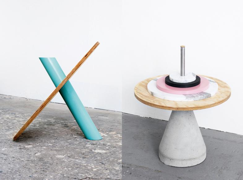
What inspired your Critical Objects project? “I have a general interest in form and function, as well as in product design, furniture, and the arts. I felt the need to have a break from my daily graphic-design routine and wanted to explore design beyond my usual work, but at the same time profit from my graphic-designer mindset and point of view. I felt like moving into a field that covers most of my interests could give me enough freedom to create something from scratch without getting lost.”
What inspired your Critical Objects project? “So I started to experiment with shapes and forms without a determined goal. It was simply not clear to me what the outcome would be. The only thing that was set was that it would be three-dimensional — that said, it wasn’t meant to be furniture at the outset. First it was objects, then they became furniture in the process, and eventually they moved away from furniture again to become something in between furniture and sculpture.”
What inspired your Critical Objects project? “The title Critical Objects refers to objects that are in a critical state between two or more possible definitions of what they could be. The recipient has to decide on his or her own interpretation of the object.”
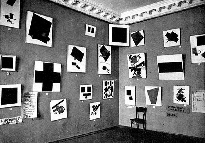
Design or art hero: “I guess one of the most influential artists for me is Kasimir Malevich, the originator of the avant-garde Suprematist movement. It’s not like I look at his work a lot, but I admire the consistency with which he conceptualized a new idea of a painting. His Black Square series gives me goosebumps and is a great source of inspiration.”
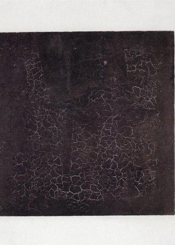
Design or art hero: “It’s the way Malevich reduced the painting to the very escence that fascinates me. When you look at the image it appears to only show a black square on a white background, nothing fancy. But if you go into detail, you see how the paint is structured, how the outlines are not exactly accurate, and how the square relates to the white space — it’s really an example of perfection. The whole revolutionary idea behind it is stunning, too. Paint a black square on a canvas and start an art revolution.”
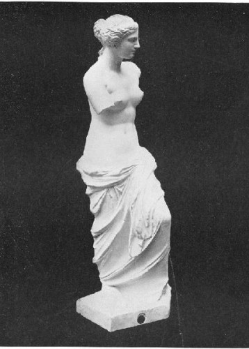
Design movement you most identify with: “I’m interested in many design and art movements. As the German Bauhaus legacy feels very close and also defines a very functional mindset, I feel this has a great connection to my own work. At the same time I do admire the Memphis movement of the 1980s for its expressive atttitude, as well as having a thing for Renessaince art — especially sculptures.”
Wiedeck’s poster for Warner/Chappell Music, inspired by the song “Uprising” by Muse
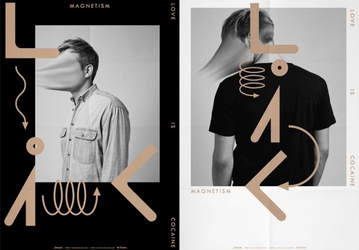
Favorite Photoshop tool: “For the project Magnetism (pictured), we experimented with distortion and the smudge finger tool. I think that went pretty nice. In other ways, I’m very nerdy when it comes to color correction. I guess selective color is what I use most in Photoshop.”
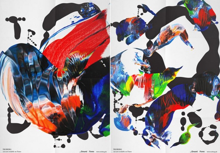
Favorite analog technique: “For another music project called Troburg, we tried painting as a way to visualize the sound. This worked great. I really liked the process as well as the outcome: We simply sat down, turned on the music, and started painting to it. Each song got a painting; we did this two times and ended up with forty paintings, selecting the ones we liked most for the artwork.”
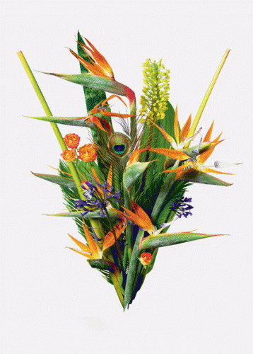
More album art by Wiedeck, this time for the band Videoclub, using flower arrangements by the Berlin florist Annett Kuhlmann of Marsano.
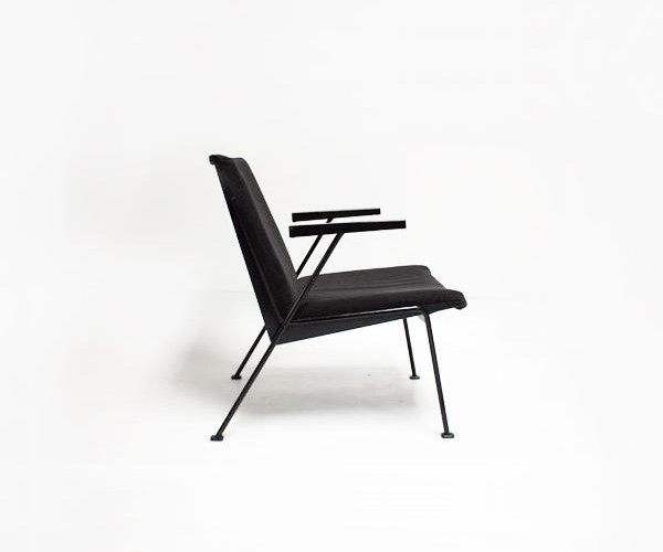
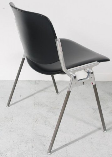
What do you collect?: “I have a thing for curious items. I collect a lot of small sculptures that look strange or were handmade or just trigger something for me. Ceramics, small hand-crafted wood toys that seem overly functional, etc. I also have a passion for chairs; you could say I collect them. I guess I own around 25 chairs, including the Oase lounge chair (pictured) by Wim Rietveld, the son of Gerrit Rietveld. I own two of them. There’s actually some quite stunning, functional design from the Netherlands.”
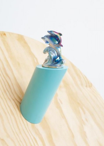
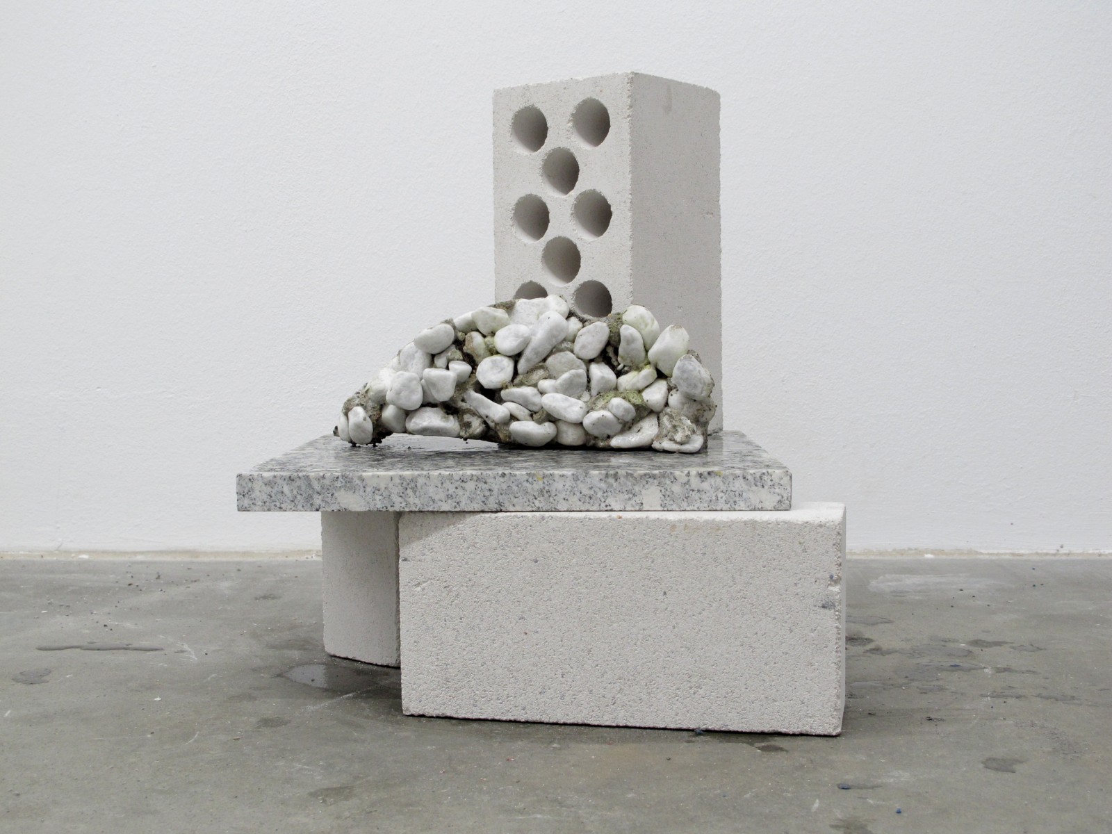
Object you keep around your studio for inspiration: “The most inspiring object is definitely the rainbow-colored dolphin sculpture featured in my Critical Objects project. We found it when looking for stuff for another photo shoot, and I fell in love with it straight away. I have a thing for ugly or over-decorative objects, even though I consider myself a function-obsessed person.”
Most inspiring place you’ve ever been: “One of the most beautiful places I’ve been to is the Louisiana Museum of Modern Art in Humlebæk, Denmark, one hour from Copenhagen. The architecture and the landscape — as well as some of the works shown there, especially the one feat
Favorite vintage book: “I recently acquired a book about the work of Constantin Brâncuși, the Romanian-French modern sculptor and photographer. His work is astonishing.” Above: A portrait of Brâncuși’s studio by Edward Steichen
Last great exhibition you saw: “The show by Nina Canell that’s currently on display at the Berlin museum Hamburger Bahnhof. Her work at first seemed very limited to me, but after my girlfriend Nadine, who really likes her work, insisted I take a closer look, I got past the very aesthetical surface of it and somehow got into the more conceptual idea behind it. Now I really dig her work.”
Best thing you ever found discarded on the street: “Plenty of stuff. Too many good things to name them all. But one cool thing that I found is a pair of Castelli chairs and a Grete Jalk table. Both in the middle of the night randomly put in the street. Both in very good condition.”
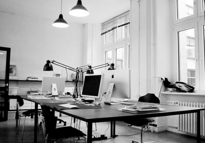
Right now, HelloMe is: “Working on a lot of nice asignments. We’re currently giving a fresh look to the Berlin Art Prize, the first non-institutional art prize in Berlin. We’re also working with the London-based magazine TOURIST on their online relaunch and a printed magazine, as well as preparing another Critical Objects exhibtion in Hamburg. I’m also looking forward to spending time in New York this spring to meet Jason of The Hundred in The Hands, who we’ll be collaborating with on another great endeavor that’s still a little top secret.” Above: HelloMe’s studio
Berlin's many charms are hardly lost on your editors. After a sunny, weeklong trip five summers ago, we both fell in love with the German capital — the wide open spaces, the well-situated swimming pools, the way clubbing unfolds as an actually enjoyable activity. But while my partner in crime has returned to the German capital each consecutive summer, I've never been able to find the time to go back. This summer, then, I was lucky enough to visit by proxy through the eyes of Felix Burrichter and his staff of Berlinophiles over at PIN-UP Magazine, which devoted its entire Spring/Summer issue to the changing metropolis. "For very long, Berlin was this one thing: You went when you had no money," says Burrichter, who serves as both editor and creative director of the architecture biannual. "But there’s a cultural elite — a moneyed elite — that has developed there over the past 10 years. Mostly people from out of town or in the art world. So there's an interesting friction right now. When that moneyed elite takes over, the city will lose a lot of its charm. But right now it still feels very raw and budding." The issue was in some ways a homecoming — Burrichter grew up in Düsseldorf — but in the end, the Berlin depicted in the magazine's pages bears more of a resemblance to Burrichter's adopted home in New York. "What fascinates me about Berlin right now is that it's very international," he says; hence the features run to a British architect who recently remade the city's Neues Museum (David Chipperfield), a West African transplant (Francis Kéré), and Clémence Seilles, a Frenchwoman who arrived in Berlin with a singular goal — to assist in the studio of designer Jerszy Seymour — and who never left. We've been fans of Seilles' work for some time now, and her conversation in the magazine with fellow Sight Unseen friend Matylda Krzykowski was too good to confine to print. Burrichter has graciously allowed us to excerpt it today on Sight Unseen.
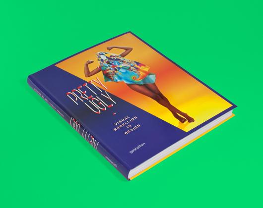
There are moments, when leafing through the pages of Gestalten's latest opus Pretty Ugly, that you'll feel a little perplexed. Not by the stretched and layered type that practitioners of the New Ugly graphics movement use to obscure the messages contained in their work, nor by the fact that brands and organizations are trying to sell themselves with these deliberately obtuse images. What you'll find so confusing, rather, is just how beautiful most of the projects appear, despite their creators' best attempts at visual rebellion — a fact acknowledged by the book's editors, Lupi Asensio and Martin Lorenz of the Barcelona-based firm twopoints.net, in its oxymoronic title.
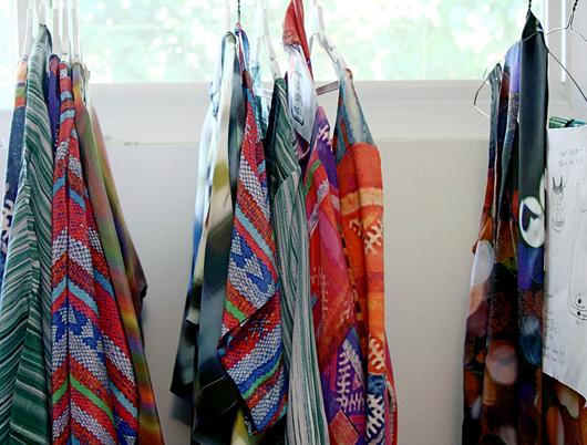
Jennifer Parry Dodge is a Los Angeles–based designer, whose beautifully printed textiles are often the result of photographs or scans of vintage textiles that have been manipulated in Photoshop. Her online store Ermie, named after a great-aunt Ermengarde who encouraged her creativity, encompasses a collection of works ranging from braided embroidered belts to watery cool crepe de chine garments made from her own textile creations. In addition to creating textiles, she maintains a blog that documents her transforming fascinations with color, textures, food, the desert, and her trips abroad. The first time I met Jennifer over coffee in downtown Los Angeles, I was immediately struck by the intensity of the colors in her work — colors that vibrated in the California sun, and intensified as the sun grew stronger. "Each pattern or print that I design has a history, however brief, of how it came to be. I’m sure the meaning for me differs from that of the viewer/ wearer/ user, but I hope some of the story comes through," she says.