Prop styling is a little bit like industrial design only in that some of its best practitioners never even realized it was a career until after they’d finished school. Such was the case with Rebecca Bartoshesky, an up-and-coming New York prop stylist who studied interior design at FIT. “After working in firms for a while, sitting at a computer 9 to 5, I wanted to switch it up, but I didn’t even know prop styling existed as a career until maybe four years ago,” Bartoshesky told me over the phone on a cozy winter day last month. “I’d be looking at these beautiful photographs, mostly in blogs and magazines — this was before Tumblr or Pinterest or any of those things — and suddenly it hit me that there was a person behind the scenes working with the photographers.” Bartoshesky began cold-calling stylists she admired and spent a few years assisting. Now she’s ready to break out on her own.
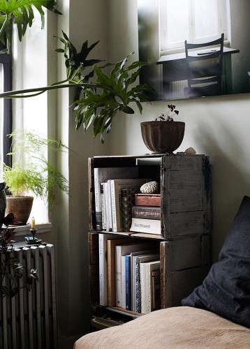
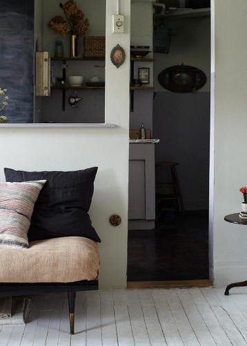
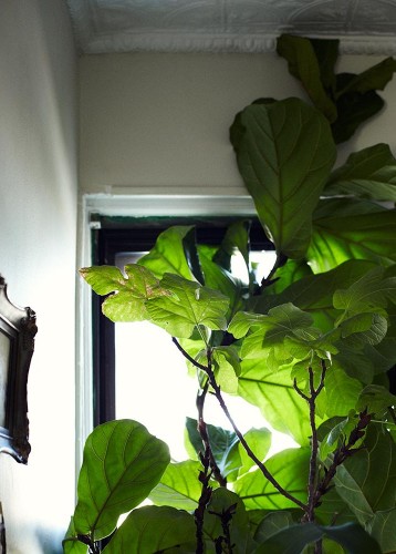
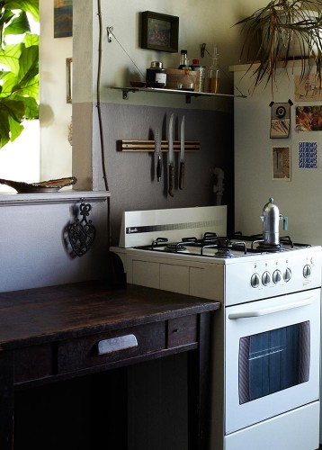
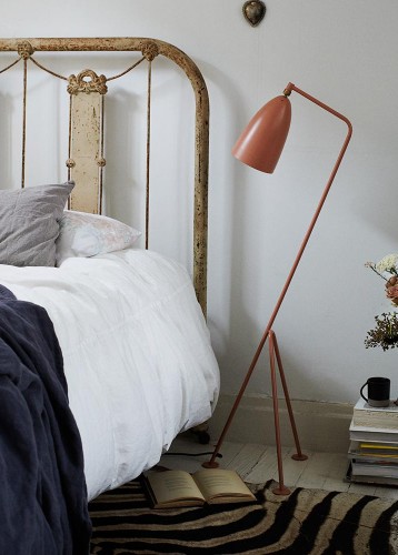
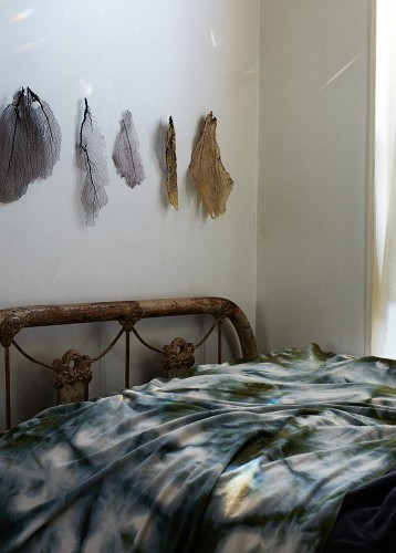
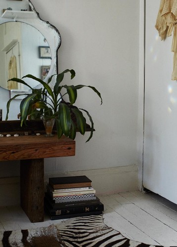
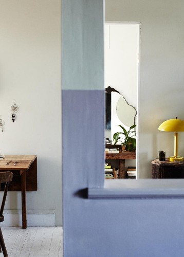
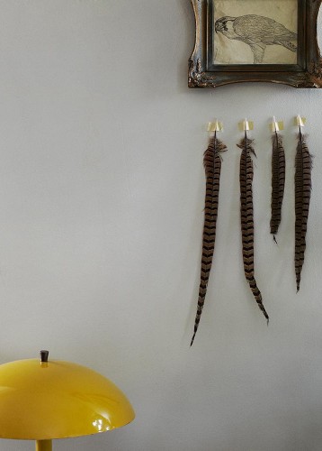
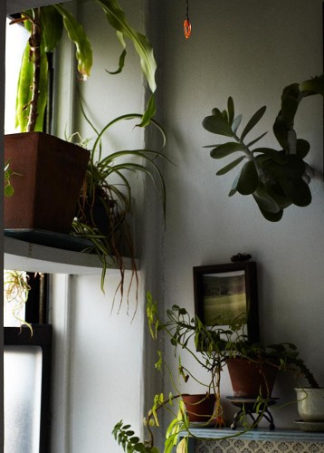
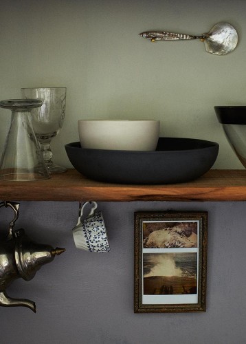
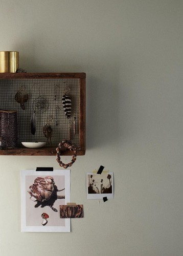
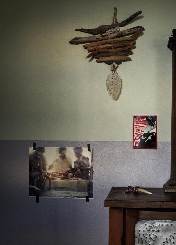
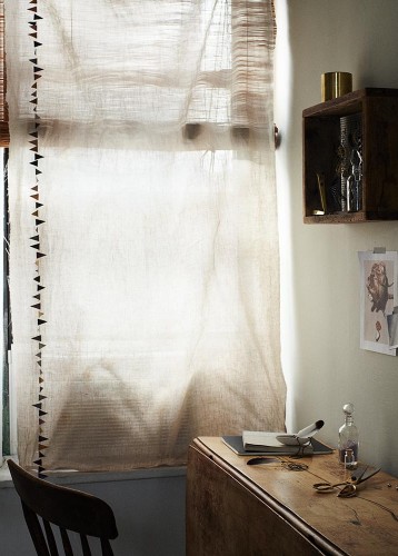
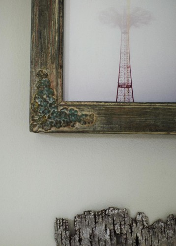
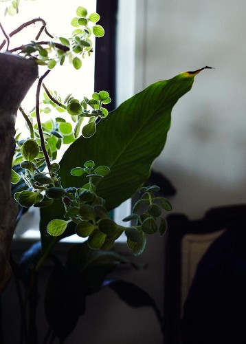
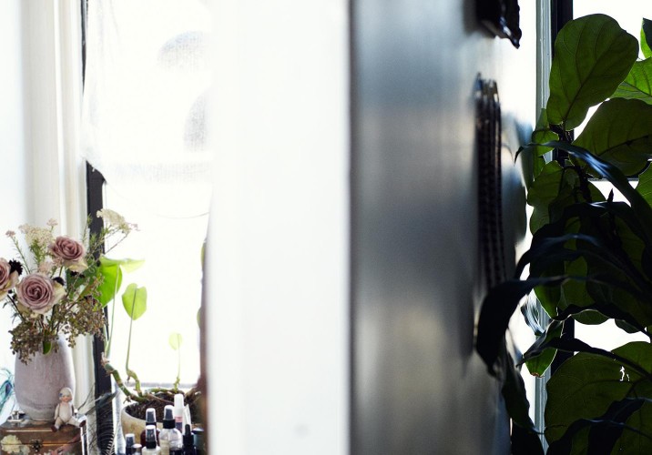
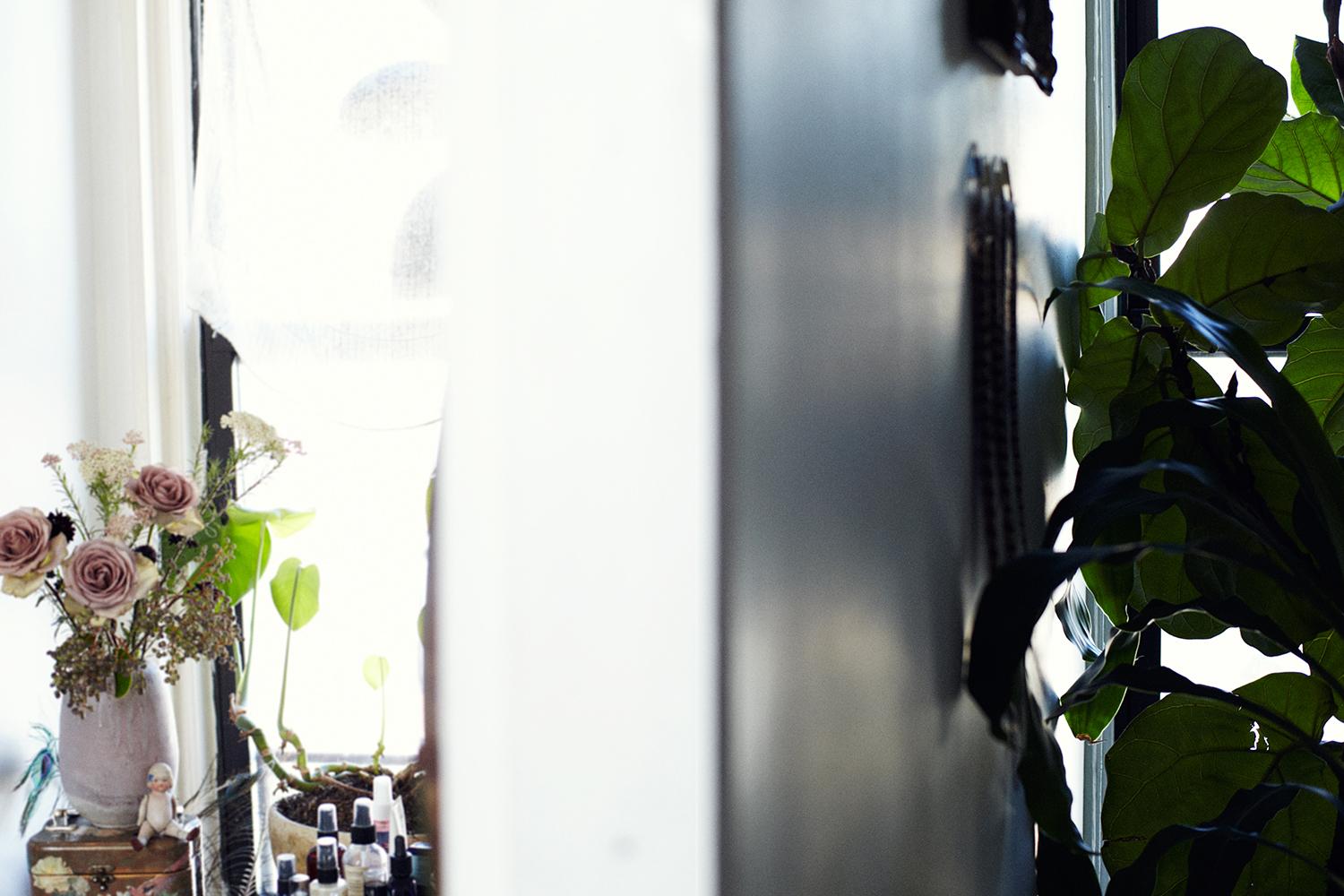
We discovered Bartoshesky through one of our new photographers, Pippa Drummond, who worked together on a project we featured earlier last year as well as on some of the other tests and still-lifes that you can see on Bartoshesky’s portfolio site. The two collaborated on the shoot at right as well: a look into Bartoshesky’s own home, the stylist’s ultimate canvas. “In my apartment, everything has its place,” she says. “It’s been meticulously thought out and placed.” But a sense of composition, she says, is something you have to cultivate within yourself. “You can’t really learn it. You can see where another stylist has placed something but a lot of it is in your own head. One of my first jobs was working in a furniture store where I grew up in Maryland, and I would do vignettes or floral arrangements. So pretty much every thing I’ve been doing since I was 16 is about placement or where things should go. The thing with interior design is that sometimes you’re working on the same project for two or three years. With styling you can create a beautiful image within a day or a week and move on to something else.”
“I moved into this 5th floor walkup in Williamsburg about eight or nine years ago. My friend was here before me and she knew the person before her, so it’s sort of been passed down. It’s a really old building, so there are funky details like different tin moldings on each ceiling, and there are windows on both sides of the apartment, so it gets lots of light. When I first moved in, you could find a lot on the street. I got my bed frame at a flea market, and the leftover crates are all from past shoots.”
“I found the couch frame at a flea market and had the cushions sewn to fit.”
“I like to bring in elements from nature, and I have a bit of a plant obsession. I have two trees in my apartment.”
A view into the kitchen.
“I always tend to mix using found objects, which have a more vintage and rustic feel, and bringing in modern elements. It’s the warm and the cold.”
“I also tend to use a lot of natural elements, plants and materials from the outside. The sea fans I collected from a beach in Puerto Rico.”
“The mirror in my bedroom came from an old woman who was moving out of an apartment in my building. In fact most of the furniture in my apartment has come from flea markets, or old buildings that I’ve stumbled upon where the owner was getting rid of everything.”
“The table I use to work at came from my grandmother. My mom used to hide under it when she was growing up and I can still see where she carved her name in the wood. The yellow lamp is the first thing I ever bought on eBay.” The dreamcatchers are made by Bartoshesky. “It’s kind of a meditative thing. I’ll wake up first thing in the morning and weave these webs from wire.”
“This drawing of a red-tailed hawk is one of my dad’s from when he was in school. All of the feathers also came from my dad, who finds them on his property in Maryland.”
A happy home
“I went to Brimfield for the first time this year, and the spoon is one of the things I got there The handle and the scoop are made from shell with a brass piece holding them together. I can’t wait to use it one day in a photo. Prop styling is such an excuse to collect new pieces that could be used in a photo! Maybe I don’t really need it for myself, but it could work one day on a shoot.”
“The larger photo on the left is from Gather Journal. All of the colors in that image epitomize colors I gravitate towards. It’s monotone and muted, but warm. The Polaroid is one I took on my first trip to California. The tiny business card is from Gjelina in Los Angeles, and the brass box is leftover from a job I worked on in Denmark.”
“I made the driftwood piece. I’m always collecting coral or pieces of wood I find on the beach. There’s a box under my bed where I keep the things I find. I brought this box to a friend’s house and we sat and we made wind chime. I guess this is something like a wind chime. I mean, it’s hanging inside on a wall.”
“All of the curtains in my house are pieces of linen I’ve rigged up. The paper garland is actually from a baby store called Sweet William, it’s something should hang in a child’s room but the color tones, the amber and the dark gray, sort of tie everything together.”
“This is a photo one of my ex-boyfriends took. It’s one of the rides on Coney Island on a really foggy day. Underneath is just a found piece of bark, another way of bringing nature into the home.”
When I mention to Bartoshesky how moody her aesthetic seems, she reveals two of her biggest influences: the Copenhagen-based photographer Ditte Isager and New York photographers Gentl and Hyers.
For more of Rebecca’s work, go to www.rebeccabartoshesky.com
The Auckland-born, New York City–based photographer Pippa Drummond is Sight Unseen's newest soon-to-be contributor, but when we were first introduced to her photography, it was the low-key but lovely portraits and coolly moody interiors that caught our eye. We had no idea at the time that she had this hiding in her portfolio. Above (Series 1) is a collaboration with prop stylist Rebecca Bartoshesky, and it reminds us a bit of Carl Kleiner’s Ikea cookbook photographs (which is interesting, considering Drummond’s other passion is food — she's got a cookbook of own in the works, and she assisted on the Amagansett-based shoot for Gwynnie’s latest. Yes, we ARE jealous). But the organized clutter here isn’t pantry staples but rather cheapo salon items that Drummond and Bartoshesky have turned into something almost beautiful.
Faye Toogood, the London-based interiors stylist and creative consultant, has designed exhibition stands for Tom Dixon, windows for Liberty, displays for Dover Street Market, and sets for Wallpaper. But in all of her career, she’s had only one job interview. At the tender age of 21, having just graduated from Bristol University with degrees in fine art and art history, Toogood was called for an interview with Min Hogg, legendary founding editor of the British design bible The World of Interiors. “I had found out about a stylist job and decided I would go for it, even though I didn’t even know what that meant,” says Toogood. “I went in and it was the strangest thing. She asked me, ‘Can you sew, and can you tie a bow?’ I actually couldn’t sew, so I lied and when I got the job, I had someone do it for me.”
Despina Curtis is in her early 30s, and yet when she talks about her college days, it sounds a bit like one of those stories your grandparents tell about having to walk shoeless through the snow to get to school every day. Curtis studied printed textile design at the University of Manchester, and it was only when she left that the program’s first-year students were beginning to use digital design and printing tools — she had to do everything analog, even when it came to her eventual focus on huge 6-by-6-foot canvases layered with painting and screenprints. And yet, unlike hyperbolic ancestral poverty tales, hers had an obvious upside: All that drawing and hands-on work primed her for her current career as a stylist for the likes of Wallpaper and Casa Da Abitare.