02.13.15
Current Obsession
Andrew O. Hughes on DeWain Valentine
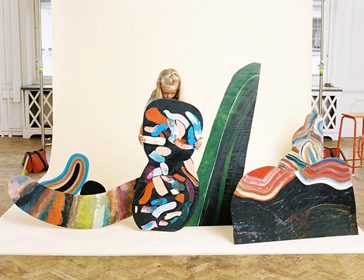
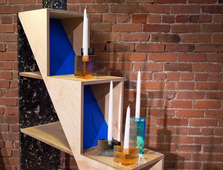
After studying glass at RISD, Andrew O. Hughes moved to New York in 2001 and honed his skills by working for others on sculptures, antique restoration projects, and a bizarre art piece that involved him knitting hog intestines for six months. It wasn’t until 2006 that a fateful and lucrative job playing a glassblower in a Michelob commercial allowed him to set up his own studio — through which he’s created pieces for himself, for Calvin Klein Home, and for commissions from the likes of Stephen Burks and Roman + Williams — and eventually end up showing at Sight Unseen OFFSITE last May. That was where we first heard Hughes speak about his love for California Light and Space sculptor DeWain Valentine, who had partially inspired the Prism Candlesticks Hughes was debuting at our show.
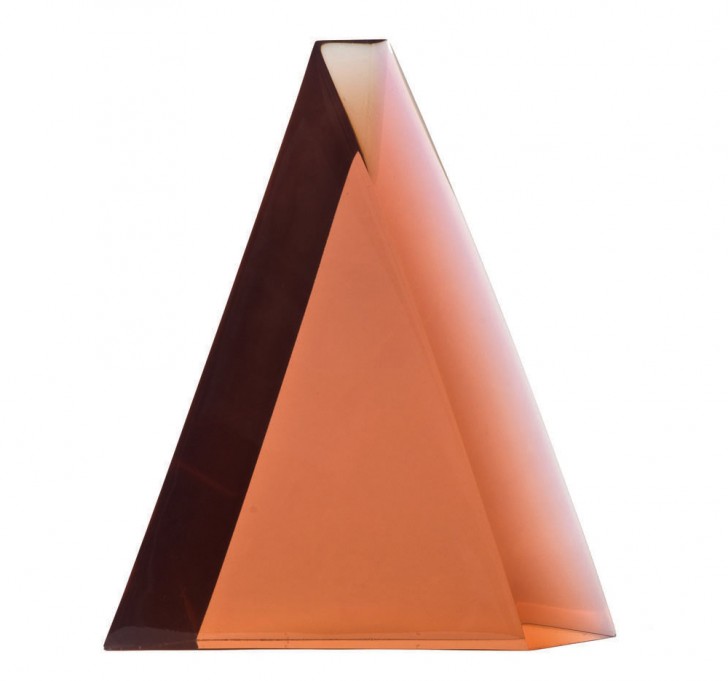
Here, Hughes tells us all the details of his love affair with the sculptor’s work, starting with how he first discovered it: “I was visiting a rep and on his coffee table was an invite to a DeWain Valentine show in Paris with a peach-colored Diamond Column on it,” Hughes says. “I had been working on triangular cast-glass candlesticks at the time, and when I saw the sculpture it felt like the realization of my vision. Though I was a big fan of other California Light and Space Artists, like James Turrell and John McCraken, I had never heard of Valentine and was enthralled. As it turns out, his work has had a bit of a recent revival, and oddly enough, after much innovation in polyurethane, he’s moved on to glass as his main medium of expression. Full-circle serendipity.”
Who is DeWain Valentine?
“DeWain Valentine is a sculptor who rose to prominence in the ’60s and ’70s as part of the California Light and Space movement. Originally from Ft. Collins, Colorado, he began making sculptures out materials from boat shops, like fiberglass and plastic. He made a stab at the New York scene, but Southern California proved to be the place where he found other artists working in new materials conveying transparency.”
“He got his first solo show at the famous Ace Gallery of Los Angeles in 1968. By 1970, he was working with a local plastics supplier to develop a new polyester resin that could remain stable when cast in huge pieces. This resin, which bore Valentine’s name in the plastic company catalog, was revolutionary for what was possible in plastic. Accordingly, he made some massive sculptures afterwards, some getting close to two tons. In his later life he’s worked more with flat glass as the medium for his transparency studies.”
Why does his work matter?
“Because he was a real innovator — an artist whose vision transcended the materials available to him. Through experimentation he was able to make a medium that could convey the purity of color and form, and the distortion through which our perception relates to it and makes it whole.”
“He, and many others of the ‘Los Angeles Look,’ were criticized for having a so-called ‘Finish Fetish’ — an obsession with slick, perfect surfaces despite their work being handmade — but I think Valentine really pushed that medium as far as it could go. Being a medium-specific artist and designer, I really respect that.”
What are your three favorite pieces of his, and why?
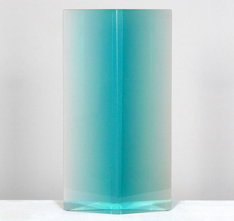
“He has several sculptures called Diamond Columns from the 1970s that are all amazing and are my biggest inspirations. I think they’re the most inspiring in how they emphasize form devolving into color and our perception of it. When you see a photo of them you don’t see a shape, you see color, light — the ephemera. The shape is unimportant, to me; it’s all about the color and how it disappears.”
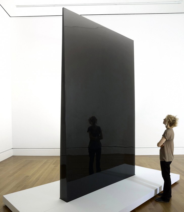
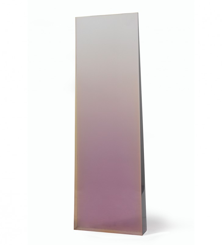
“His 3,500-pound Gray Column from 1978, which had once been two columns until the other one was damaged, is just a stunning display of what’s possible with fearless determination — and a lot of polishing compound.”
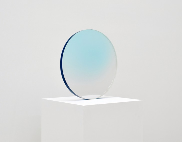
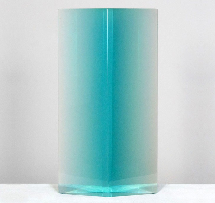
“An earlier, smaller work, Valentine’s Ring Agate from 1968 was the first piece of his that I was familiar with, without knowing who had made it. I saw one in clear plastic in a showroom years ago, and I remember expecting it to be glass, and being drawn to how it distorted the colors of its surroundings to evoke the perception of depth and weight.”
How has Valentine’s work influenced your own?
“Mass, color, transparency, and perception were the vital aspects of DeWain’s work that I find most influential. How a piece is going to react to its environment, light, refraction, perception, and color is a real guessing game when you’re working with glass, and the discovery of a piece’s final realization can be a magical experience. I get so excited as a piece goes from a rough casting or a blown blank of glass to a realized object. As each successive layer is polished away and the perfect surface reveals itself, I feel — as I’m sure Valentine did — a sense of validation.”
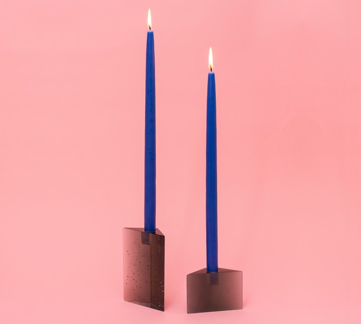
“It was such a serendipitous moment when I saw Valentine’s Diamond Column. I had been wavering on the final triangular shape of my Prism Candlesticks — equilateral? isosceles? scalene? — but when I saw those columns, I knew it would be an obtuse isosceles and I would do them in gray, blue, and peach. I realized I wanted to emphasize not only all the refraction that occurs in the kind of prism that I had previously envisioned, but also how the color transmits as the form goes from thick to thin.”
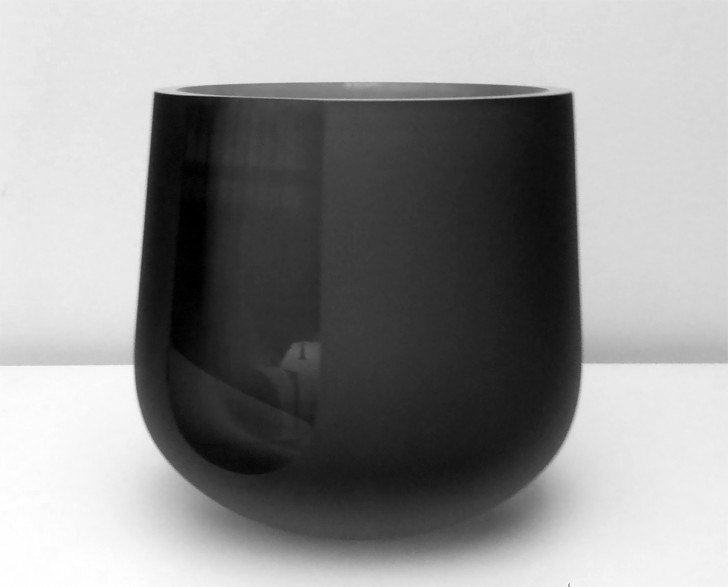
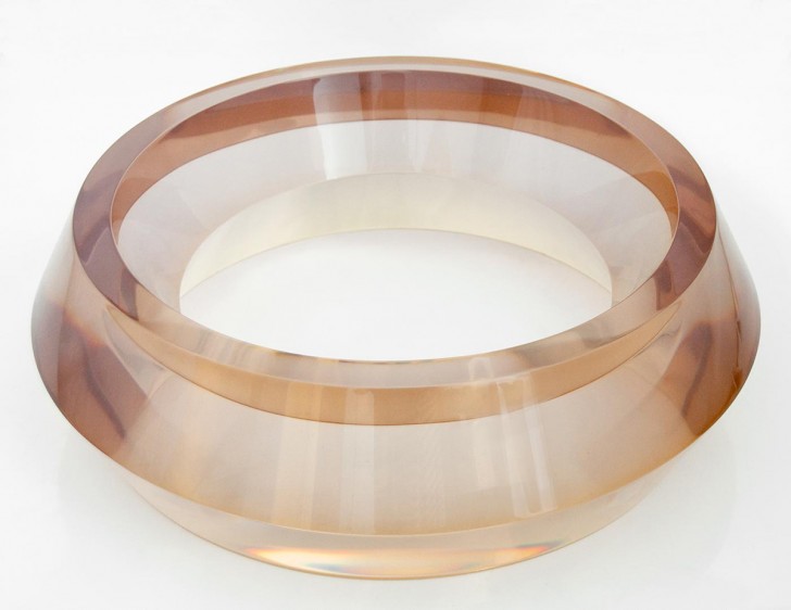
“My ice bucket plays with the distortion of light, transparent color, and surface quality in order to change ever so slightly depending on how the viewer looks at it, which very much relates to Light and Space interpretations of light and perception.”
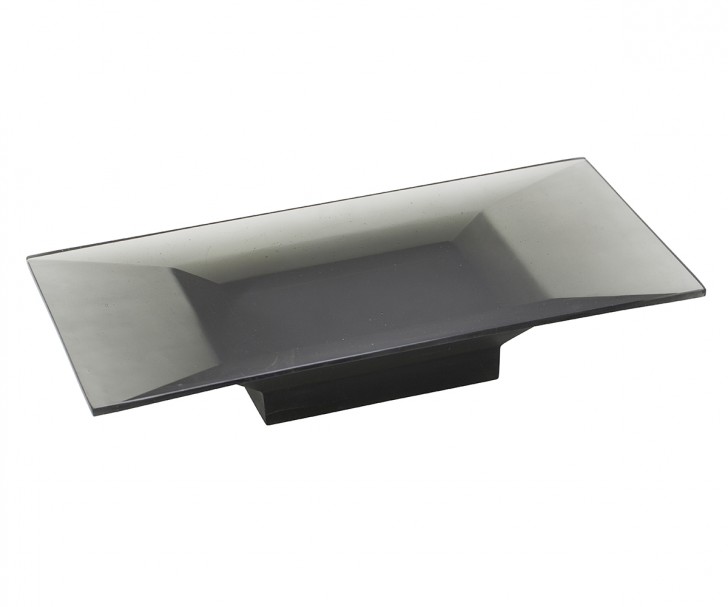
“This is a cast-glass altar I made for the Calvin Klein Collection’s Home Artisan Series, and like Valentine, I wanted it to be about the intersection of color and transparency influencing form. I wanted to achieve a gradient color field, and that informed the piece’s final shape.”