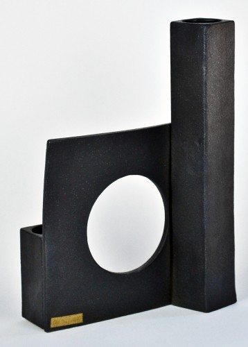
Anyone familiar with the work of Los Angeles ceramicist Ben Medansky would be surprised to learn that, when he was a student at the Art Institute of Chicago, his work was actually colorful, spanning the full spectrum of glaze hues. But after he graduated and went to work for a succession of other artists — among them the Haas brothers, who hired him to set up and run their in-house ceramics shop, and Peter Shire, for whom he spent a sweaty summer splatter-painting dishware — he decided he needed to find his own signature style, so he abandoned color entirely upon setting up his own studio in 2012 and started by focusing exclusively on form. The strong, graphic shapes he’s been creating since, all in earthy orange stoneware peeking out from under a speckled-white glaze, have become instantly recognizable in the contemporary ceramics scene.
Now that he’s achieved a measure of success, however — at the enviable age of 25 — he’s begun to push out in new directions, which follows naturally from his creative process: “My work is always a reaction to my previous pieces,” he says. “If I make something soft and asymmetrical, then I tend to create the opposite in my next collection, something highly designed and textured.” His all-white color scheme recently ceded to pops of hyper-saturated blue, and he’s been experimenting with using bubbly, lava-like surfaces to soften his geometric forms. He’s also moving decidedly in the direction of larger-scale works, perhaps because of his recent move into an airy new studio space in Downtown L.A., where he and his team craft every single piece by hand in one-of-a-kind or small-batch runs. After paying a visit to that space in February, we sat down with Medansky to find out more about the inspirations behind — and the future of — his work.
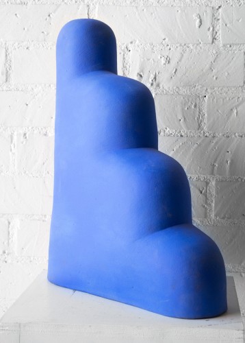
Martin Puryear “Martin Puryear is one of the first sculptors I learned about in art school, and his process has really inspired me, the way things are so soft and smooth without having to be called ‘organic.’ I’m not a fan of using that word — ‘my work references nature and organic forms’ — I mean yes, that’s true, but there are deeper undertones as to why: the body reference, the way shapes can undulate into themselves and into other shapes, the sensuality. I also love Puryear’s reductive way of making sculptures, where he’ll start with a large piece of wood, and sand away and chip away at it until he gets the piece he wants underneath.”
Martin Puryear “The blue pieces I have in my studio that look like clouds and steps are inspired by him. They were a moment in time — they were the first large sculptures I made in my own studio. I do plan on making more things that are hand-built like that, that aren’t made on the wheel and that aren’t functional. That’s definitely the direction I’m moving toward.”
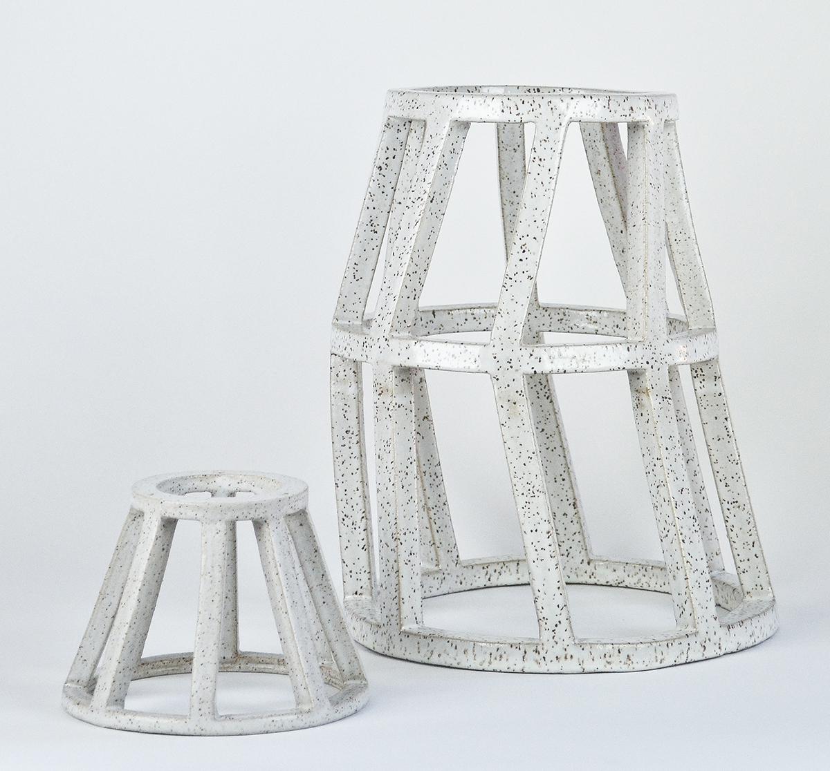
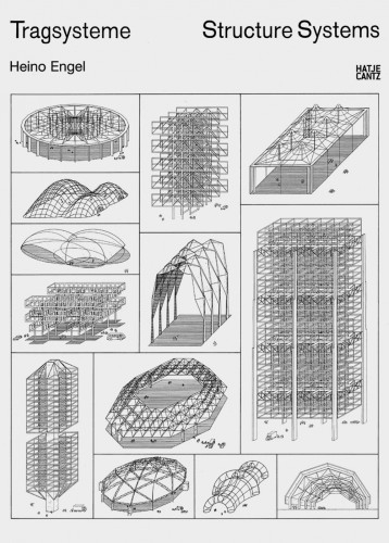
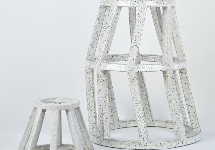
Structure Systems by Heino Engel “This book is kind of like a little bible that I found – a friend who went to architecture school had it on his coffee table, and I thought it was amazing. It’s about airplane hangers and other large spans of material that do things, and how wind and earthquakes can affect them, and as soon as I brought it to my studio, we all learned from it. We started reading about how things become strong, and how strength plays into the material you’re using, and began trying to figure out how can we use clay to emulate that.”
Structure Systems by Heino Engel “In recent weeks we’ve been trying to really run with it, and failing a lot; we’ve been making larger structures, hollow geometric frameworks about 16” tall, and out of 12 of them 8 have broken during the making process or as they’re drying. The book has been teaching us new concepts like skew, rotate, twist, and we’re trying to apply that to our structures. The structures also reference Martin Puryear’s work – he’s made hollow structures that are rounded and look a bit like boats.”
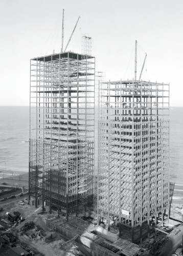
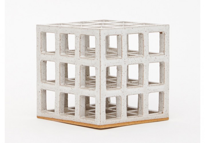
Mies van der Rohe’s Chicago buildings “When I lived in Chicago, I rode my bike to the Art Institute every day and passed these buildings — I thought they were stunning, especially once I learned how old they were and how they were the first to exist as pure form. They were the first example I had as to what modernism was. The image I’ve used is from the buildings’ construction phase, which I hadn’t seen until I was preparing this story; I was going to use photos of them finished, but I liked that you can see through them, and they reminded me of my cube structures.”
Mies van der Rohe’s Chicago buildings “Between those buildings, the Structure Systems book, and the inspiration I take from Sol Lewitt, I’ve been fascinated with open cube forms that can hold weight but are also filled with air. The way the Mies buildings were built, with a hollow steel frame and glass windows, the architecture world has taken that concept and run with it, and I like trying to take this mud from the earth and replicate that. These structures wouldn’t normally be able to be made out of clay, and the challenge in producing them is why I like it.”
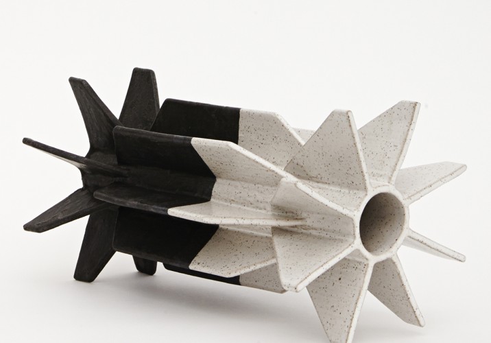
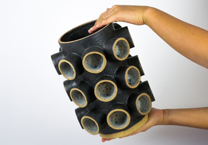
Radial fin symmetry “This structure is normally only used in industrial processes, purely for a purpose: to pull heat from an object and disperse it evenly in order to keep that object from overheating. My roommate has a motorcycle, and the engine has this kind of heat sink. You also see it a lot in contemporary LED bulbs, which often have radial fins built in, and I’m trying to make that more familiar in the aesthetic realm. I get turned on by the way manufacturers make things without any clue as to the impact they’re going to have on how our environments look.”
Radial fin symmetry “I started to think about that in conjunction with ceramics: Because I’ve raised this design element up to a higher aesthetic plane, you look at it and think oh that’s pretty now, because Ben used it on a vessel.”
The desert “I grew up in Arizona, where I was surrounded by sand and dirt. I never really liked the color green growing up, because I had no reference point for it until I moved to Chicago. The greenest thing we had was cactuses and palo verde trees. Once I was able to find a clay body that reminded me of home, the speckled buff stoneware I use almost exclusively, I stuck with it — that’s why I tend to reveal the base of a lot of my sculptures as being made out of clay. I couldn’t relate to porcelain, mainly because I had no reference point for it besides dollar store stuff.”
The desert “My work is a little chromophobic — it’s almost exclusively just the stoneware and the white speckles, though I’ve slowly introduced blue, a reference to the vast blue sky of the desert. I also like desert tones in reference to sunsets and gradients, those pinks and purples; it isn’t so apparent in my work, but I’m trying to figure out a way it can be. I’m slowly introducing black, blue, and a few other colors — until everything goes crazy and I start using every color again once my forms are perfect.”
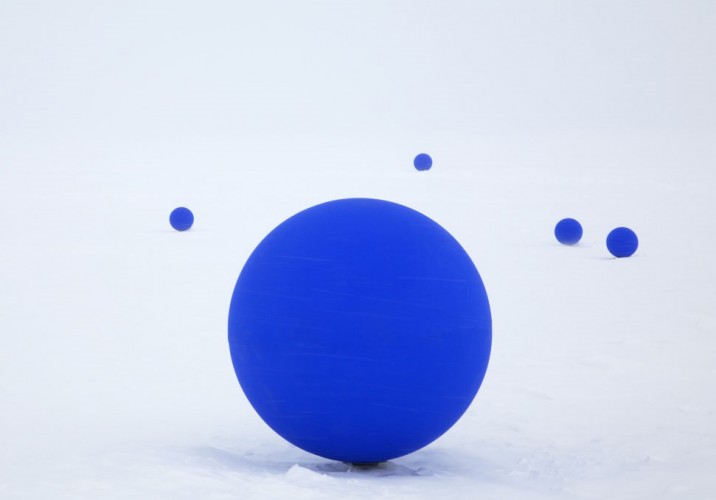
Lita Albuquerque’s blue spheres “I’m very inspired by the artists I’ve worked for, and I used to do work for Lita – she’s another chromophobic artist. Her blue spheres stand out to me. She put a bunch of them in Antarctica and other site-specific places. While I was working for the Haas brothers, they were helping Lita fabricate some pieces, and we went up to her estate in Malibu and cast her naked body in latex, then covered it in blue pigment.”
Lita Albuquerque’s blue spheres “A lot of people call my blue Yves Klein blue and it’s not; his is a lot darker and more textured. I’m referring more to Lita when I’m using blue. Blue is an important color and it has been throughout history, so I don’t like taking ownership for it. Though it has been my favorite color since I was a little kid.”
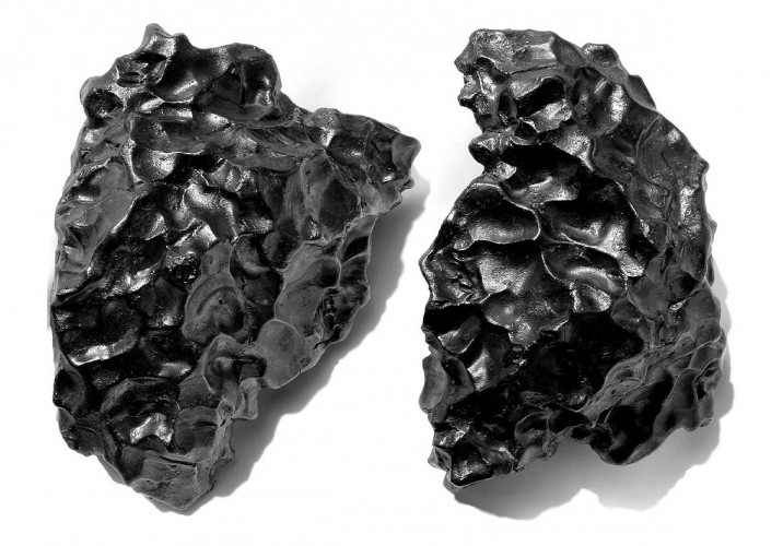
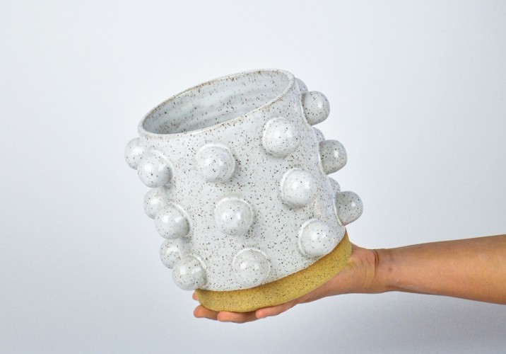
Meteors “Meteors have been this new thing I’m trying to emulate with my glaze, where I can make the surface of my objects look like they’re otherworldly. Space really excites me. I went to space camp as a kid; I wanted to be an astronaut. When I found out that meteorites hit earth and you can find them, I’d go out into the desert and look for them after a meteor shower. All those divets and rivets in them is from getting hit, beat up, melted, and frozen again tons and tons of times.”
Meteors “We’re trying to come up with glazes that look like hot lava, where a bunch of bubbles have bursted and it’s kind of foamy. What a meteorite might look like when it’s frozen in space. We’re also emulating them in the textures of the clay, carving it out, hitting it with rocks, taking tools and jabbing it, or carving out pieces. We’ve only done one test so far (pictured), with a greenish blueish foamy glaze inside.”
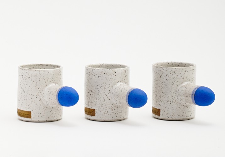
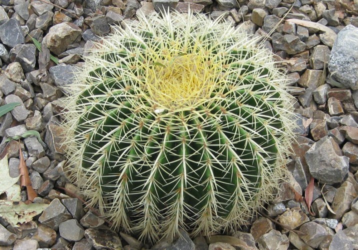
Cacti “I like having a lot of plants around, and I like designing pieces that those plants can go in. When it comes to sculpting, I’m also inspired by Saguaro and golden barrel cactuses, which refer again to that radial symmetry I’m really interested in, where it’s spikes coming all out of the sides of things.”
Cacti “Lately I’ve been translating that idea more into nubs or fins or pegs — referencing radial fins and cacti without being so literal. I don’t want to make sculptures that look like cactuses, I just like the idea of being inspired by the mathematics they use in growing themselves. Nature’s mathematics.”
It's a quiet summer week here at Sight Unseen HQ. August is approaching, we're spending more and more weekends out of the city, and the time in between them is becoming increasingly shorter and less productive. But that doesn't mean we don't know from hard work — we've spent the last four years pouring inordinate amounts of time and effort into the stories on this site, and so we're all the more sympathetic when we see other blogs doing the same. Case in point: the ridiculously extensive, print mag–worthy interview with ceramicist Ben Medansky we spotted recently on the blog Los Angeles, I'm Yours, a city-centric cultural resource founded in 2011 by The Fox Is Black's Bobby Solomon with editor Kyle Fitzpatrick. We've excerpted part of it here, along with a selection of the accompanying studio photos.
In the long list of ways that New York differs from Los Angeles, we’ve always been particularly fascinated by one: New York can be a very physically demanding place to live, but it is not a difficult city to understand on a psychological level. In Los Angeles, the living is easier, but there seems to be — especially among artists — a constant grappling to define and understand LA as a place. L.A. artist Kevin Appel explains it this way: “Los Angeles has always had a bit of an identity crisis partially due to the external view of LA as having this superficial mentality tied to the film industry. It doesn’t have a long lineage of a canonical or intellectual history, as opposed to New York.” He should know: Appel is a native Angeleno who has called the city home for almost his entire life — save for a brief stint at Parsons for his BFA — and he’s been steeped in the city’s history and vocabulary since birth. His father was an architect and his mother an interior designer, so it makes sense that the city’s structures and surroundings would eventually become his subject matter.
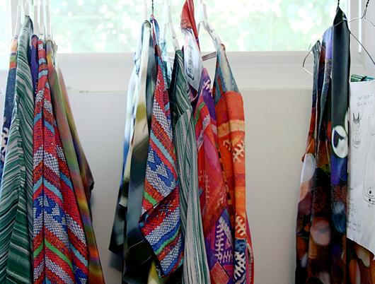
Jennifer Parry Dodge is a Los Angeles–based designer, whose beautifully printed textiles are often the result of photographs or scans of vintage textiles that have been manipulated in Photoshop. Her online store Ermie, named after a great-aunt Ermengarde who encouraged her creativity, encompasses a collection of works ranging from braided embroidered belts to watery cool crepe de chine garments made from her own textile creations. In addition to creating textiles, she maintains a blog that documents her transforming fascinations with color, textures, food, the desert, and her trips abroad. The first time I met Jennifer over coffee in downtown Los Angeles, I was immediately struck by the intensity of the colors in her work — colors that vibrated in the California sun, and intensified as the sun grew stronger. "Each pattern or print that I design has a history, however brief, of how it came to be. I’m sure the meaning for me differs from that of the viewer/ wearer/ user, but I hope some of the story comes through," she says.