09.18.15
Q+A
Jim Walrod on His “Difficult” Exhibition at R & Company
It’s not news that certain works by designers such as Ray and Charles Eames, Robert Venturi and Denise Scott Brown, or Ettore Sottsass deserve a place on a podium. The LCW chair by the Eameses, for example, or the Queen Anne chair by Venturi and Scott Brown, are icons in their own right, and are instantly recognized by anyone passionate about furniture. That their initial reception was shock, outrage, and even utter disgust, then, may come as a surprise — that’s the premise explored in “Difficult,” a new exhibition at New York gallery R & Company curated by interior designer Jim Walrod. Through the works themselves, choice anecdotes, and witty observations culled from the design community and beyond, Walrod reveals telling characterizations about how time can shape and reshape trends. On the occasion of the show’s recent opening, we caught up with Walrod to talk about object narratives, finding beauty in the hideous, and tackling his next show.
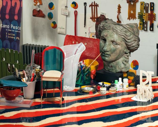
(Pictured in top image: Queen Anne chair by Robert Venturi, 1979; Big Beaver chair by Frank Gehry, 1987; Amazonia Vase by Gaetano Pesce)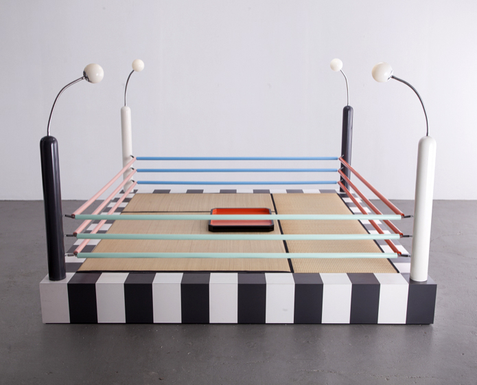 Tawaraya Boxing Ring by Masanori Umeda for Memphis, ca. 1981
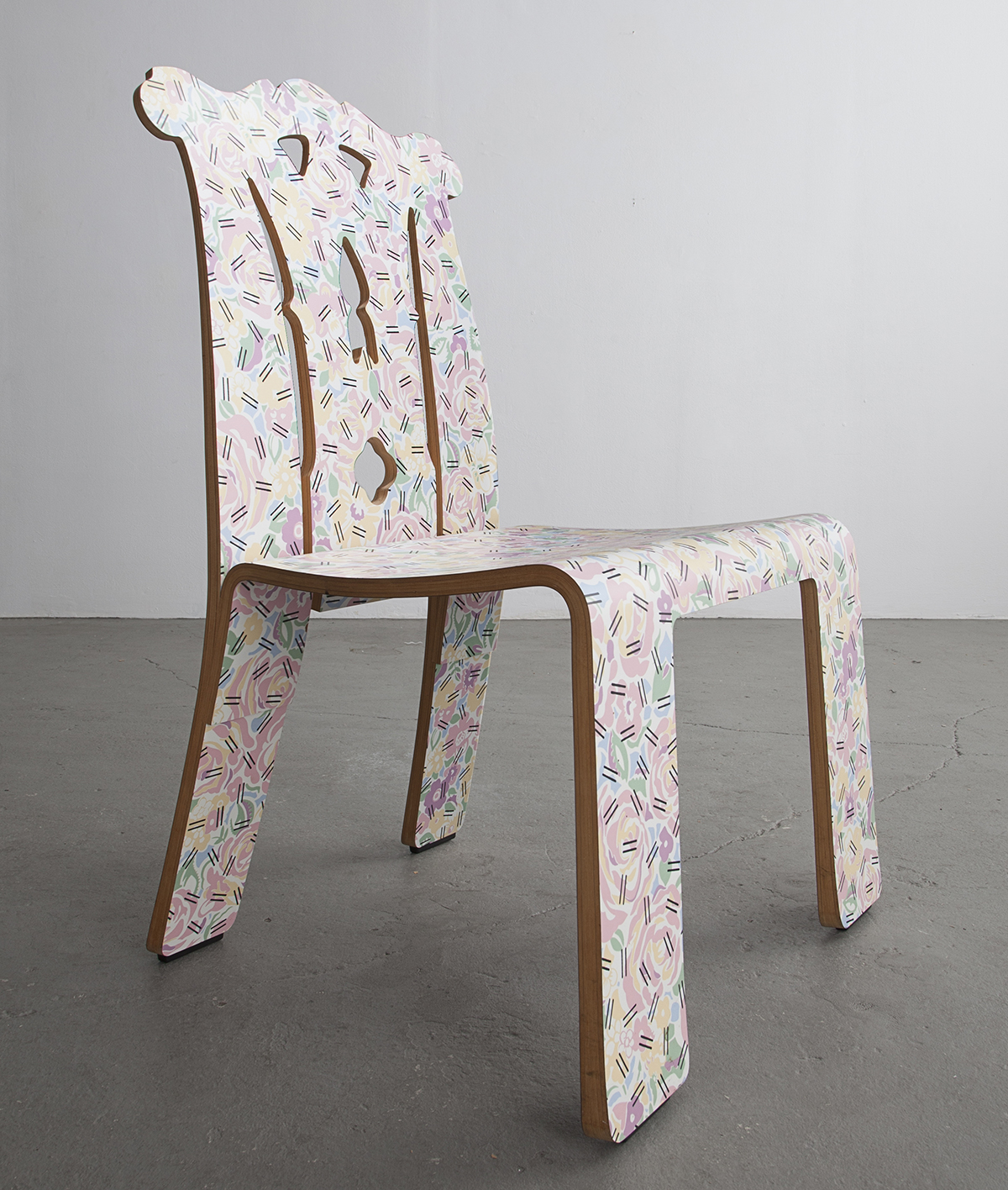 Queen Anne chair by Robert Venturi, 1979
Tiffany Lambert: Your show, Difficult, opened last week. How has it been received so far?
Jim Walrod: It was definitely a weird [reception]. It was a lot more than I hoped for. I loved the opening night because there were the usual people that know in design, but then there were these skater kids and I was like, “Finally!” That was a very intentional thing I was trying to do with the show.
The crowd was a good mix. That seems to be a good measure of success.
I think the older people were more shocked than the kids. For the people I know that are very rooted in design and think of me as a high-end interior designer, they were like, “Where did all these kids come from?” That was the most successful part of it for me. I don’t come from a design background. I didn’t go to school for it, but I did, at 16, go to Fiorucci. That was my exposure to design. I used to walk home from work and think, “How do people build buildings?” or “How do people design things?” That seemed like such an impossible thing to do. For kids that I see and talk to today, like skaters, kids that buy zines, kids that go to book fairs, kids that make art in my neighborhood, or that I follow on instagram — for them to show up and see a Masanori Umeda Boxing Ring or a Gehry Big Beaver Chair, that is the greatest success.
Were you able to get some of their reactions?
Well, what was amazing was that they couldn’t believe at one point or another this kind of design was considered ugly. Kids can’t conceive of it as ugly. The first time I took out that Venturi chair and put it on the platform, an intern that worked at R & Company said to me, “Wow, that’s the most beautiful thing I’ve ever seen.” [Laughs] I still have a problem with it. I know I’m crazy for ever even buying it. It’s sort of the same thing as me looking at an Eames LCW chair. I can’t believe that anyone would ever call that ugly.
And that’s exactly what happened when it first came out.
Yeah, I even printed the clips to prove it.
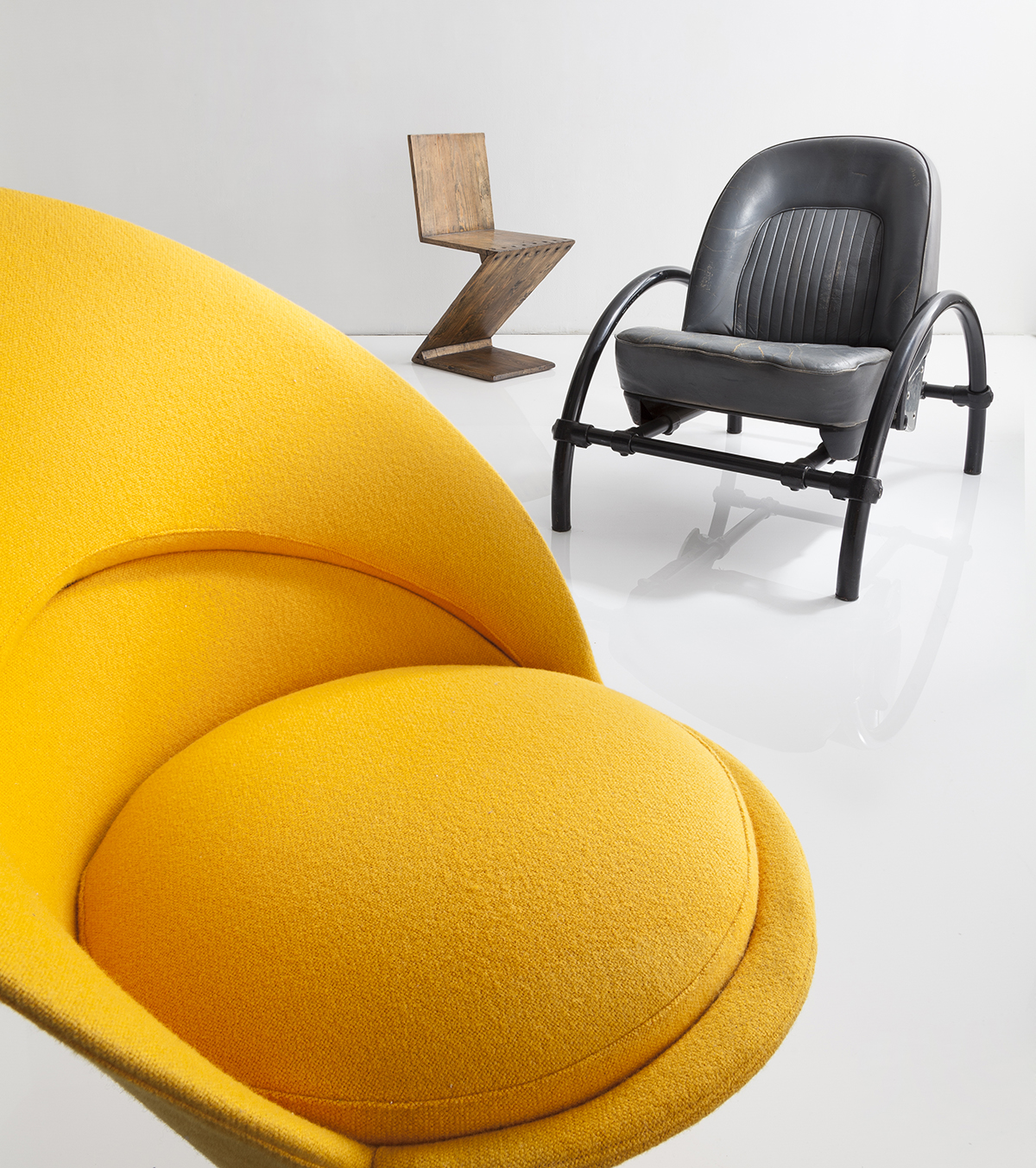 Cone chair by Verner Panton, 1958; Zig-Zag chair by Gerrit Reitveld, 1932; Rover chair by Ron Arad, ca. 1981
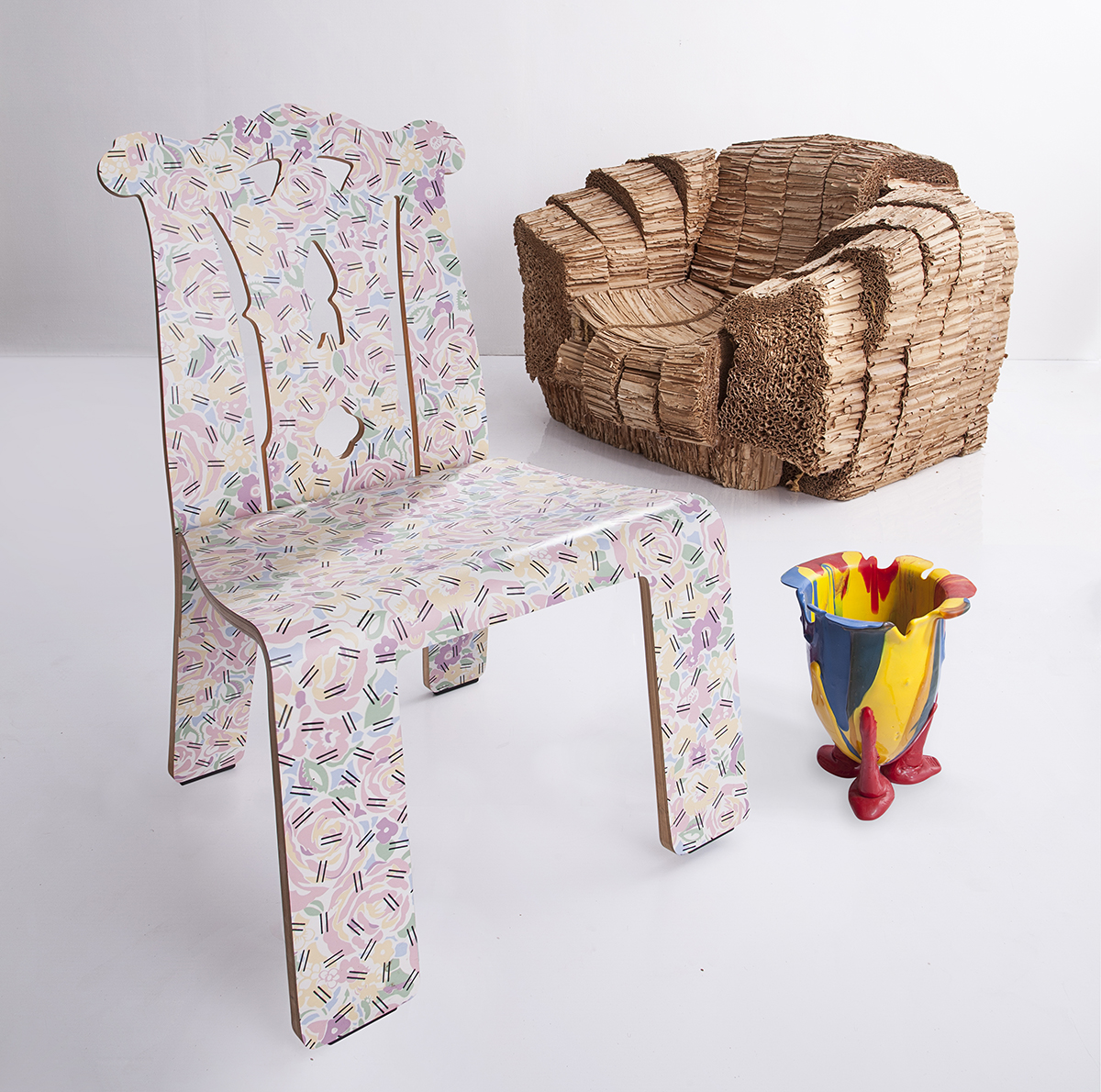
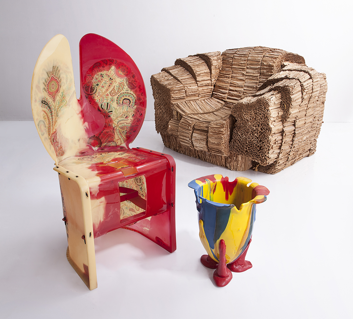 Nobody’s Perfect chair by Gaetano Pesce, ca. 2002; Big Beaver chair by Frank Gehry, 1987; Amazonia Vase by Gaetano Pesce
Along with the printouts, I was interested in the display system and the anti-preciousness of the overall concept.
That came about because of zine culture. Magazines have become sort of useless. There are very few of them and they have a targeted market, like the ones that you write for or the ones that I write for. They send out a certain type of information for a certain type of person that is very concerned about things. The person that buys Apartamento is not the person that’s going to buy Glamour. Or the person that buys PIN–UP is not the person that is generally going to buy Vanity Fair. They may read it in their doctor’s office, but they’re not going to go out and buy it. It’s the person that’s involved in a certain type of culture and is the type of person that would turn up at the PS1 Book Fair or Printed Matter. So to show precious furniture in a non-precious way where I was thinking about the information that’s dispersed through zine culture was very important. I love the idea of setting the show up that way using cardboard displays and a hand-punch and a labeler to label everything. We used paper on the walls for the comments so it didn’t look like it was written in stone. It looked like it was put together haphazardly and quick. But at the same time, the curation of one of the chairs took a year and a half of going out and finding it.
How did you decide to do the show at R & Company?
I think the show is important for R & Company, too. The owners Zesty Meyers and Evan Snyderman come from a similar place as I do in a lot of ways. The 26th Street Flea Market is where they started, and it’s been an 18-year journey for those guys. I pitched the idea for the show to them and thought there’s no possible way they’re going to go for this because they’ve spent hundreds of thousands of dollars on installations and furniture. They looked at me and said, “This is genius, let’s do it.”
 Molar Group chair by Wendell Castle, ca. 1969; Cone chair by Verner Panton, 1958; Lounge chair by Sol Bloom, 1950
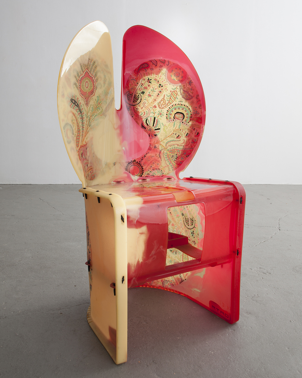
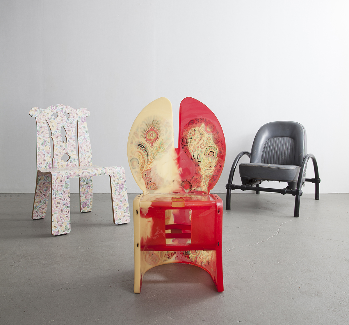 Queen Anne chair by Robert Venturi, 1979; Nobody’s Perfect chair by Gaetano Pesce, ca. 2002; Rover chair by Ron Arad, ca. 1981
That connection makes so much sense because they were originally performance artists and came to design with a similar curiosity.
I’ve known those guys since the time they were at the 26th Street Flea Market. They did not fall into the norm because they were younger, they were aggressive, and they were obnoxious. I liked them for that. Right now I’m going to meet my friend Petra Collins. If you’re a woman over 25, you don’t understand Petra. If you’re a woman under 25, then 2,000 of you show up at openings and cry when you see her. I like stuff like that and I like speaking to it. I don’t really feel comfortable within the generation that I’m in sometimes. I like to work with my generation because they’re intelligent and they understand what it is that I do, but the inspirations that I get are from people like Petra or younger people. It’s always been that way. It never feels that alienating to me to work with them.
When kids started liking Memphis and declaring it as something good and cool, I understood it. It was the same return back to the past that 1970s furniture was for me. I never had it in my house. We didn’t have design. Those kids didn’t grow up with Sottsass in their house but they watched Saved By the Bell, which had something very close to a Sottsass Bacterio pattern in the beginning of it. My heart and sympathies go out to those guys because I used to be able to find Memphis in vintage stores and now no kid is going to be able to go out and find a Sottsass, Mendini, or Branzi in a thrift store. It’s not going to happen. They’ve been locked out of that past because intellectuals like me have dealt it for the last 10 years. So, it was really important to get that kind of information out to them.
There were many objects that could have fit into this show. Design in general seems largely misunderstood in different contexts. I was wondering what your selection process was?
If there was something that I really liked, I really went after it. It was very to the point. There were connections that weren’t really shown in the show or talked about but were, from a design standpoint, very important. I loved the idea of starting off with a Marilyn Sofa and then closing with the Boxing Ring. There were very strong points I was trying to get across. And subversions. We said,we’re going to strip down what people expect design shows to be and rip it apart and go at it to mobilize the design community. I wanted people’s takes on things whose voices you generally don’t hear in design.
 Nobody’s Perfect chair by Gaetano Pesce, ca. 2002
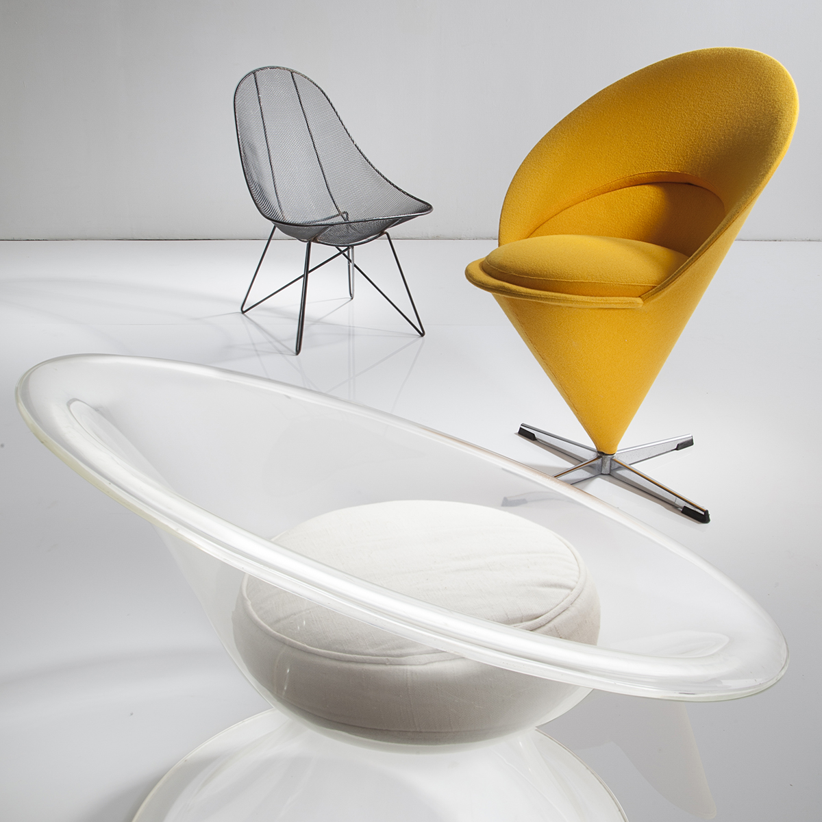 Lounge chair by Sol Bloom, 1950; Cone chair by Verner Panton, 1958; Jonquil chair by Erwine Laverne, ca. 1959
Something that really came through in the show were these object narratives. Not only the historic narratives about how they were hated and then revered, but also these personal anecdotes about each of the pieces.
That was also important. I loved everyone’s comments. Except Tom Sachs, who dared me to put his up. [Laughs] Beatrice Galilee’s comment was also really incredible, which was: “Keep up the bad work.” Will Cotton was probably the funniest because I could never figure out why he wouldn’t pick the chair up. I had given him what I thought was a really beautiful Scarpa chair and he said, “I don’t know, I’m not so sure.” I called him a week later and was like, “Hey, are you going to pick it up? He never told me he thought the Scarpa chair was the most hideous thing he’d ever seen in his life.
I have to ask, which piece did you absolutely hate the most? Was it the Queen Anne chair by Robert Venturi and Denise Scott Brown?
I own it! I was at an auction and I paid I think $5,000 or $6,000 per chair. I was literally sitting there going, are you out of your mind, why are you doing this? I kept questioning myself. Why are you at an auction buying this? Explain this to yourself. Then they came into my house and became maybe one of my favorites, because I had to interact with them and see them. They’re examples of Postmodernism and I realized maybe this is the reason I like difficult furniture or atonal furniture. You don’t go, “Okay, where’s my chair?” You go, “Holy shit what is that thing?” You have to think about it. It invades you and makes you feel uncomfortable in a lot of ways, and that’s the point. It opens up a dialogue. It’s funny, for me — somebody that knows design — to question that and hear a simple answer from an intern who thought these were the most beautiful things he’d ever seen, was magic for me. I’m sitting around intellectualizing this thing and this person just gets it.
There’s something very intriguing about the grotesque that draws us in, and then it becomes beautiful.
I loved the idea that this should have been the most horrible looking show on the face of the earth with the ugliest furniture you’ve ever seen. Then you walk in and it was nothing but beautiful objects. It’s more a point about taste and time, and things shaking out, and how what’s important to one person and beautiful to one person could be the ugliest to the other. It opens up a question and a dialogue as to what it is and why.
Do you have any ideas about what your next show is going to tackle?
The next show I want to do is the objects of Ray Johnson. He’s probably the most misunderstood and overlooked artist of the latter 20th century. He painted on objects, on chairs, on furniture. Nobody knows whether they’re sculpture, ephemera, or design. That interests me in so many ways. Even the estate doesn’t know what to call them. I want to do a show on it, badly. So that’s what’s next.