10.08.15
8 Things
The Influences of Mast Brothers Creative Director Nathan Warkentin
Eight years ago, when Rick and Michael Mast launched their line of artisanal chocolate bars wrapped in thick, wallpaper-like packaging, the bearded brothers became instant mascots for the burgeoning Brooklyn scene, its vintage-obsessed aesthetic marked by reclaimed wood, taxidermy, and general store vibes. Fast forward to last month, though, when Mast Brothers christened its new sleek, white-tiled Williamsburg outpost, and it felt like the very people who’d helped birth that look had put the definitive nail in its coffin — not a moment too soon, either. Much of the credit for the brand’s evolution is owed to Mast Brothers creative director Nathan Warkentin, who’s been driving the Mast aesthetic for the past three years, nudging it towards something that feels just as relevant now as the original did then. “In the beginning everything was a little old-timey, with a lot of classic or nautical patterns,” says Warkentin, whose influences we’re profiling today. “When I joined the company, I started looking for inspiration in interesting art and architecture movements, and the work of current textile and pattern designers, to make it feel more contemporary.”
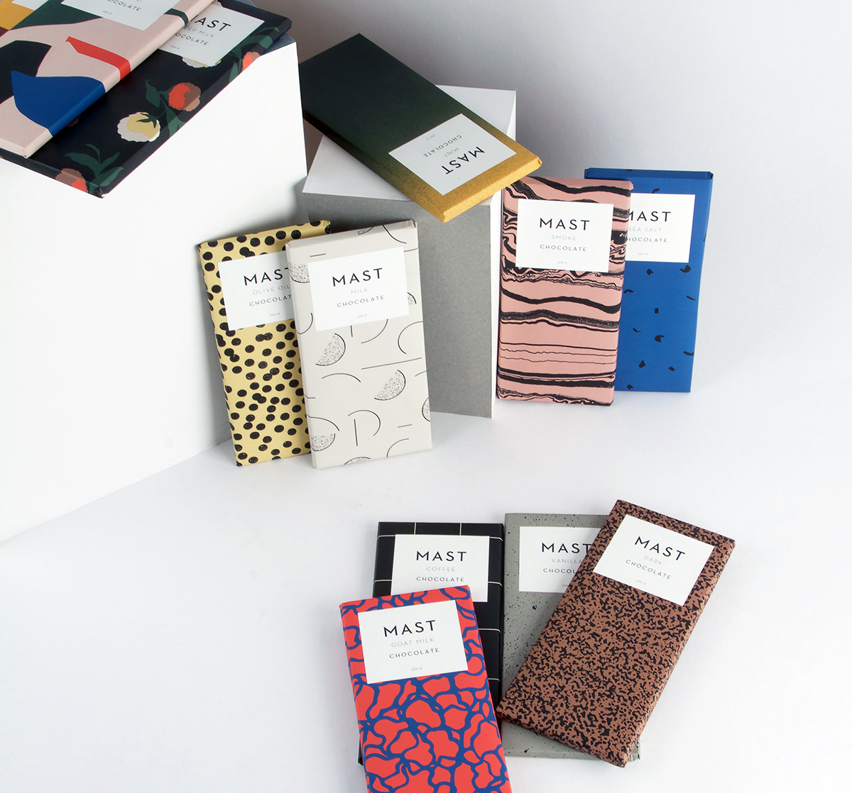
Warkentin was already following a similar trajectory himself before he arrived at Mast Brothers. Having spent a few years doing menswear design for the Los Angeles brand Ever, known for its vintage-inspired surf wear, he left the company because he was itching to do work that was more rooted in the present tense. After moving to New York, he designed leather jackets for Schott, then launched a workwear brand, before landing at Mast in 2012. His aim there was to gently guide the company into a more modern aesthetic by slowly paring back its graphics and store interiors. “The first collection I did, I didn’t want to flip things completely upside down,” he says. “I wanted it to be a smooth transition. So instead of getting rid of the bar with the anchors, I tried to simplify the anchor’s form.” Warkentin has been actively taking elements off of the bars’ labels ever since, ditching long descriptions of provenance in favor of straightforward ingredient lists and letting the packaging patterns speak a bit more loudly instead. “I’ve been making them more funky and a little more fun,” he notes, an intent that’s clearly visible in his latest collection of 12 new bar designs, pictured at top, which Mast Brothers launched two weeks ago.
As the package motifs have gotten brighter and more artistic, the Mast Brothers store interiors — including the aforementioned Williamsburg shop and a brand new outpost in London’s Shoreditch neighborhood — have been toned down to accommodate them. “The old space in Brooklyn had that knick-knack-y feel, with a lot of stuff everywhere,” says Warkentin. His new store designs, which hew towards black steel and subway tile, “still feel connected to Mast’s roots, but don’t feel so dusty. We’re trying to make neutral yet sculptural spaces that put the focus on our more fun, interesting bars. They’re like a cross between an art gallery, a high-end fashion boutique, and an awesome grocery store.” Curious to hear more about Warkentin’s inspirations? You’ve come to the right place.
1. Esprit Store Interiors by Ettore Sottsass, 1985
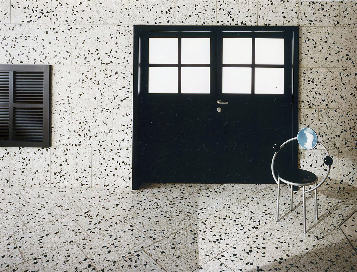 “I’m a big fan of Ettore Sottsass and the Memphis Group — it seems like most designers are these days. I came across some of the Espirit Store interiors he designed in the mid-eighties and thought they were so great. Some iterations get a little too PeeWee’s Playhouse for me, but they all have a nice blend of playfulness and luxury, which is a tricky combination to get right. Designing for a high-end chocolate brand, this is always the balance I wish to achieve.”
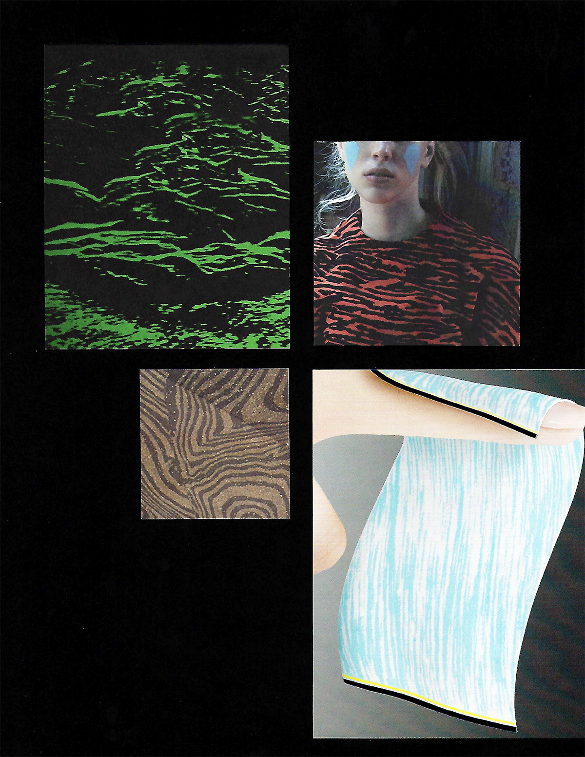
 An image from Warkentin’s fall 2015 collection mood board
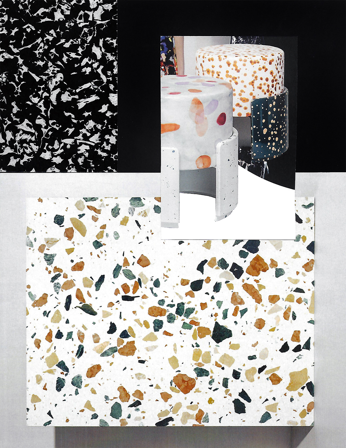
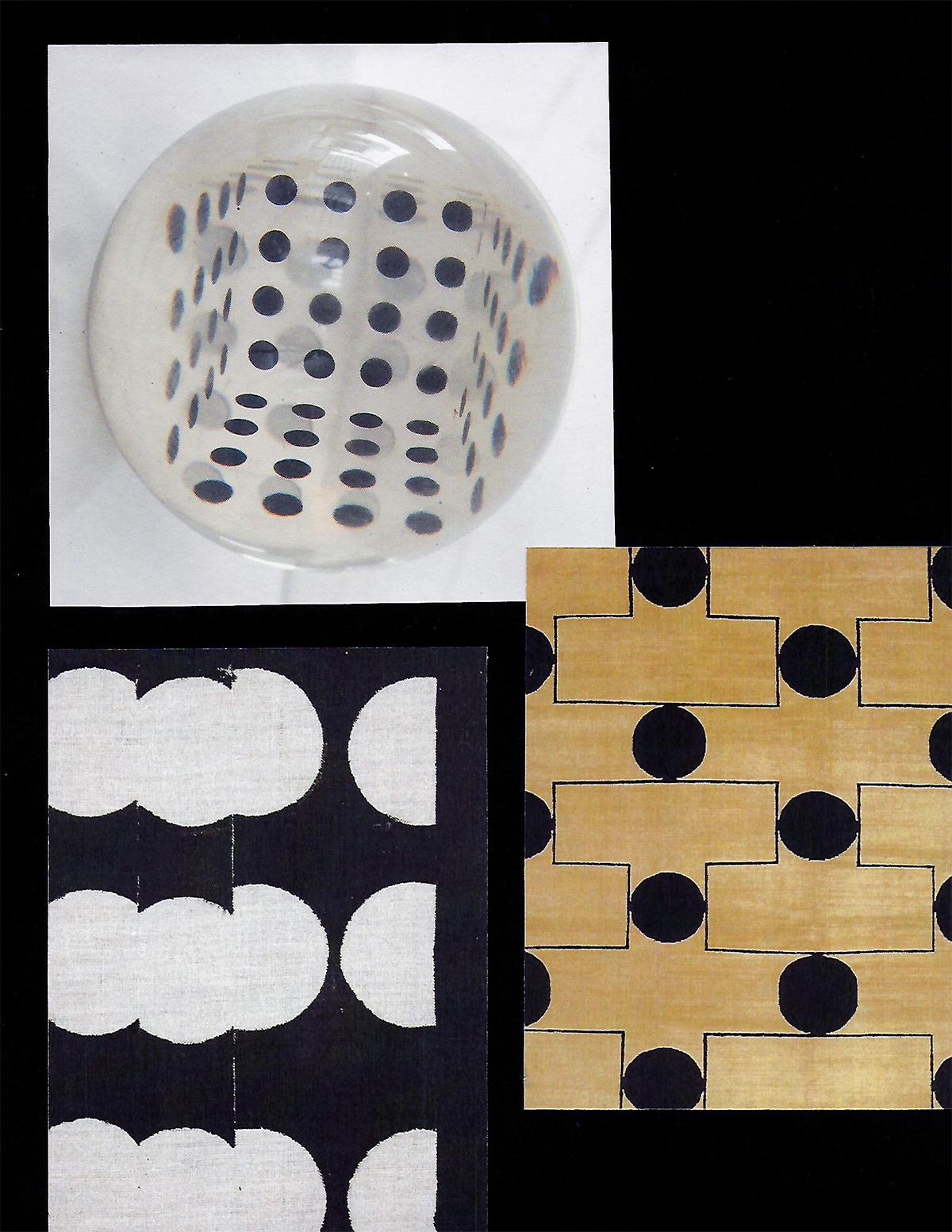
2. Untitled Vessels by Cody Hoyt
 “Cody Hoyt is a Brooklyn artist that makes beautiful geometric ceramic vessels with hand-marbled designs and patterns. His approach seems to be less formal and more experimental, which comes through in the wild energy in his work. Lately I’ve really been into more abstract or organic patterns that play with texture, which his work epitomizes.”
 The Mast Brothers’s Smoke chocolate bar, part of its new fall collection, with packaging loosely inspired by Hoyt’s work
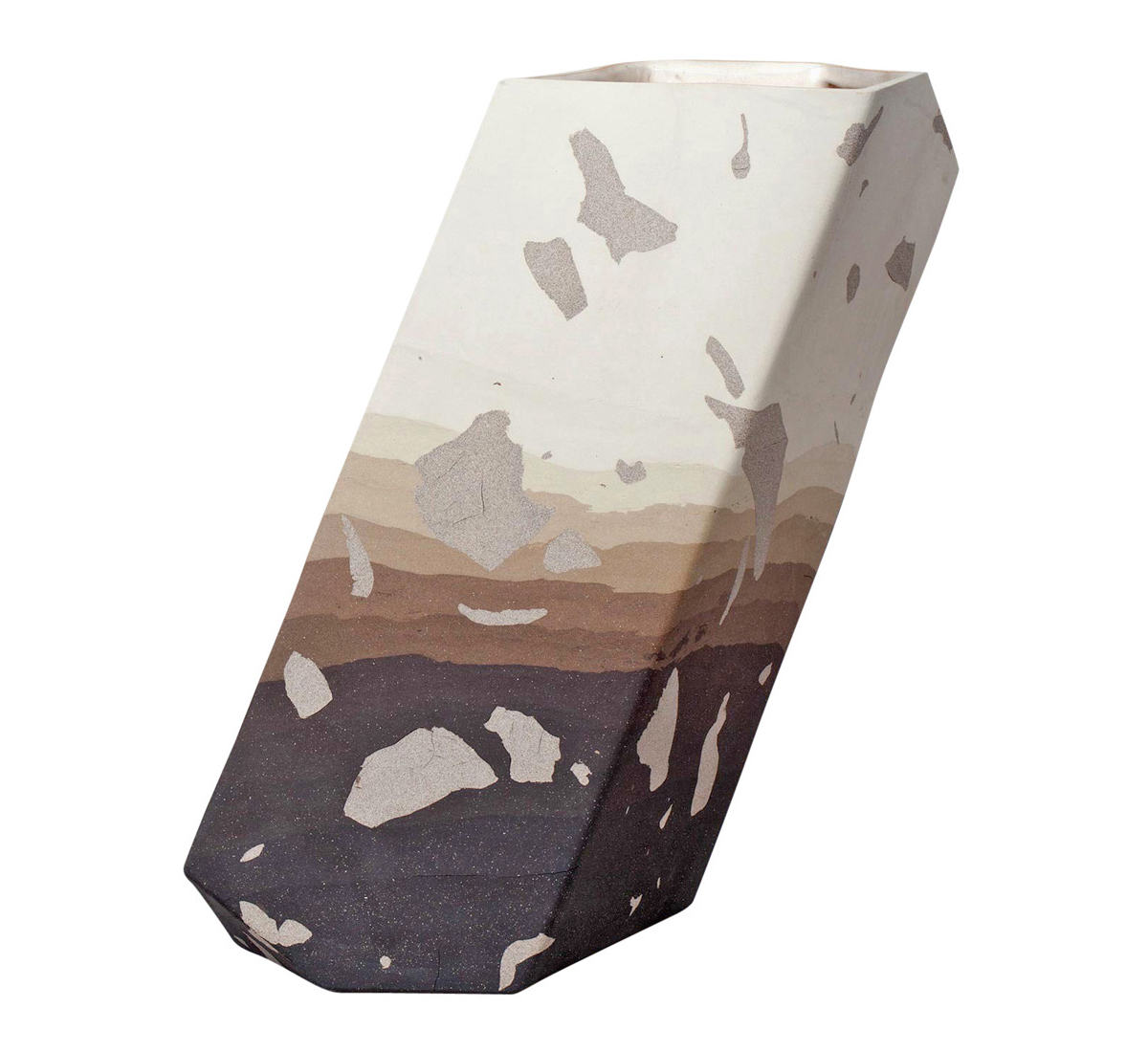
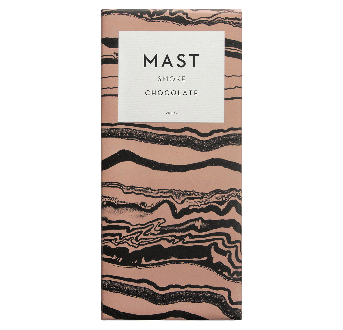
3. De Natura Fossilium by Formafantasma, 2014
 “Two Italian designers based in Amsterdam took basalt stone, volcanic glass, and lava rock from Mount Etna and made a series of beautiful sculptures. These very unique natural materials were transformed into very linear, almost brutalist forms. When I first saw images of the pieces, I knew nothing about the backstory, but fell in love with the forms and textures. This is one of those situations where the form stands on its own, but grows stronger when you uncover the layers behind it. To me, great art and design is always multi-dimensional and can keep giving as its viewers or consumers keep digging.”
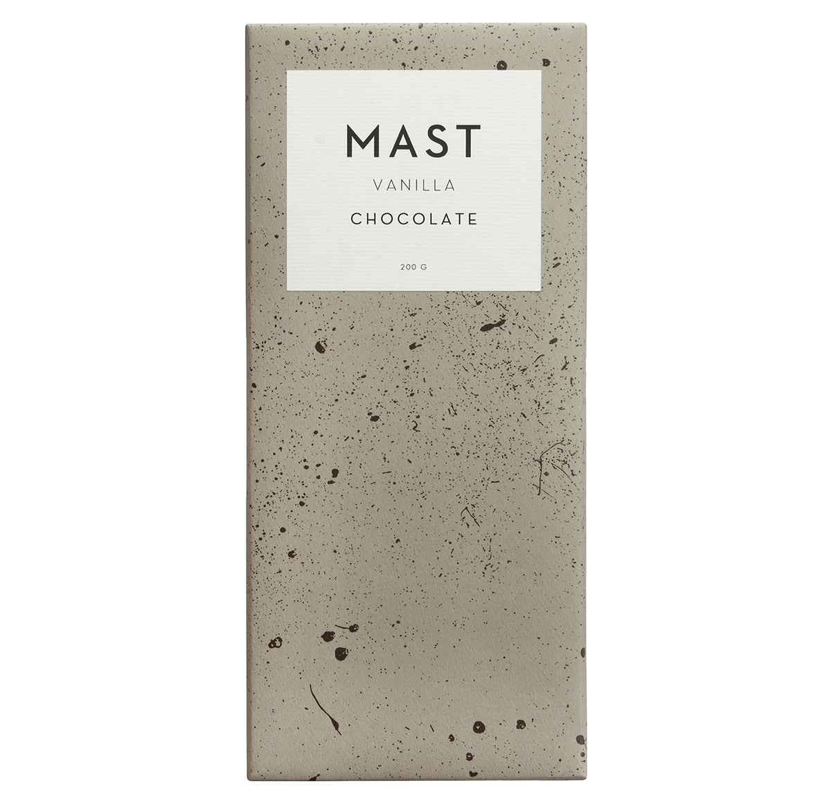 The new Mast Brothers Vanilla bar, with an ash pattern influenced by the De Natura Fossilium project
4. Futurist Suit by Giacomo Balla, 1918
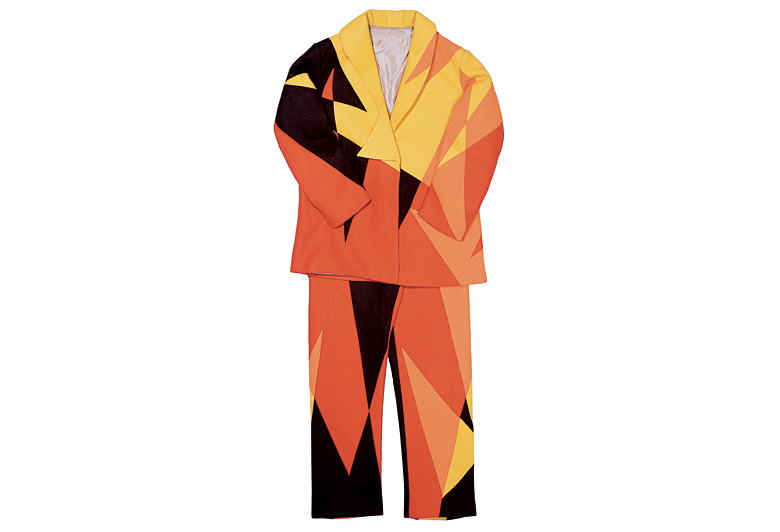 “I’ve been into the Futurist movement since I first came across it in college. The movement spilled into every medium and was more of a philosophy than an aesthetic. One of my favorite pieces is the Futurist Suit created by Giacomo Balla. He made several drawings and samples of different suits based on his Futurist Manifesto of Men’s Clothing, which outlines his desire to create ‘anti-neutral clothing’ that is ‘lit by electric lamps.’ He even goes as far as claiming that pattern changes should be available by pneumatic dispatch based on the wearer’s current mood. This was all based on the idea of bringing new life to a tired form, to change, push, and keep pushing. And this was all happening before 1920. I love encountering artists working in the past that manage to still feel so contemporary. These guys were so far ahead of their time.”
5. Jungle Beach House by ArqDonini Architects, 2006
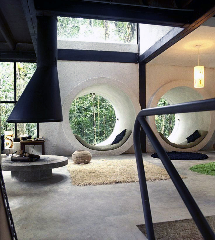 “I’m always looking to architecture for new inspiration. This funky treehouse was built in a rainforest in São Sebastião, Brazil. To me, the success of this design is all about contrast and balance. The building itself is a modern concrete and steel structure surrounded by lush green rainforest, but the interiors made of cold, hard surfaces are softened by large, soft rugs and textiles. I kind of hate the word juxtaposition and its art-school baggage, but sometimes it hurts so good.”
 Another image from Warkentin’s fall 2015 mood board
6. Time Lock by Isamu Noguchi, 1944-1945
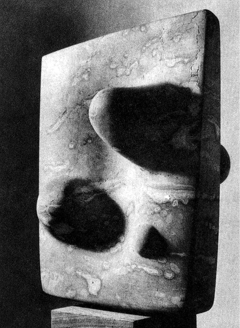 “I recently went to the Noguchi Museum in Long Island City, which is not far from where I live. The museum represents the life’s work of Isamu Noguchi, from huge stone sculptures to drawings and models. I loved all of his large-scale stone pieces, but this one, called Time Lock, was one of my favorites. It’s an odd-shaped marble sculpture on a wood stand, and it almost appears as though three smaller forms were “coated” in marble, concealing their true material and shape.”
7. Geometricke Studie by Zdeněk Sýkora, 1961
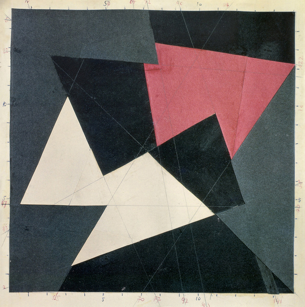 “I came across this piece not knowing what it was or what era it was from. On further research, I found it to be by Czech artist Zdeněk Sýkora, one of the first artists in the world to use computers to create geometric abstract paintings in the 1960s. The stark colors and shapes stood out to me, but I became more fascinated by his use of computers. Regardless of what the ‘computer’ being used was like at that point, this was an early point in a very relevant conversation of artistry and modern tools. I find my computer and even my iPhone to be my most frequently used tools, while trying my damndest to make my work look as ‘analog’ as possible.”
 A third image from Warkentin’s fall 2015 mood board
8. Wall Drawings by Sol LeWitt, 1972
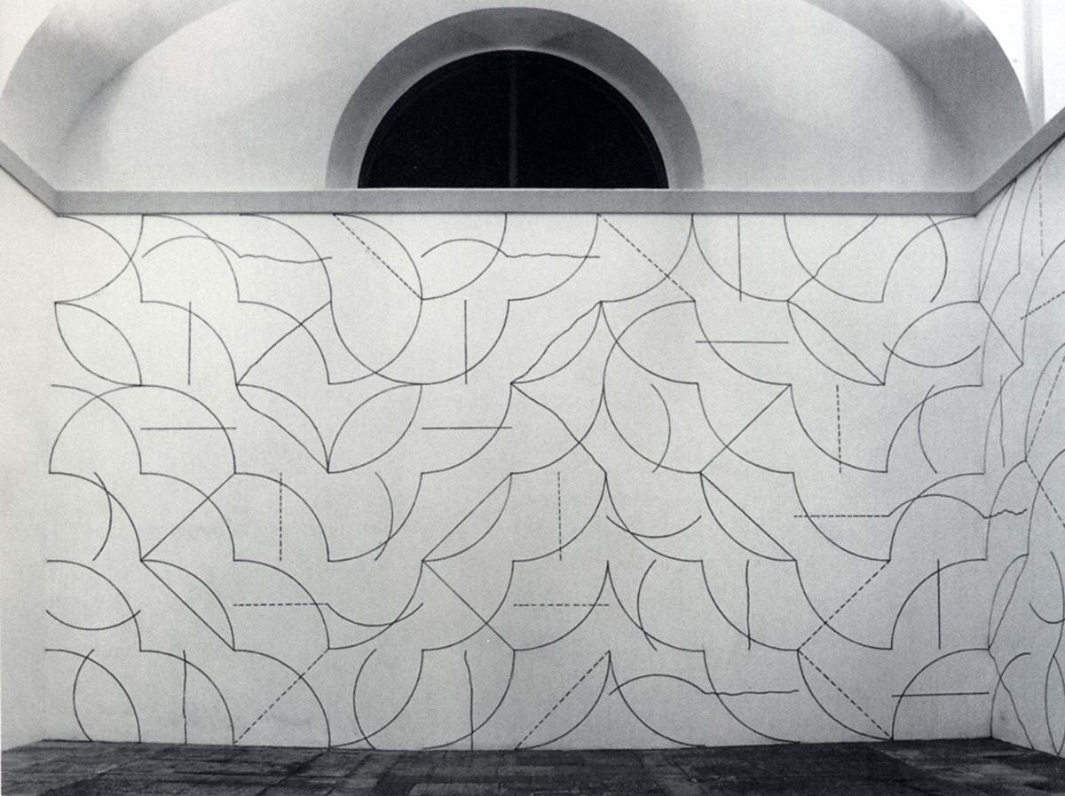 “I really like all of the iconic cube structures by Sol LeWitt, but more recently I’ve gotten into his wall drawings. He used systems that would direct how arcs and lines were drawn, creating interesting pattens on large-scale surfaces. I love the idea of creating a set of rules or parameters for a work, no matter how arbitrary they may be. That approach sounds restricting, but I find that it opens up rather than limits my creative process. I think every artist probably has their own set of rules, even if those rules are totally insane.”
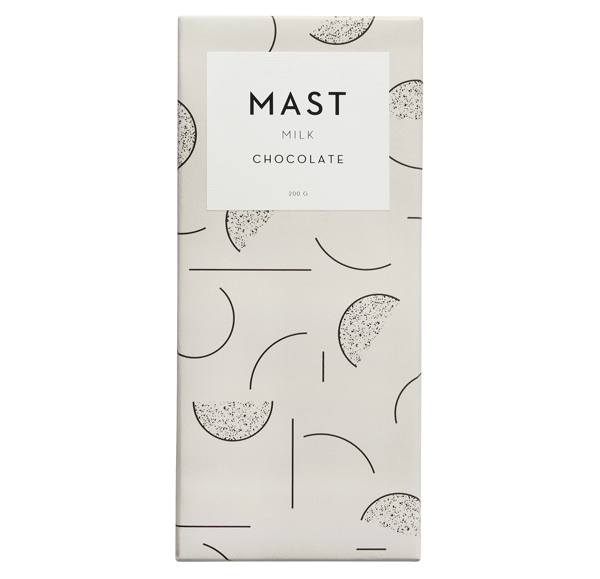 Warkentin’s LeWitt-style illustration for the brand’s new Milk Chocolate bar