11.21.16
Up and Coming
Strauss Bourque-Lafrance and the Deconstructed Domestic Space
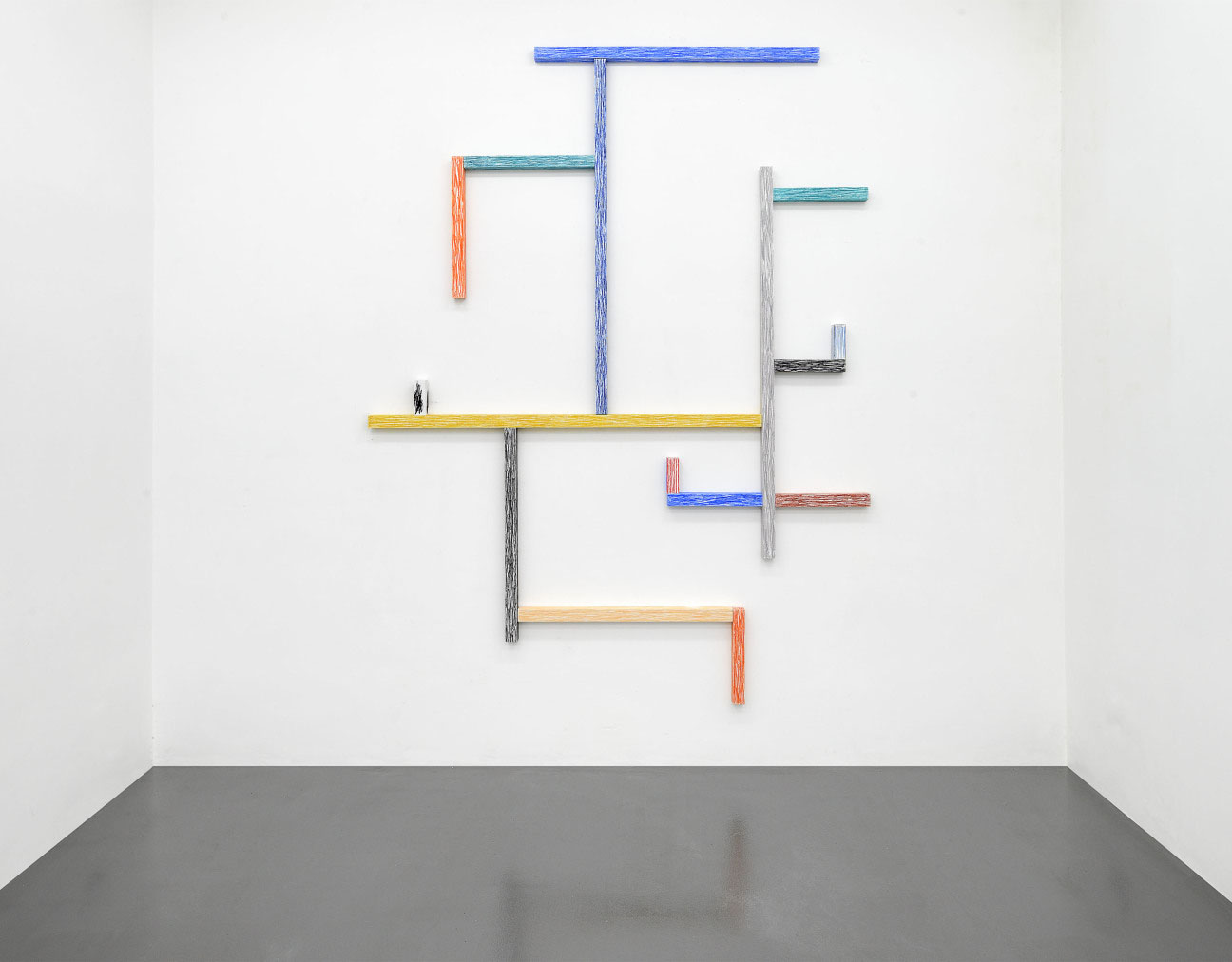
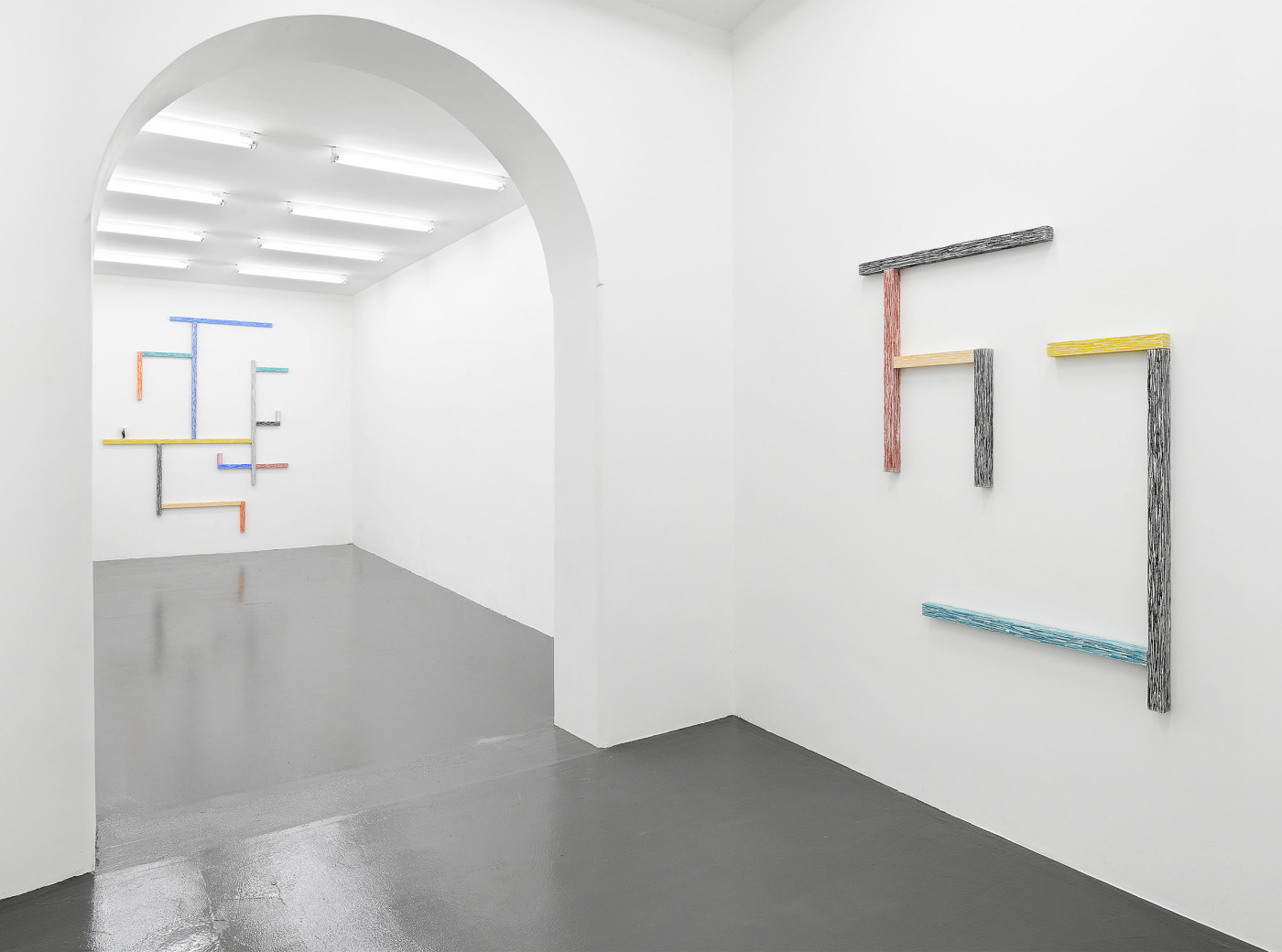
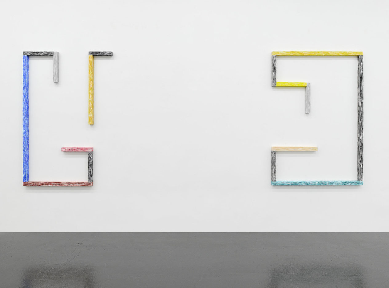
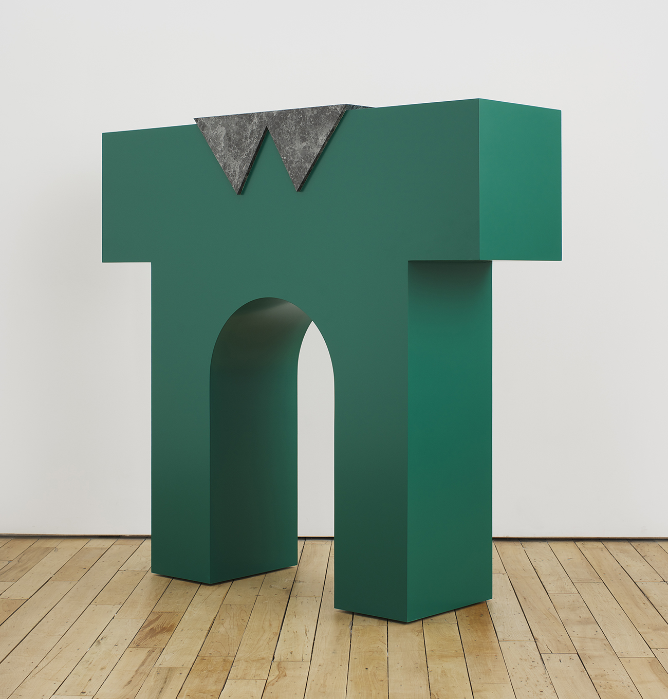
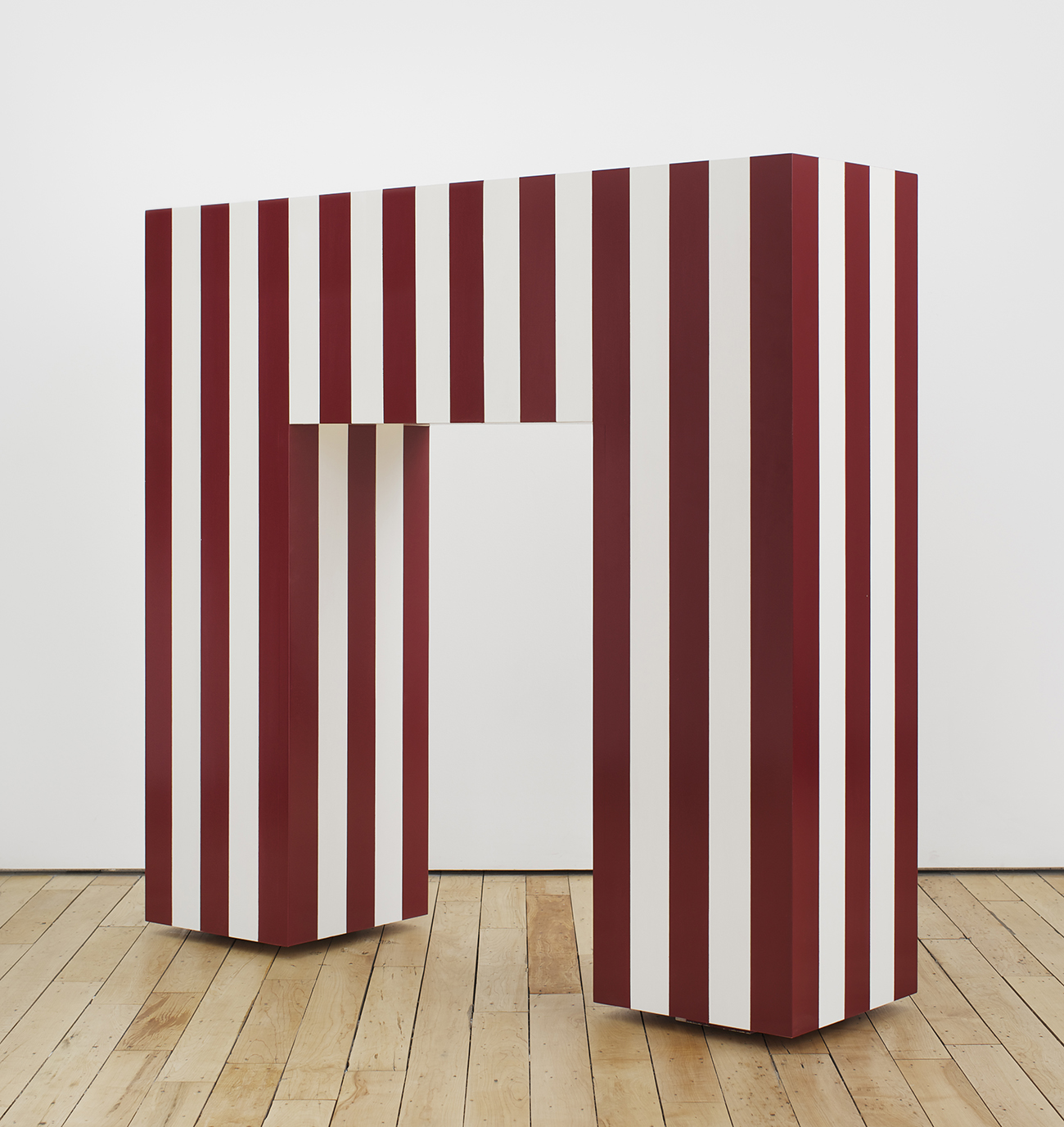
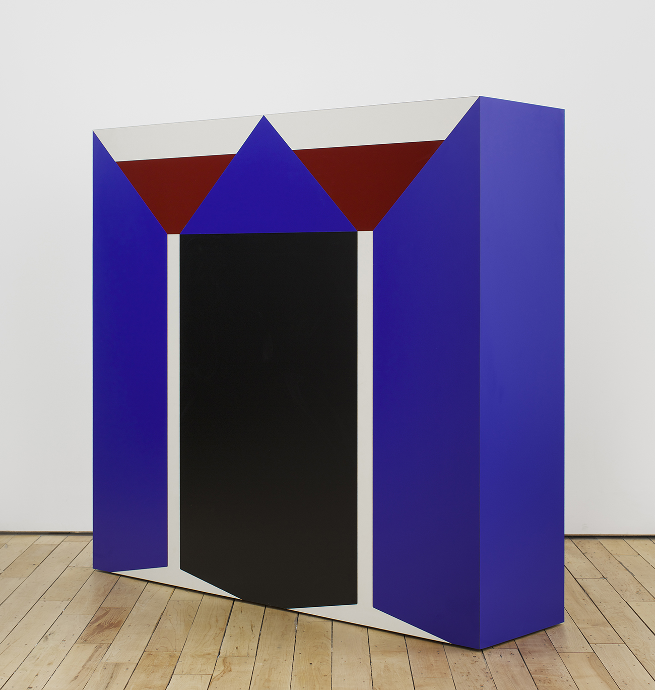
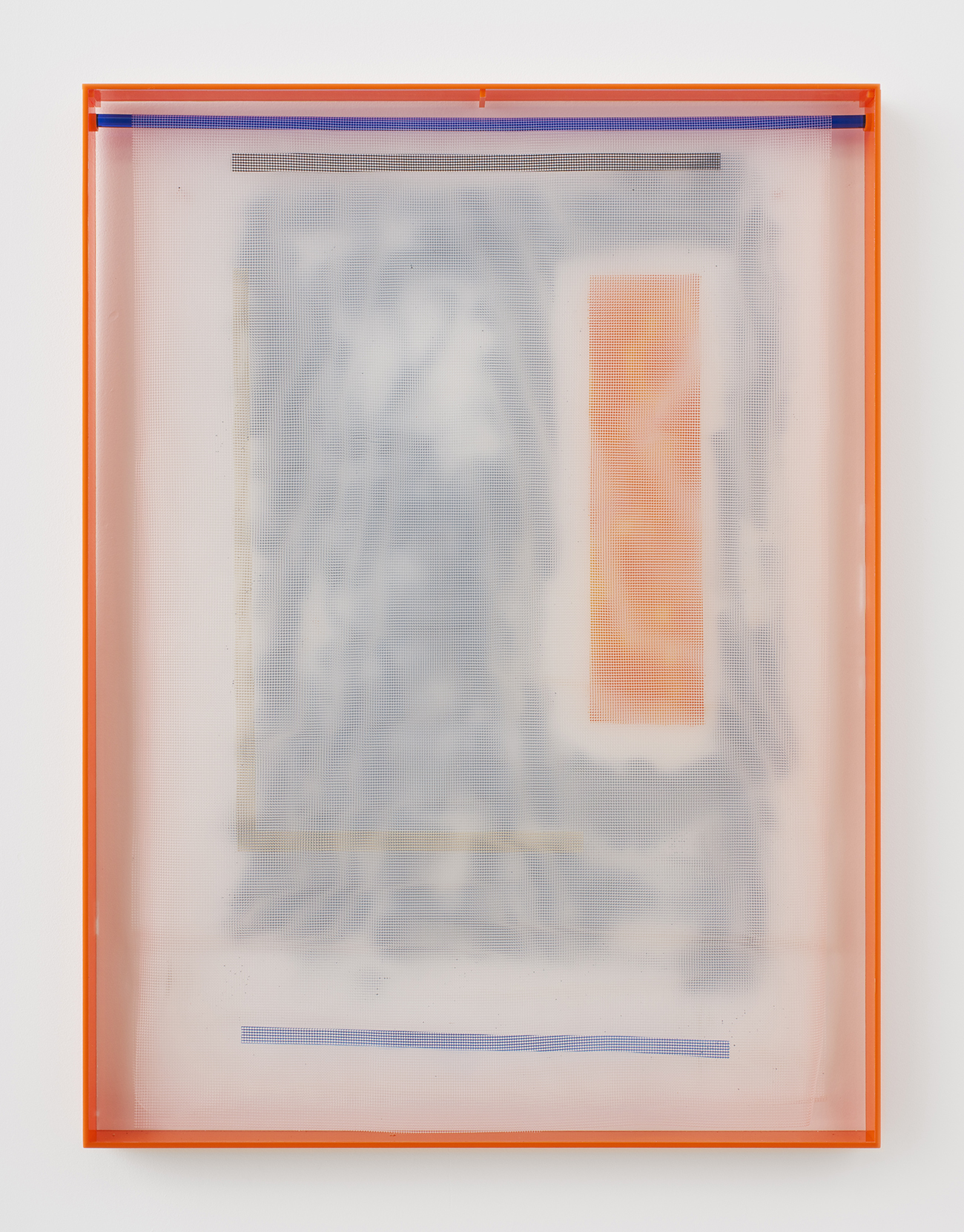
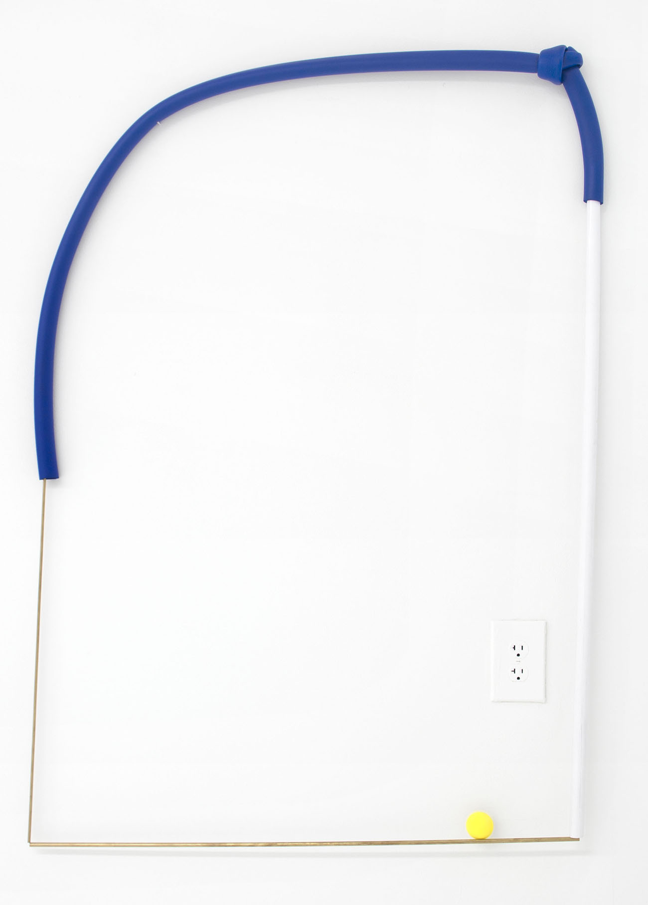
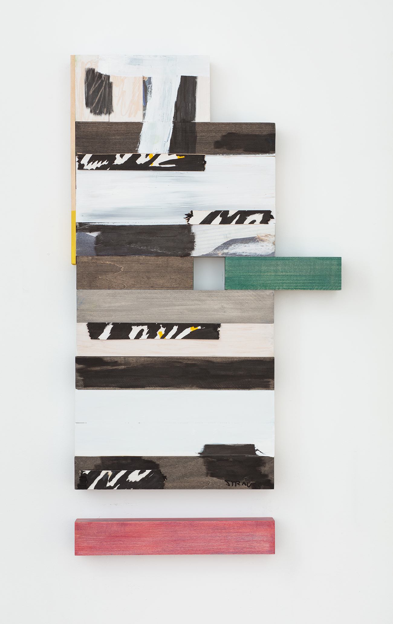
Strauss Bourque-LaFrance’s work reflects a holistic approach to materials informed by the social function and status of objects as well as our relationship to them; the roles they play in our lives as symbols, signs, and totems. In Bourque-Lafrance’s world, objects and paintings often get mixed up together with sculpture and interior design. His approach may be best summed up by his gallerist, Rachel Uffner, who calls it “painting-in-the-expanded-field, painting-as-collage, painting-as-performance, and painting-as-sculpture.” In one body of work, Bourque-Lafrance created a series of abstracted, geometric fireplace mantels; in another, the artist took the literal building blocks of a home — wooden posts — and collaged them into a series of tongue-in-cheekily called “Post Paintings.” His work is often shown in the context of an imagined room or other domestic space, more often than not complete with wall-to-wall carpeting.
If it all sounds a bit far out, blame it on the 70’s, a decade Bourque-LaFrance routinely turns to for inspiration, deftly avoiding drudging up kitsch or nostalgia. His work is also influenced, among other things, by his upbringing in rural Maine as the son of a furniture maker, de Stijl, Surrealism, and his status as one-half of a distinctly Brooklyn art-and-design world power couple. (His partner is Alex P. White, a noted designer and protégé of Kelly Behun.) We caught up with the artist to find out what’s on his moodboard, why it’s good to get out of town, and which project he’s tackling next.
Describe your most recent project and how it was made.
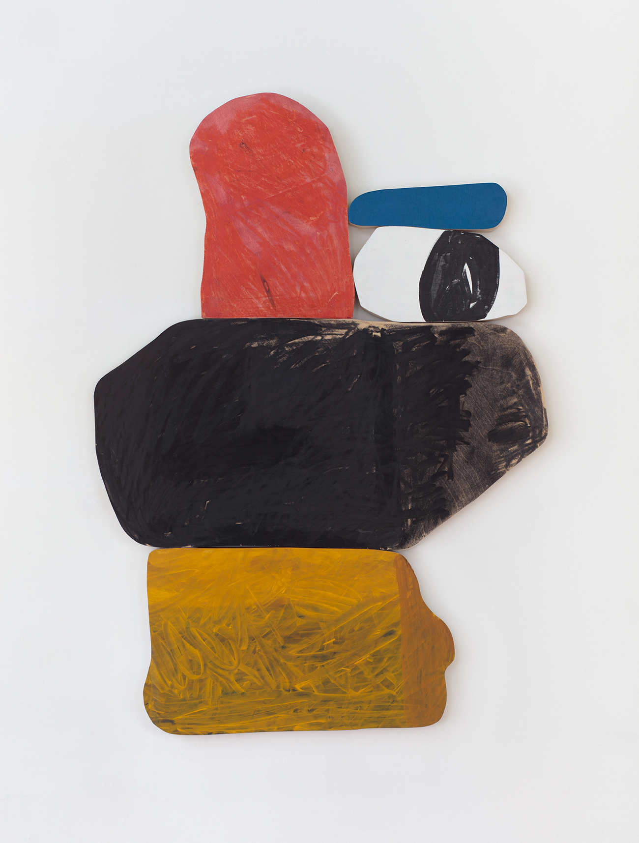
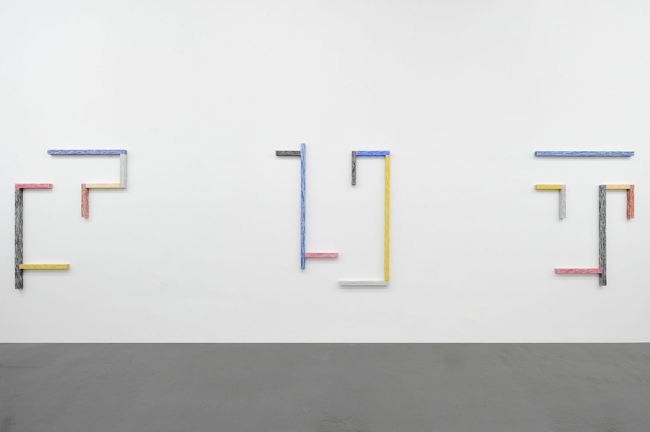
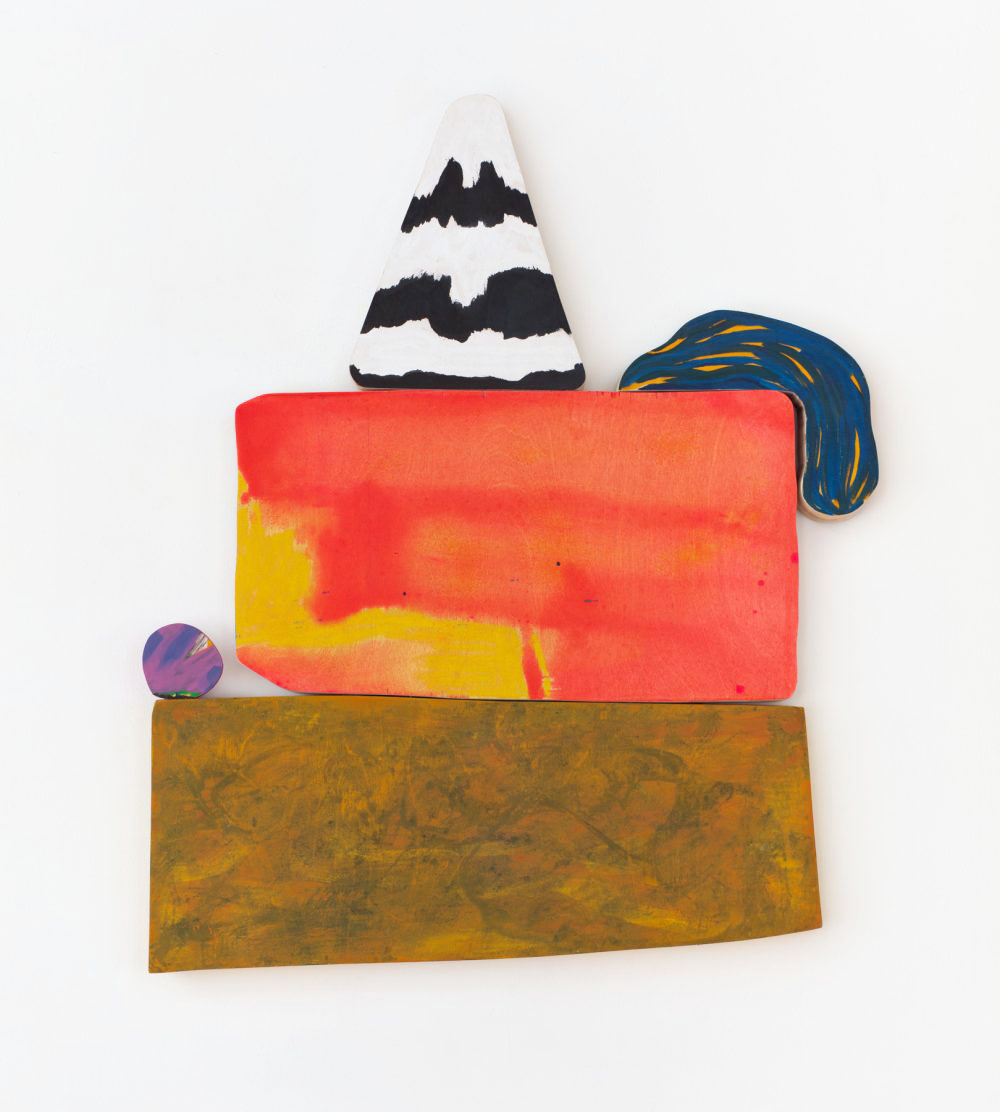
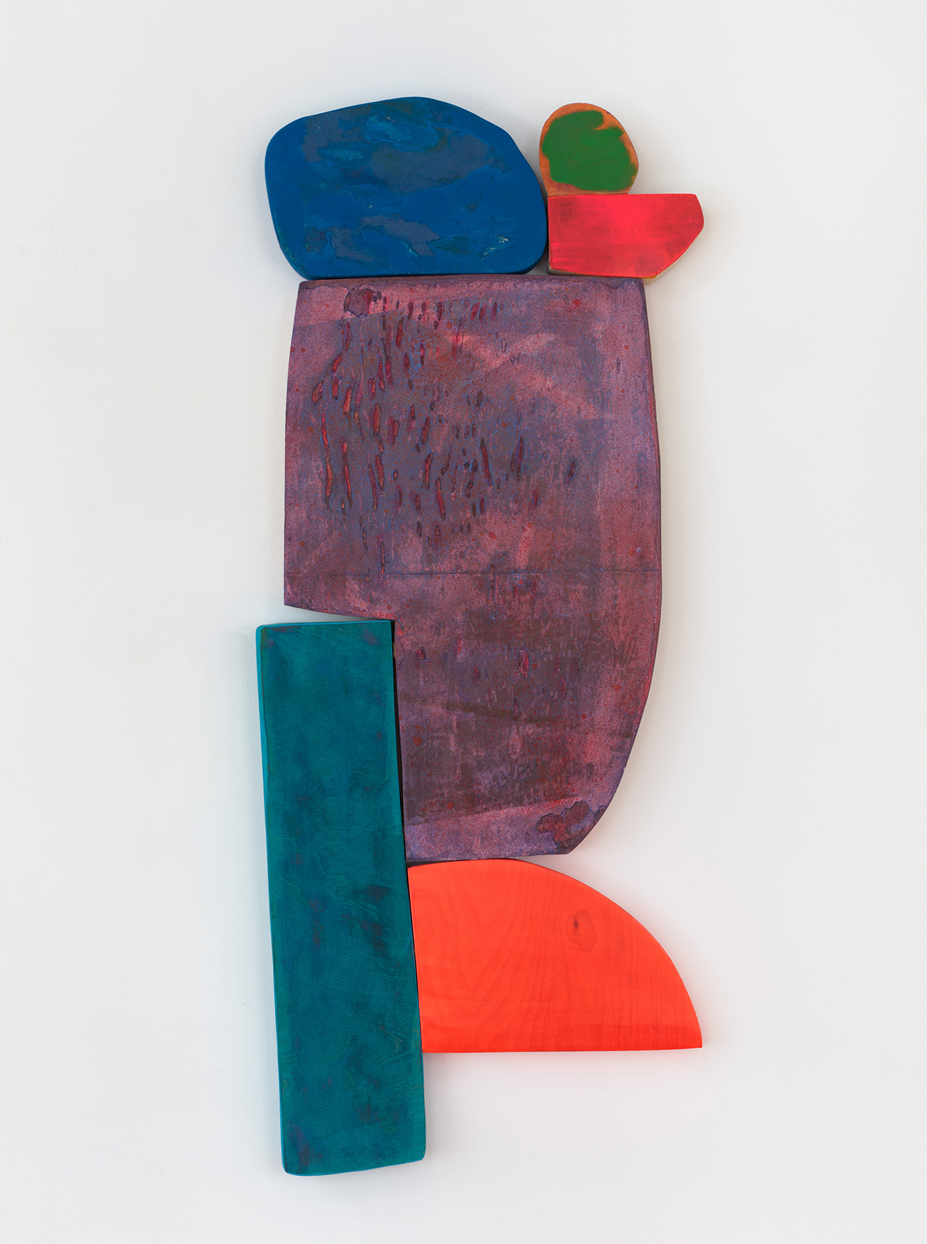
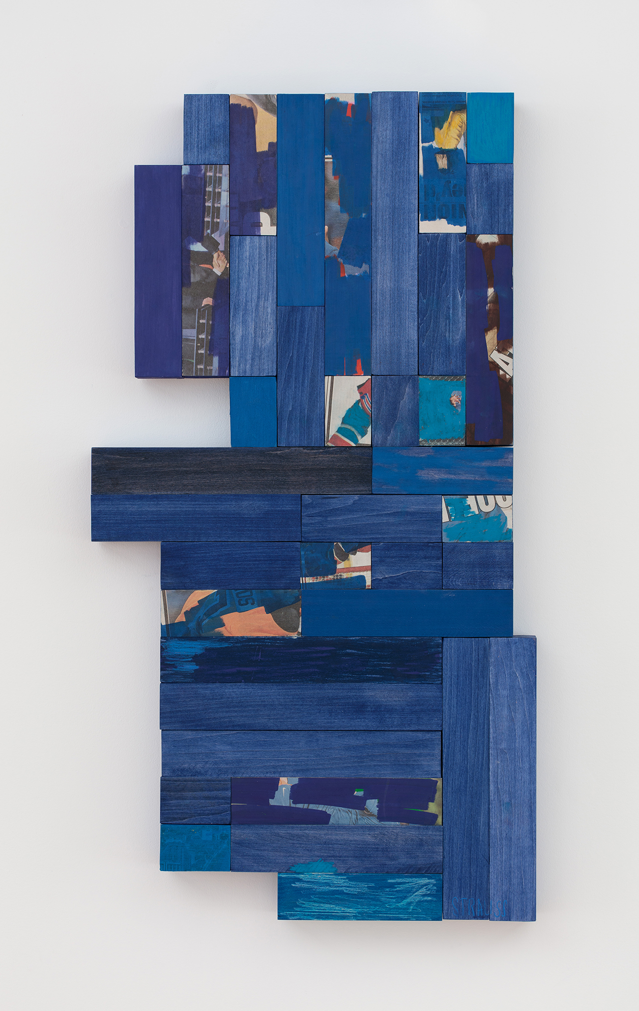
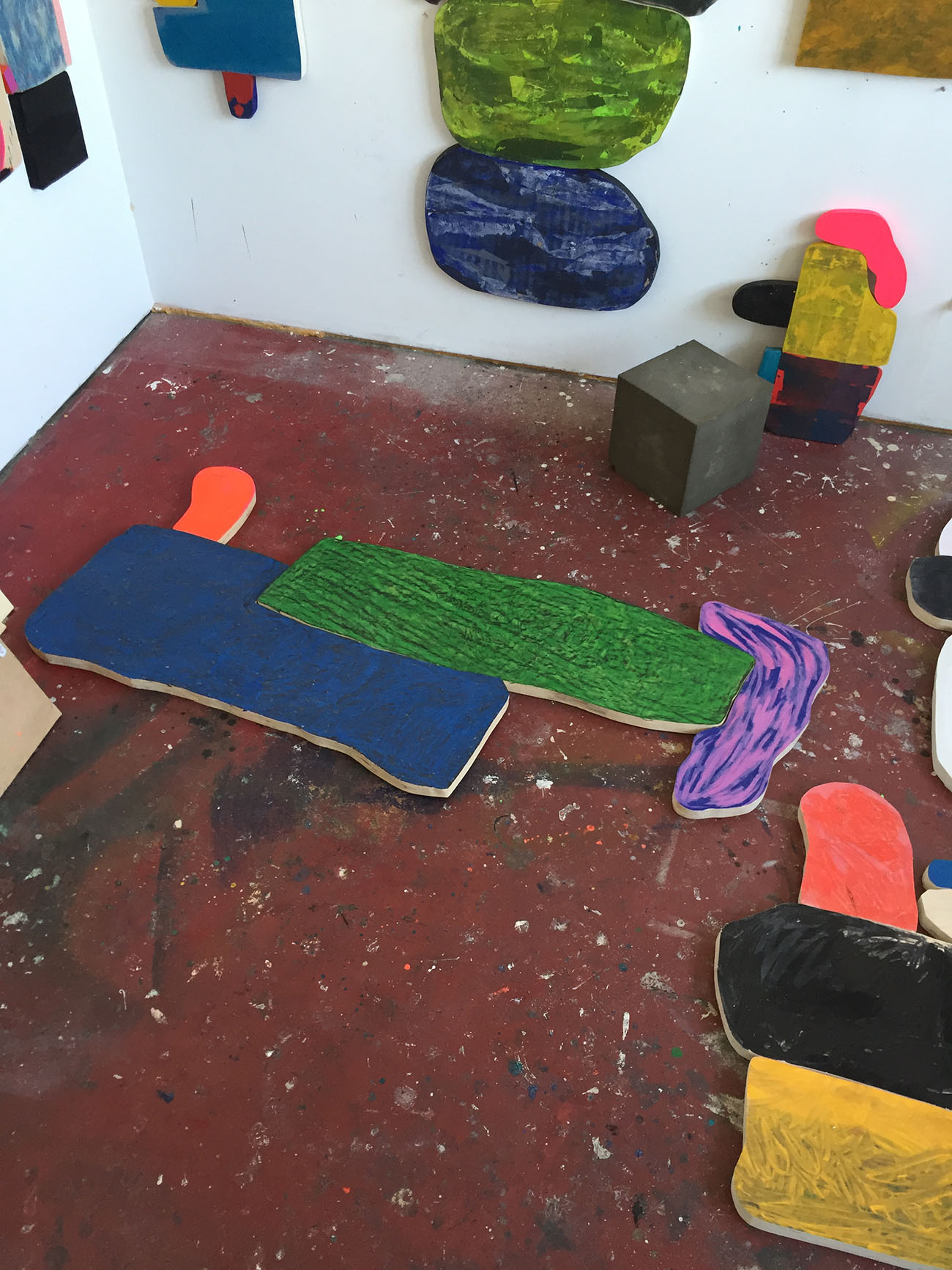
I recently showed a new body of work with Rachel Uffner Gallery at the SUNDAY Art Fair in London. The works are painting-sculpture hybrids comprised of shaped birch panels assembled into various compositions. Each panel is drawn, cut, sculpted/sanded, painted, and collaged on. As shapes are combined, familiar gestures and almost-images appear — beach balls, eyes, flowers, fruit, furniture, bodies. Arranging abstraction has become a way for me to edit and develop an image in unexpected ways; it’s like arranging objects on a shelf or solving a puzzle.
American crafts, surrealism, eccentric abstraction, and obscure 70’s cartoons helped guide this work. Working from existing visual histories allows me to play with meaning, associations, and memory and illuminates our constant conflicts with style, taste, and content. I write a lot about art and interior space and phenomenology and often incorporate these words into my titles, which act as poetry and humor, but also as markers of my influence and research.
Describe your next project and how you’re currently making it.
I am expanding this series of wood works, trying to incorporate some surface materials I’ve used in the past — Plexi, laminate, fabric. I am starting to embed imagery into the paintings, cutting out shapes and puzzling them into the picture plane.
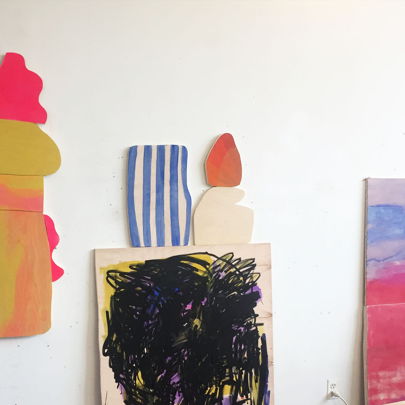
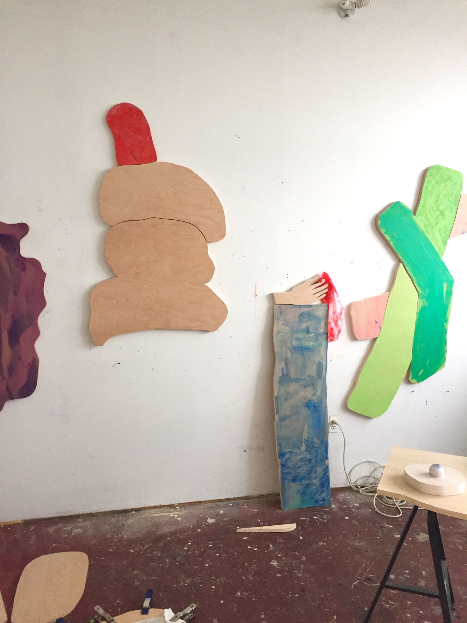
Some sculptures and interior elements are in the works that will be incorporated into the next exhibition of these wood pieces. Like any other domestic objects, paintings are in constant dialogue with other things, bodies, and spaces. Designing the space around a painting can distract from or enhance what a painting is trying to do. I’ve used both as strategies, because sometimes you have to put a painting in its place.
I am also making some canvas works that are too young to say much about, but they are large and bright and at this point are looking a bit like ugly landscape paintings. I typically work on multiple bodies of work at once. I lose interest when I focus on one kind of painting for too long.
Tell us one thing that’s been inspiring you lately and why.
When I’m not in the studio I’m usually walking or driving with no destination in mind. I document a lot of what I see which ultimately gets absorbed into my work, my Instagram, or put into the books I make. I’ve been focused on signs lately. Signs convey ideas, create borders, guide bodies, plead for help, propose problems, advertise, and so on. I prefer signs rendered unreadable, masked over graffiti, hand drawn notes in bodega windows, staple clad telephone poles — the signs that show marks of human error, action/reaction, or disappearance. It’s hard not to apply an aesthetic lens to certain signs, but you can often find better paintings on a rural upstate drive than you can in Chelsea…
What’s your favorite piece of art/design from the last ten years and why?
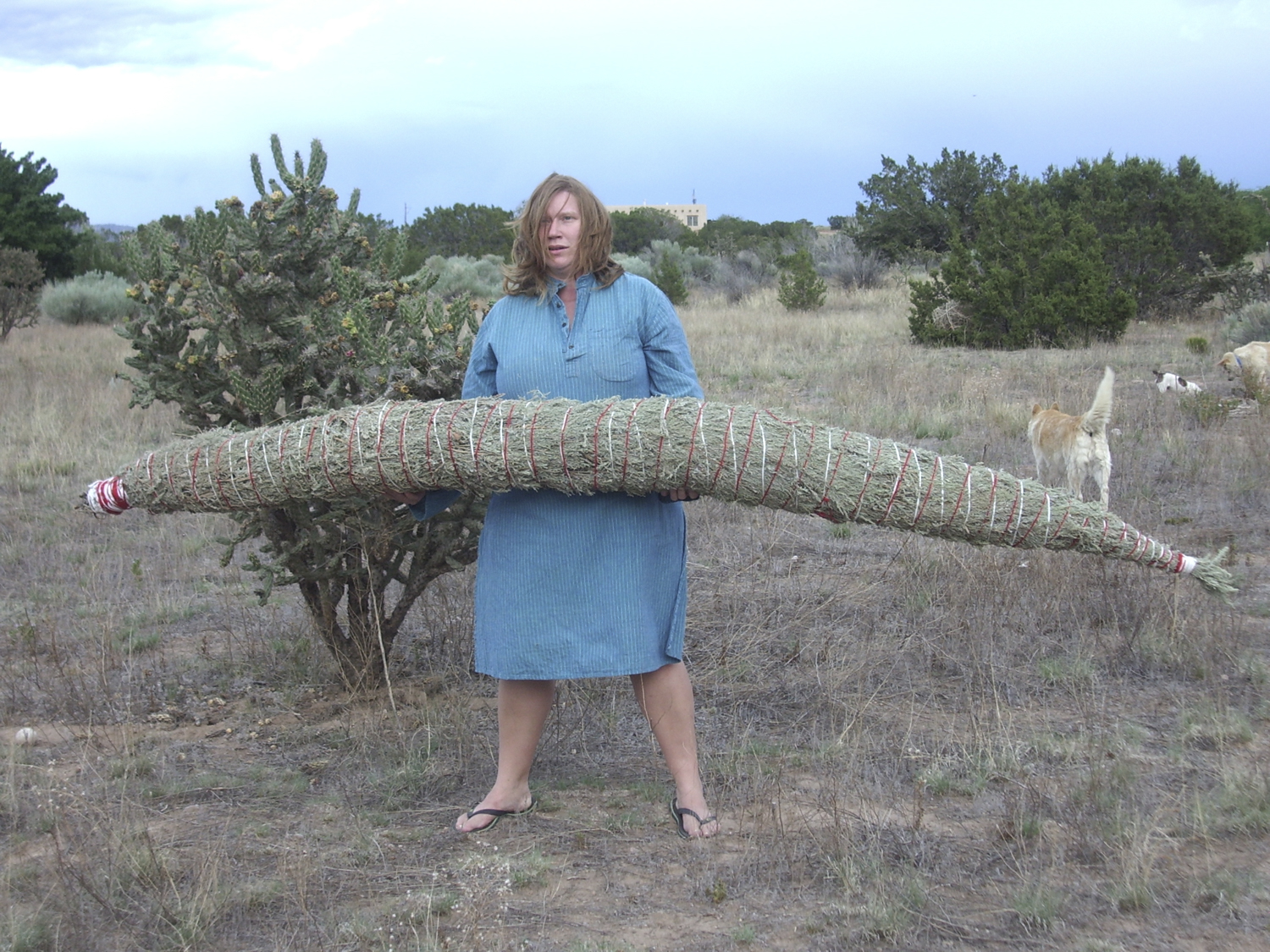
Never just one — but I was recently reminded of Jeanine Oleson’s giant smudge stick (like, 10 feet long) that was burned at various sites in the city in 2008. Seems like a perfect time to bring this piece back — America could use a good cleanse right about now, no?