11.08.17
Up and Coming
Meet the Up and Coming Finnish Illustrator Behind the Sight Unseen Suitcase Print
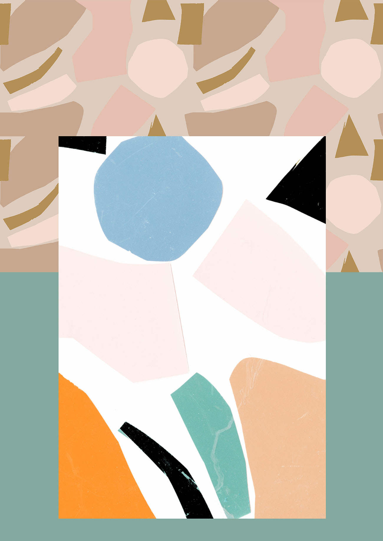
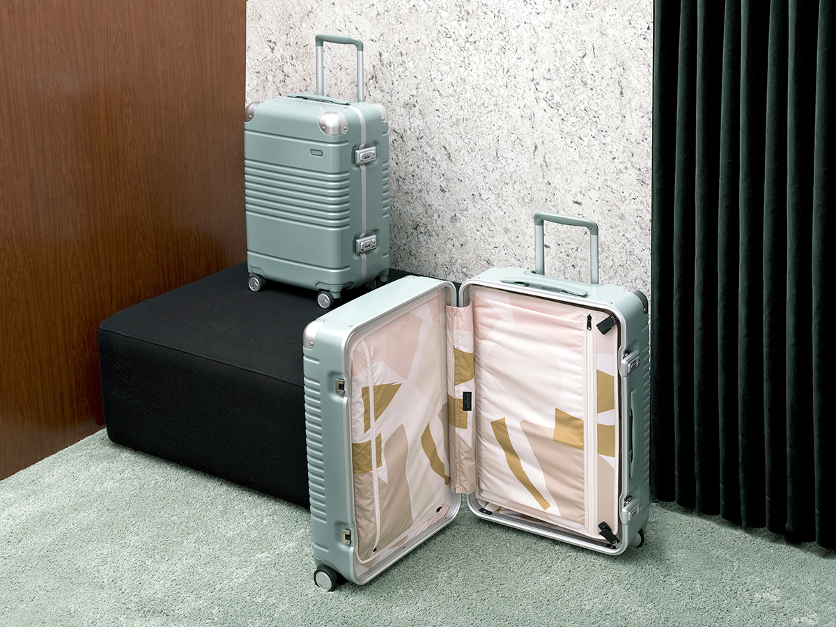
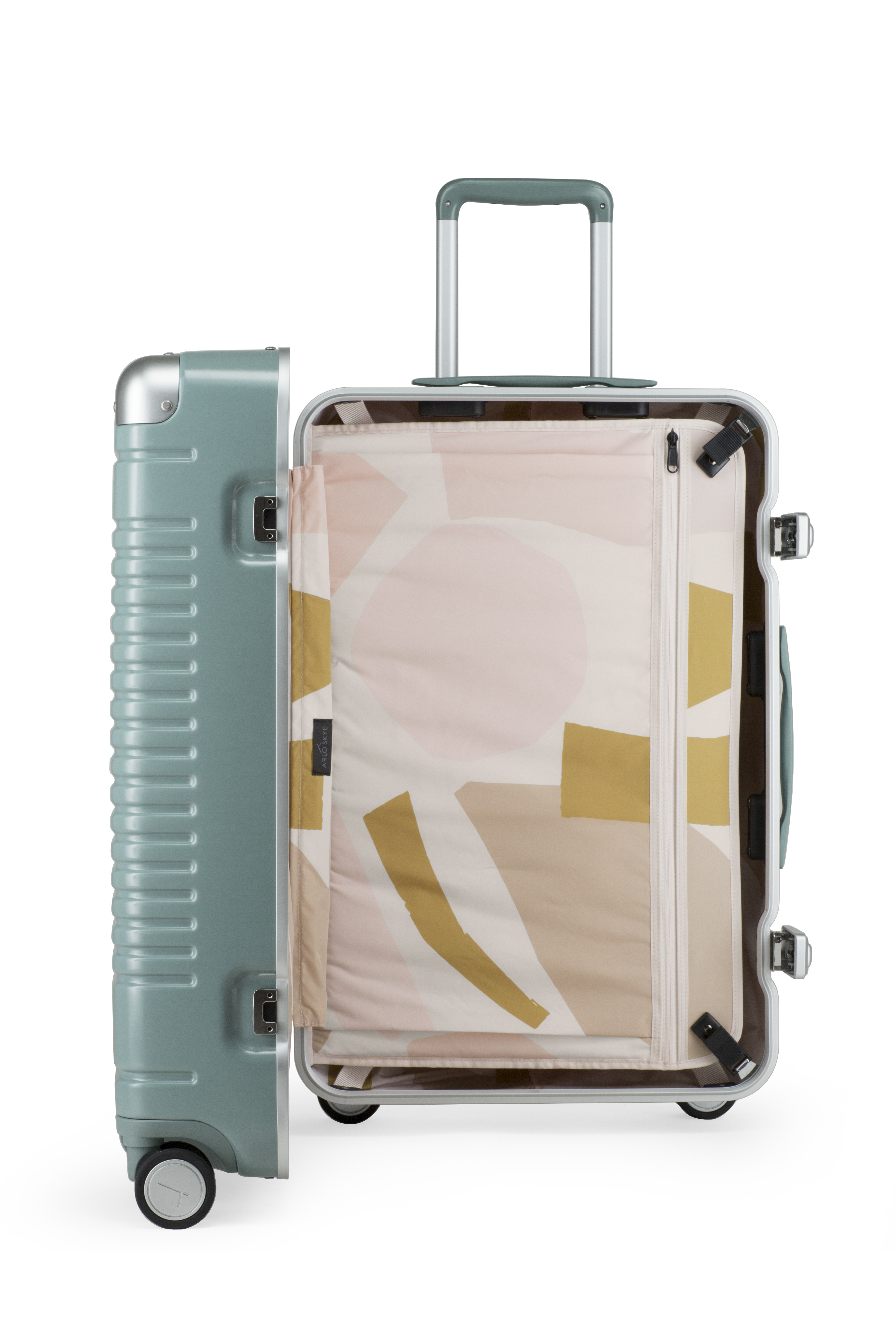
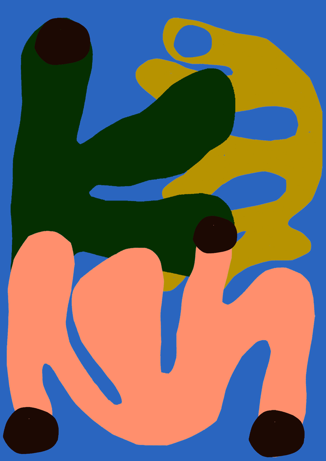
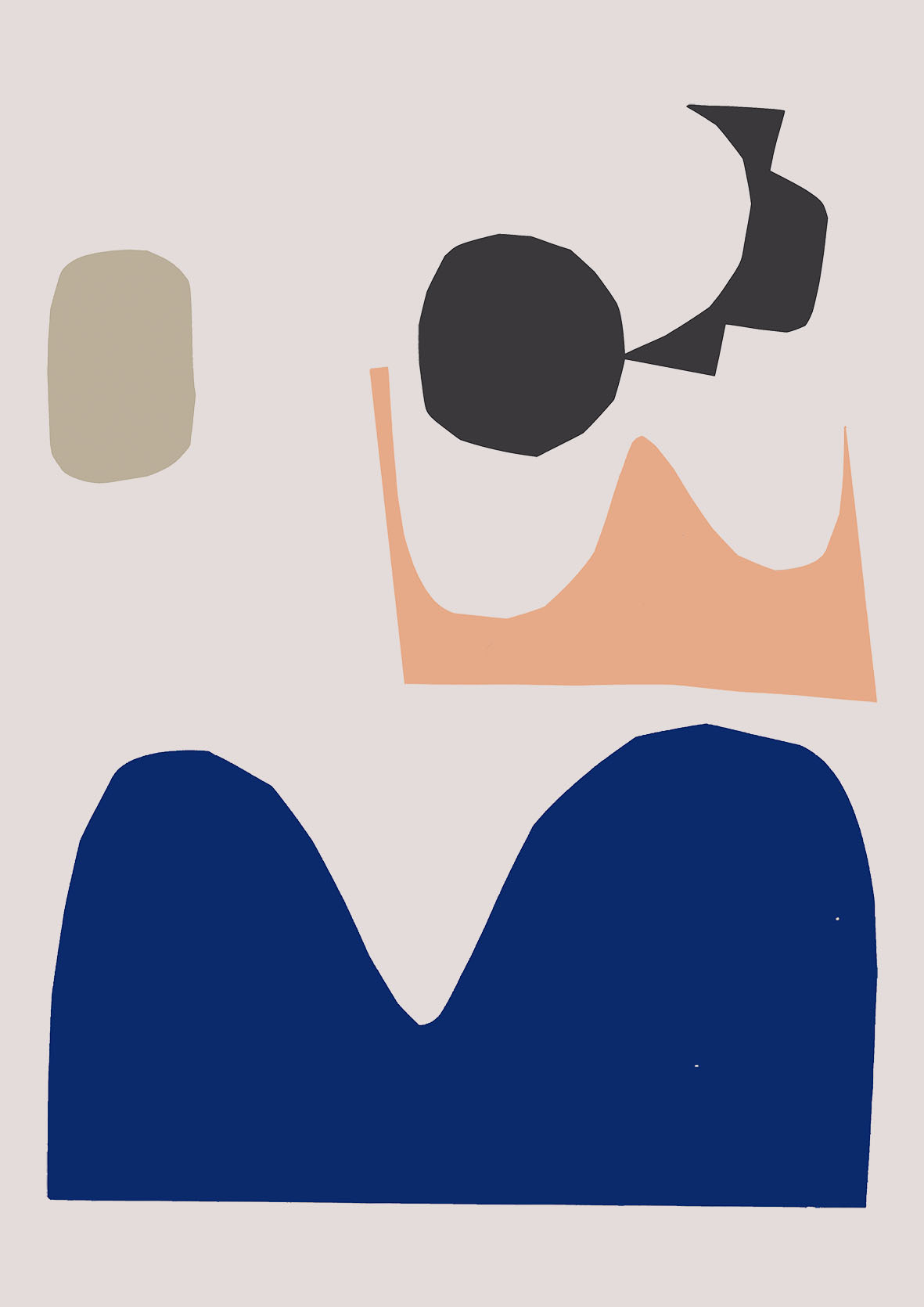
Earlier this year, when we began to think about who might design the pattern that would adorn the interior of the Arlo Skye x Sight Unseen suitcase, we first established a few parameters: We wanted the suitcase to be more sophisticated than playful, but to still embody the warm, colorful, graphic sensibility that we tend to favor. We needed the print to repeat, but we wanted the pattern to have the illusion of being more random. And we hoped that we might be able to shine a light on a lesser-known, up-and-coming talent. With this in mind, we turned to our most trusted advisor: Pinterest. We remembered pinning a paper collage by a Finnish illustrator a few months earlier, and when we took a harder look at the designer behind that collage, we knew we’d found our man: Antti Kekki, a Helsinki-based graphic designer just a few years out of art school.
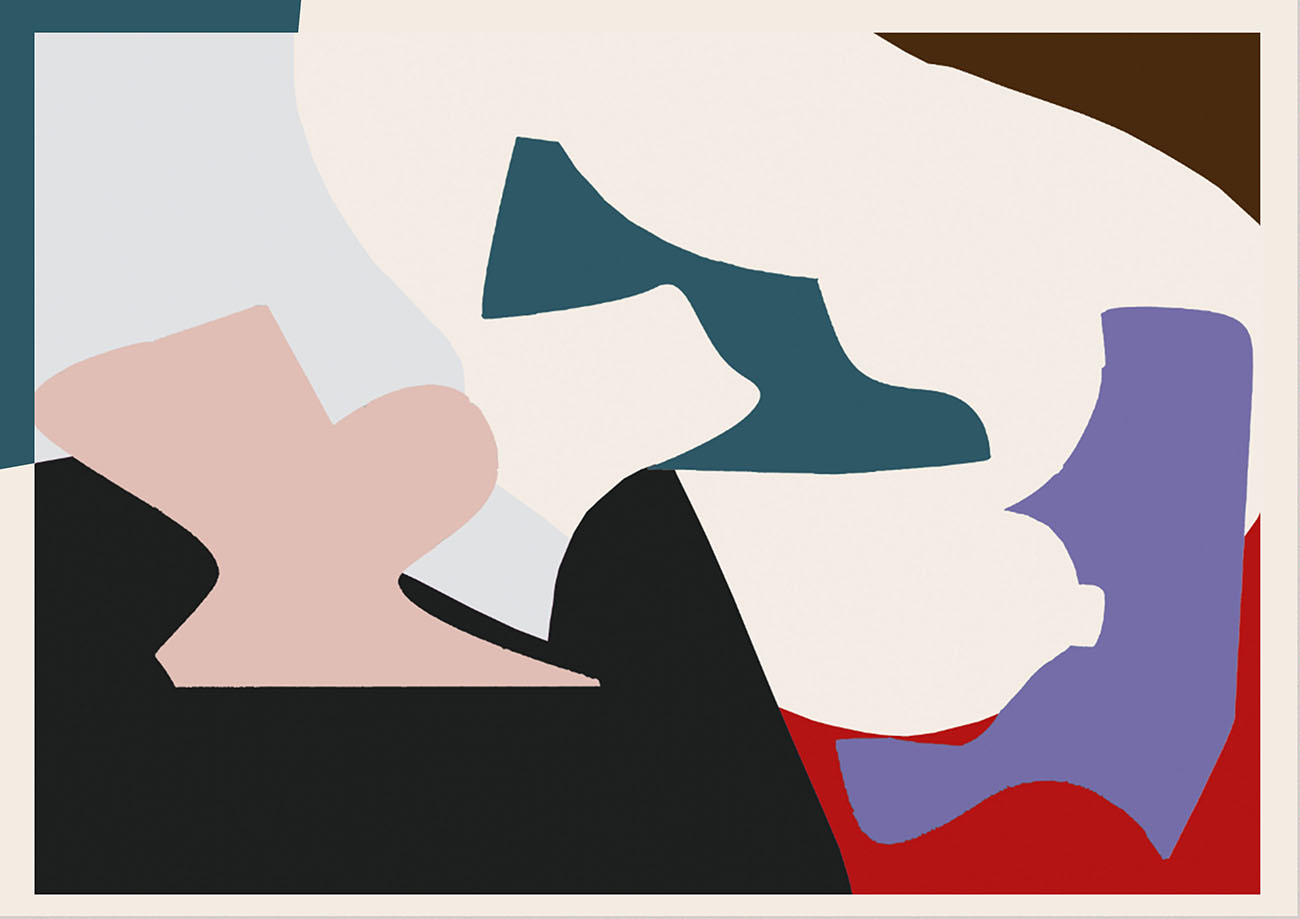
Kekki works as a graphic designer with the Helsinki collective GRMMXI but his personal aesthetic is less slick, and more hand-crafted, inspired as it is by old textiles, ceramics, and artists like Jockum Nordström. Kekki set to work translating his paper collage into a digital, infinitely recombinable pattern, and we sent him suggestions for different color palettes. We couldn’t be happier with the mustard, beige, and pink combination we eventually landed on, and today, we’re getting to know the designer and the larger body of work behind it. Read on to find out why Kekki’s work is moving away from bright colors, whose fruit still-lifes inspire him, and why he tries to steer clear of the traditional “masculinity” of Scandinavian design. And, if you haven’t yet, head on over to Arlo Skye to purchase one of our limited-edition suitcases!
Describe your current project and how you’re making it.
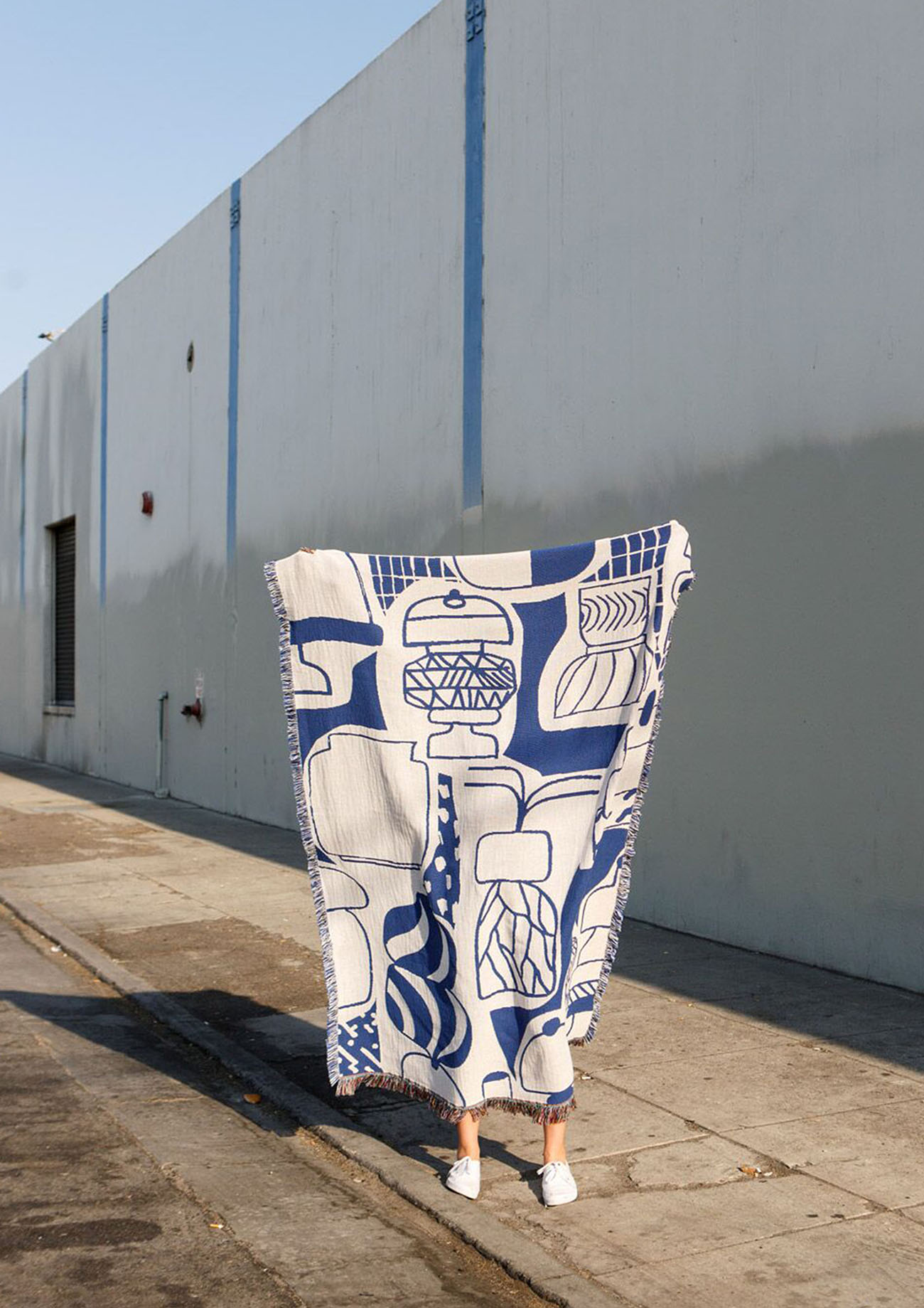
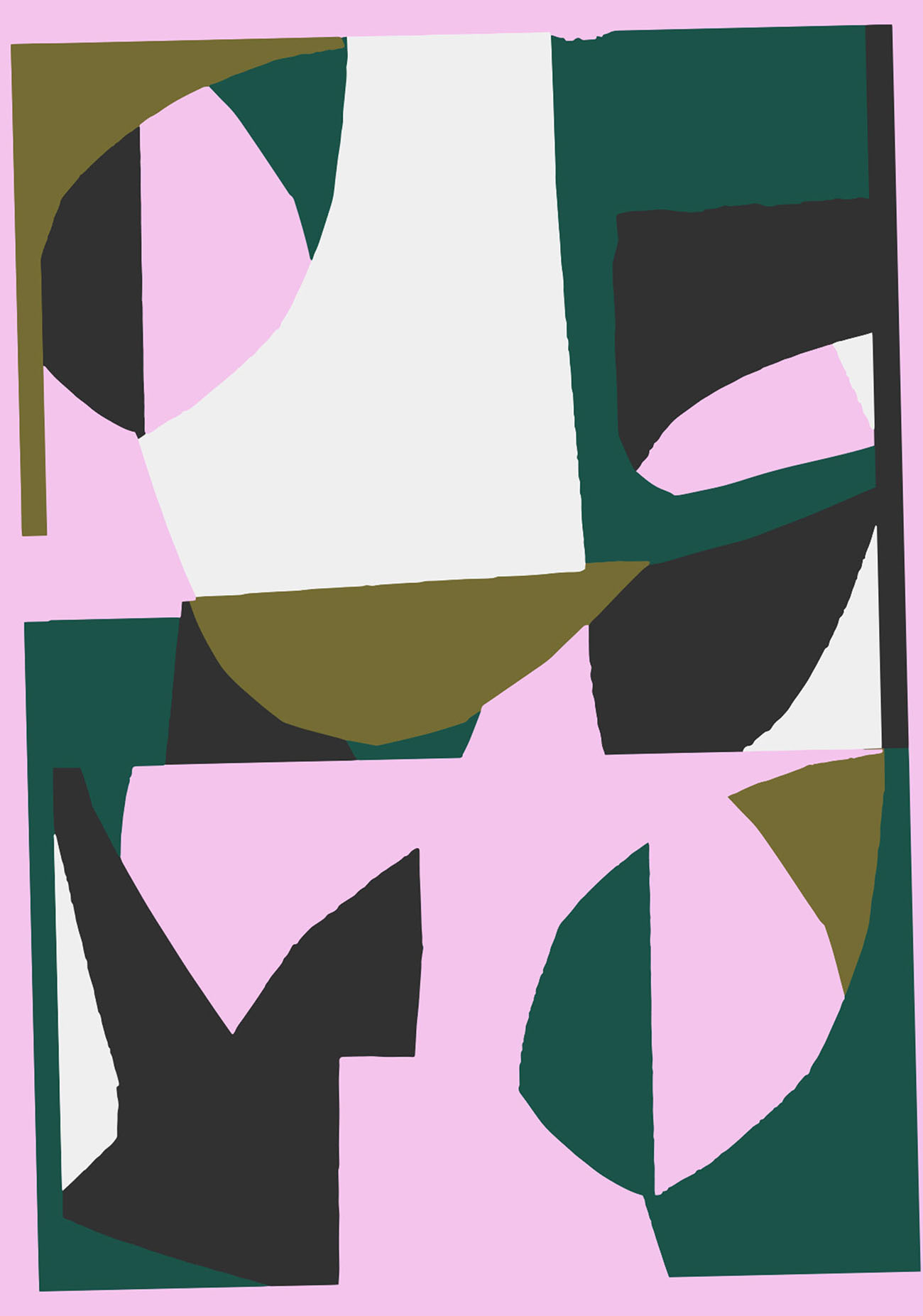
Most recently I worked on a collaboration with Arlo Skye and Sight Unseen, where I was asked to design a print for the lining material of their suitcase. I had scanned some paper cuts years ago as a part of a school project and put a section of that scanned collage to my Tumblr, which Jill and Monica found through Pinterest. They wanted me to design a print for the lining based on this picture. The print was originally designed for an album cover but it was never used for some reason. I was very happy for this assignment since textile design projects are my favorites. In fact, last year, Slowdown Studio approached me with a similar suggestion, wanting to do a woven cotton blanket from a picture that they found on my Tumblr.
With the Sight Unseen project, I experimented with several different color combinations. The first ones were slightly too playful and we decided to tone the colors down to a more sophisticated palette. Using earthy tones lessened the contrast between the shapes and the background and made the print look calmer. The end result — a dusty green suitcase with a sophisticated lining — looks like something that Hercule Poirot could use in the novel Death on the Nile.
Describe your next project and how you’re currently making it.
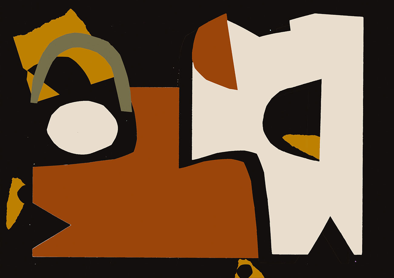
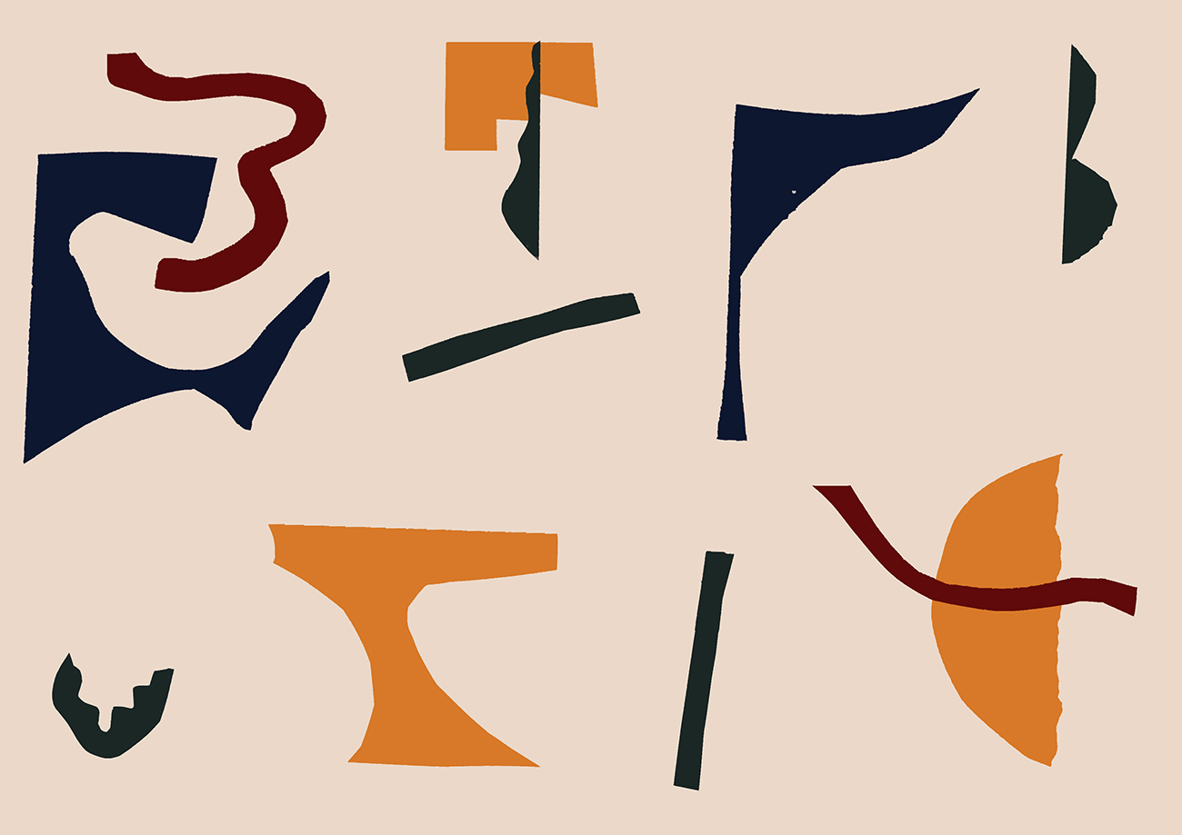
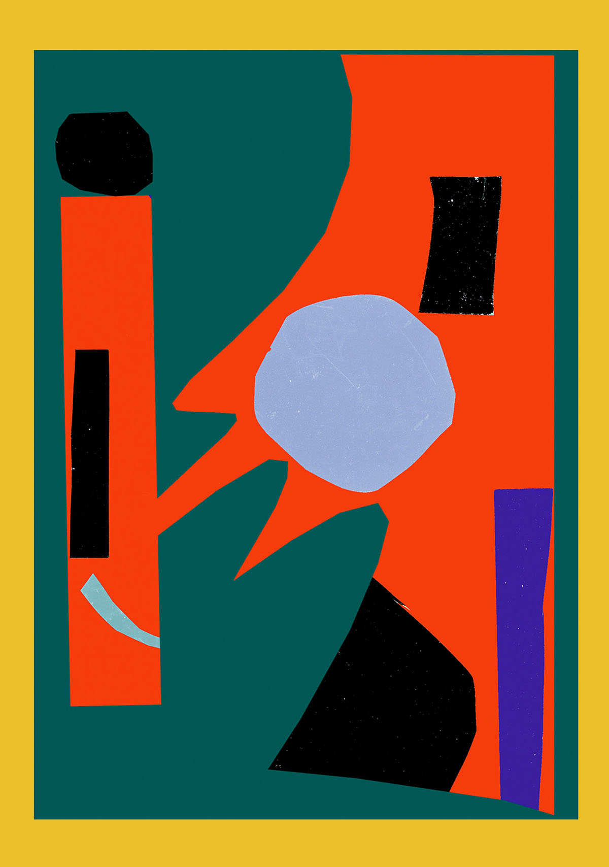
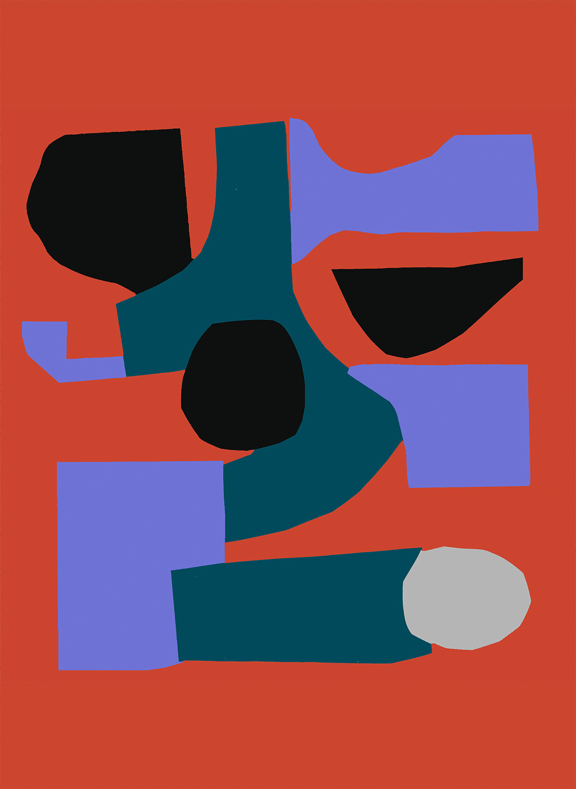
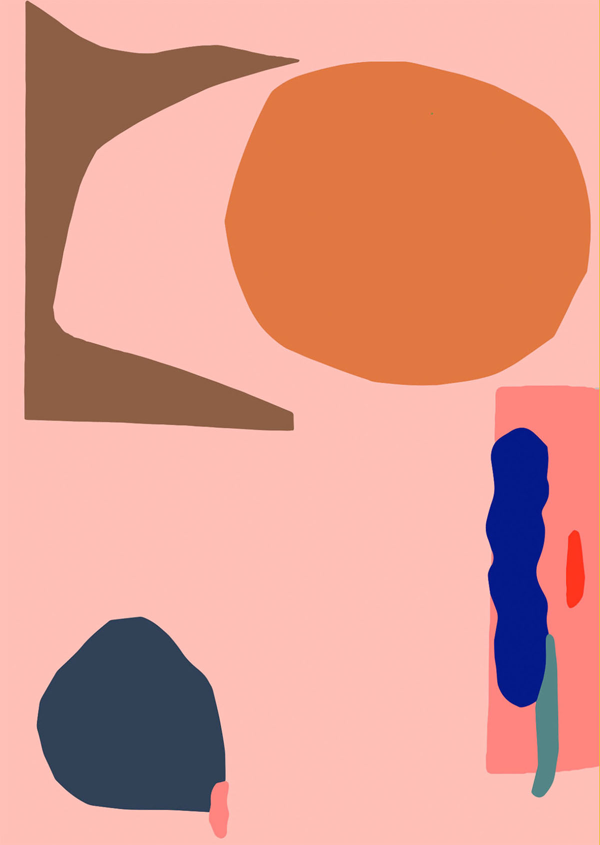
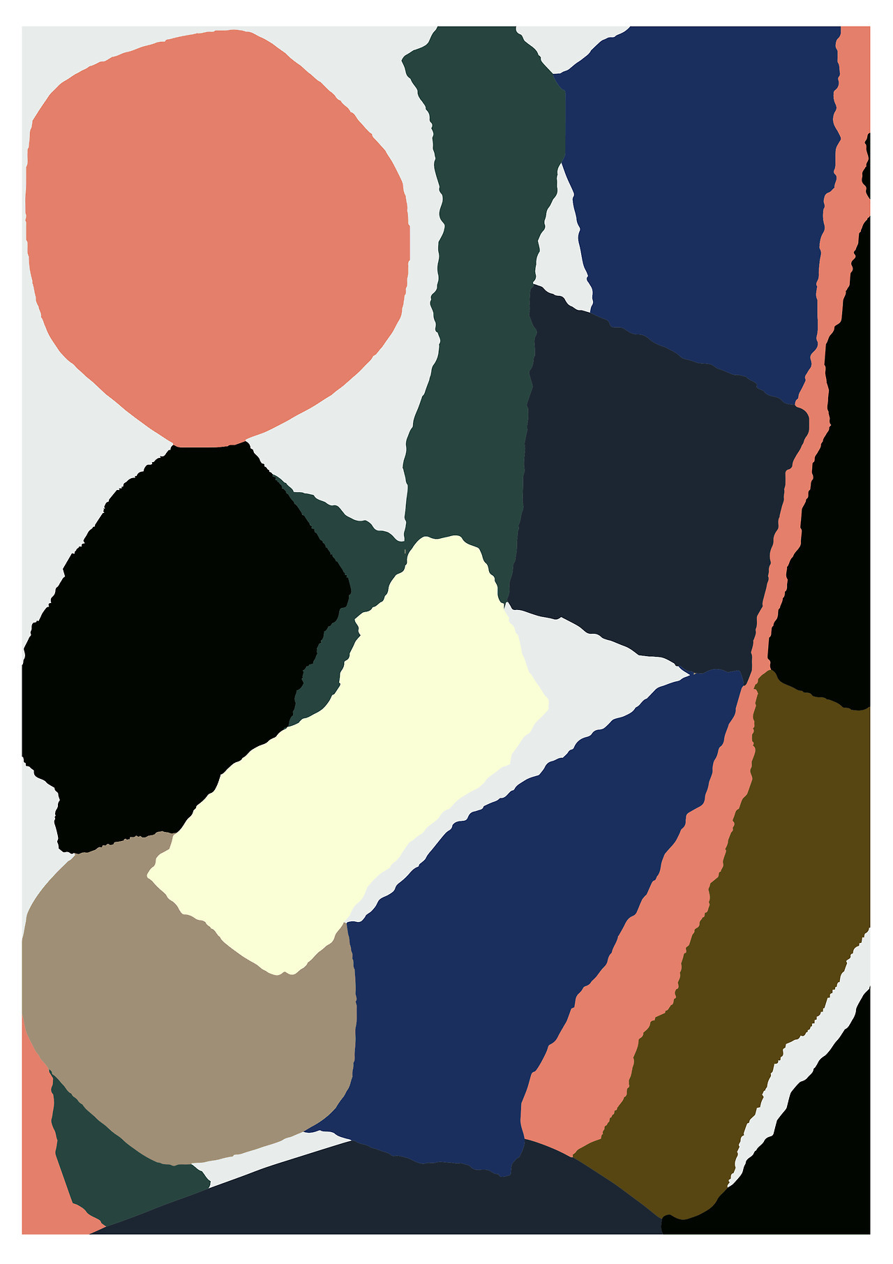
At the moment I am designing window decals and postcards for Christmas season for the Berlin-based sunglasses brand MYKITA. I was asked to do something bold and modern and not to use traditional Christmas symbols. The color palette was quite Christmas-y though, with forest green, candy apple red, mustard, deep aquamarine and baby pink. The end result was abstract collages, forms cut from paper, inspired by fireworks and gift bows.
Tell us one thing that’s been inspiring you lately and why.
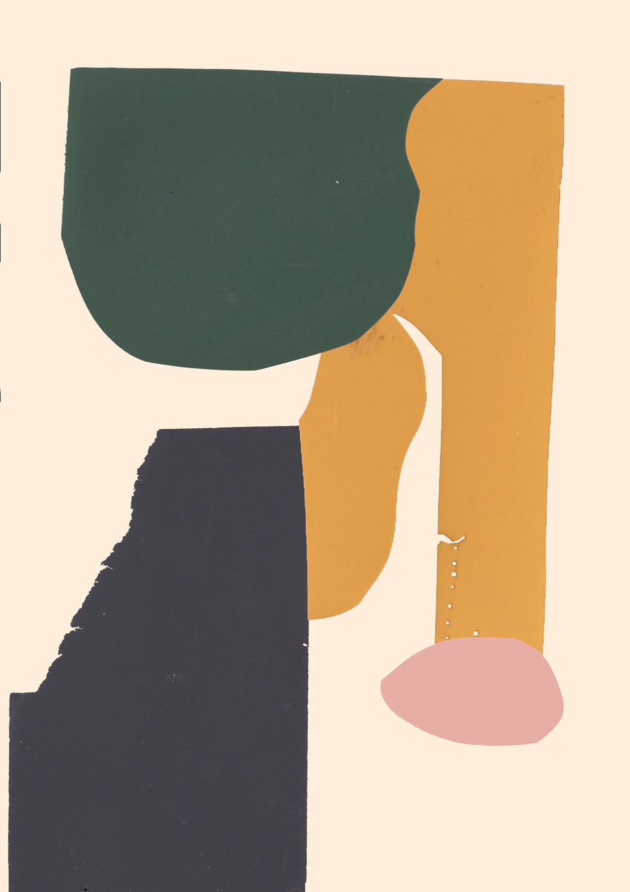
Lately, there has been a turn in my work from bold and bright colors to more earthy tones like mustards and muddy browns. I think I’ve been influenced by the ceramics and clay works that I encounter in Helsinki auctions that I visit regularly. And the movie Hannah and her Sisters. Also work by glass artist Nanny Still has inspired me, especially the forms of her Harlekiini glassware set and her yellow glass objects that get their fluorescent dim from uranium.
What drew you to the world of design?
I pondered between graphic design and textiles, but eventually opted for graphic design as it sounded more all-around. During my studies I became part of graphic design Grmmxi collective, which is known for digital gluttony and a critical attitude towards design. My personal style and Grmmxi’s style are very far away from each other, which I enjoy. During last few years I’ve been lucky to have increasing commissions from all over the world as well as textile design projects, which I hope to do more in the future.
How would you describe your aesthetic?
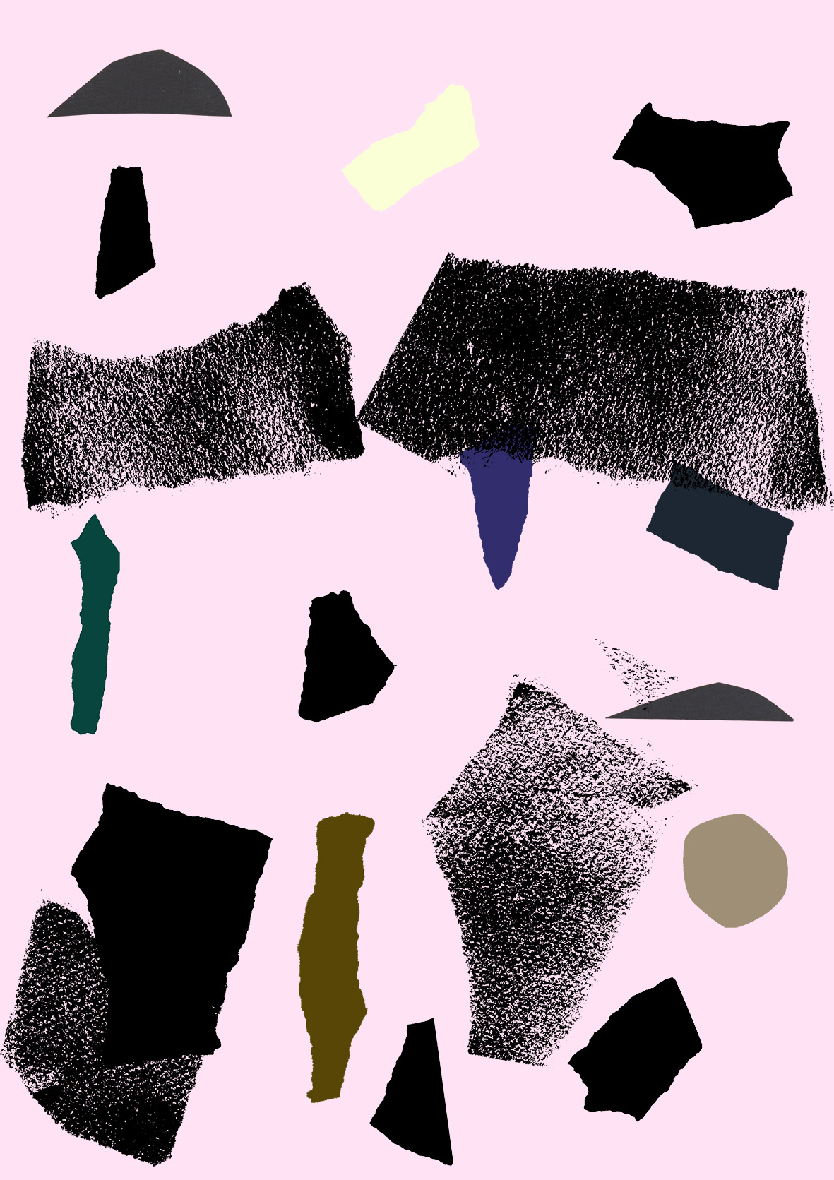
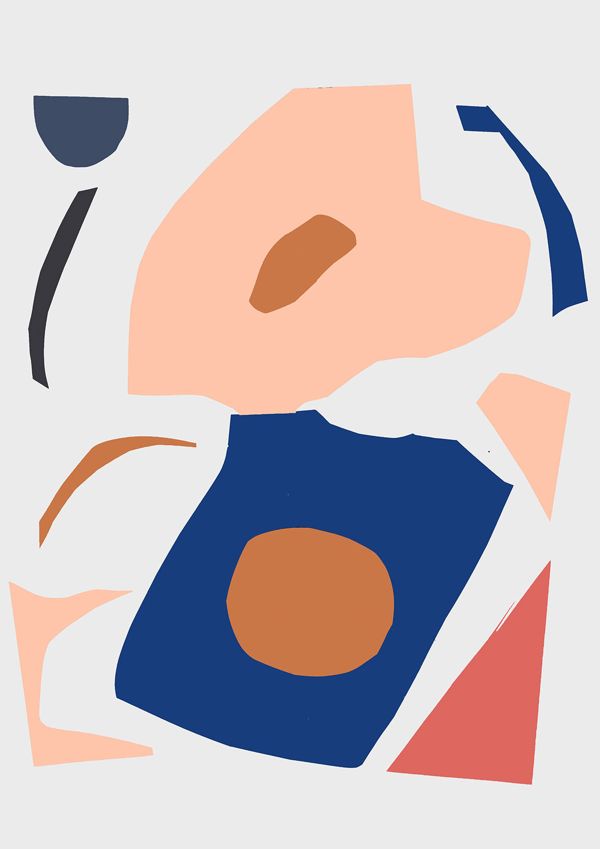
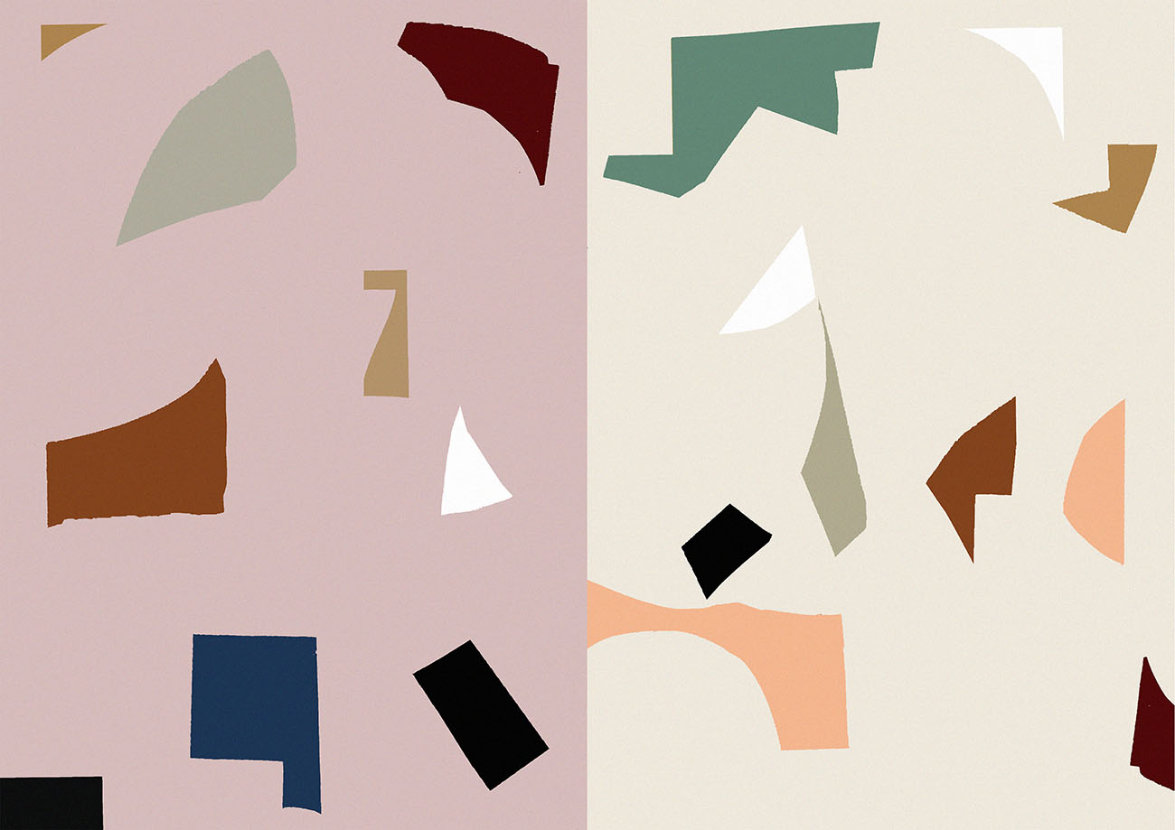
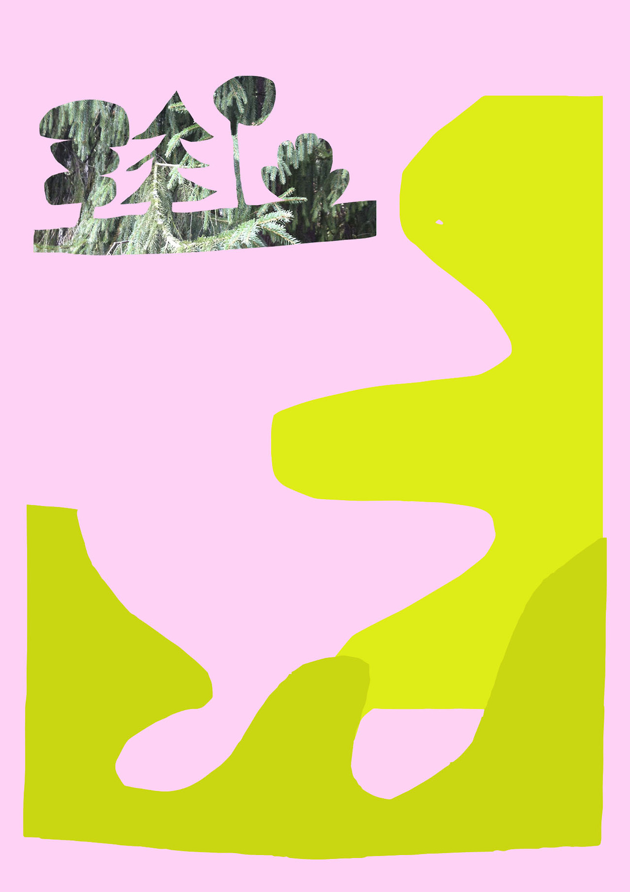
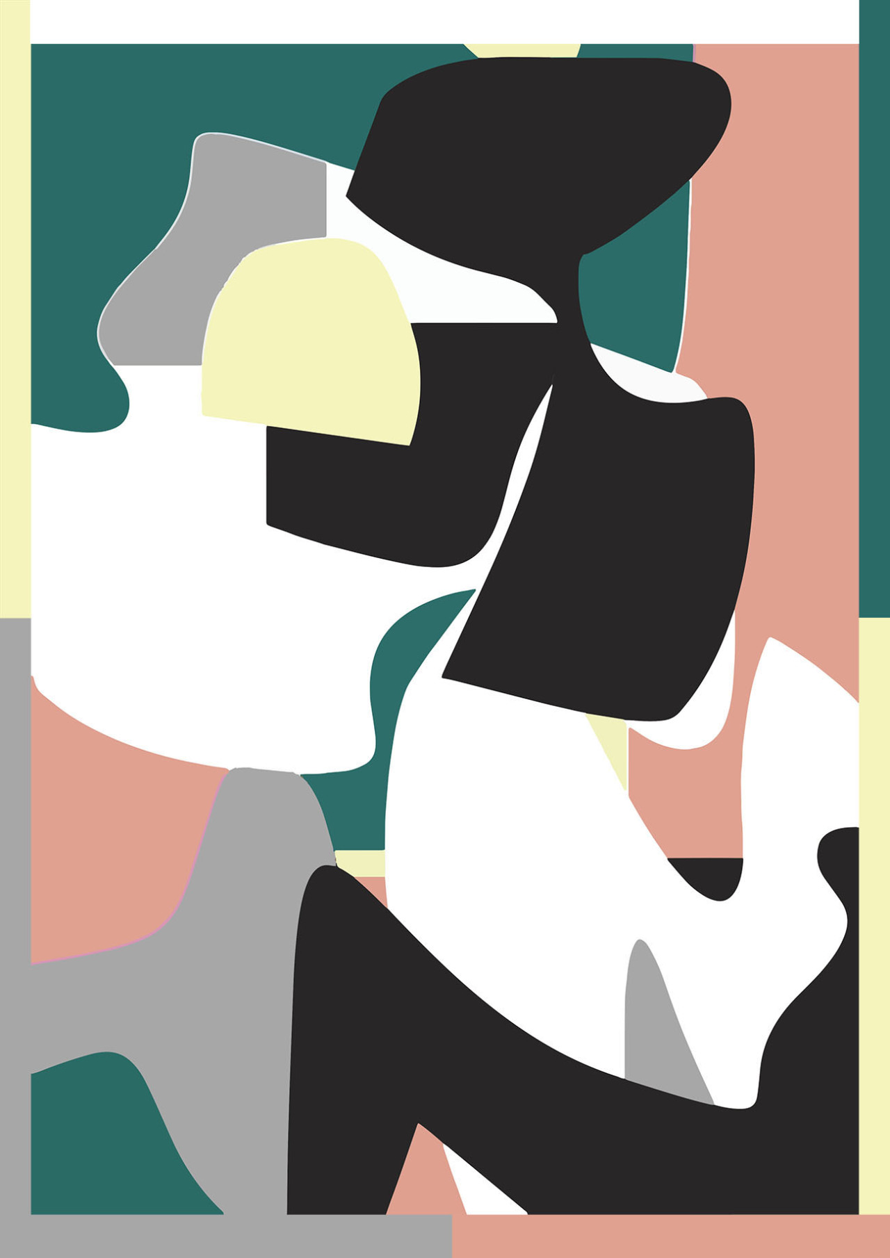
Playful colors and asymmetrical shapes in an arbitrary order. I enjoy working by hand, cutting shapes from colorful papers and arranging them into collages. I have been using this technique since before I began to study design and still find this way of working exciting. Playing with different shapes and forms takes the project to unexpected avenues. Overall I try to keep my distance from the masculinity and functionality of traditional Scandinavian design. My friend once described my work as ”looks like child did it — but didn’t”.
What do you often look at when you begin to design?
The Memphis group is a continuing inspiration, especially textiles by Nathalie du Pasquier. Also artist Eero von Boehm’s fruit still lifes are always close to my heart.