02.27.19
Current Obsession
We Asked 13 Design and Fashion Influencers to Predict Spring’s Biggest Color Trends
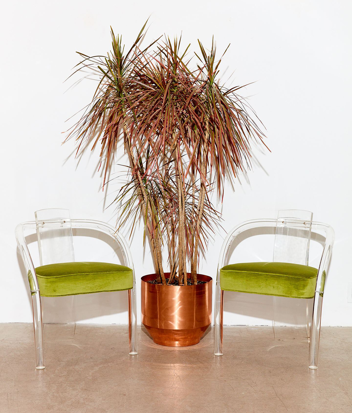
We look at a million images and products each week in a million different colors, but lately, all we can see is brown and lime green, over and over, everywhere. That’s what happens, to people who work in creative fields, when a color suddenly feels like THE color — it lodges itself in your brain temporarily, influencing every eBay search, shopping trip, and Instagram like you make until the next color comes along to replace it. This month, as we were trading links about brown interiors and coveting a pair of $400 lime green sandals, we decided to reach out to 13 of our most trusted design and fashion authorities to find out what hue they were stuck on for spring, then teamed up with Behr — who were responsible for the rainbow of walls in our 2018 OFFSITE show — to suggest the perfect paint color to get the look in your own home. Scroll down to see their picks!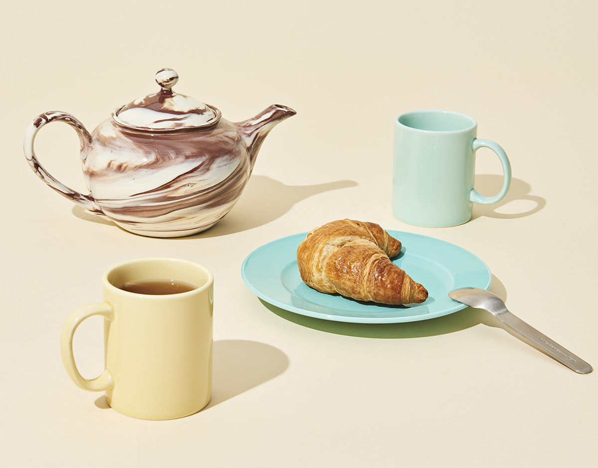
Tekla Severin, photographer
Pale yellow
Behr paint color: Storm Lightning, P310-4
“I love this version of yellow that’s warmer and less attention-seeking, and feels both new yet classic. Like for example on a retro car like the 1955 Alfa Romeo Boano 1900 CSS. I’ve seen pale yellow coming in a major way on accessories and furniture, and it’s slowly moving into interiors too — I’m working on one right now that features it. At the moment HAY probably has the best and most obvious examples, though.”
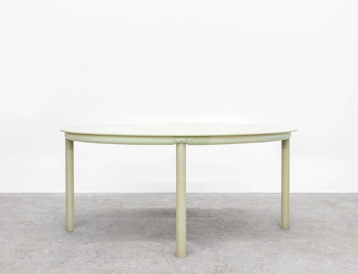
Amaryllis Jacobs, co-founder of Maniera gallery
Glass green
Behr paint color: Anjou Pear, MQ4-41
“We choose the strange green color of Jonathan Muecke’s Fiberglass Table (pictured), or Anne Holtrop’s glass lamp. It’s the natural color of glass and fiberglass. It’s rather undefinable… we love it.”
Fabiana Faria, co-founder of Coming Soon
Peridot
Behr paint color: Lazy Lizard, P350-7
“The color we can’t escape right now is a shade of green that could be called a chartreuse to peridot. It’s a color that goes well with pastels, but also pairs well with deeper, richer jewel-tone colors. And even though it goes well with a lot, it still feels like a statement — and almost a risky choice.”
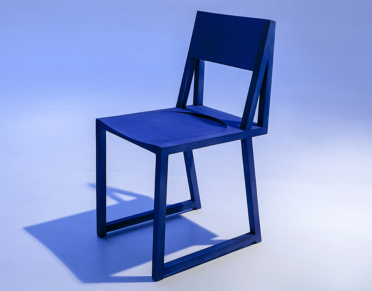
Katy Taplin, co-founder of Dokter and Misses
Ultramarine blue
Behr paint color: Indigo Batik, P530-6
“Originally made by grinding lapis lazuli into a powder, its name comes from the Latin ultramarinus, or ‘beyond the sea,’ because the pigment was imported into Europe from mines in Afghanistan by Italian traders during the 14th and 15th centuries. We love it for its depth and brilliance, and the way it plays well with a range of colors, from avocado green to marshmallow pink.”
Robert Storey, stylist
Yellow
Behr paint color: Unmellow Yellow, P300-7
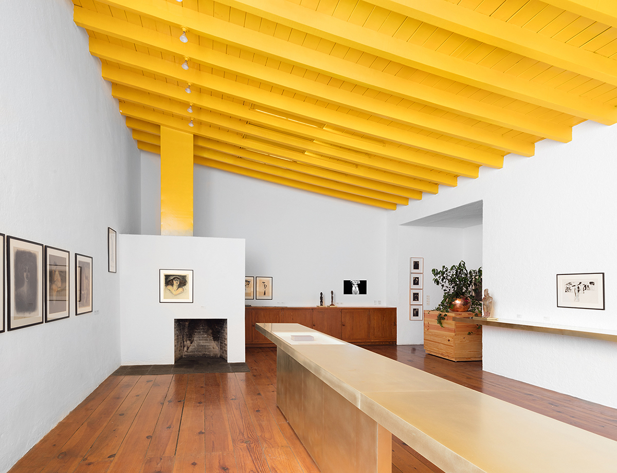
“Yellow reminds me of my grandmother and her sunflowers. As London winter is in full force, with the sun hiding behind the clouds, yellow brings back the sun for me — and I want it everywhere! Yellow everything! I just painted my front door yellow and bought a pair of beautiful reupholstered Finn Juhl chairs to go on a yellow/orange gradient Moroccan rug in my house.”
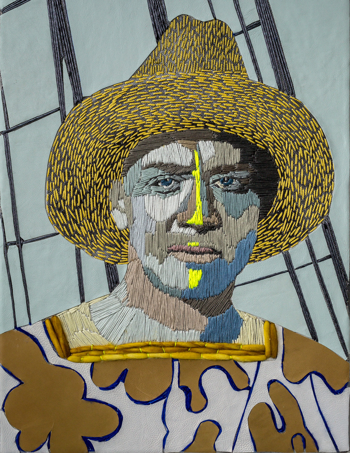
Adi Goodrich, art director
Maroon
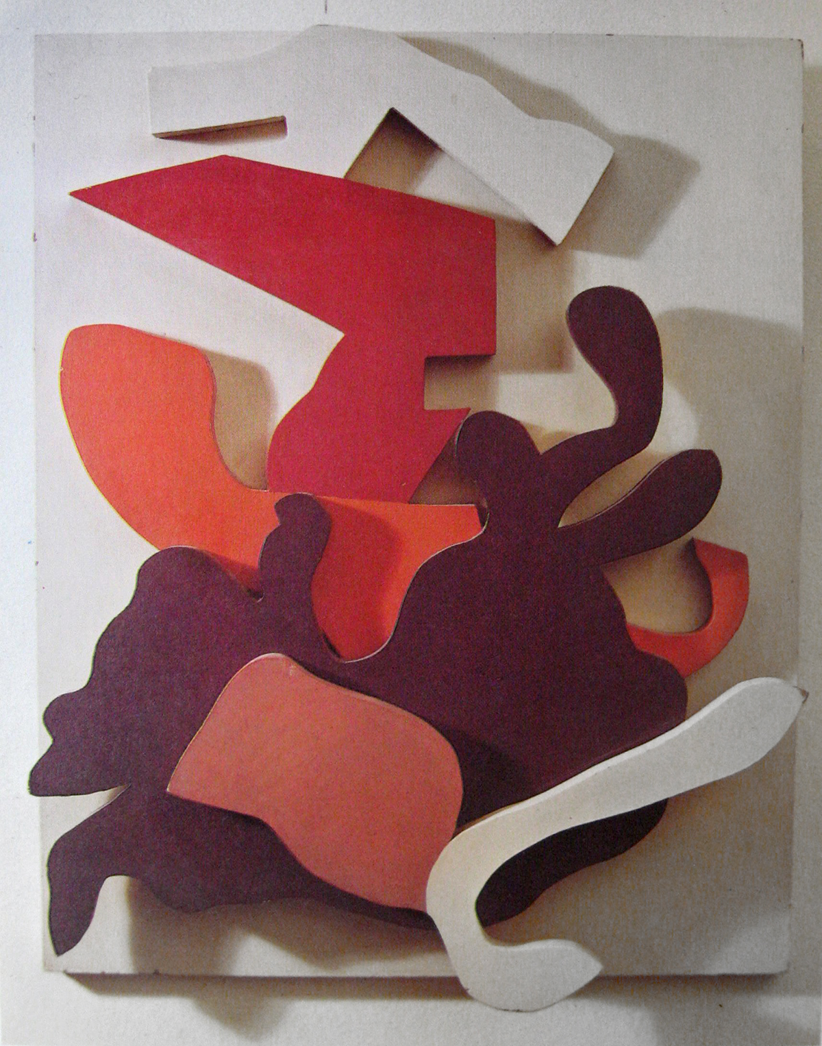
Behr paint color: Chipotle Paste, PPU2-01
“I choose maroon, good old maroon. At times I’ve despised this color. Now, I find a depth, a RICH darkness in this color. Red, mixed with a deep brown; a sophisticated color that does not beg to be heard loudly, but aims to please with just a little bit of excitement… (but not too much). The artwork is Jean Arp’s Hammer Flower.”
Hollister and Porter Hovey, artists and stylists
Chartreuse
Behr paint color: Citronette, HDC-MD-03
“Nothing cuts through a grey dreary day — or a neutral, muddy brown palette — like a bolt of chartreuse. It recently lit up the runway at Valentino couture, Dries Van Noten, and Rochas. We’re particularly obsessed with Dutch artist Preta Wolzak’s multimedia embroideries that celebrate strong women and climate change pioneers. The chartreuse highlights on the skin of her subjects electrify the works and elevate all the colors around them. We’d love to see full homes with her palette.”
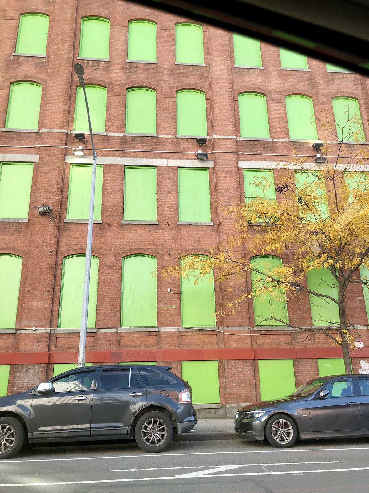
Ellen Van Dusen, founder of Dusen Dusen
Desaturated lime
Behr paint color: Early Spring, MQ4-46
“I’m currently in a green phase — I like all shades but have really been feeling a desaturated lime. It’s fresh and manufactured at the same time, which I think is a very rare balance. I’m obsessed with this building on Flushing Avenue where all the windows are painted over in this green. I take a picture of it every time I pass it; I probably have about 10 identical photos.”
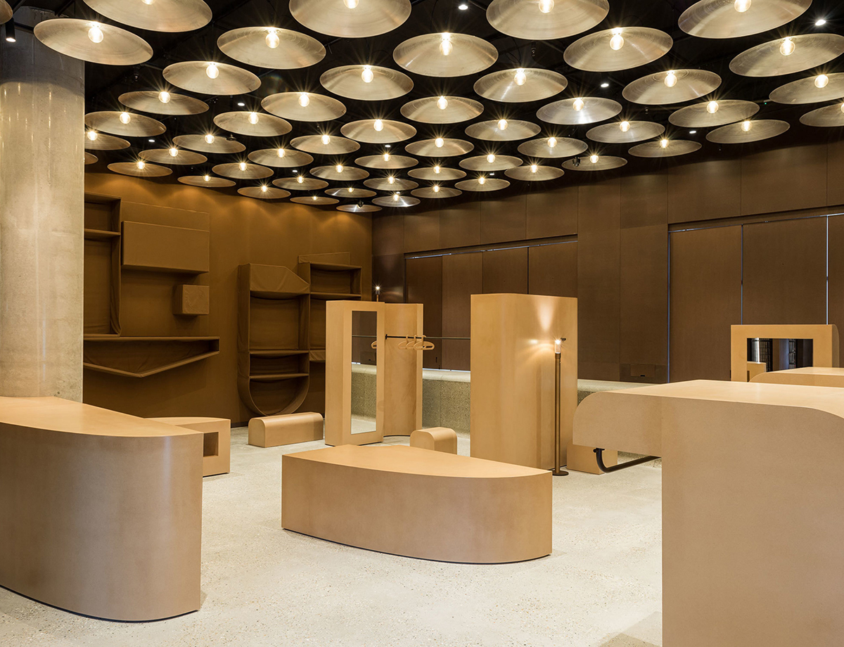
Norma Studio
Brown
Behr paint color: Leather Work, S240-7
“We love brown because of its heft; it grounds space in a way that many other colors cannot. Brown takes on tone easily, skewing reddish or yellowish with just slight introductions of adjacent colors. In spring, brown is so often the color of the stuff that prompts green, the soil or dirt or mud or fertilizer out of which plant life emanates. This 2017 space by Faye Toogood for Carhartt WIP was inspired in part by Imi Knoebel’s ‘Raum 19’ (1968), itself constructed predominantly from satisfyingly brown fiberboard. In working on the remodel of an all-wood Craftsman house here in Los Angeles, we are regularly and happily surrounded by a cocoon of light brown wood.”
Caitlin Mociun, founder of MOCIUN
Mustard yellow
Behr paint color: Midsummer Gold, P280-7
“My favorite color right now is mustard or marigold. I love the way that it pairs with dark woods like walnut. And I love it with oranges, grayed purples, dark greens, and gold. I think it’s wonderful at warming up an interior (with a very ’70s vibe, which I love!), and when I wear it, I think people respond to me in a more friendly and kind way.”
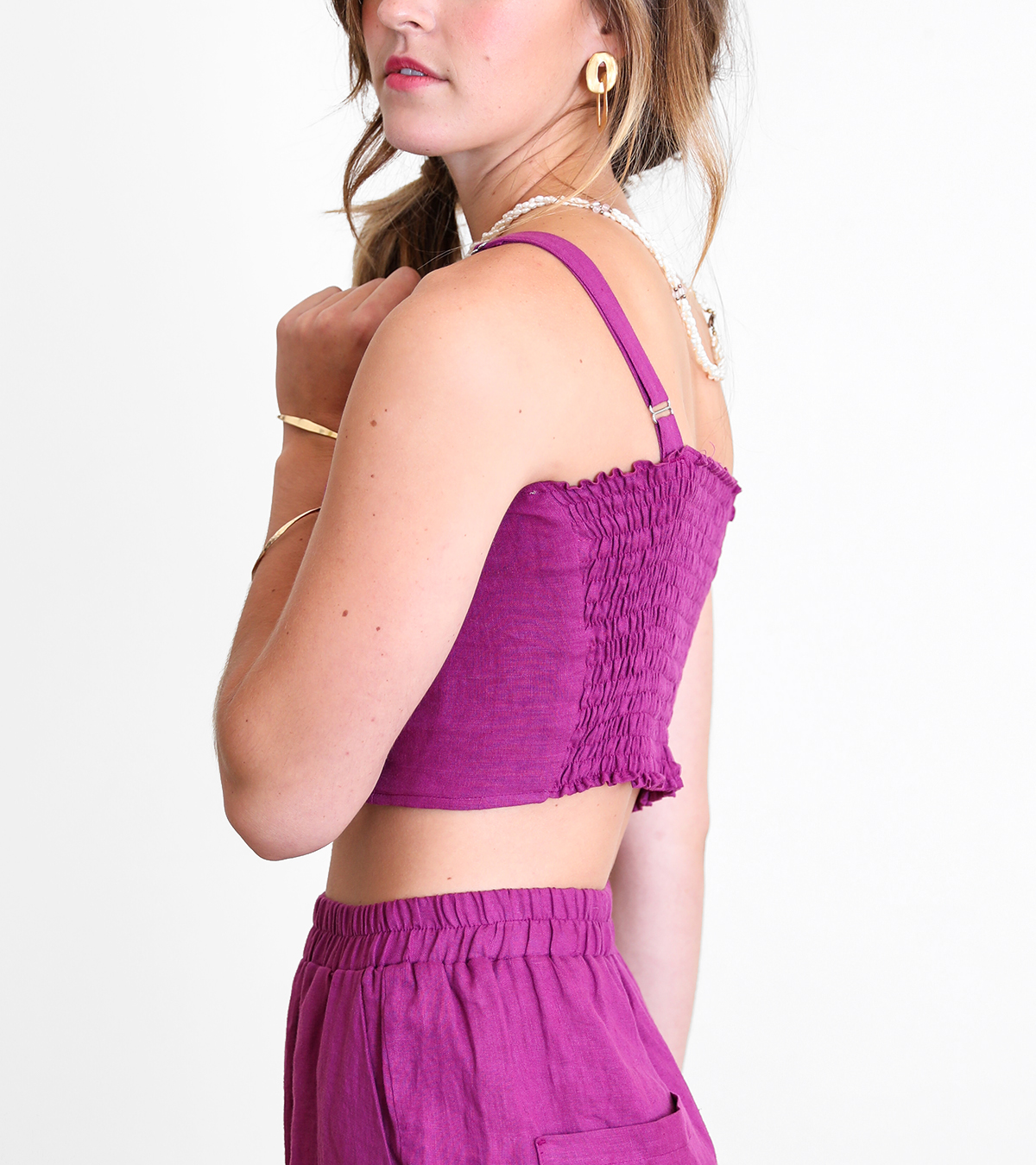
Tomra Palmer, founder of Gravel and Gold
Fuchsia
Behr paint color: Diva Glam, P120-6
“We’re looking forward to incorporating some feel-good fuchsia this spring. It’s the color of electric sunsets and cactus blooms, and it makes us feel warm and revived. Whether it shows up as a pop of color or as the main event, we’ll be seeing a lot of it this season. Fuchsia shows up a lot in our next apparel collection; in our textile print The Picnic and as a vibrant solid in several new styles. We’ve been pleased to see it showing up in the work of some of our favorite artists and designers, as well.”
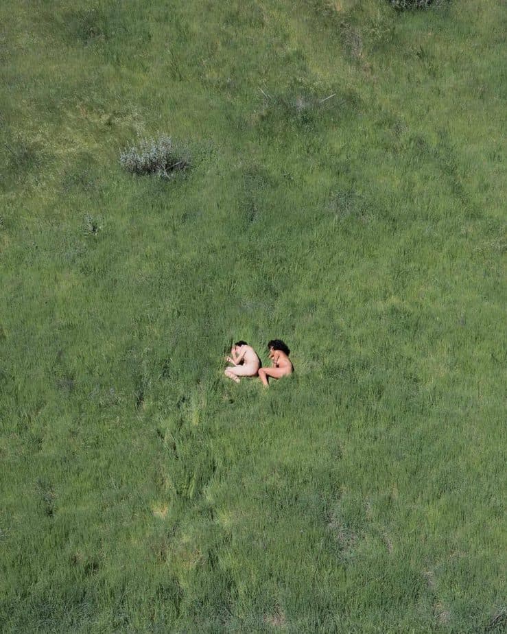
Adele Tetangco, founder of Garmentory
Leafy green
Behr paint color: Snip of Parsley, M370-6
“I’ve been feeling all things deep green lately. There’s something refreshing and cleansing about it, maybe because it’s so closely connected to things that grow — trees, grass, leafy plants — or maybe it’s that the new moon is making me feel refreshed and so in tune with my own personal growth. I’ve recently fallen in love with the photograph ‘In the High Grass’ by Jimmy Marble (pictured). I’m going to buy the print, and let the color liven up the white interior of my home, along with 10 new plants.”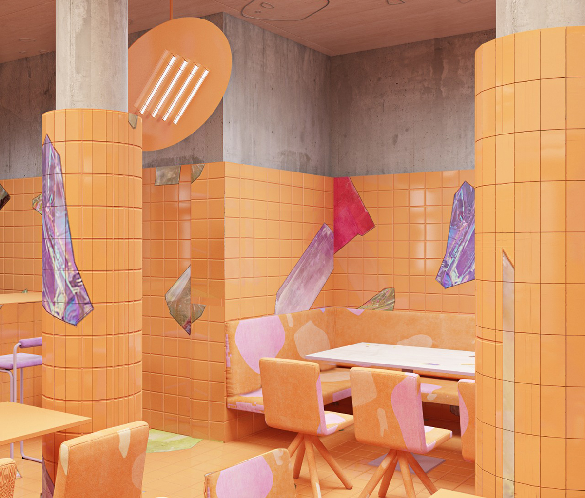
Harry Nuriev, designer
Freeze orange
Behr paint color: Blazing Bonfire, P250-7
“I get inspiration from just being outside and walking around. I find my favorite color palettes when I’m walking in the street or on the sidewalk, where garbage sits. I’m currently in love with this hibiscus color (also known as freeze orange), and I’m going to heavily incorporate it into my next project for Amika Beauty Salon in New York City, as well as a café I’m designing in Berlin.”
This post was sponsored by Behr, but all thoughts and editorial content are our own. Like everything at Sight Unseen, our partner content is carefully curated to make sure it’s of the utmost relevance to our readers. Thank you for supporting the brands that support Sight Unseen.