01.04.13
Sighted
New Jewelry by Nhat-Vu Dang
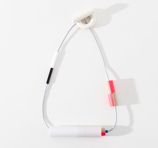
Sometimes we furiously scour the internet or go gallery-hopping for inspiration. But sometimes, new good things just fall into our laps (something for which we’re particularly grateful on these tough days back after a holiday!) Case in point: These amazing new necklaces and brooches by recent Rietveld Academy grad Nhat-Vu Dang, which arrived in our inbox yesterday. It’s no secret we love ourselves a large, mixed-media necklace, and these fit the bill nicely, made from glass, wood, paint, high-density foam, and epoxy (the brooches are foam and steel). The new pieces, on view at the Amsterdam jewelry gallery Rob Koudijs through the end of February, are an extension of Dang’s graduation project: sculptural pieces of jewelry made from gray cardboard, which revealed hidden flashes of color when worn. The new pieces, says curator Ward Schrijver, are even more conceptual but no less covetable.