herman miller x hay eames

How Do You Remix the Most Iconic Furniture of All Time? Give it a Splash of Danish Color

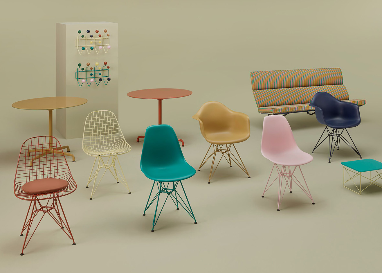
Charles Eames once said that “the details are not the details — they make the product.” So, when Danish design brand HAY had the chance to collaborate with Herman Miller on a refresh of eight classic Eames pieces, we imagine the opportunity was as exciting as it was daunting: How do you take something so iconic and rework the defining nuances in your own style? The Eames Office has rarely let creative liberties be taken with these mid-century designs. But this collaboration, born out of mutual appreciation, features a revitalized color palette and some updated materials that feel utterly contemporary while remaining true to the originals.
More

Gabrielle Teschner on Why Being an Artist Is a Job You Can’t Lose

Gabrielle Teschner’s signature “Sculptures-That-Are-Flat” are made of individually painted planes of muslin that are stitched together, then ironed. Their scale ranges from hand-held (called ‘Minutes’ and measuring around 7x10 inches) to environmental, monolithic (up to 16x14 feet). Employing the symbolic and physical language of architectural forms, spatial relationships, and, often, weather patterns, Teschner explores dichotomies, concepts of strength and softness, force and flow, and phenomena of perception, among other impulses and ‘attractions,’ as she calls them. All of these are a way of understanding and questioning what it is to be in the world.
More

In Wang & Söderstrom’s First Shop Interior, Color Reigns and 3D-Printed Blobs Act as “Jewelry” For the Space

A central player in the explosive rise of Denmark’s boutique fashion scene, Stine Goya's clothes have become more directional in recent seasons, as has its visual identity. Creative duo Wang & Söderström were recently brought on to help translate that new energy into the label’s physical spaces, with two stores whose color-blocked interiors and 3D printed accents echo the brand's palette — and add a dose of serious fun.
More

At Barber Osgerby’s Galerie Kreo Exhibition, An Exploration of the Artisanal and the Industrial

Though the London-based studio Barber Osgerby first started working with Galerie Kreo more than half a decade ago, with their monolithic, shinto shrine–inspired Hakone collection of tables, last month marked their debut as a solo exhibitor. In a show called Signal, on view until April 16, the London duo finally gets to show off their impeccable color sense, which has always seemed a natural fit with Galerie Kreo's aesthetic.
More

Tour the Unbelievable 1930s Color-Blocked Fantasy Interior Hiding Inside a Simple Brick Building in Belgium

The modernist pioneer Jozef Schellekens was the public architect of Turnhout, a Belgian town halfway between Antwerp and Eindhoven, where he worked on schools and city halls. But his best-known and greatest work was his own house, a 1935 rectangular brick-and-glass structure whose simplicity belies the expressiveness of its interior, where Schellekens created a colorful world full of bespoke built-in furniture and other functional and decorative details.
More

Week of September 20, 2021

A weekly Saturday recap to share with you our favorite links, discoveries, exhibitions, and more from the past seven days. This week: tables inspired by California's kidney-shaped pools, Gustaf Westman's latest furniture drop, and a colorful installation by Germans Ermics at last week's Design Miami Basel show (above).
More

With Prints Inspired By Art-Store Pen-Test Doodles, These Curtains Are ‘Free and Wild’

Sarah Illenberger has a talent for recontextualizing everyday items in ways that are deceptively simple, yet at the same time so clever that there's an irresistible kind of magic in it. The same is true for her new collaboration with Danish textile purveyor Kvadrat, a series of three vibrant curtain panels created by scanning the little pads of paper people test pens on in stationery stores — the unremarkable made remarkable, through little more than a flash of creative inspiration and a change in scale.
More
Sean Gerstley ceramics

Sean Gerstley’s Clay Objects Live In A World Of Their Own

Following the trajectory of Delaware-born artist and designer Sean Gerstley’s practice, it feels a bit like he’s always, intentionally, scaling down. “I went to Rhode Island School of Design for architecture before finding ceramics,” he says of his creative coming-of-age. “As a kid I was, and still am, super interested in interior spaces. My ceramic practice started as sculptural work that was kind of about interiors and domestic space in abstract-installation form.”
More

Week of March 29, 2021

A weekly Saturday recap to share with you our favorite links, discoveries, exhibitions, and more from the past seven days. This week: a reissued Memphis classic, a new hotel in Baja, and a cache of European ceramic finds, including this mug with #tinyballs.
More
Note Design Studio office interior

Perhaps More People Would Want to Return to the Office If It Looked Like This

There's been copious hand-wringing since the pandemic began about how people have adjusted to working from home, how WFH might actually be preferable to returning to the office, and what it all means. We would venture to guess that more people would be willing to return to their offices if they looked like this, a new London interior by Note Design Studio for The Office Group.
More

Justin Morin’s Silk Draperies Reference Pop Culture and Natural Phenomena in Equal Measure

Justin Morin’s printed silk installations take many forms — some unfurl dramatically against an expansive gallery wall; others are cinched and pleated like couture; still others are knotted, tied, looped, bunched, gathered, or, simply hang listlessly like a flag. Morin’s specific visual vocabulary, developed over the course of a decade since he created his first printed silk work in 2011, proposes that anything and everything in our information-dense and visually overwrought world can be unraveled and represented in sensual, gradient silk.
More