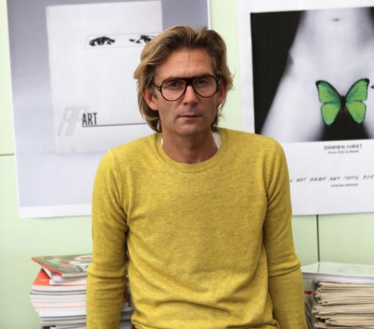
Axel Peemöller, the Mediterranean Sea

On gloomy New York days like today, we begin to think that Axel Peemöller might be on to something. The German-born graphic designer studied in Düsseldorf, moved to California, and eventually settled in Melbourne, but a few years ago he gave it all up for a studio at sea. Aboard a 40-foot-long 1974 Trintella — which he purchased off eBay from a Barcelona woman for a song — Peemöller lives with his girlfriend and works remotely for clients and studios, docking when he needs to visit a colleague or use power to light a photo, and flying clients in to whichever port he’s landed. And while it’s not to say that life at sea is never gloomy, Peemöller finds that a fluid perch makes for a clearer head: “To do creative work, you need to have a balance between life and work and fun,” he says. “Here I can go diving, watch dolphins, catch octopus: I guess the not-working days are like holidays for other people, but for me it’s my usual life.”
More

New Friends, Weavers

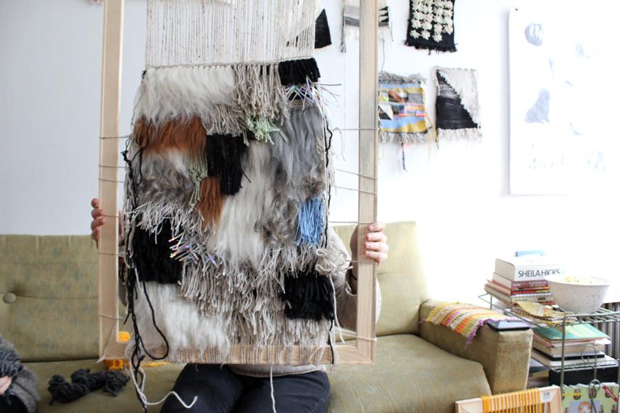
Back in 2009, Kelly Rakowski was a graphic designer at Todd Oldham in New York, and Alex Segreti was living in Philadelphia, working in the textiles department at Urban Outfitters. In her free time, Rakowski ran a blog called Nothing is New, for which she scoured image archives on the web, unearthing old exhibition catalogs, classic spreads from magazines like Domus, and vintage ceramics and textiles. Segreti had a blog as well, called Weird Friends, where she documented similar obsessions: craft, pattern, art, ceramics, textiles, and dogs. The two had never met, but when Rakowski emailed Segreti on a whim one day to tell her how much she liked her site, they began to bond; when both expressed a desire to learn how to weave by hand, they decided to embark on an experiment. They shipped each other yarn, so they’d have the same palette to work from, and a few months later Rakowski made the trip to Philly. They had dinner, retired to Segreti’s apartment, and showed each other their weavings. “They kind of looked the same,” Rakowski remembers. “It was crazy. Now we always come up with the idea together but work separately, and when we meet, we forget who did what because everything magically works.” The two eventually made their design partnership official, merging the names of their online identities into a fitting moniker: New Friends.
More

Kent Fonn Skåre, Artist and Graphic Designer

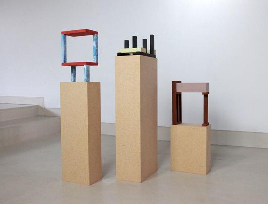
Being that he's still a student at Konstfack in Stockholm, you've probably never heard of Norwegian artist and graphic designer Kent Fonn Skåre. But his work, even at first glance, is ridiculously easy to love: It's got a heavy focus on materials, lots of marble, and a whiff of Memphis — yes, the three "M"s, the golden trifecta of the current avant-garde, or at least the little corner of it that we're obsessed with, which also includes folks like Clemence Seilles and Jens Praet. We discovered Fonn Skåre via a fleeting image on Pinterest, but found surprisingly little information on him and the ideas behind his work, so we did what we do best, harassing the poor man until we were able to tease out a bit of insight into his practice. Check out the interview and accompanying photos here, then bookmark Fonn Skåre's Flickr feed to browse more of his graphic design work and follow his future projects.
More

With Martin Lorenz, Co-Editor of Pretty Ugly

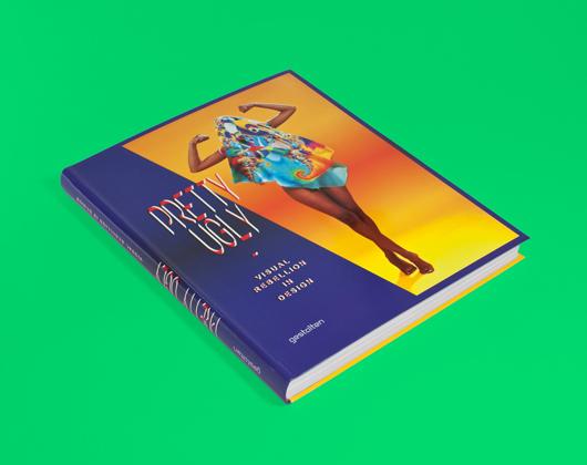
There are moments, when leafing through the pages of Gestalten's latest opus Pretty Ugly, that you'll feel a little perplexed. Not by the stretched and layered type that practitioners of the New Ugly graphics movement use to obscure the messages contained in their work, nor by the fact that brands and organizations are trying to sell themselves with these deliberately obtuse images. What you'll find so confusing, rather, is just how beautiful most of the projects appear, despite their creators' best attempts at visual rebellion — a fact acknowledged by the book's editors, Lupi Asensio and Martin Lorenz of the Barcelona-based firm twopoints.net, in its oxymoronic title.
More

Lars Beller Fjetland on It’s Nice That

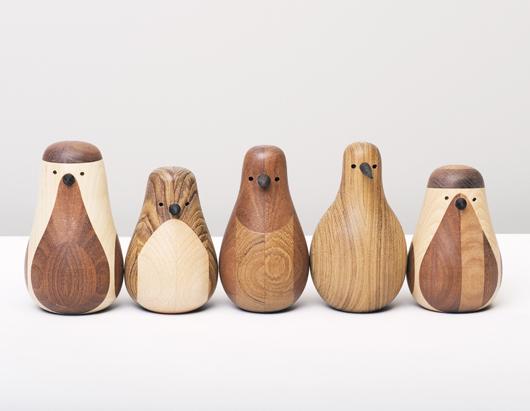
We've had printed editions of online magazines on our minds lately, and now comes the news that one of our favorites, It's Nice That, will release its 8th issue at the end of this month. Their new edition will feature all sorts of design-world greats like Paula Scher and John Pawson, but their website continues to introduce us to exciting unknowns, like their recent feature on Norwegian designer Lars Beller Fjetland, which we're reposting today. Fjetland hasn't even graduated yet from the Bergen National Academy of Arts, but he's already amassed a first-rate portfolio of projects that often use found objects or waste materials, like cork and leather, as their jumping-off points. His latest collection is a series of hand-turned wooden birds made from reclaimed Norwegian wood. In this interview with It's Nice That, the designer explains how the project came to be; we were intrigued enough that we asked him to share with us some process photos as well.
More

Paper View

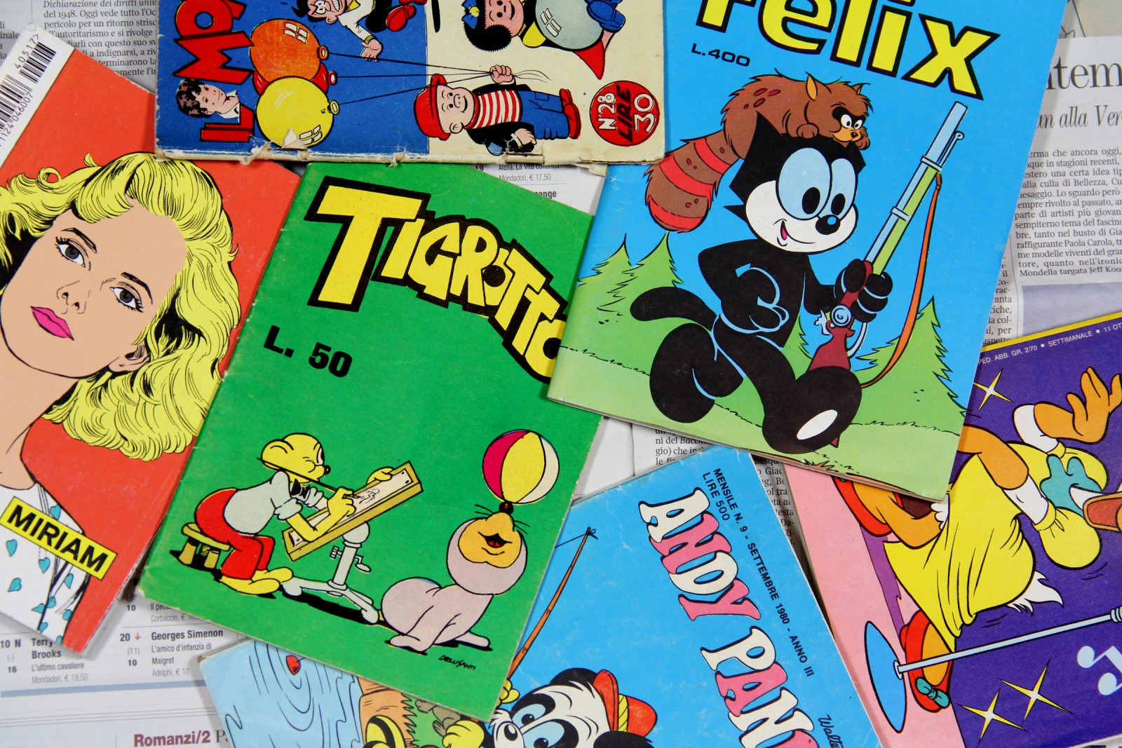
The launch of the first-ever Sight Unseen book — debuting in April as part of the Karlsson’s Vodka Unfiltered project — is just around the corner. This week, we’re posting sneak peek images and asking our readers to guess who the subject of each photograph might be. Here’s a quote from today’s featured designer, an illustrator and University of the Arts grad who spent some formative years at Fabrica, where he became inspired by these vintage Italian comics: “There is a fun, visually approachable quality to my work but ultimately I try to convey some darkness or satirical angle. If it’s too nice, then it’s boring for me.”
More

Found Objects at RoAndCo

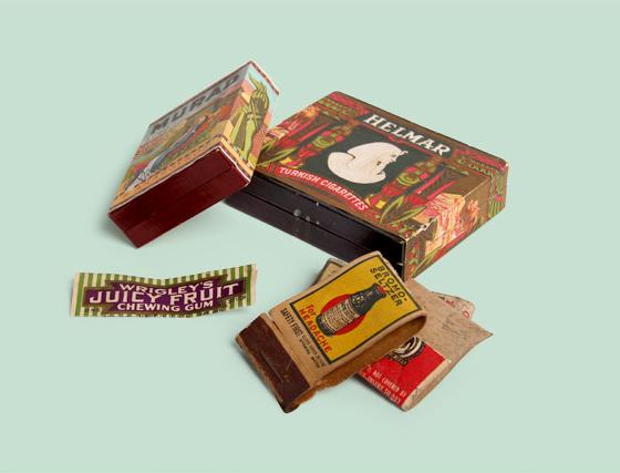
Sighted today on the blog of RoAndCo — the up-and-coming, ADC-award-winning design agency run by our friend Roanne Adams — a beautifully presented series of old treasures discovered under a client's floorboards. Writes Adams: "All too often our NYC paced lifestyles make it easy to forget that the buildings we walk by and work in every day have stories to tell. Our friends and clients at Projective Space recently found some treasures hidden under floorboards while renovating their new Lower East Side space, and we thought they were too beautiful to not share! We did a little research and found that both cigarette boxes date back to 1910 and feature artwork inspired by Owen Jones, a London-born architect who reproduced the ornate designs he found while traveling in Asia, the Middle East, North Africa, and India. We thought it was pretty funny that the design for the Turkish Cigarettes packaging clearly took its style cues from Egypt. The Juicy Fruit wrapper and matchbooks all date back to the 1920s. One of the matchbooks actually has an ad for life insurance: $5,000 worth of coverage for 5 bucks!" Click through for more images.
More

Andy Beach of Reference Library in 01 Magazine

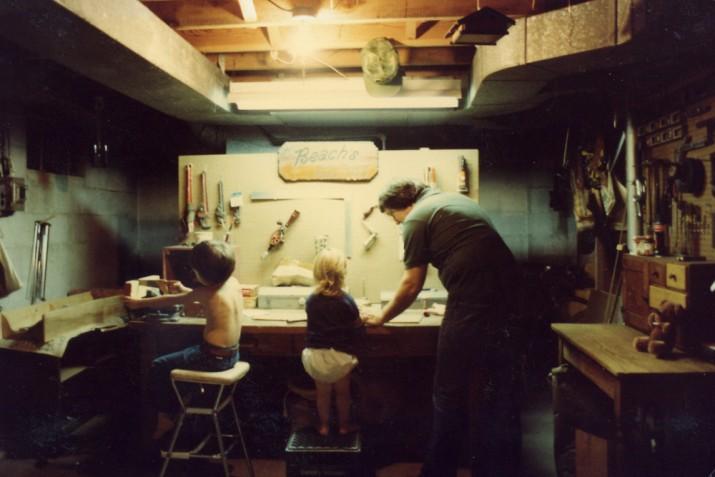
Sighted in the seventh issue of the online journal 01 Magazine, an interview with Philly-based blogger extraordinaire Andy Beach. Despite having never met the two women behind the Vancouver-based publication, we feel a certain kinship with them: They meander across disciplines, they cover folks who are near and dear to us like ConfettiSystem and ROLU, and they even have a healthy appreciation for the absurd. But when we saw the story about Beach, in particular, we knew we had to repost it, as we've been trying to weasel our way into the man's home ever since we first met him in Milan two years ago, when he did a pop-up shop with Apartamento and sold us this book from his personal collection. For now, we'll settle for excerpting a Q+A that shines a light on the goings-on behind the scenes of his cult blog Reference Library, including the avalanche of inspiration binders that started it all
More

David Saunders of David David, Fashion Designer and Artist

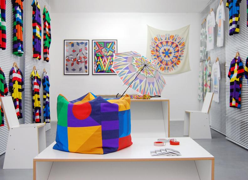
If you were somehow unfamiliar enough with the London fashion scene that you’d never encountered the work of David David, née David Saunders, a primer in his background certainly wouldn’t help much. Saunders is best known for a whirlwind rise to prominence that began with a job as head sculptor in YBA Tracey Emin’s studio, stumbled into a fashion line that won him a coveted spot in London’s Fashion East runway show, and now entails an obligatory mention of fans like Kanye West, Agyness Deyn, and M.I.A. each time it comes up in conversation. It’s not that it’s much ado about nothing — we were huge admirers of Saunders’s line by the time we ended up in his flat last February, a block away from our favorite London boutique Darkroom — but all that star power conveys very little about a charmingly blithe collection consisting of a handful of wearable silhouettes festooned with hand-drawn kaleidoscopic graphics, except maybe how he ended up with it in the first place.
More

Digital Artist and Scientist Krist Wood on Rhizome.org

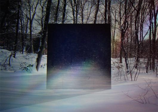
Any first-time visitor to the internet-art blog Computers Club could be forgiven for getting lost in the meandering stream of digital illustrations, photo manipulations, and animated gifs created by its close-knit group of international contributors. With no real nav bar or About Us page to use as a guide, either, they would even be justified in wondering what, exactly, it all means. And if, like I did back in 2009, this visitor decided to trace the site all the way to its founder, they would discover an even bigger enigma: Krist Wood, a doctor in Yale University's Department of Molecular, Cellular and Developmental Biology who spends his days studying the protein nanomotors responsible for cell motion, and who calls his scientific work "part of my art practice." Indeed, I found Wood so intriguing — and Computers Club so freakishly addictive — that I contacted him two years ago, when Sight Unseen was just about to launch, in the hopes that I could feature both him and his cohorts on the site somehow. And yet without a clear understanding of how to capture such a disparate and mysterious group, I let the ball drop, which is why I was so pleased to see an interview with Wood published at the always-thought-provoking Rhizome blog earlier this week, one that actually sheds light on Wood's oeuvre. It's partially excerpted here.
More

Mike Meiré, Art Director

History isn't always kind to guys like Mike Meiré — become the poster child for a rebellious and polarizing creative movement like the "New Ugly," which rocked the graphic design world in 2007 with its stretched typography and defiantly awkward layouts, and you're practically begging for an expiration date. To achieve the kind of unqualified success that Meiré has since he started his career in Cologne 25 years ago demands two basic personal attributes: The ability to talk about even your most controversial work in a straightforward, no-bullshit manner, which helps people believe in what you're doing, and the talent to excel at a diverse range of projects just in case they don't. What you learn from reading interviews with Meiré, or in our case, sitting across from him at a dinner party hosted by Apartamento magazine during the Milan Furniture Fair, is that he's driven far less by the desire to make a statement than by an earnest ambition to offer people products that are different from all the other ones already available to them. You also realize that the same guy who made his name art-directing publications like Brand Eins and 032c — and who most recently helped Russian doyenne Dasha Zhukova launch her latest project, the art and fashion magazine Garage — is just as likely to spend his time hanging pheasants inside modern farmhouse installations for Dornbracht, or collecting and exhibiting street food carts from around the world. In other words, even with the hype surrounding 032c having long abated, and that of Garage conspicuously angling to take its place, we still think Meiré's a fundamentally interesting guy, so we asked him to share some of his favorite tools and inspirations below.
More

Jason Schwartzman interviews Andrew Kuo for Bad Day #11

In the realm of magazine-making, photographer Eva Michon and creative director Colin Bergh could be considered populist heroes. Whenever they begin an issue of their four-year-old side project Bad Day Magazine, they make a wish list full of dozens of potential subjects they happen to be interested in at the moment — Sofia Coppola, Glenn O'Brien, Ariel Pink — and then, except for one fateful attempt to woo Nicki Minaj, they actually manage to go out and persuade those disparate personalities to appear together among their monochromatic pages. The pair have gotten so good at the curatorial hunt that when Michon, who serves as editor, agreed to let us reprint an article from the recently released Bad Day Issue #11, we were spoiled for choice: There were interviews with Sight Unseen favorites Martino Gamper and Tauba Auerbach, both of whom we're planning to feature on our own in the near future, plus stories on Mike Mills, David Shrigley, Tomi Ungerer, and David Shearer. But ultimately we settled on the curious multidisciplinary dialogue between the actor Jason Schwartzman and the New York artist Andrew Kuo, who meander between topics like music, color-mixing, hangovers, and what it would be like if they looked like Jesus.
More