Stephan Jaklitsch, architect

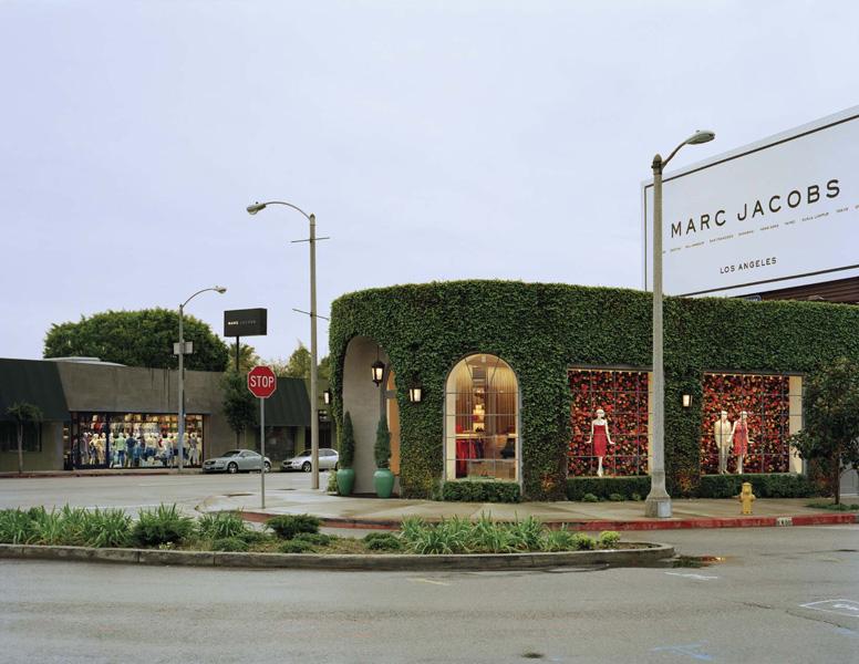
In the world of retail, there is a tendency towards sameness, a familiarity designed to lull shoppers into a complacent state in which they might begin to feel it’s okay to spend a lot of money. A Zara, anywhere in the world, is immediately identifiable by its gold-toned lighting and rows of shoes lined up haphazardly underneath the clothes; a Marni boutique leaves its mark with swooping stainless-steel rails and elliptical cutouts in the ceilings. As a brand, Marc Jacobs has never been about uniformity, though — this is a fashion designer, after all, who’s gone from the most infamous collection of grunge in history to the luxurious heights of Louis Vuitton — so why should his stores? “There are certain iconic elements that are repeated,” admits Stephan Jaklitsch, the New York–based architect who’s been responsible for Jacobs's bricks-and-mortar for more than 10 years, “but in general, each store relates to its own specific building type, to the city’s specific urban condition, and to the architecture of the individual space. Although they’re identifiably connected, every one of them has a particular feel.”
More

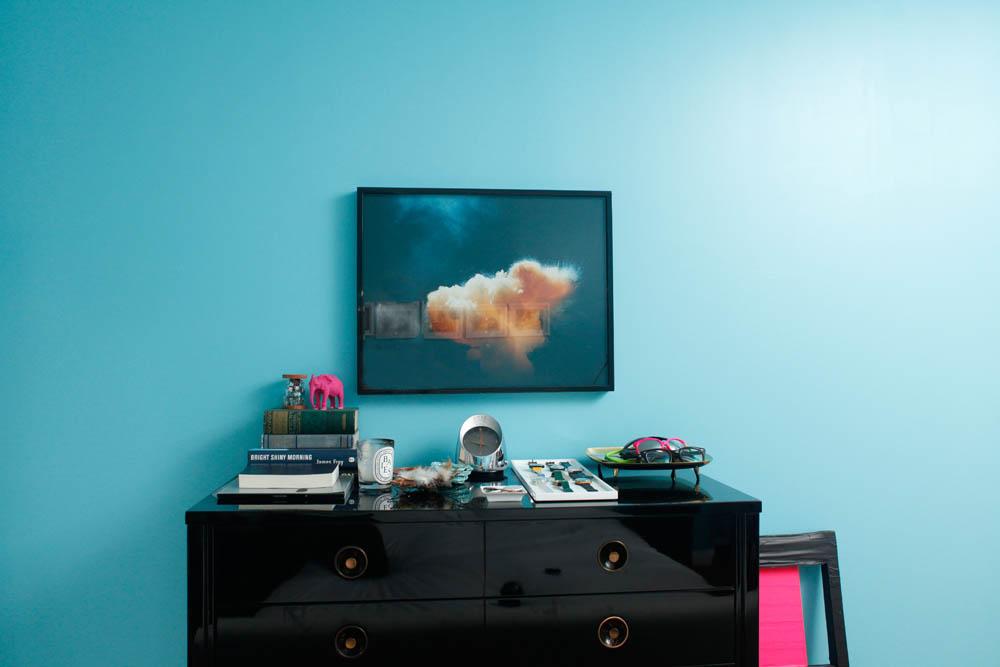
Rafael de Cardenas, Interior Designer

If style is a sore subject for the up-and-coming interior designer Rafael de Cardenas, who bristles at the suggestion that he might have one, a therapist would likely lay the blame on his mother. A Polish-Swiss former fashion PR agent — who with his Cuban father moved the family to New York City when de Cardenas was six — she was constantly redecorating, stripping the house bare every time her tastes changed. “She’s into one thing carried throughout, she can’t mix and match,” says de Cardenas. “So once it’s something new, everything’s gotta go. There was an Armani Casa phase, and now it’s all Native American, with blankets and sand-covered vases from Taos. It scared me away from design to a degree.” After spending most of his childhood wanting to be a doctor, he eventually went to RISD to study fashion and painting, and ended up heading the menswear department at Calvin Klein for three years. But although he admits that interiors were something he never put any thought into back then, design began exerting its slow pull.
More

Rich Brilliant Willing, Furniture Designers

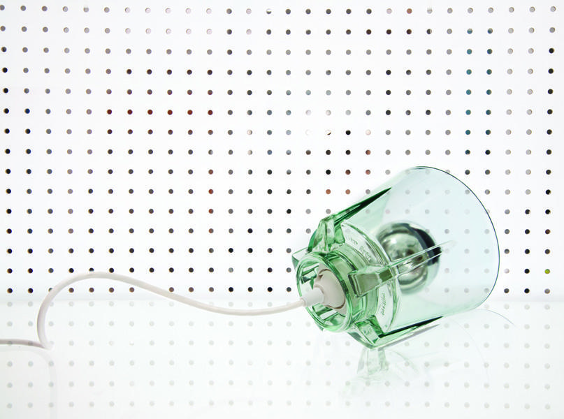
If there’s one thing that’s defined a Rich, Brilliant, Willing product since the studio’s three members graduated from RISD in 2007 and banded together to make furniture, it’s the idea of the mash-up. In most of their pieces, seemingly disparate materials and odd colors come together in a sort of joyful schizophrenia — a lamp with differently colored, awkwardly placed dowel legs, a wood-and-metal coat rack with copper, steel, and plastic pegs, and even a candle holder crowded with tapers, birthday candles, and fat, number-shaped votives. But a funny thing happened this spring: The trio released a series of cast-glass pendant lights with the Los Angeles–based design company Artecnica that were notable not only for their pretty, industrial aesthetic but for their adherence to a single, monochromatic material. “It’s unusual for any object to made of a single part these days,” says Theo Richardson, who with Charles Brill and Alex Williams makes up the trio, their surnames forming the basis for the studio's cheeky name. “Most of the time, things are glued together, screwed together. But for us, this was going from assemblage work to something that’s made of a single piece.”
More

Harry Allen, Product Designer

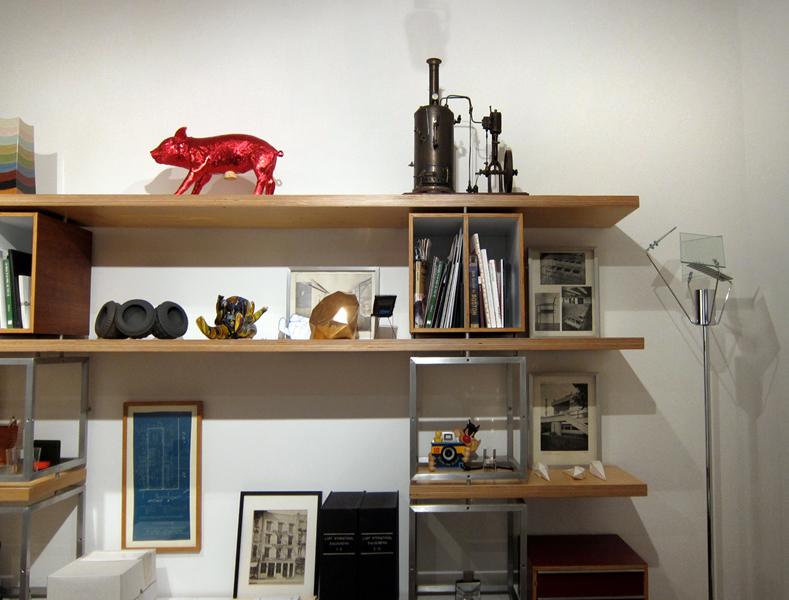
Harry Allen is a happening guy. From his design studio in New York’s East Village, he makes ironic banana bowls and pig banks for Areaware and is one of only three American designers working with the hip Italian furniture brand Skitsch, along with Jason Miller and Todd Bracher. His new Bang perfume bottle is all over the ad pages of major fashion magazines, strategically positioned atop a nude Marc Jacobs, and the skateboarding store Supreme owes its interiors to him. Allen is so evergreen, in fact, that it’s easy to forget the most basic fact of his biography: He’s been doing this for nearly 20 years. “Everyone treats me like I’m some kid, but I’ve been around for a long time,” he says. “When I started in 1993, there was no Moss, no Wallpaper. Philippe Starck was king, and everything was shaped like a horn. I looked at Europe and thought: That’s what I want to be, I want to be like Starck. I want to be Starck.” But while he did follow that model when he set up his own design studio in 1993 — as opposed to joining a corporation like most of his American peers were doing at the time — part of the reason Allen’s presence in the design world always feels so fresh is that unlike Starck, he's constantly reinvented himself along the way.
More

Jill Singer, Co-Editor

In honor of Sight Unseen's first anniversary, we, the editors, decided to turn the lens on ourselves, revealing what inspires us as writers about and champions of design and art. If you're an especially devoted reader of Sight Unseen, you might have noticed that Monica — who spent her childhood putting bugs under a kiddie microscope and was at the head of her high-school calculus class — often tends towards subjects inspired by geometry and science, while Jill — whose love for color and pattern likely began with an uncommonly large novelty earring collection — favors maximalist, throw-every-color-at-the-wall-and-see-if-it-sticks types. We were interested to see how those formative experiences would play out in a documention of our own reference points. Here's a closer look at eight of Jill's editor's picks.
More

Monica Khemsurov, Co-Editor

In honor of Sight Unseen's first anniversary, we, the editors, decided to turn the lens on ourselves, revealing what inspires us as writers about and champions of design and art. If you're an especially devoted reader of Sight Unseen, you might have noticed that Monica — who spent her childhood putting bugs under a kiddie microscope and was at the head of her high-school calculus class — often tends towards subjects inspired by geometry and science, while Jill — whose love for color and pattern likely began with an uncommonly large novelty earring collection — favors maximalist, throw-every-color-at-the-wall-and-see-if-it-sticks types. We were interested to see how those formative experiences would play out in a documention of our own reference points. Here's a closer look at eight of Monica's editor's picks.
More

John D’Agostino’s Empire of Glass

On the photography blog Feature Shoot: An interview with artist John D'Agostino, who uses smashed stained-glass Tiffany windows from the 1930s as photographic negatives. D'Agostino's grandfather rescued the shards from the East River when Tiffany's studio was being torn down; the grime crusted on them from being stored away for 75 years now forms a crucial part of his imagery. "The layers of detritus on the surface of the glass have decomposed into wonderful biomorphic forms [that] combine with the layers of color underneath," he says. "This creates a dialogue between past and present."
More

Jonas Damon’s iPad Case and Fruit Bowl

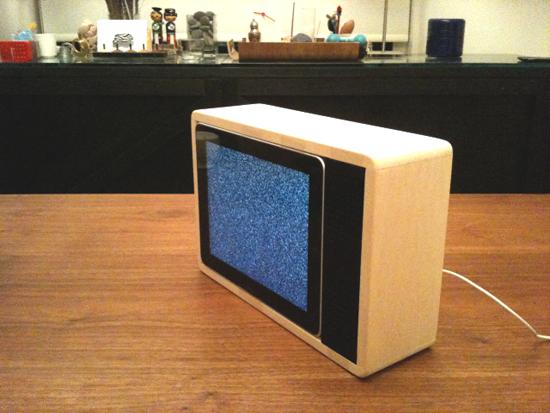
The way Jonas Damon sees it, designers these days fall into two camps: those who hold fast to the principles of legendary German industrial designer Dieter Rams and those who are partial to the camp and kitsch of pop artist Jeff Koons. It’s a theory Damon, creative director at New York's Frog Design office, picked up from his friend and fellow New York designer Ross Menuez — both of whom often produce work for Areaware, a design company that moves expertly back and forth along the Rams-Koons continuum. Damon is decidedly a Rams guy, which is perhaps why he feels so conflicted about the retro wooden enclosure he made for his iPad, one of the many things he’s built in his spare time for use around his apartment.
More

To Draw Every Person in New York, by Jason Polan

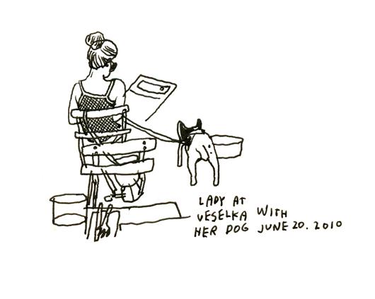
In March of 2008, Jason Polan set off into Manhattan armed only with a white notepad and a black Itoya Fine Point .6 pen. He had one goal: to draw every person in New York. It would seem an insurmountable task if not for Polan’s habit of documenting most anything that crosses his path, tagging each conquest with a thick scrawl detailing its circumstance, such as “Plant outside of a medical center on Orange and Magnolia Streets, April 25, 2010, drawn right after I tripped on the sidewalk,” or “Philly Cheese Steak, Pat’s Steaks, June 4, 2010.” In the service of his blog Every Person in New York, Polan — whose illustrations often appear in The New York Times and Esquire — has over the past two years drawn more than 10,000 of the city's residents.
More

Introducing the Noho Design District

Even non-New Yorkers know Soho, the swath of land below Houston Street in Manhattan, colonized by artists in the '60s and now the domain of the rich and the retail-obsessed. Noho, on the other hand, still flirts with obscurity, despite having been home to some of the city's most legendary artists — Robert Mapplethorpe, Frank Stella, and Chuck Close, to name a few — as well as its first Herzog and de Meuron building. Sure, as an emerging neighborhood with several hotels on the rise, its streets are often crisscrossed with ungainly spiderwebs of scaffolding, but beneath that lies a creative energy so strong we at Sight Unseen figured it would be the perfect place to create a new satellite destination during New York design week: the Noho Design District. All of the elements were already there.
More

Apartamento’s Tasca Dinner

Most people run around during ICFF frantically gathering design leads. But for Apartamento editor Marco Velardi, it was zucchini — about 6 pounds per night, to be exact. Tasked with organizing three dinners during the furniture fair in New York, "I had to pick them every day, individually, choosing ones that weren't too big or too fucked up as the skin was an important part of the dish," he says. "I got to know all the guys working in the fresh veggie department at Whole Foods, and I imagine they thought I was the crazy zucchini guy when I kept asking for more." The summer squash became a salad doused with lemon and olive oil, the second of four courses at the dinner Sight Unseen attended this past Sunday along with Todd Selby, Rich Brilliant Willing, the editors of Dossier, and half a dozen other New York creatives.
More

David Alhadeff, Owner of The Future Perfect

As design-store owner Dave Alhadeff sees it, there’s a distinction between the kinds of craftspeople he is and isn’t interested in: The latter make objects primarily to show off their manual skills, while the former are motivated by a larger concept, a wish to make tangible some abstract artistic meaning. Carving toothpicks into forest animals? Skills. Carving porcelain into vases so mind-bogglingly intricate they appear to be made by machine? Concept. A subtle difference, but one that helps it seem slightly less absurd to picture Alhadeff — who runs The Future Perfect, one of New York’s most well-respected purveyors of contemporary design — roaming the aisles of a Westchester craft fair, chatting up potters and glassblowers. Concept, he explains, is what builds a bridge between pure craft and design.
More