When Hamburg-based artist and textile designer Katharina Trudzinski decided to take a second residence in Berlin this spring, she found an inexpensive live-work space on the fringes of the up-and-coming Neuköln neighborhood — the city’s equivalent of Bushwick, Brooklyn — and saved two months’ rent by promising the landlord she’d renovate. But it was imagination, not thrift, that inspired her next move: After stripping the wood paneling from the walls and ceilings and tearing down a few ill-conceived door frames, she began painting the detritus and incorporating it into her sculptural installations and high-relief paintings. Made from constellations of scraps, street finds, and everyday junk cloaked in perfectly calibrated hues, her work — some of which becomes inspiration for the pieces in her clothing line — is meant to dialogue with its surroundings. “It’s not my intent that the materials should be cheap, I just like to use things that are around me,” she says. “I like to start with what I’ve got.”
While Trudzinski has moved the majority of her art studio to Berlin, whose eastern half is still conveniently piled high with unwanted flotsam left behind by rapid modernization, her fashion label Hui-Hui remains in Hamburg. She started it with her sister and a friend in 2004 while they were studying fashion design and she textiles, and the line between it and her art practice regularly blurs. Her sculptures, like a recent plywood totem inspired by the Memphis Group and ice cream cones, are sometimes integrated into sets for Hui-Hui’s elaborate lookbook shoots, and her paintings often go on to become scarves, jackets, and jewelry. But the effect also works in reverse, albeit in a more subtle way: Many of those paintings are concerned with materiality, and how objects like toothpicks, popsicle sticks, or wood cuts can evoke the qualities of a fabric’s surface or a pattern traditionally associated with textiles.
When Sight Unseen visited Trudzinski in her new home studio in Berlin, there was precious little to see. She had just put up a piece in a local boutique called Nr.4 — which also carries clothes by Hui-Hui — but she prefers to do nearly all the construction for her installations on-site. The label’s upcoming presentations in Tokyo and Paris, plus the apartment renovation, had also delayed her from getting a proper start in her new digs, and then there was the cruel fate our Canon S90 suffered when it was dropped to the floor mid-shoot. But we still appreciate the chance to introduce our readers to a truly multidisciplinary artist, and to offer a glimpse at her many-layered practice.
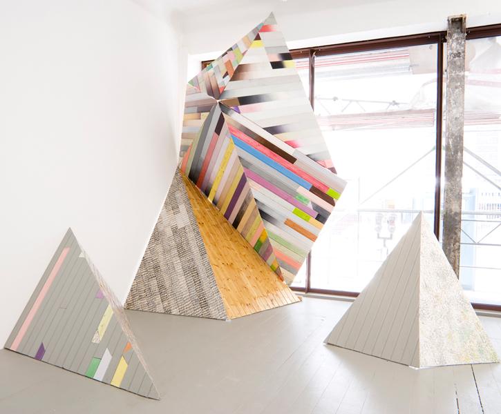
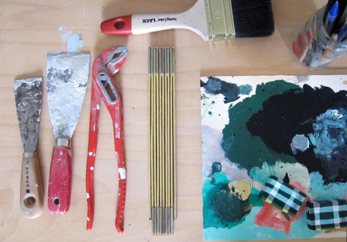
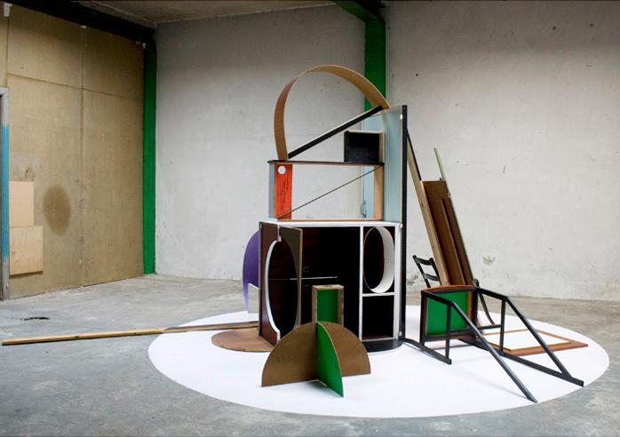
Trudzinski’s Berlin art studio is on the third floor of a building located on the fringes of the emerging art enclave Neukölln. Armed with a band saw, drill, paint, and glue, she constructs large-scale sculptures and elaborate 3-D paintings like the one shown here. Though you wouldn’t necessarily guess that she trained as a textile designer by looking at her art, her obsession with color, texture, and pattern stretches across both disciplines.
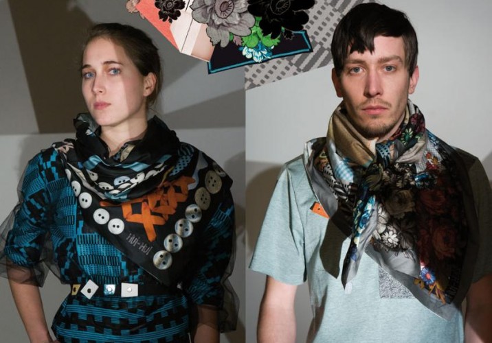
Sometimes the translation is literal. This photograph of the painting that hung from the wall when we visited has become a scarf for Hui-Hui’s summer 2011 collection, thanks to the wonders of digital printing. “I do a lot of Photoshopping, collaging paintings and drawings into an abstract print, but for this one the idea was to stay true to the original,” she says. “The only thing I added was a second border similar to the first.”
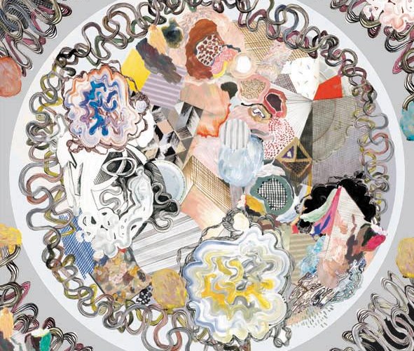
This Hui-Hui scarf, on the other hand — from an older collection inspired by the work of Julian Schnabel — is a Photoshop mashup of various painting techniques, with the squiggles meant to resemble abstract brushstrokes. “I like to do this mosaic or patchwork thing, where you put all kinds of different surfaces together,” she adds.
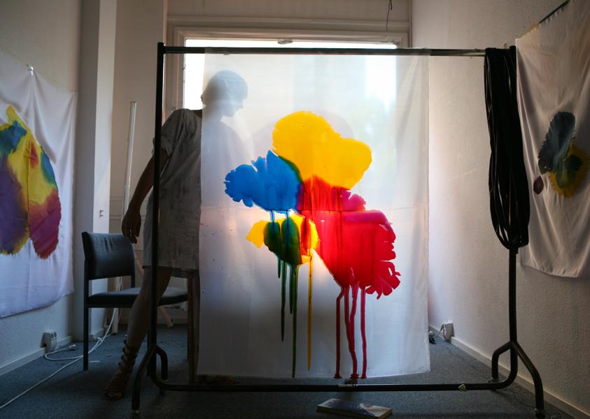
Another painting in her studio, created not long after Prada ignited a craze for ombre fabrics back in 2007. “I was inspired by traditional Indonesian ikat fabric techniques, where you dye the thread with this fading effect before you weave it,” says Trudzinski. Her use of color is undoubtedly her calling card — it may be completely instinctive, but it’s also incredibly meticulous, as if she were directing a symphony. “It’s a bit random, but it’s always a composition. If I’m missing something I go back and paint it; if I think I need a yellow piece here to make it more fresh, I’ll make a yellow.”
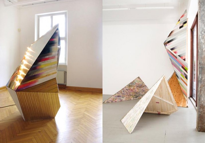
A piece she’s currently experimenting with will deconstruct the influence of color in her work, in a way: Made from varyingly sliced segments of lumber piled into a huge wall, the cut edges on one side will be painted in her usual mosaic fashion, while on the other, they’ll all be gray. “On that side you’ll see only the light and shadow and shape.”
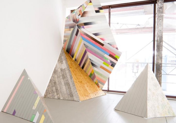
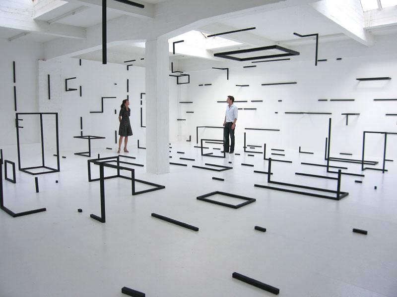
She used a similar technique for one of her best-known works, a two-sided geometric sculptural installation. From inside the gallery, visitors saw a pastel-striped landscape made from wood paneling that had been stripped from the interior of the gallery owner’s boat.
From outside, the view was quite different. Trudzinski exposed the innards of each piece, giving passersby insight into how they were constructed — and just how much work she’d done to elevate their facades.
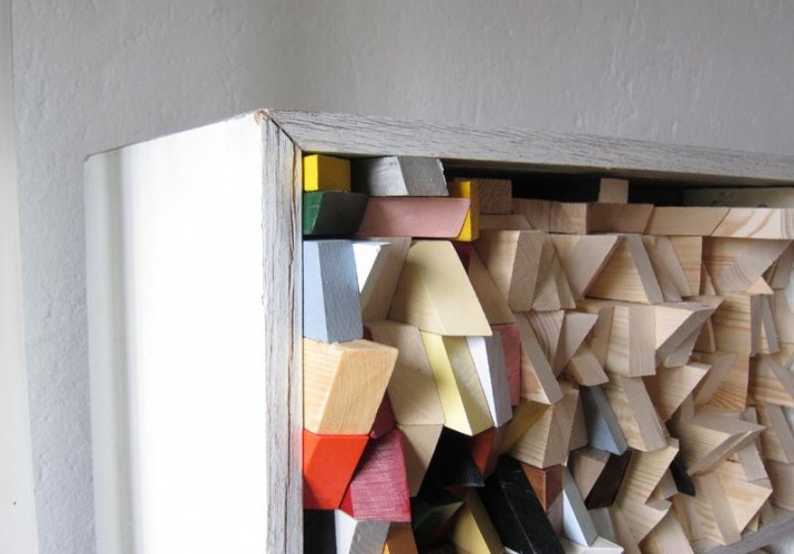
After making that piece, she began searching for an easier way to turn 2-D elements, like panels of wood, into a 3-D piece — not least because Hui-Hui’s Tokyo showroom was interested in displaying its collections alongside the installation used in the corresponding lookbook. This sculpture — the one inspired by Memphis and ice cream — was the result. Its elements pack flat and then slot easily into place.
While not as modular, this piece similarly achieved a 3-D shape using flat elements. “I tried to bring straight pieces into a round form based on a ball of wool,” she says. “It’s lighter, a bit more like a drawing.”
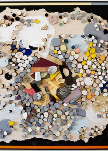
Next to a group of tools in her studio sits a test palette for last year’s winter collection, inspired by fashion in the era of Princess Diana. It featured a digitally printed watercolor plaid which Trudzinski also painted onto jewelry pieces; the small boxes shown here became pendants pierced through and hung on silver chains.
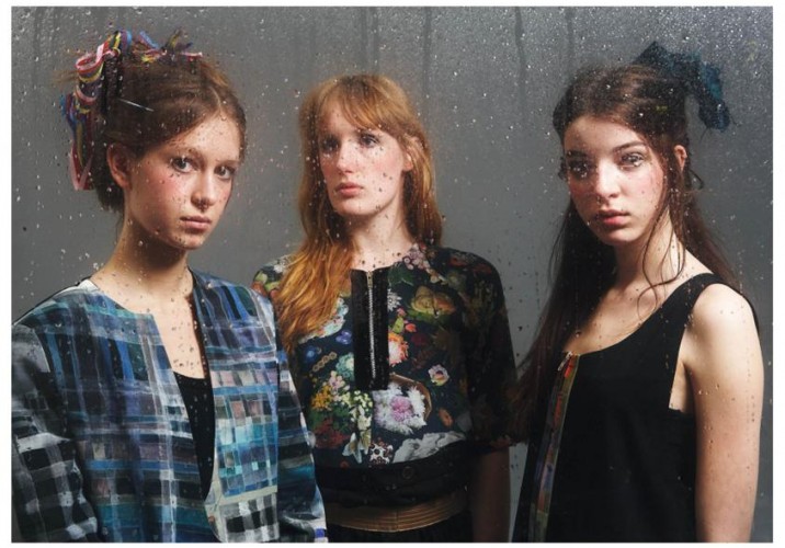
A shot from that season’s ’80s-styled lookbook also includes a fabric Trudzinski made from photographs she took of flowers. “We did this Princess Diana/elderly English woman flower thing, but we always try to make it modern.”
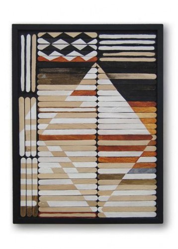
When it’s the other way around, with her art mirroring her textiles, it’s typically thanks to her use of pattern. This piece evokes an African motif in painted popsicle sticks. “I like that you can get a lot of them in the same shape, which imparts something like a textile structure — you can compare it to weaving, especially when I made one with toothpicks. I also like the idea of taking these everyday materials that children play with and putting them in a new context.”
She’s quick to point out that she buys the sticks in bulk. “I don’t eat all the ice cream myself.”
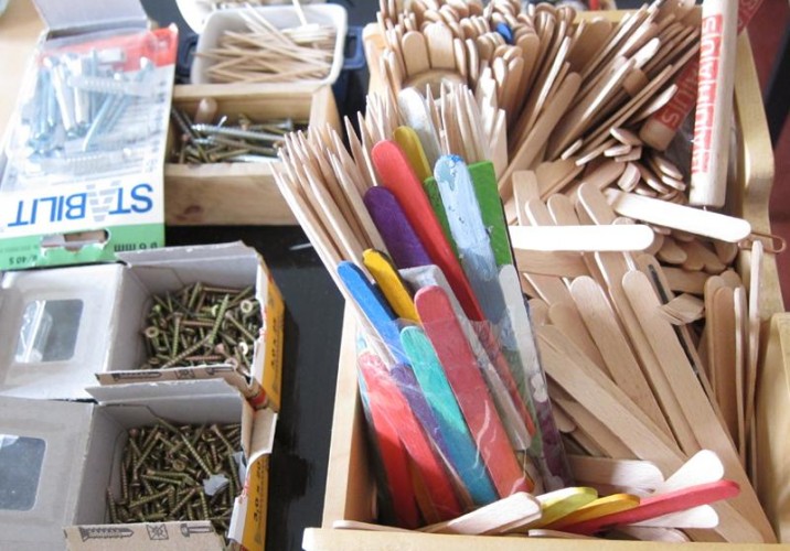
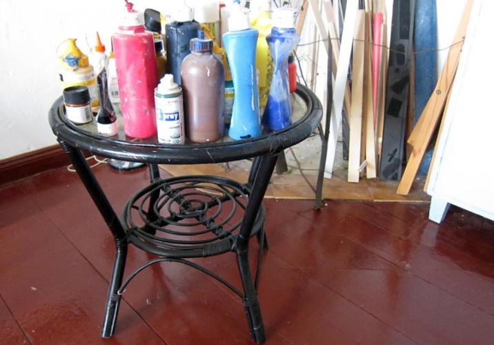
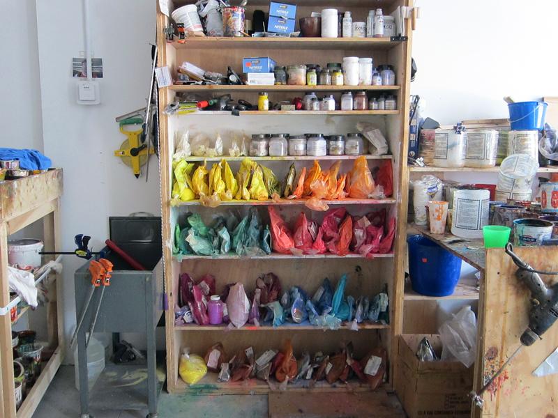
One corner of her studio is a holding pen for materials — panels and pieces of wood she picked up off the street, remnants from the apartment renovation, branches she gathers from the sidewalk in front of her house each time the city tree-trimmers visit. By the time they find their way into her work, though, they’re so transformed that not even she can tell which is which.
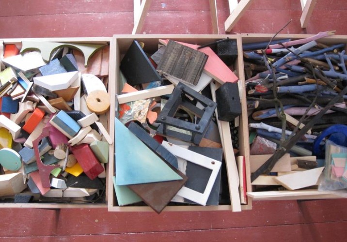
Other odds and ends are piled into boxes waiting to spark an idea or get pulled into an existing piece. Some of them are found objects, but others are offcuts from previous projects.
Most will get painted or repainted along the way.
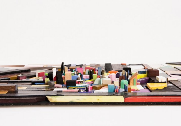
Viewed from the side, the resulting works can look like cities, with complex topologies.
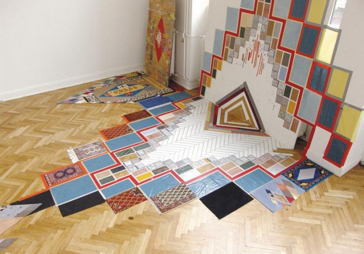
In the case of this installation, Trudzinski used reclaimed carpet samples to build an abstract composition that climbed the gallery walls. It’s a perfect illustration of her philosophies on site-specific art: “I like to work with a room, to see which structures and colors are in it and start from there. This piece played on the patchwork elements already in the floor.”
For a group exhibition in Antwerp in 2008, Trudzinski not only echoed the arched windows in the space — an ’80s office building slated to be torn down after the show closed — she also incorporated one of its doors into her artfully constructed Bauhaus-style furniture pile. Installed in a room just off the parking garage, the piece could be viewed through a giant semicircular opening she carved out of the wall.
Besides color and pattern, what unites Trudzinski’s varied talents is her ability to remix, deconstructing visual layers or actual objects and then putting them back together again. For one Hui-Hui collection called Dada, she referenced the material elements of the clothing itself — buttons, stitches, flower embellishments inspired by old Russian scarves — manipulating them until they were something entirely different, but that felt just right.
When he was an art student in the '80s — in Kassel first, and then Berlin — Markus Linnenbrink worked primarily with grays and blacks. “I had no idea what to do with color,” he admits. “And honestly, I was a little afraid of it.” Which is ironic, considering that for more than a decade, the German-born, Brooklyn-based artist has built a body of work that centers around thick streaks of color — painted in stripes on gallery walls, poured in puddles on the floors of art-fair booths and installations, and dripped in lines down the face of his canvases. “Somehow a field trip to Italy where we spent three weeks painting outside got me into the idea of color, but I had a long period where I would mix, like, red and green. I feel like I had to walk through a lot of dirt and mud to get to the brightness.”
Clemence Seilles was only four months into a job at Jerszy Seymour's Berlin studio when she started to feel it: that restlessness creatives invariably get when they're unable to fully express themselves. It's not that the job wasn't fulfilling — it was, and more — but working fulltime meant Seilles hadn't yet found a way to devote attention to her own projects. "I had this idea to make a piece that would do the work for me, something that would happen when I wasn't there," she recalls. One morning she hung a few felt-tip pens from the ceiling of her apartment, their tips pressed down against a sheet of Chinese rice paper, and left for Seymour's studio. "When I came back that evening, the work was made."
It's funny to hear Esther Stocker talk about reading between the lines. The Vienna-based painter is known for manipulating spatial geometry using the framework of the grid — both on canvas and in her trippy 3-D installations — until the mind starts making linear connections that aren't really there, trying to find order in the optically illusive chaos. But that's not what Stocker's referring to. She's talking about Charles Schultz's Peanuts.