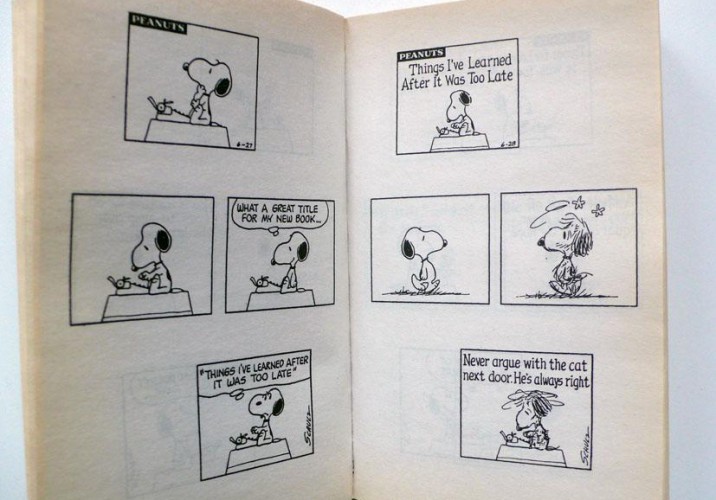
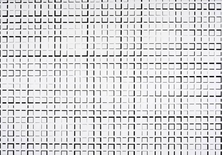
It’s funny to hear Esther Stocker talk about reading between the lines. The Vienna-based painter is known for manipulating spatial geometry using the framework of the grid — both on canvas and in her trippy 3-D installations — until the mind starts making linear connections that aren’t really there, trying to find order in the optically illusive chaos. But that’s not what Stocker’s referring to. She’s talking about Charles Schultz’s Peanuts, one of her great artistic inspirations: “Schultz’s work is so complex, but it’s also so simple,” she muses. “Sometimes it gets really philosophical, but sometimes the dog’s just looking up and down. It’s beautiful because it’s so reduced.”
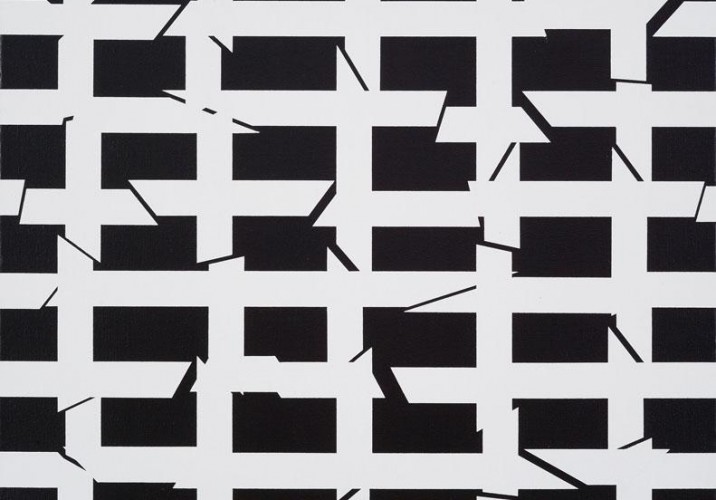
Stocker’s narratives may be a bit more abstract than the comics she admires, but reduction is definitely her thing: Early in her studies, she specialized in portraiture but became so focused on the relationship between a viewer and a painting that she found all she needed to get her point across were simple black-and-white lines. She made her first grid piece while getting her MFA from Pasadena’s Art Center College of Design in 1999, and she instantly fell for its magical ability to lure people in. “When you work in a very minimal way in high contrast, maybe it’s only two-dimensional, but you see it as three because you want to know what’s the figure, what’s the foreground and background,” she explains. The viewer spends time “wandering around in” the painting, trying to make sense of it.
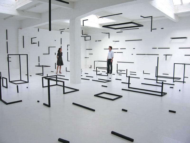
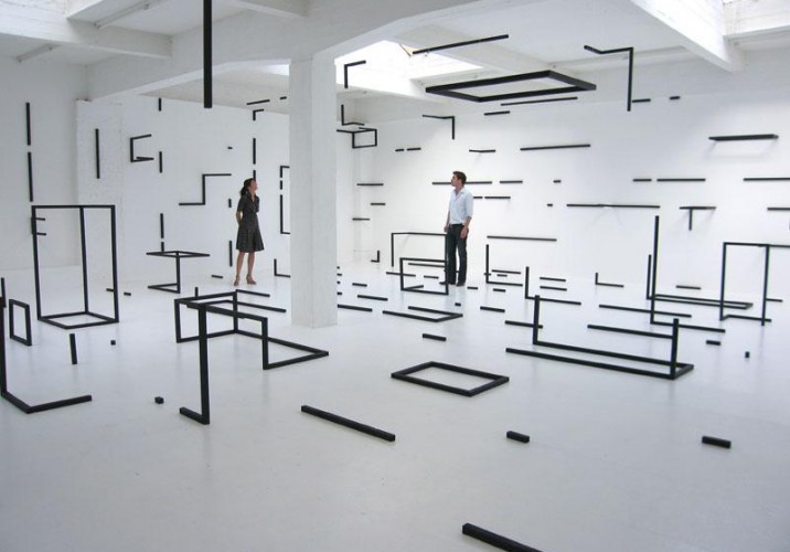
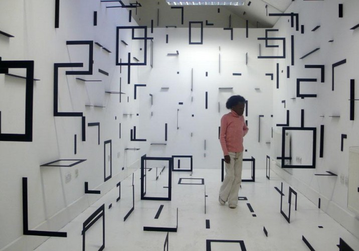
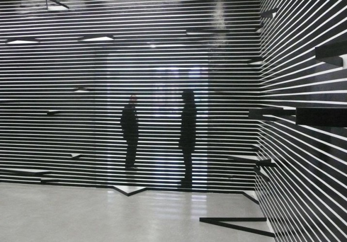
A less adventurous soul might have stopped there, but Stocker has a love not just for comics but also for fantasy and science fiction, where the boundaries between what’s real and what’s not are subtly erased. And so she began making immersive 3-D installations designed to confuse perspective in a way that invites actual physical exploration, most recently integrating semi-functional objects, like lights and tables with extra appendages or unexpected proportions. “There’s a beauty in things you can’t figure out,” she says. Regardless, she was more than willing to help us better understand her work by discussing eight of the inspirations behind it — cartoon dogs and all.
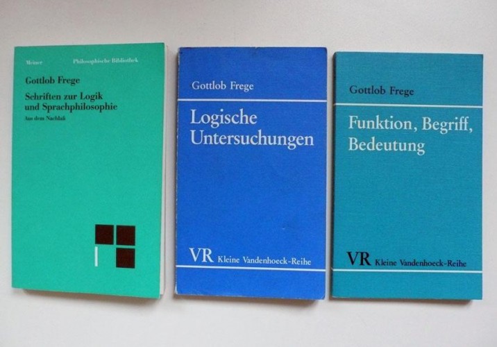
Gottlob Frege: “Frege, the German mathematician and logician, had this project — he wanted to make a mathematical measurement of the precision of language, but he failed,” Stocker says. “There are all these different words to describe equality, but in the end the word means nothing at all, because it’s about how you use it and in what context. If you really try to define it, somehow it’s not even possible.”
Gottlob Frege: “In the process though, he produced something very important for modern logic. He said something like, you can say a group of things are similar, but you can also say why they’re all different. For me this is also like in abstract art. You can have similar forms but even if you look at them, you can never see the same form all the time. You can see it’s a grid, but you can always look at one unit and then maybe the next one looks a bit different.”
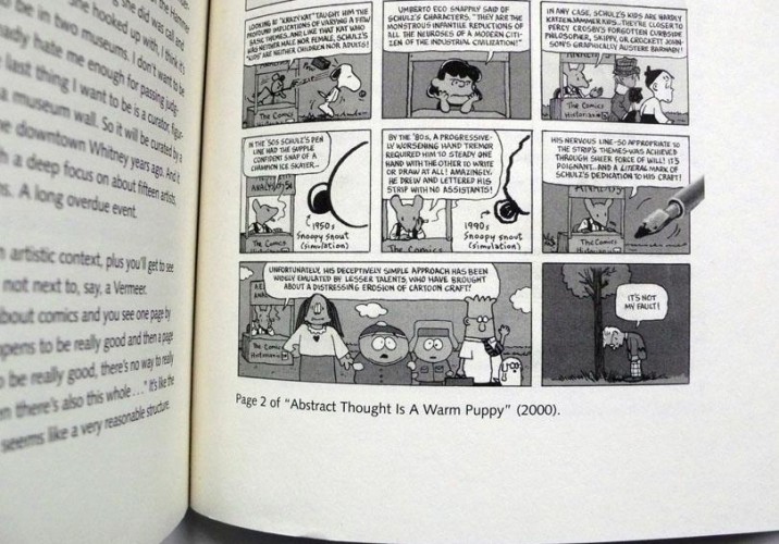
Charles Schultz and Peanuts: “I think of comics as a very abstract medium — what’s funny is somehow between the lines, like in painting. I love that you can tell a joke with so little. They’re so minimal that sometimes they’re not even that funny. I don’t really come from a comic culture, but I do think comics can really capture language and drawing in a beautiful way.”
Charles Schultz and Peanuts: “In comics I see this potential or this power of what images can tell you, even with so little.”
“Abstract thought is a warm puppy” —Art Spiegelman: “This quote comes from a story about the history of comics, about Schultz. I like that he makes such an unexpected conclusion. Abstract thought can be quite playful or sensual, like a warm puppy, even though sometimes the tendency is to divide the two and make them feel like enemies.”
“Abstract thought is a warm puppy” —Art Spiegelman: “There’s a theory in art that good things come from your stomach and aren’t thought about, and I disagree with that exclusion of thinking and of the senses. I like that Spiegelman doesn’t exclude it. I used this quote as the name of a 2008 installation I made at the Center for Contemporary Non-Objective Art in Brussels.”
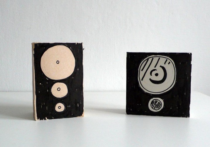
Cardboardmusicboxes by Nic: “Nic is a cartoonist in Vienna, and these were for a gallery in London. I really like the simple gesture, and the beauty of something that’s somehow useless but so much fun. I don’t even understand how speakers work, it’s all this high complicated technology, and here are these empty speakers that don’t really play — I like that paradox.”
Cardboardmusicboxes by Nic: “My installations are usually made from very simple materials like painted wood, masking tape, or cardboard. I like that when you get close, it looks simple or like something you could do yourself, but when you step back it looks like fiction, like it could be floating in space even if it’s just mounted to the wall. It’s all a bit banal, but at the same time it’s magic.”
Brigitte Mahlknecht: “My friend Brigitte’s drawings are all quite similar to this in that you can never really tell what it is you’re looking at, though it’s almost like it reminds you of something. Like a walking peanut. It’s in between what’s recognizable and fantasy, and even if you can’t entirely understand it, you can somehow enter it and wander around.”
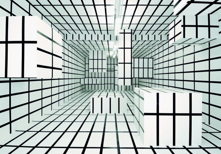
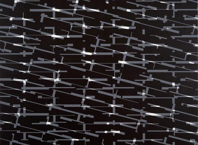
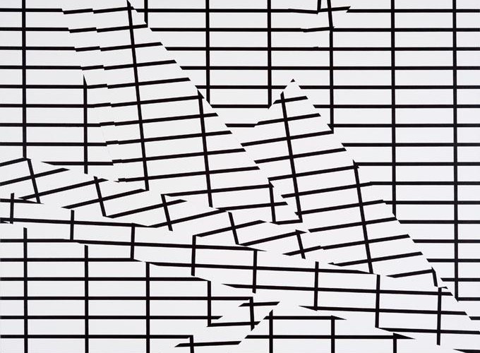
Brigitte Mahlknecht: “Brigitte’s work has a story to it, whereas mine is repetitive, but there’s that same wandering. Where do you go in, where do you go out? This painting has six layers of different types of grids, but one is straight and the rest are shifted. It creates both absent forms and intersections, which show up as white. You become curious as your idea about it in a spatial/relational way changes, and you begin to look at it differently.”
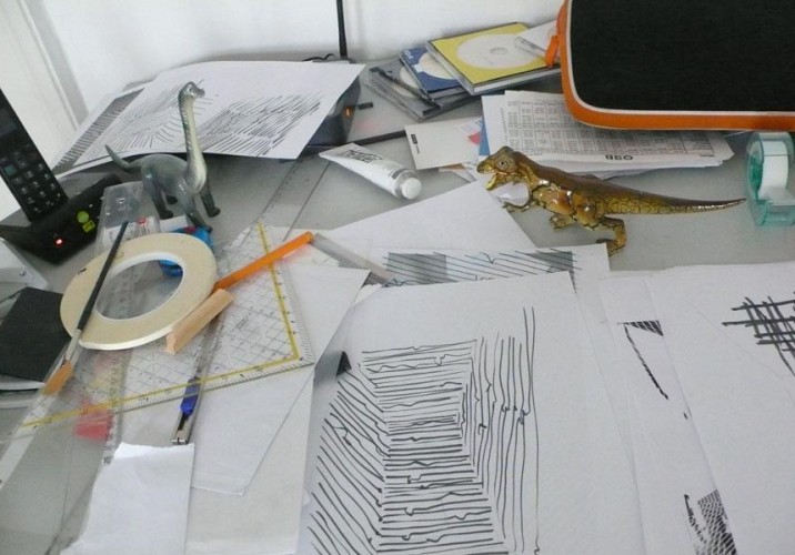
The desktop jungle: “I make paintings of grids, and think about structure and order, but this is really what I see in front of me every day, the little mess I create every five minutes. It’s somehow all connected. You can see the drawings I make here, and the pencils and rulers and little toys that are around. The dinosaurs are actually pens, but I like them as a concept — no one ever saw the dinosaurs or knows what they really looked like, but somehow they still exist for us, even though we don’t really understand. It’s that fantasy idea.”
The desktop jungle: “There are simple conclusions you can make from an aesthetic, but it’s also about how you come to it. Because I can never find what I’m looking for, I usually run into something unexpected, and that’s the best way of finding ideas.”
“Nothing could be done — men were only men, and space was their eternal enemy.” —Harlan Ellison: “Philosophy is very important to me as an artist, but also maybe science fiction. It describes things that are somehow out of the ordinary, and lets you go astray with your thoughts. This quote is from Deeper Than Darkness, where the narrator travels in space and describes strange lights and confusing sensory perceptions. Space is this territorial, existential thing — where should we go and why? There are always efforts to fight against space because it’s the enemy.”
“Nothing could be done — men were only men, and space was their eternal enemy.” —Harlan Ellison: “In my art, and in a lot of other installation art, you could always say that space is the friend, but at the same time you always try to fight with space when you install something, because you’re trying to change it. I used this quote for my show at the House of Art in the Czech Republic last year.”
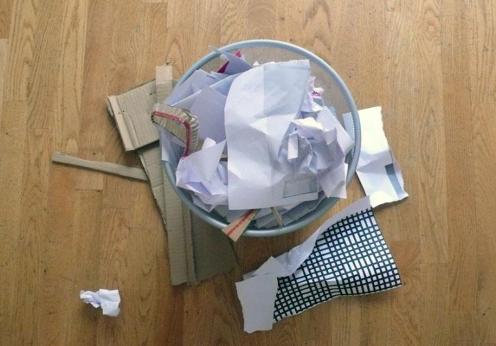
The garbage: “The garbage is quite symbolic for me. Modernism and older theories of abstract painting always single out the right form and throw something else out as being not as good; Josef Albers was always talking about good form and the right form. But I like to work with those things — they might be a little more irritating, but they’re also more interesting. I don’t really believe there’s a ‘right form.’ Some things just take time to be understood.”
The garbage: “I was always interested in the history of formal thinking, and they have really strong ideas about harmony and symmetry. I can understand that symmetry is a strong principal in our lives, and that our bodies look somewhat symmetrical, but somehow it’s not possible for me to say that symmetry is better or stronger than asymmetry, maybe because that’s a little bit boring. Most of my work is asymmetrical. Consciously or unconsciously, you can’t really escape from yourself, even if you try to do something else. My process has to be open, and everything has to be considered.”
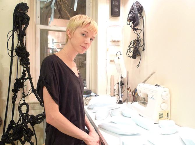
When most of us get a package in the mail, it’s the book we ordered from Amazon, or a birthday gift from our parents. When Bec Brittain gets a package, it’s usually full of dead bugs. She orders them in bulk off the internet for a dollar a pop, then chops them into pieces and transforms them into hybrid bug-monsters.
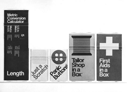
There are more than 20,000 instances of great graphic design housed in the AIGA’s online archives, but for every Pushpin or Chiat\Day, there’s a Swatek Romanoff — a firm that churned out loads of wonderful work in its ’70s/’80s heyday but that isn’t the subject of much chatter among today’s design circles. When we were first putting together ideas for this site, it was Randall Swatek and David Romanoff’s whimsical 1979 “In a Box” series that inspired this column.
The fourth and most recent issue of Apartamento, one of our very favorite publications, includes a special kids' supplement called Kinder, curated by Andy Beach, one of our very favorite bloggers. Apartamento bills itself as "an everyday life interiors magazine," and Kinder follows suit: There's an acid-trip of a coloring book illustrated by Andy Rementer; the Memphis-esque results of a furniture-building workshop for kids; and a story about a collection of objects that Los Angeles graphic designer Geoff McFetridge made for his daughter Frances, which is excerpted here in its entirety.