Despina Curtis is in her early 30s, and yet when she talks about her college days, it sounds a bit like one of those stories your grandparents tell about having to walk shoeless through the snow to get to school every day. Curtis studied printed textile design at the University of Manchester, and it was only when she left that the program’s first-year students were beginning to use digital design and printing tools — she had to do everything analog, even when it came to her eventual focus on huge 6-by-6-foot canvases layered with painting and screenprints. And yet, unlike hyperbolic ancestral poverty tales, hers had an obvious upside: All that drawing and hands-on work primed her for her current career as a stylist for the likes of Wallpaper and Casa Da Abitare, which she could hardly do from behind a computer. “Even now I draw all the set designs that I do,” says Curtis, who’s based in London. “A lot of people in my industry still do that, even though it’s quite old-school.”
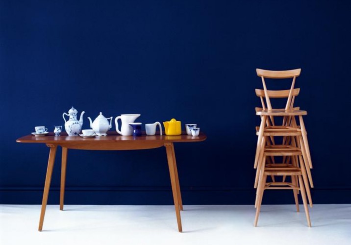
Of course, if you ask Curtis, the most practical takeaway from her education was learning precisely how to wield her intuitions about color and pattern, which followed her through her leap from two dimensions to three. After initial stints at textile studios in Manchester and New York, Curtis had an awakening that led her to apply for an unpaid internship at Elle Decoration, whose pages she’d pored through for inspiration as a student. “To be quite honest, I think I got to a point where I was a little bit over the designing side of things,” she recalls. “I think I’d exhausted it, so I left it behind. I thought I would like to be the one putting things together rather than creating them.” At the magazine, she swiftly rose through the ranks to become style editor, where she found herself taking the lead on shoots like a Greek draping–inspired feature set inside a derelict building she scouted in her hometown of Brighton, complete with classical columns and peeling flocked walls. She went on to work at Wallpaper for three years as deputy style editor, where she developed her signature style: Arranging whatever objects she shoots into strong, abstract geometric patterns, often incorporating additional geometric elements of her own.
Now that Curtis has been freelance for two years — with a client list that includes a who’s who of design and fashion magazines, plus Harrod’s, AmEx, and the European fashion retailer COS — she’s finally begun to incorporate making back into her repertoire, starting with a series of framed prints for the London store Darkroom that first turned the editors of Sight Unseen on to her work. It was that series, part of a commission to create the windows for the shop’s Africa-inspired launch, that gave her the motivation. “It’s great to be able to work towards something rather than having to find time to do random tests and things like that,” she says. Now that she’s back in the game, though, she has been experimenting on her own: “I just started printing onto panels of stained wood, using the same geometric patterns but scaling them up a bit and incorporating metallics. And hopefully I’ll do another project for Darkroom soon.” In the meantime, we snagged some of Curtis’s time to find out what’s behind the amazing visual work she does. Here are eight of her biggest inspirations.
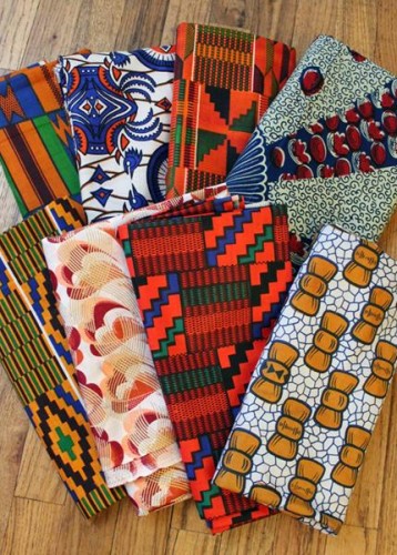
African Prints: “They’ve been an obsession of mine since I was asked to take part in an Africa-inspired exhibition for the London shop Darkroom. Darkroom’s co-founder Rhonda Drakeford has an amazing collection of African fabrics and jewelry, and it inspired me to spend hours in African fabric shops in Willesden, Dalston, and Brixton. I became aware of how modern and contemporary the designs were, although they’re used in very traditional dress. What I love most about the fabrics is that they’re so bashful and unapologetic.”
African Prints: “London has an abundance of African fabric shops, but you tend walk past them without realizing it. Since my project for Darkroom I’ve become really honed in on the subject, so I’ve been spying evidence of it everywhere. You walk past a church on a Sunday and the African women look so amazing in these fabrics made into dresses and head dresses. It’s sea of color and pattern, and it feels like a huge celebration.”
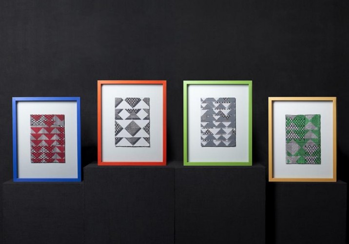
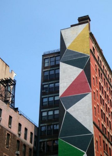
African Prints: “When it came to designing my own African-inspired prints, I had done a monthlong course in New York City on black and white photography, and I took loads of pictures of architecture and the outsides of buildings, honing in on their textures and facades so they became really abstract. The simple triangle in the Darkroom print came from a shadow I photographed in that series, which I repeated and played around with. The primary color scheme worked well because it made the four prints a coherent set.”
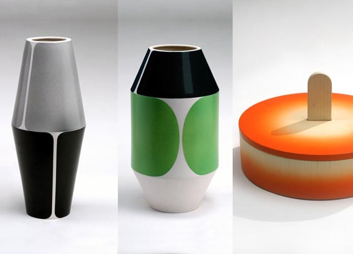
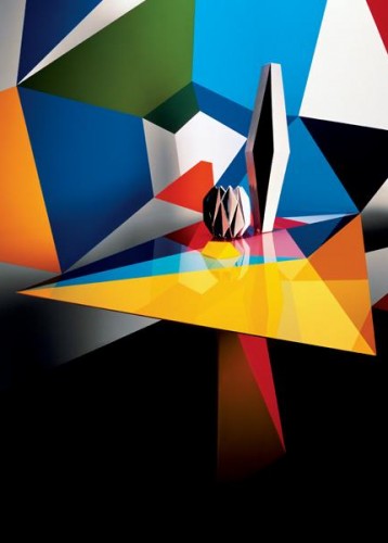
Pierre Charpin: “I was introduced to Pierre Charpin’s designs when I visited the Design Gallery Milano while working as style editor for Elle Decoration. His exhibition ‘Oggetti Lenti’ was a mix of centerpieces and vases (pictured), and I was fascinated by the mix of materials he used, as well as the combination of color and pattern. Since then, his work has been a huge source of inspiration for me.”
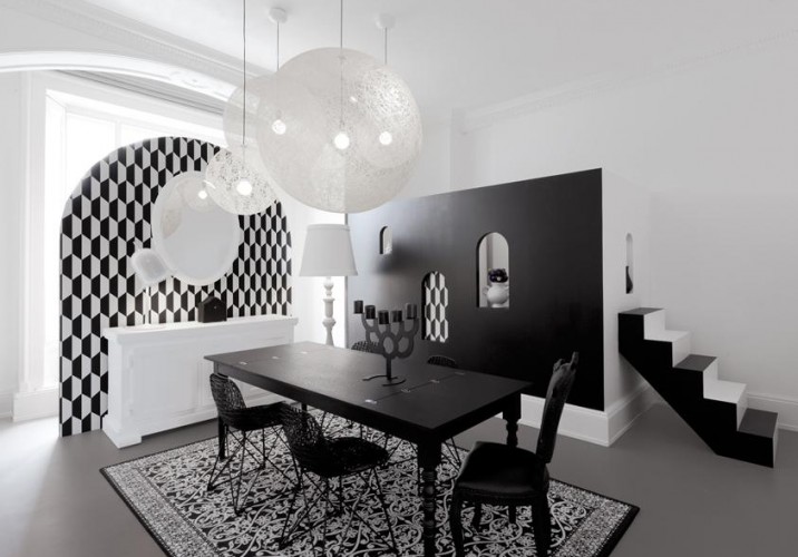
Pierre Charpin: “I recently read an interview with him about his exhibition at the Grand-Hornu in Belgium (pictured), and when asked why he painted the floor red, he replied: ‘Don’t look to any special significance there. It was just the first color which came to mind.’ I liked his honesty, because sometimes as a designer, there’s no deep and meaningful reason for your choices. Much of the time it comes from instinct.”
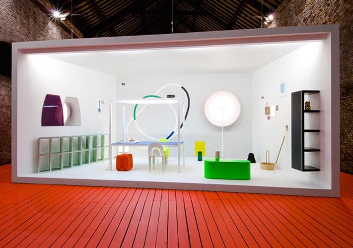
Pierre Charpin: “This installation I designed for Moooi was very much planned out, but it was also meant to look spontaneous and playful in the way it all came together, to match the company’s character. I had a good idea of what I wanted to create, but every time I went back into the space, elements of that plan would change or develop. For instance, there wasn’t a particular calculated reason for why I designed a staircase to lead up not into a room, but a tiny window. It added a bit of mystery and humor.”
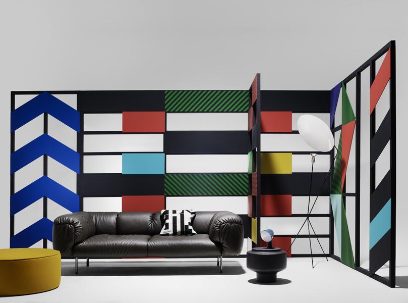
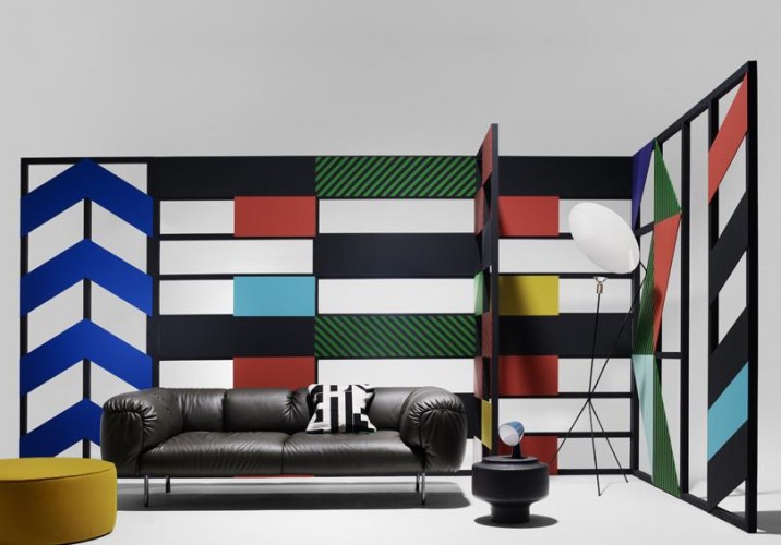
Geometry: “I always gravitate towards geometric patterns in my work, as well as strong color combinations and symmetry. When I’m designing a set, I often place the products or furniture within it so that they make a pattern as a whole, so a piece’s form is always the first thing I notice.” Pictured: Dutch designer Oskar Peet’s Room Dividers.
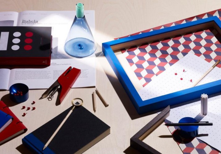
Geometry: “I recently did a shoot with the photographer Leandro Farina for the men’s magazine Port on desk tools (pictured), and at one point I looked at the set and thought, ‘Am I just repeating myself here?’ But ultimately I think it’s good to have a signature style.”
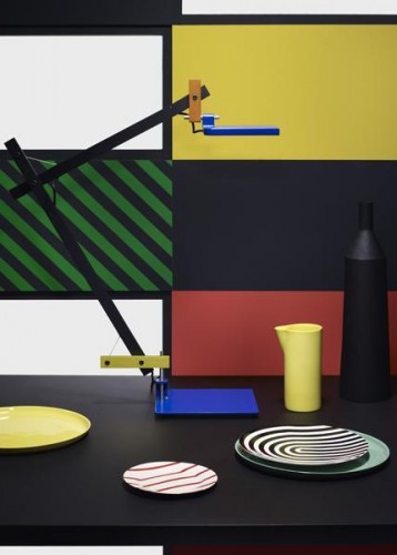
Geometry: “One of my previous shoots for Case Da Abitare, photographed by Thomas Brown, was based on the idea of a graphic house. I found great shapes and patterns in obscure old books about the street signs and signage of 1960s America.”
Geometry: “The primary acid colors were very much inspired by pop-art paintings.”
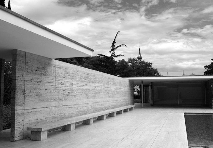
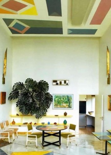
Modernist architecture: “Architecture has always been a huge influence on my work in design and art, and at the moment, especially the buildings and spaces designed within the modernist/Bauhaus aesthetic. These often have interiors which take you back to a past boom era of inspiring design, but are totally fresh and relevant to today’s design as well. With the Bauhaus, I love the idea of a whole collective working under the same aesthetic and producing everything from textiles to architecture to furniture.” Pictured: The Barcelona Pavilion by Mies van der Rohe
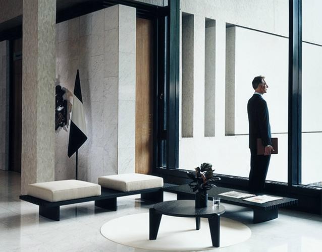
Modernist architecture: “My Waiting Rooms shoot for Wallpaper, one image from which is pictured here, led me to scout all over London and beyond looking for buildings designed and built in the modernist aesthetic. It was a huge crash course in design and architecture, but it became one of my most-loved projects.”
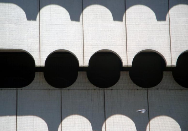
New York City: “In my mind, it’s the best city in the world. I worked there after graduating and have been a regular visitor for the last decade. I spent one whole month my first summer in New York taking photographs for the course I mentioned above, and we’d be set different tasks every day, going out and walking around and shooting. The building photos were my final project.” Pictured: St. Vincent’s hospital’s 1963 O’Toole building
New York City: “When I visit now, just walking the streets in Brooklyn, people watching, and absorbing the street art and fashion brings on a years’ worth of ideas. When you’re in a place that you’re not so familiar with, you open your eyes much more. In New York I look around me really intensely, whereas in London, because I work here and live here, a lot of the time my head’s down and I’m just busy going from A to B.”
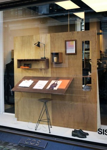
New York City: “My most recent visit to New York inspired a series of mid-century windows I for COS last season. I’d been to see the permanent furniture collection at the MoMA, which has some amazing mid-century modern pieces, including an American Ivy League wardrobe from the 1950’s/’60s — a great starting point for the capsule wardrobe and desk I designed for the windows.”
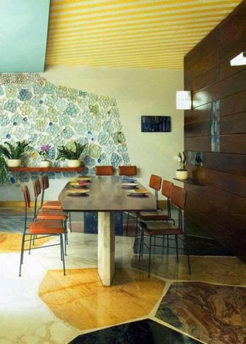
Gio Ponti: “Ponti’s interiors and architecture fascinate me, particularly his houses Villa Planchart and Villa Arreaza. Inside Villa Planchart (pictured), which is in Venezuela, nearly all the wall and floor surfaces are covered in different patterns, be it in the ceramic walls or striped ceiling.”
Gio Ponti: “You’d think it would be overpowering, but instead it’s a gorgeously soft collage of texture. He shows that using pattern on many surfaces in one space can work beautifully.”
Gio Ponti: “That mix of pattern and texture inspired a shoot of mine for Wallpaper which was based on multi-faceted furniture and photographed by Andy Barter. I commissioned an artist to paint the background pattern, which took a day, and then I chose furniture with facets and layers that would blend into the background, creating an optical illusion confusing what was 3-D and what was 2-D. The shoot was chosen for the magazine’s cover that month, which was hugely flattering.”
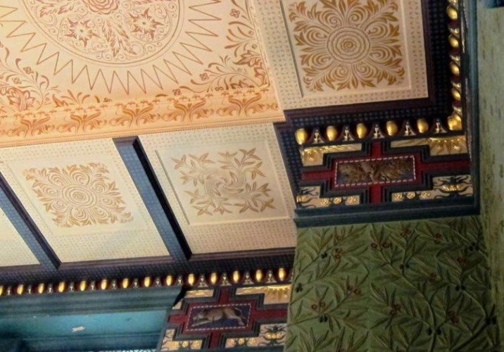
The V&A: “The Victoria and Albert Museum is one of the first museums I visited in London, and it’s the one place I know I can spend hours in appreciating the excellent mix of art, design, and craft — articles from centuries ago to the present day. My favorite space is the William Morris room in the café (pictured), mainly because it’s so dark and inviting.”
The V&A: “The museum also has amazing archives, which are great for research. Years ago I produced a small shoot for Elle Decoration featuring interior companies based in Europe with very strong histories, like Cole and Son and Royal Copenhagen. These companies had all begun looking through their archives and re-issuing best-selling pieces either as they were, or with a contemporary twist. The shoot showed a simple timeline of past and re-issued designs.”
Water: “Although the coast hasn’t been a direct influence on my work since my sketching days at university, it’s where I grew up, both here and in my second home of Greece. It’s a place I go to escape from the craziness of the city, where I can re-charge and empty my head before starting a new project. I love working in a creative industry because most of the time it doesn’t feel like work in the traditional sense, but then again, you’re constantly switched on. Since I’m always so honed in, it’s quite nice for me to go to a place where nothing’s ever designy or flashy, it just is what it is, and it hasn’t changed in years — your eyes sometimes need a little bit of a break.”
Faye Toogood, the London-based interiors stylist and creative consultant, has designed exhibition stands for Tom Dixon, windows for Liberty, displays for Dover Street Market, and sets for Wallpaper. But in all of her career, she’s had only one job interview. At the tender age of 21, having just graduated from Bristol University with degrees in fine art and art history, Toogood was called for an interview with Min Hogg, legendary founding editor of the British design bible The World of Interiors. “I had found out about a stylist job and decided I would go for it, even though I didn’t even know what that meant,” says Toogood. “I went in and it was the strangest thing. She asked me, ‘Can you sew, and can you tie a bow?’ I actually couldn’t sew, so I lied and when I got the job, I had someone do it for me.”
Francesca Gavin is a London-based writer, editor, and blogger, and, like you and me, she’s a major voyeur. For her book Creative Space: Urban Homes of Artists and Innovators, she traveled the world, slipping inside the studios, apartments, and houses of designers, artists, photographers, stylists, curators, writers, and filmmakers to document the chaotic interiors she found there.
For Anna Murray and Grace Winteringham, pattern is everywhere — in the flaking paint of street bollards and the crisscrossing beams of scaffolding, in the fashion photography of Mel Bles and the banded stiletto heels of Parisian shoemaker Walter Steiger. Together, Murray and Winteringham run Patternity, a studio and online resource for pattern imagery where each photo is curated, sourced, or taken by the designers themselves. Spend some time on the site, and their obsessions become clear: One week it’s rocks and strata; another it’s the vivid African textiles that line the stalls of the Ridley Road street market that runs daily in Dalston, the East London neighborhood both women call home.