When asked if he identifies more as an artist or a designer, Thaddeus Wolfe seems genuinely stumped. But perhaps it’s that way for anyone working with glass, a material that’s notoriously hard to confine: “I don’t think I’m a great designer,” he muses. “Maybe it’s because I’m not a master of glass yet that I never quite get what I intend. But sometimes cool things happen from mistakes.” It’s a pretty self-deprecating summation of process coming from someone whose chaotic, mysteriously opaque Assemblage vases are the subject of a solo exhibition opening tomorrow at Chicago’s Volume Gallery, which has in the year and a half since it opened become somewhat of a barometer for the Next Big Thing.
Chalk Wolfe’s humble outlook up to a healthy Midwestern upbringing: He grew up in Ohio, the son of an architect, always building small figures in clay. “I did art on my own in high school,” he says, and in some ways he’s been working in a similar fashion since moving to New York nearly a decade ago. While paying the bills with fabrication jobs — terrariums for landscape designer Paula Hayes, or cast-glass pieces for architect Michele Oka Doner — he was constantly making his own work on the side, and it’s only recently begun to see the light of day.
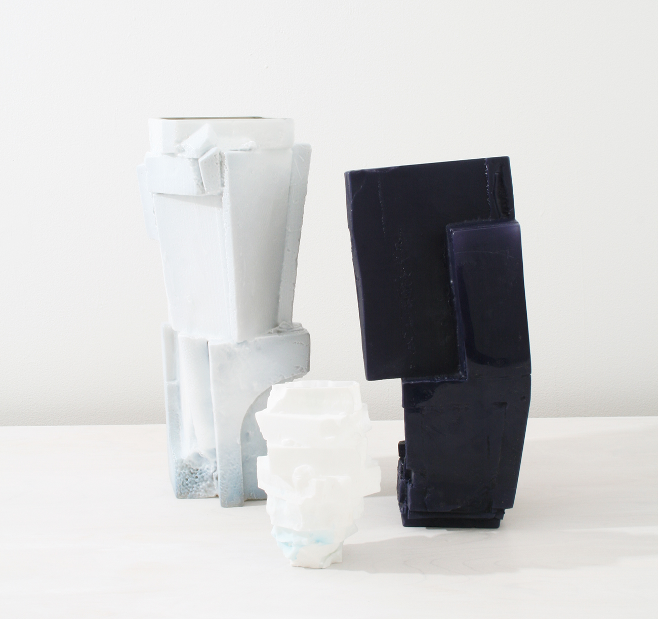
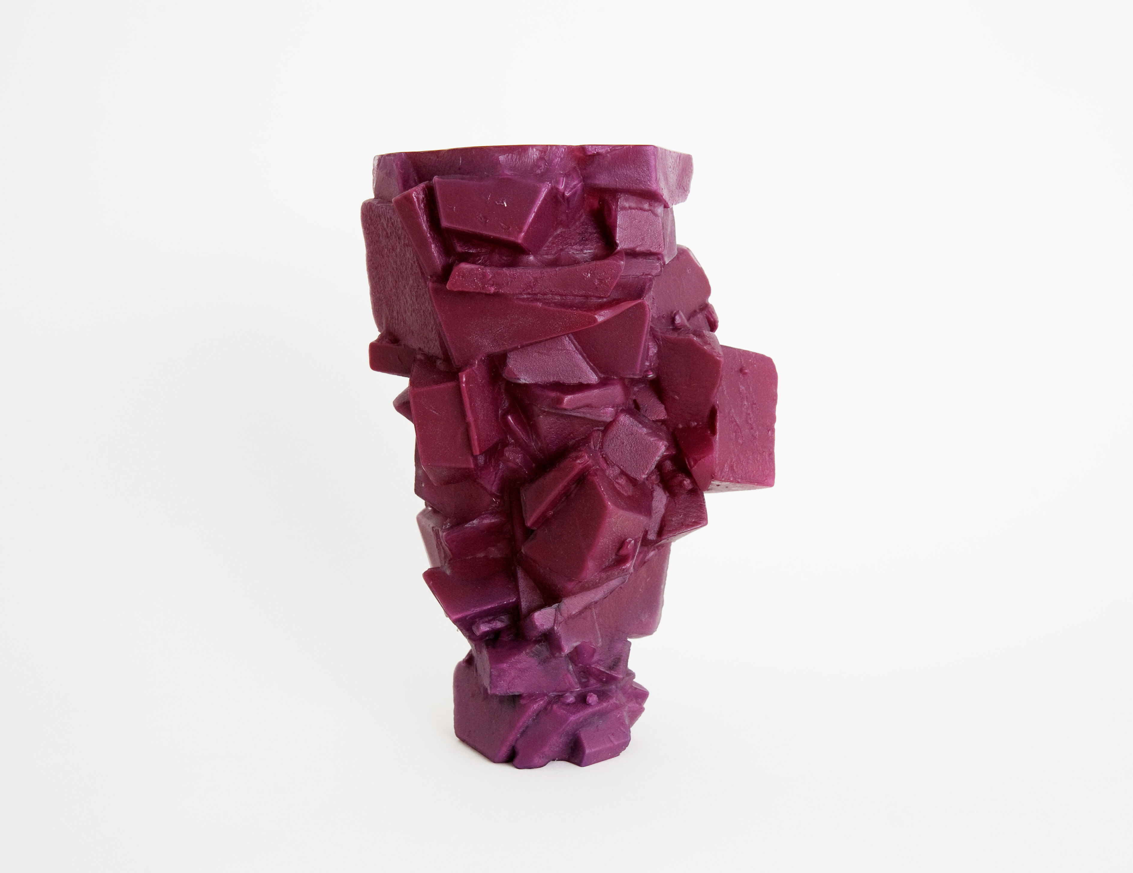
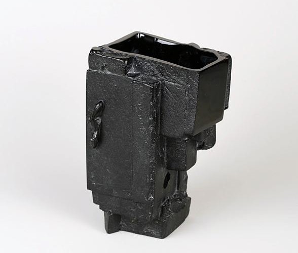
The Assemblage pieces began during a residency at the Creative Glass Center of America in New Jersey, but after seven failed attempts he set them aside. “I made the forms way too crazy,” Wolfe says, resulting in holes or material inconsistencies. When he returned to them almost three years ago in his Brooklyn studio, he began perfecting what’s become a relatively crude, improvisational process. At its heart is a one-shot plaster-silica mold, which means that no matter the planning, each piece remains fundamentally different from the one that came before. Such mixed results can be frustrating — “sometimes the shape is too strange for a glass bubble to fill, and I’ll have to throw it away,” Wolfe says regretfully — but they can also be freeing for Wolfe as a maker, saving him the drudgery of creating the same thing over and over and allowing him a measure of delight each time he breaks open a mold to find the whole thing has worked. The fact that each piece is different and beautiful in its own right is also part of what makes his work so appealing to the outside viewer — and what made it almost impossible to choose the images featured in this slideshow.
Event that inspired you to be a maker: “I’ve made things my whole life, and it provided some solace at times. When I was about five, I wanted to be a potter, which is pretty much what I turned out to be.”
Style movement you most identify with: “Lo-fi. I’m more analog than digital. I practice simple, non-computer-assisted processes.”
If you weren’t a designer, what would you be? “A painter or a ceramicist.”
Thing you love most about New York: “It can be exciting just to bicycle or walk around aimlessly and discover new things. The city is inexhaustible.”
Thing you hate most about it: “Stupidly long lines for everything — lines for shows, lines for bathrooms, obnoxiously long waits on a Tuesday night for restaurants in the middle of nowhere.”
Favorite place to shop for materials: “I usually just go to the local Ace hardware in my neighborhood, on Knickerbocker Avenue. An old-school Italian family runs it. The place is a dump, but they have everything I need — even art supplies.”
What inspires your work? “Natural phenomena like rocks, plants, and shells, but also the process of glass-making and the decorative arts and artifacts of many cultures.”
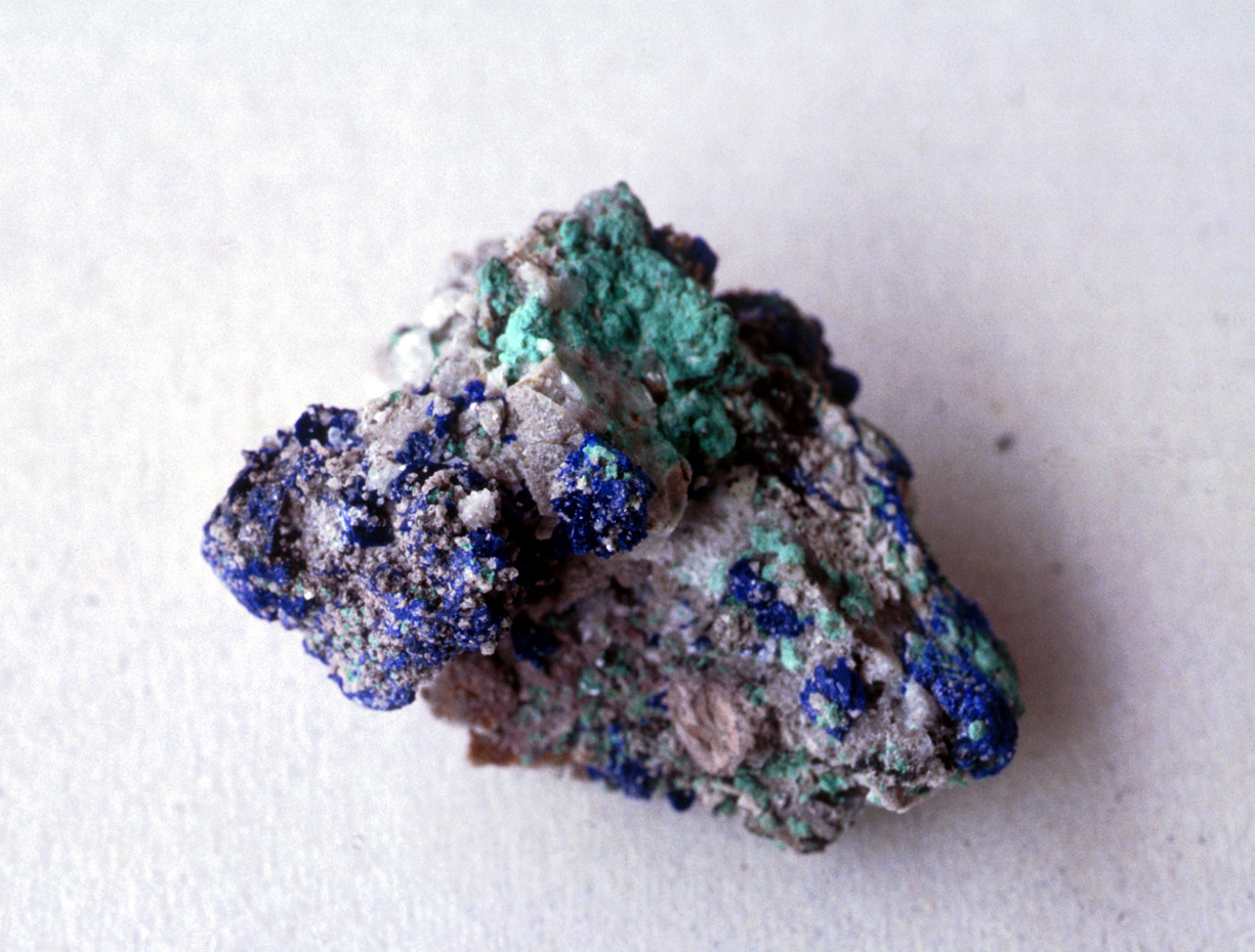
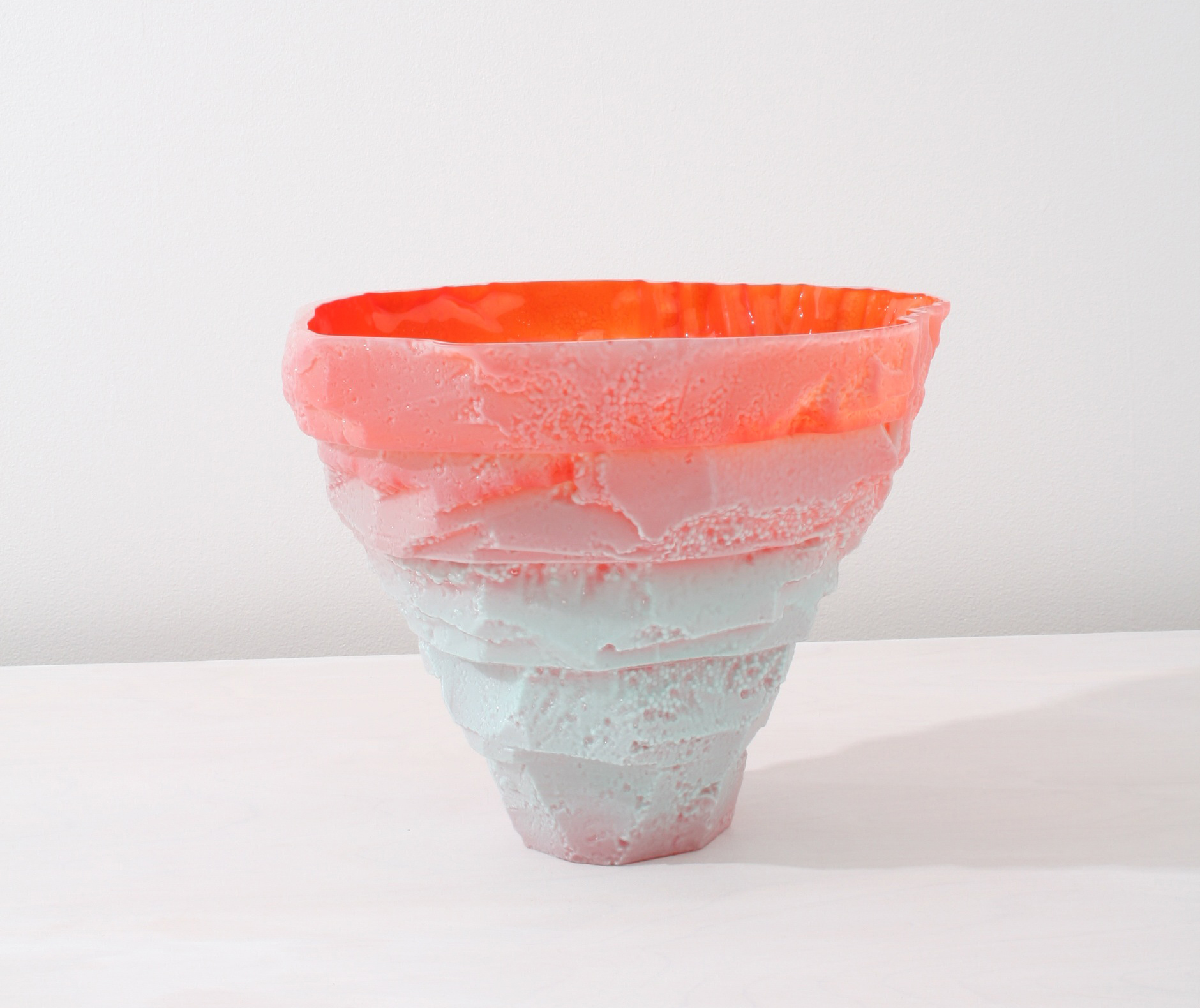
What about your Assemblage vases? “After many trips to the mineral sections of natural history museums, I became intrigued by the forms and the way many of them looked like modernist sculpture. That was the starting point, but my forms don’t actually follow any of the rules by which minerals form. I’ve come up with systems for building the pieces such as stacking, or cutting things apart and reassembling them. I like the idea that the pieces are being built up but also appear to be fractured and coming apart.” Wolfe’s pieces debuted during New York Design Week at Matter, but their visual language has evolved even since then. In the above piece for Volume, Wolfe layered celadon blue atop an orange interior. “The celadon layer became thinner when it was blown into the mold, causing the orange to show through towards the top,” Wolfe says. “A happy accident, but I liked the effect.”
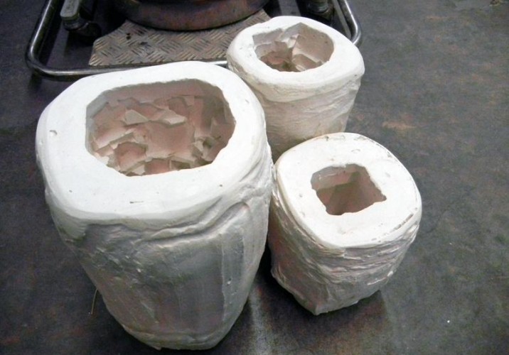
Wolfe calls his Assemblage process “seriously low-tech but effective.” He begins each mold by slicing up pieces of foam with thin box cutters or an old straight razor, then gluing the pieces together and carving out large chunks using a hot-foam wire cutter. The foam pieces are then coated with a mixture of plaster and silica and, once it’s dried, the foam is removed and the mold heated to 1100 degrees before glass is blown into its cavity.
The painstaking de-molding process is “like an excavation,” Wolfe says. “I break off all of the big chunks of plaster, then wash the piece really thoroughly and pick all of the leftover bits of plaster out with dental tools, bamboo skewers, and tooth brushes.” Diamond tools are used to grind and polish inside and out, leaving the interior glassy and smooth, with a rougher, more matte finish outside.
Design hero: “The Finnish designer Tapio Wirkkala. He made an astounding amount of amazing things in many different materials; plus, he was great with his hands and also made really beautiful drawings. He definitely didn’t sit in front of a computer.”
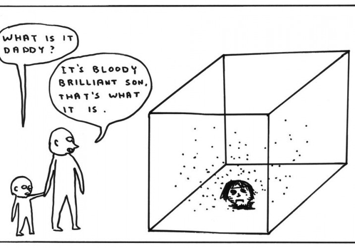
Art hero: “I really dig David Shrigley. I can’t get enough of his dejected take on life.”
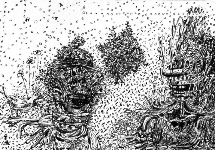
Wolfe’s doodles (above) are more elaborate than most, and yet he doesn’t consider drawing a serious pursuit, though he did, at one time, think he’d end up being a painter. “I don’t do finished drawings; I don’t even draw on nice paper. I’m only okay at it, but it’s become a good way to document thoughts and ideas.”
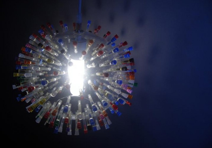
Favorite collection: “The only thing I ever rigorously collected was crack vials. When I moved to New York after college, you could find them all over the streets in Williamsburg and Bedford-Stuyvesant. They came in all different colors — different colors, different weeks. I made a lamp out of some of them, which is collecting dust on a shelf in my apartment.”
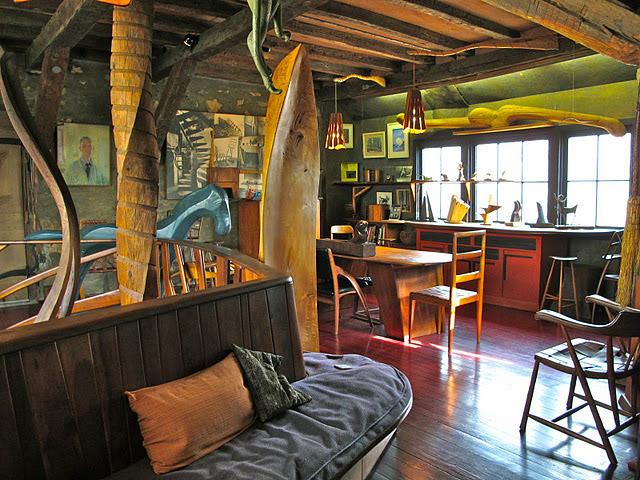
Most inspiring place you’ve ever been to: “I went to the Wharton Esherick house in Pennsylvania a while back. It was an incredible space to see, not just because I love the style he worked in, but it was simply inspiring to be in the house and studio he built, with the furniture and sculpture he made, and to feel a connection to the way he lived and worked.”
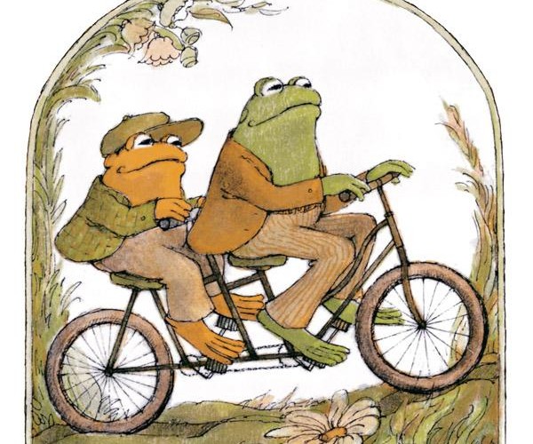
First thing you ever made: “According to my mom, when I was about 4, I made a sculpture in clay of Frog and Toad riding a bicycle. Unfortunately it didn’t survive.”
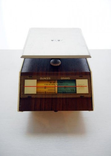
Last thing you bought at a flea market: “I bought this kitchen scale at a strange little thrift store in my neighborhood.”
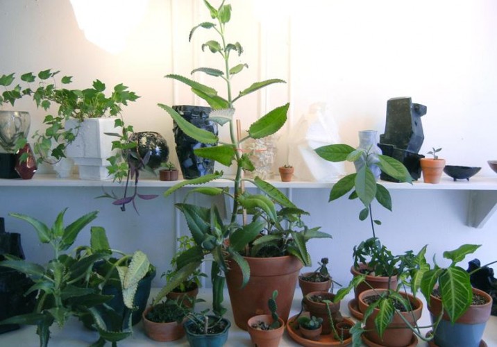
What do you keep around your studio or home for inspiration? “I’ve gotten into plants in the last year or so, and growing things from seeds. It’s pleasing to me just observing the way things grow and change.”
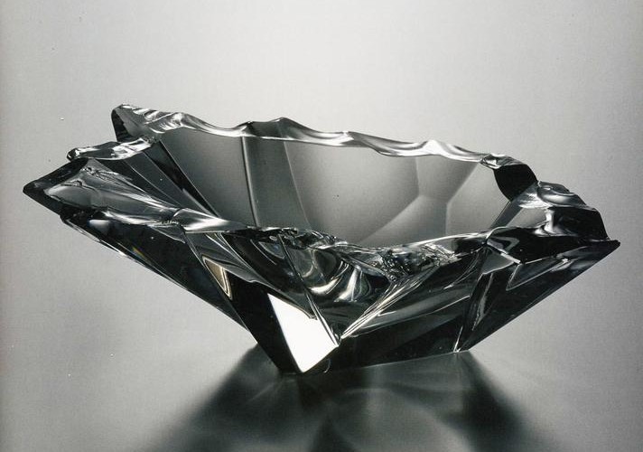
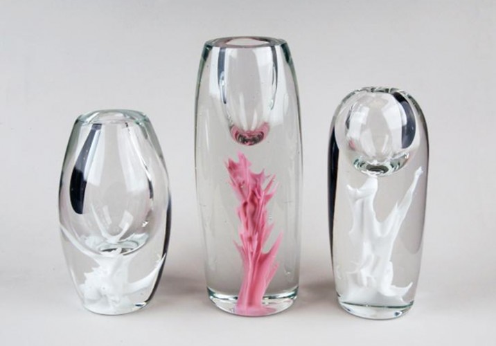
Color theory: “I tend to gravitate towards more muted, natural colors. The great thing with glass is that I have the choice of not using color. I can use just clear glass, which can be really beautiful in the way it transmits light and its other optical qualities.” Shown here are Wolfe’s Inclusions vases, which he calls simpler and more straightforward than the Assemblage pieces. “The Inclusions I feel like I’ve figured out. The Assemblages I’d like to still to develop further, maybe using different shapes and colors and increasing the scale.”
Last great exhibition you saw: “The Ryan Trecartin show at PS1. His videos are strange and over-the-top, but I think they’re an apt criticism —and reflection — of the place we find our culture in presently.”
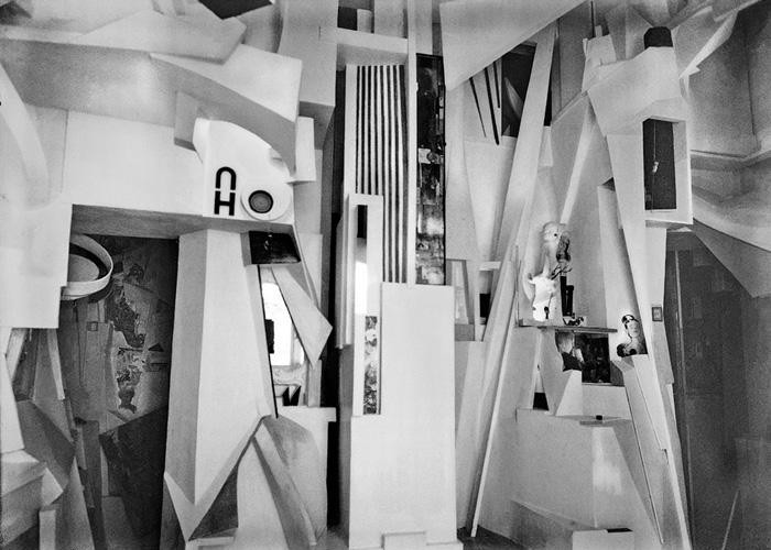
If you had an unlimited budget for a single piece, what would you make? “I would like to transform someone’s living space into a kind of Merzbau, a la Kurt Schwitters, with glass sculptures, light, and a collage of wood, stone, and wallboards in various forms.”
Fictional character who would own your work: “Maybe Darth Vader. I really like using black glass, especially for Assemblages. It becomes like this mirror, but then there are parts that are really rough.”
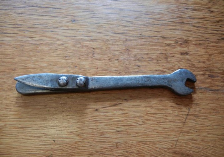
Favorite everyday object: My grandfather made a can opener (probably back in the 1950s), which I have and still use. It was made by riveting a blade to a small wrench. I love it for its ingenuity and simplicity.”
What is your next project? After making 26 new pieces in the span of a month for the show at Volume, opening tomorrow, Wolfe deserves a break: “Cleaning my apartment,” he says.
When we — and the rest of the design world — were first introduced to her at the 2009 London Design Festival, Faye Toogood already seemed like Superwoman: Having just left her post as a stylist at the UK shelter magazine World of Interiors and cast out on her own, she'd engineered a coming-out party for herself that included a collaborative installation with Gallery Fumi featuring designs made from corn, a Memphis-inspired playroom with an Arabeschi di Latte egg bar, and a temporary shop for Tom Dixon that showcased how she'd begun to transform his brand image. Just seeing her do it was enough to make us feel stressed, and that was before we knew that she was about to reinvent herself again, this time as a furniture designer. Her first collection, Assemblage 1, was inspired by modernist sculpture, British craftsmanship, and her childhood growing up in the English countryside; it gave way to Assemblage 2 in Milan earlier this year, which took a darker, edgier turn. Finally, with Phillips de Pury last week, Toogood unveiled the third chapter in the series, and the most ambitious to date — it's based around her fascination with iridescence, and it took a motorcycle fabricator, a gun maker, and a studio full of assistants in gas masks to complete. I was asked by Phillips to conduct an in-depth interview with Toogood to appear in the show's catalog, and so Sight Unseen received special permission to reprint that interview here. It's lengthy, but it offers a good deal of insight into the mind of one of the most intriguing and ambitious personalities working in design right now.
There's a reason why one of the first questions we always ask Sight Unseen subjects is "What did your parents do?" In the nearly two years we've been producing this site, it's become apparent that the ideas and habits of ultra-creative people usually germinate in childhood, and that the environments in which they were raised tend to have played a part — whether their formative years resembled those of Kiki van Eijk, whose father competed on the 1976 Dutch Olympic field hockey team but also taught her to paint, or Lauren Kovin, whose parents filled the house with Ettore Sottsass furniture. The more designers and artists in a given family, the more interesting things tend to get, which is why we decided to start this new Related column. In it, we'll periodically ask creative talents who are related to interview one another about their respective practices and what it was like growing up in close proximity. First up are brothers Lukas Peet, 24, and Oskar Peet, 27, up-and-coming designers who were born and raised in the Canadian mountain resort town of Banff, attended the Design Academy Eindhoven together, and whose Dutch-born father Rudi Peet immigrated to Banff in 1974 and has since established himself as a successful jewelry designer there.
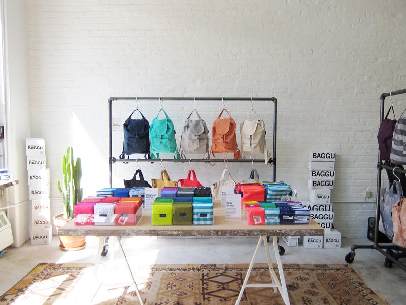
“Always listen to your mother” isn’t exactly the kind of central tenet they teach you at Harvard Business School. But for Emily Sugihara, the California-raised, Brooklyn-based designer behind the reusable bag line Baggu, it’s a piece of advice that’s been invaluable to the brand’s runaway success since its founding in 2007. Back then Sugihara was a Parsons grad working as an assistant designer at J. Crew, just coming to realize that a corporate job wasn’t her calling. “As a kid, I was very entrepreneurial, and I always knew I wanted to have my own company,” she says. At home over Christmas break one year, Sugihara and her mother began talking about making a line of reusable shopping bags. Her mom was “sort of a treehugger” and an artist in her own right — an expert seamstress who learned to sew making her own clothes as a kid in rural Michigan — and Sugihara was a die-hard New Yorker-in-training, sporting fingers turned purple each week as she lugged home bags full of groceries. Together they came up with a bag that’s almost exactly like the original ripstop nylon Baggu that sells today: long handles that fit comfortably over the shoulder, gussets along the bottom that allow things like milk and eggs to stack, and a single, double-reinforced seam that’s the result, Sugihara says, of her mother’s “sewing genius.”