05.22.20
Sight Unseen OFFSITE
JUMBO’s Founders on the Science of Cuteness — And Why They’re Endlessly Inspired By the Emoji
This piece is part of Sight Unseen’s 2020 Offsite Offline coverage. To view JUMBO’s virtual booth on Offsite Online, click here.
For Justin Donnelly and Monling Lee of Jumbo, working remotely is old news. The duo have kept their design practice going from their respective home bases in Brooklyn and Washington, D.C., by creating a collaborative working relationship that thrives on distance. Similarly, metaphor, abstraction, and the unreal have been themes throughout their practice, which has largely consisted of making, well, jumbo, overstuffed furnishings or other designs with outsized personalities.
Trained as architects, Donnelly and Lee design objects that seem seamless, almost immaterial, just arrangements of color and form. Working in this gap between representation and object could be no less prescient — as if we weren’t experiencing much of the world mediated by screens already, social distancing due to the pandemic has only increased our reliance on digital intermediaries.
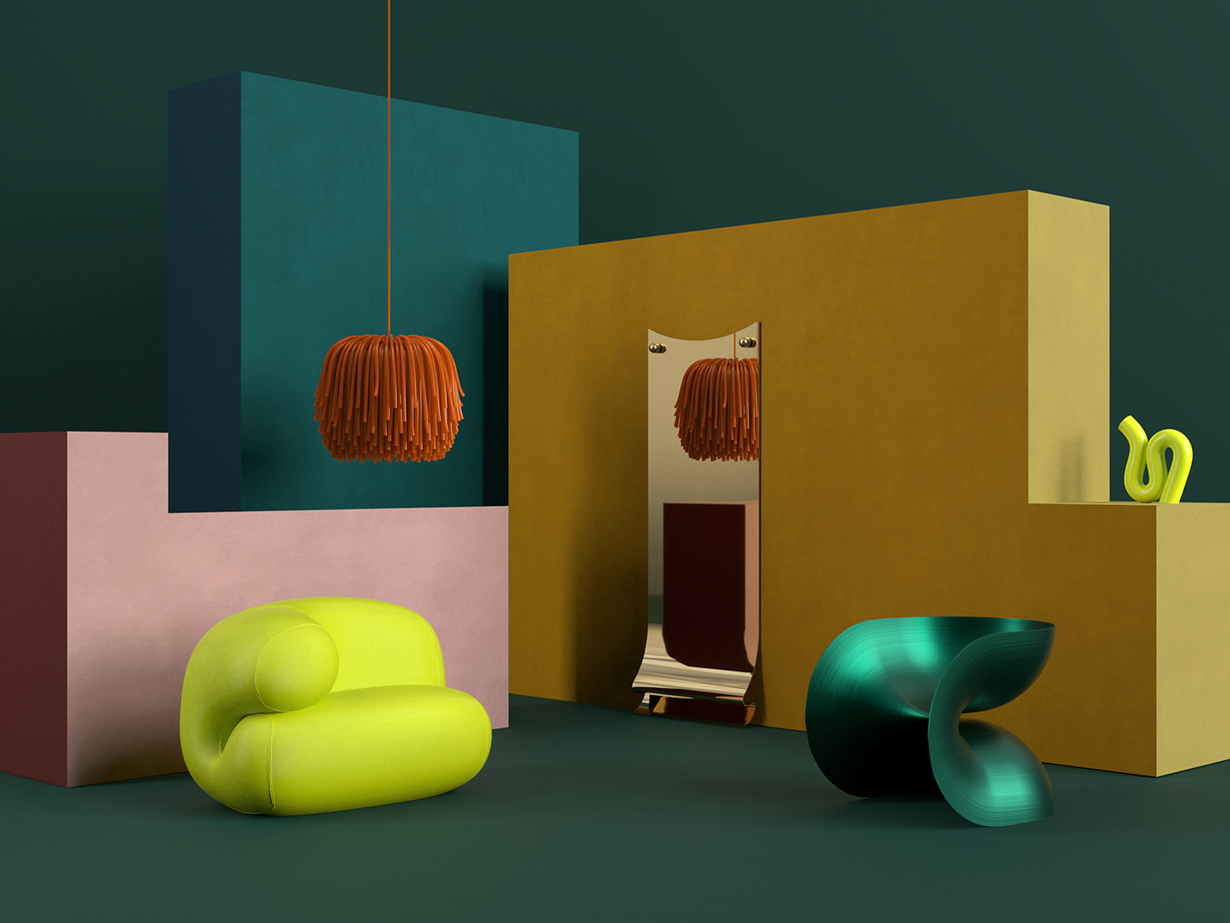
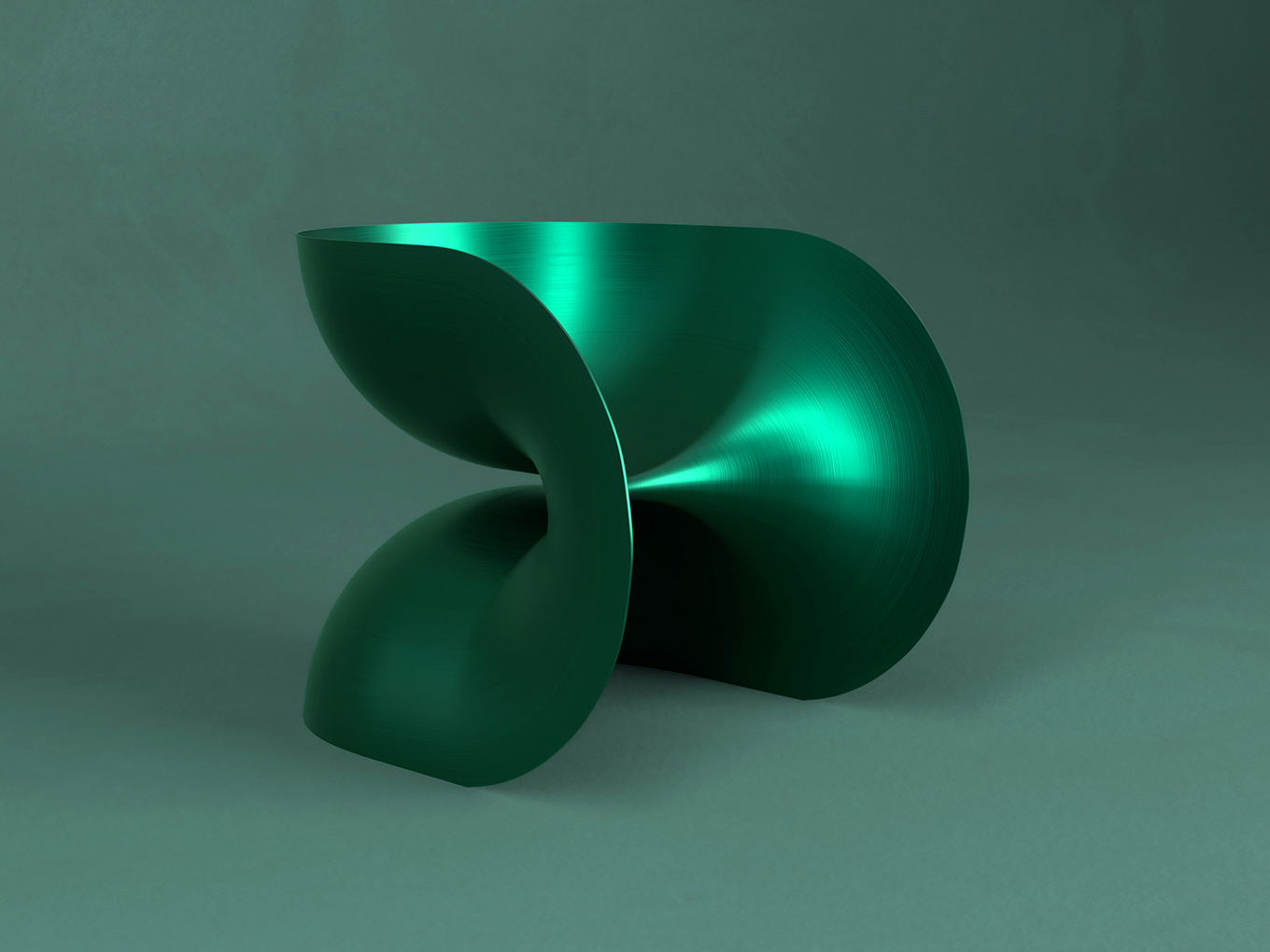
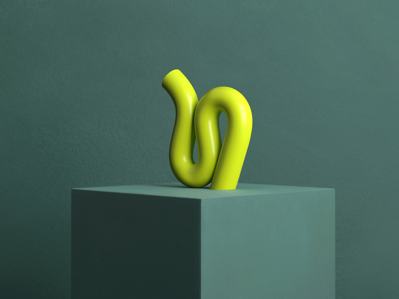
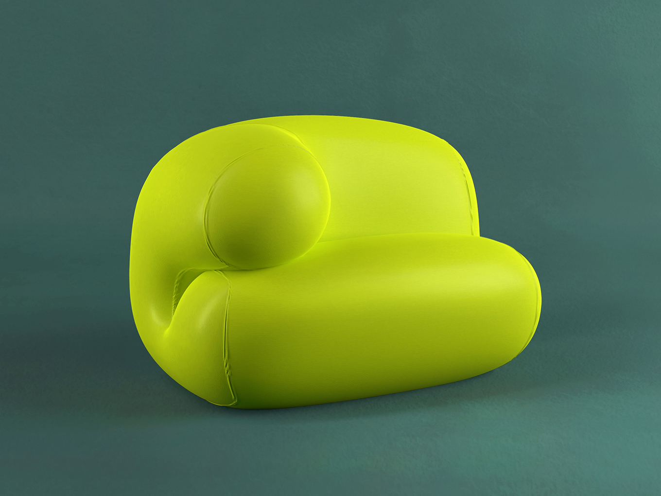
Jumbo’s Creature Comfort collection, debuting at Offsite Online, nearly dips into the uncanny valley, but, cleverly, steers clear of unnerving us. It’s fun, inviting. You want to jump on a cushy-looking neoprene loveseat, and expect that a squiggly cast aluminum decanter might bounce right off the floor if dropped. Inspired by everyday items — tennis balls, fortune cookies, mops, bugs — the work is an exuberant exploration of the tension between image and object, and the evocative power of design.
Jumbo, for me at least, is instantly recognizable. You’ve got a very particular aesthetic that you’re able to mutate into many different forms. What makes something a Jumbo project?
Justin: What we’re about is creating emotionally communicative and evocative objects. And we do that in a couple of ways. We’ve been described as maximalists, but we actually think of ourselves as a minimalist design practice. We’re trying to communicate emotion and affect using the most simplified or dumbed down forms and colors. A lot of times they’re inflated or puffed up or modulated in a way that makes them more easily identified with. That identification is very important to us.
One way of working is to come up with a great material or material process and have that process guide you. Then there’s another way of working where you’re more interested in metaphor. We love it when we can have our cake and eat it too, like when a material process along with a metaphorical association that’s clearly evident. But if we have to choose, we’re always going to choose metaphor, because we think that metaphor helps us connect. The objects, though they’re abstract, become less abstract and more identifiable through it. We’ve read a lot about the science of cuteness, and done a lot of research on what makes design objects “iconic.” We’re really interested in those ideas. We’re really interested in the emoji.
Why the emoji?
Monling: With our designs and objects, we’re trying to convey emotion and gestures in quick and simple ways. And really in mass culture, the equivalent would be the emoji. We just love that — looking at a graphic symbol and knowing clearly what that is trying to convey, in an instant. They’re iconic. That’s what we strive for. When we design a chair or an accessory we’re looking for that instant recognition, which in turn creates an emotional connection.
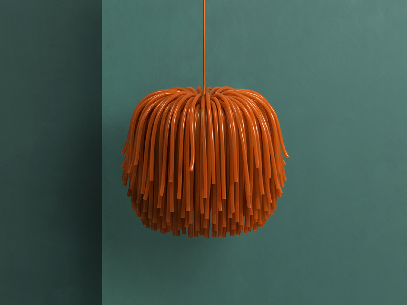
Speaking of emojis, your work has a certain render-aesthetic quality. It’s smooth. Even IRL it looks like I could be seeing it on a screen. This is even more relevant during the pandemic and as it comes to Offsite Online, where the work is, at least for now, going to be only experienced on screen. How does dematerialization fit into your practice as object designers?
Justin: This is a core tenet of our practice. We really want to dematerialize the objects in the real world as well as in our presentation of them. It is easy to make digital models that feel unreal. It is very difficult to make material objects that are surreal or dematerialized — our brains are so advanced in terms of how we appreciate objects and light and shadow, we know when something isn’t “material.” And, as designers, we want to make objects that are a little bit trickier to understand. That’s actually really hard to do if you don’t rely on decorative details, as we don’t. This also really influences how we present the work, which is something Monling’s been working on for years.
Can you tell me a little bit more about the presentation?
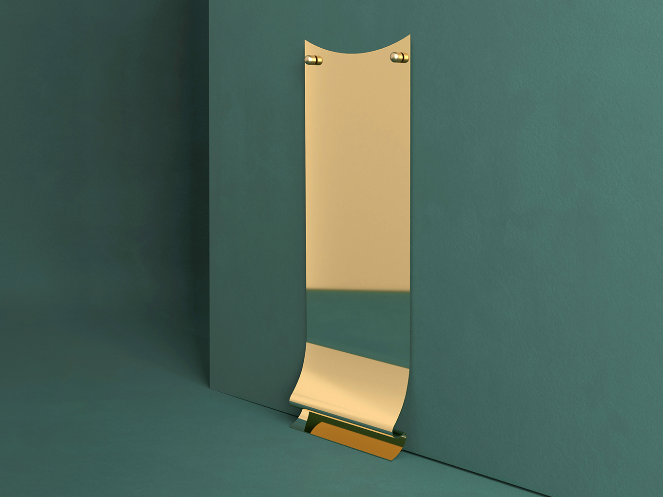
Monling: We want to highlight the friction between what’s real and what’s surreal. That’s an ongoing theme to our work, but it’s also critical at this moment of working virtually during a pandemic. If you look at the set pieces, the geometries are pretty simple. They’re made out of straight lines and thick walls and large podia. They’re things that could be conceivably built and be brought into a photo studio. But how the walls and the pieces are arranged, they play with our perception of space. The arrangement forces you to do a double take and question the reality of the environment.
Justin: We’re both architects, so we’re really interested in these kinds of strange symmetries. If you were to look at these environments in plan, sometimes the objects that seem like they’re coplanar or right next to each other are actually not where you’d expect at all. It’s not like a real space that you would inhabit, or rather it only makes sense from this one vantage. But if we were to look at it from like a bird’s eye, arial, it would make no sense. There’s a layering of the space and strange symmetries.
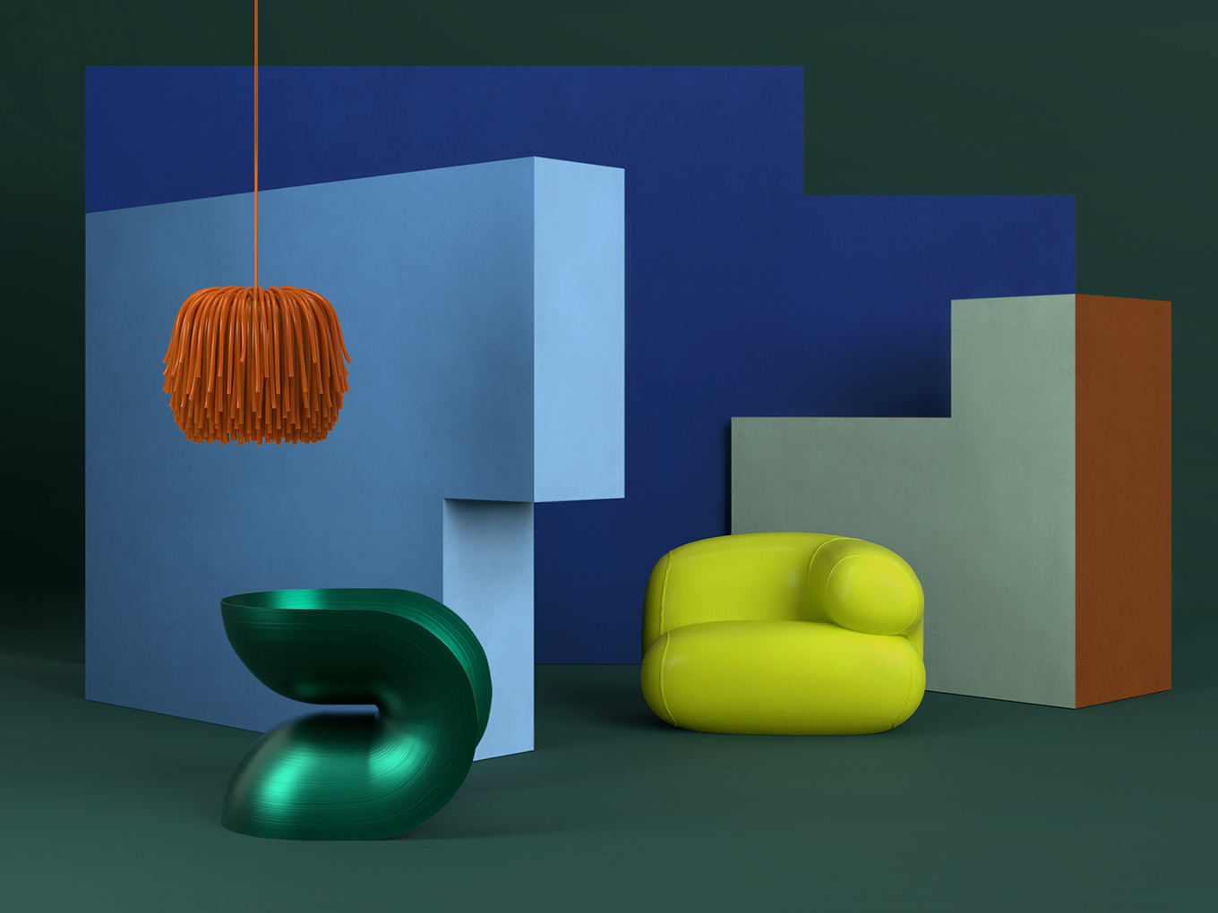
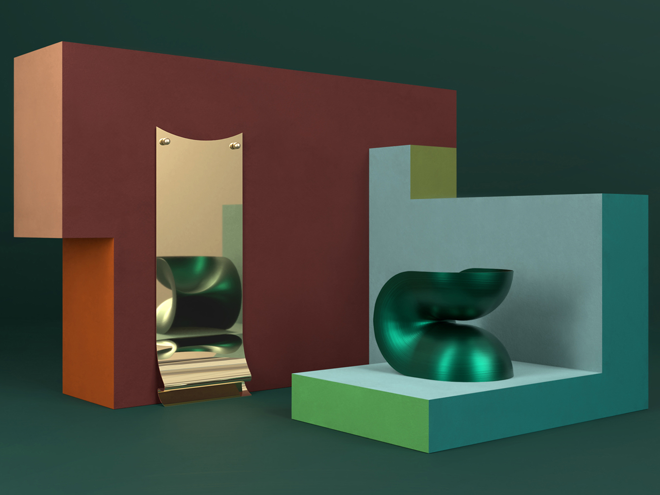
While they’re seemingly abstract, many of the forms are inspired by something else — a fortune cookie, a mop, an inchworm. How do you look at objects and creatures for guidance?
Justin: We want all of our objects to be characters, like stand-ins for something else. A core premise of the studio is to get emotional effects, and this familiarity helps with that. For instance, that decanter, we showed that to one of our studio mates and she was like “Oh my God, I love it. I just want to touch it.”
The geometry has some sort of an elusive power to it. She identifies with it because she thinks it’s cute. It’s maybe animal-like, bug-like, it’s colorful, it’s curved, it’s a mono-material, it’s shiny. And she responds to that in a certain way. We like foods, animals, household objects, stuff that’s like really quotidian, that you see and experience every day that by seeing it reinterpreted in another material and in another color and another at another size or scale, there’s a moment of delight. That’s what we’re going for.
