09.14.23
Sight Unseen Collection
Farrah Sit’s Work — Including Her Best-Selling Serpentine Sconce — Feels Both Effortlessly Current and Like a Prehistoric Artifact
Equilibrium and harmony: They’re difficult to achieve in life and maybe only slightly easier in design. But the search for balance, especially a desire for balance with nature, has lately been driving New York designer Farrah Sit — in a stylistic sense, yes, but also in the way she produces the lighting and furniture for her eponymous line. Sit makes pieces that embody substantial and even existential concerns but wear their heaviness lightly; they’d look really great in your living room but they’re also meant to do more than that. “Part of what we’re trying to do as designers,” she says, “is create awareness between you and your environment.” What she’s ultimately aiming for is “to create a space of quietness and harmony, an expansive space of contemplation. I’m curious about that in life and it expresses itself in my designs. How do we recreate this contemplative expanse of space that we feel when we’re in nature?”
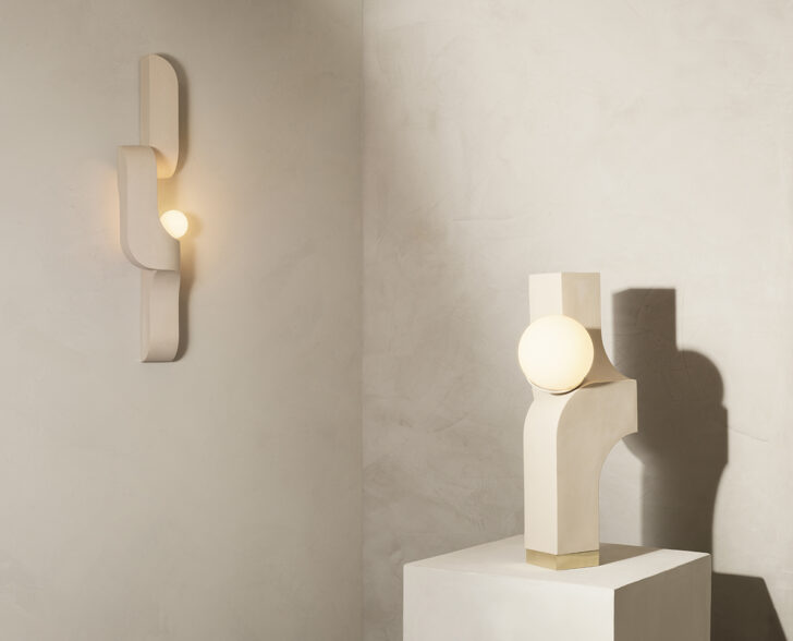
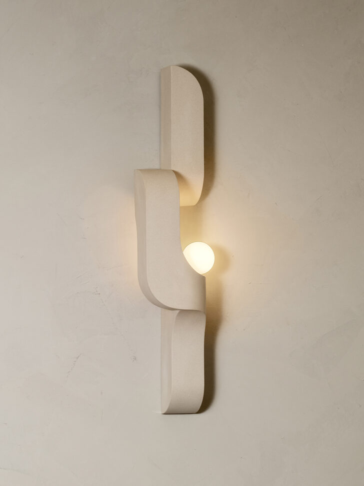
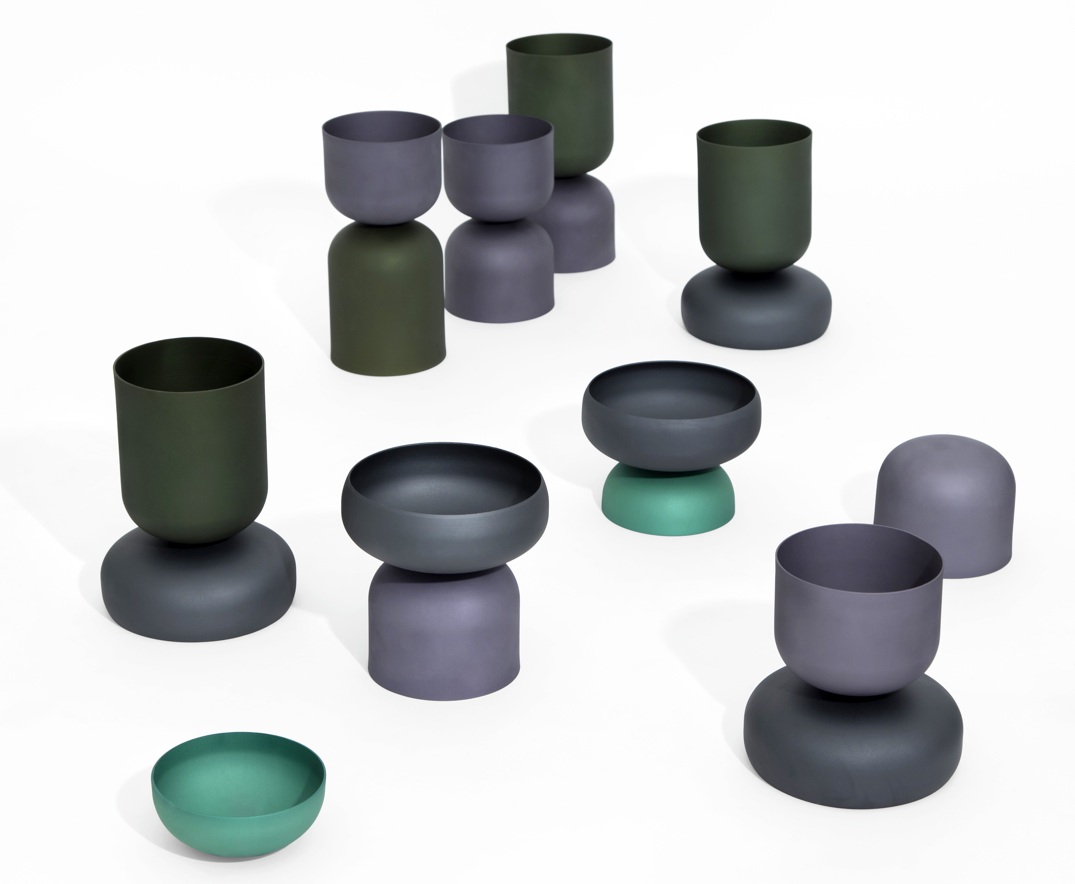
Sit’s interests have evolved, of course, over the course of her career. After studying industrial design at RISD, Sit went to work for Michael Graves and then Calvin Klein Home as a tabletop designer — “that’s where I grew up as a designer,” she says — before going out on her own around 2009 and eventually founding Light + Ladder, offering minimalist yet earthy ceramic planters, vases, and accessories for the home. Parallel to that, she began focusing on lighting and furniture and split her work into two distinct brands “to allow Light + Ladder to grow in a way that was authentic to itself as an entity and keeping Farrah Sit totally free from that so that I could express whatever I wanted to express in whatever material and aesthetic that I wanted.” That aesthetic has largely hewn to neutral colors and natural materials and a dedication to elegant, mysterious forms — like Sit’s best-selling Serpentine sconce, which debuted as part of Sight Unseen Offsite in 2020 and is now part of the Sight Unseen Collection. A ceramic wall sconce, Serpentine seems both effortlessly current and like an unearthed artifact — not entirely unlike the work of British architect John Pawson, who continually inspires Sit with the way “he creates these spaces that are places of awe even though they’re modern.” Sit’s pieces look relatively simple but wordlessly convey a whole world of feeling.
“The cool part to design is that there’s so much that can be communicated to strangers who might not even share the same language as you,” Sit says. “Design can be a language… that crosses all cultures,” and time, too. In collaboration with TRNK last spring, Sit created the Hathor collection, inspired by ancient Egyptian monolithic structures — i.e. forms that are thousands of years old but still have an emotional immediacy. The Serpentine grew out of this work, which explored concepts of femininity and strength, and how the two have often been placed in opposition to each other, in a false, limiting binary. Sit wanted to visually represent a kind of power that “feels soft and inviting, that’s welcoming but not weak,” combining “generous curves that feel all-accepting with these refined lines to show intentionality and direction.” And while Sit sees potential for further iterations of the Serpentine — perhaps a pendant variation — the tone of the piece isn’t likely to change dramatically.
“I have always been drawn to a more natural palette. Everyone has different paintbrushes,” she says, and though she loves the use of bold color in other people’s work, her paintbrush is “light, shadow, and materials,” as she puts it. “I love form that comes first, so when you’re moving around the space it’s light and shadow that creates what you see and it’s ever-changing based on your relationship to the object, where you are, how you’re using it. As a designer I start there.”
The richness, density, and sensuality of natural materials – the touch, feel, and temperature of them – is also primary for Sit. “I use materials the way someone might use color. I don’t know if it’s from RISD, where we were trained to create the perfect sphere or disc and you had to just sand and scrape until you could feel the surface being perfect with your hands. You couldn’t look to see the perfection, you actually had to feel it with your hands underneath a cloth to discern the perfection of the curve. Maybe it came from that, but I definitely have such a love for materials and how they create an environment. When you walk into a room that’s all concrete, it has a certain temperature. In a room that’s all wood your voice sounds different,” she says. “When you touch marble, it draws in your body heat. These are the subtleties that I’m really passionate about because they affect how you feel. That’s what I want to do as a designer — be the mediator between object and person.”
When we spoke, Sit had just spent a week at an off-the-grid island in Greece, which further intensified her desire to design in harmony with nature. She’d stayed in a house constructed by artist-architects that was “tucked into the landscape, proportioned to the existing terrain” in stark contrast to newer, bright white dwellings that seemed plunked down with no thought to their environment. How to create in a conscious way has long been on her mind, but now, she says, “it’s a bit more heightened. How can we make the entire process reflect that? It’s always a tough thing as a designer because at the end of the day we are creating more things. But we can create things with integrity, things that last longer.” She’s also working on new projects based on her fascination with computer simulation and how artists using it “are able to capture forces of nature, how they’re able to make natural phenomena freeze, so that we can witness the beauty of it.” While she describes this work as a departure, figuring out how technology aligns with the natural world is also an extension of her current preoccupations – an attempt to bring it all into balance.
Explore Farrah Sit’s work as part of the Sight Unseen Collection here!
RENDERING (TOP) BY NOTOO STUDIO
Photo by Nicole Franzen; interior by Banda
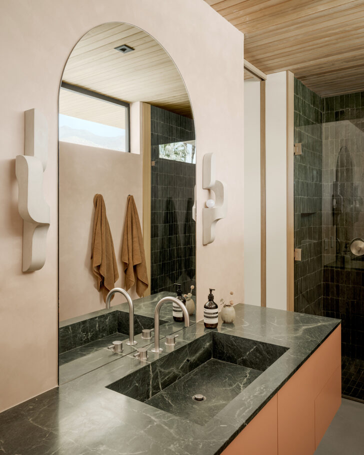
Photo by Lance Gerber