At the 2015 Milan Furniture Fair, Part I

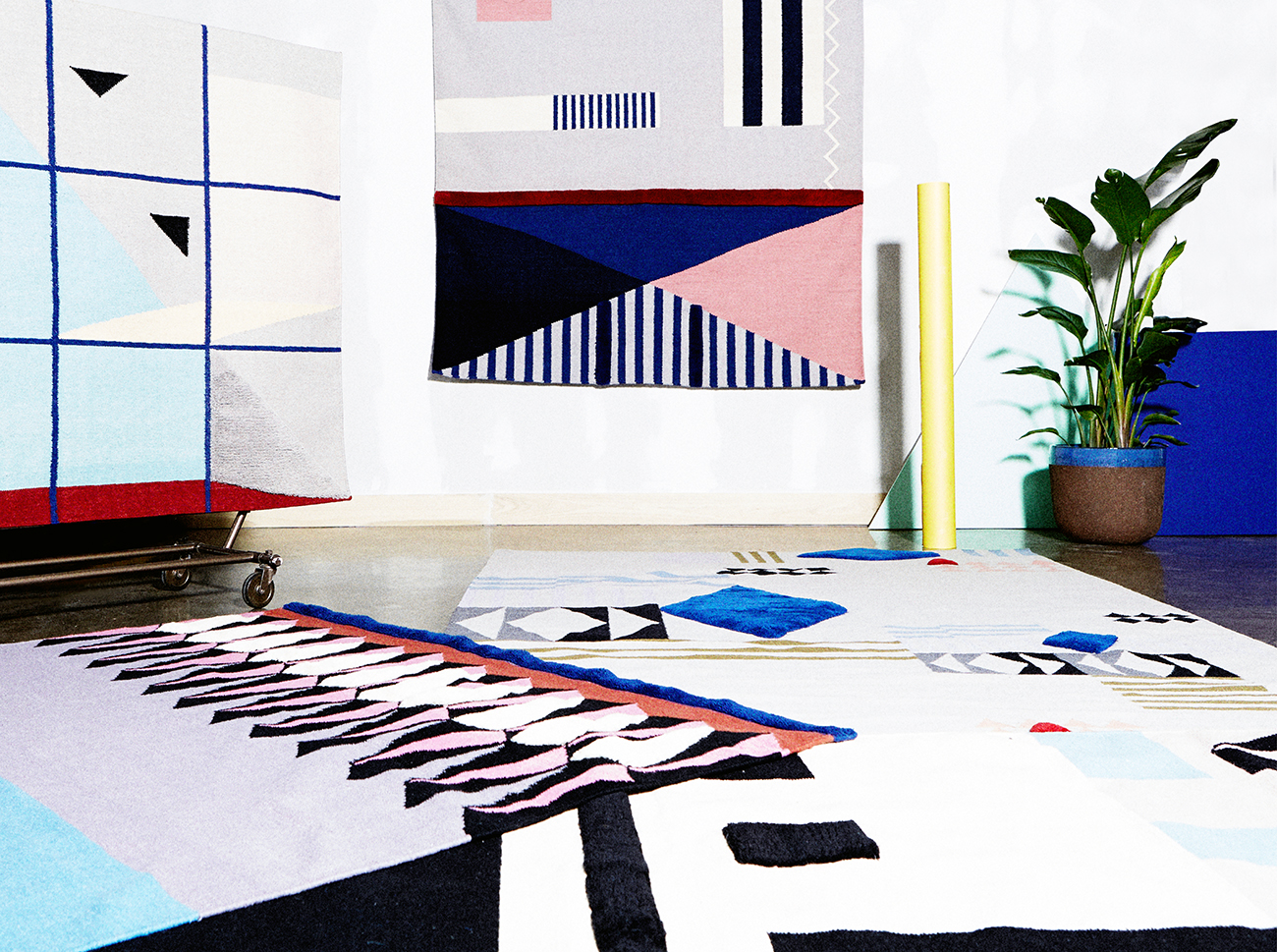
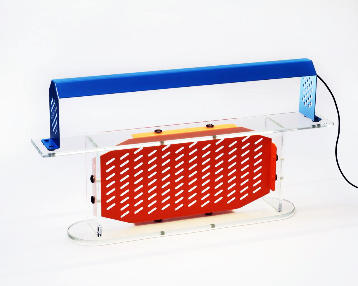
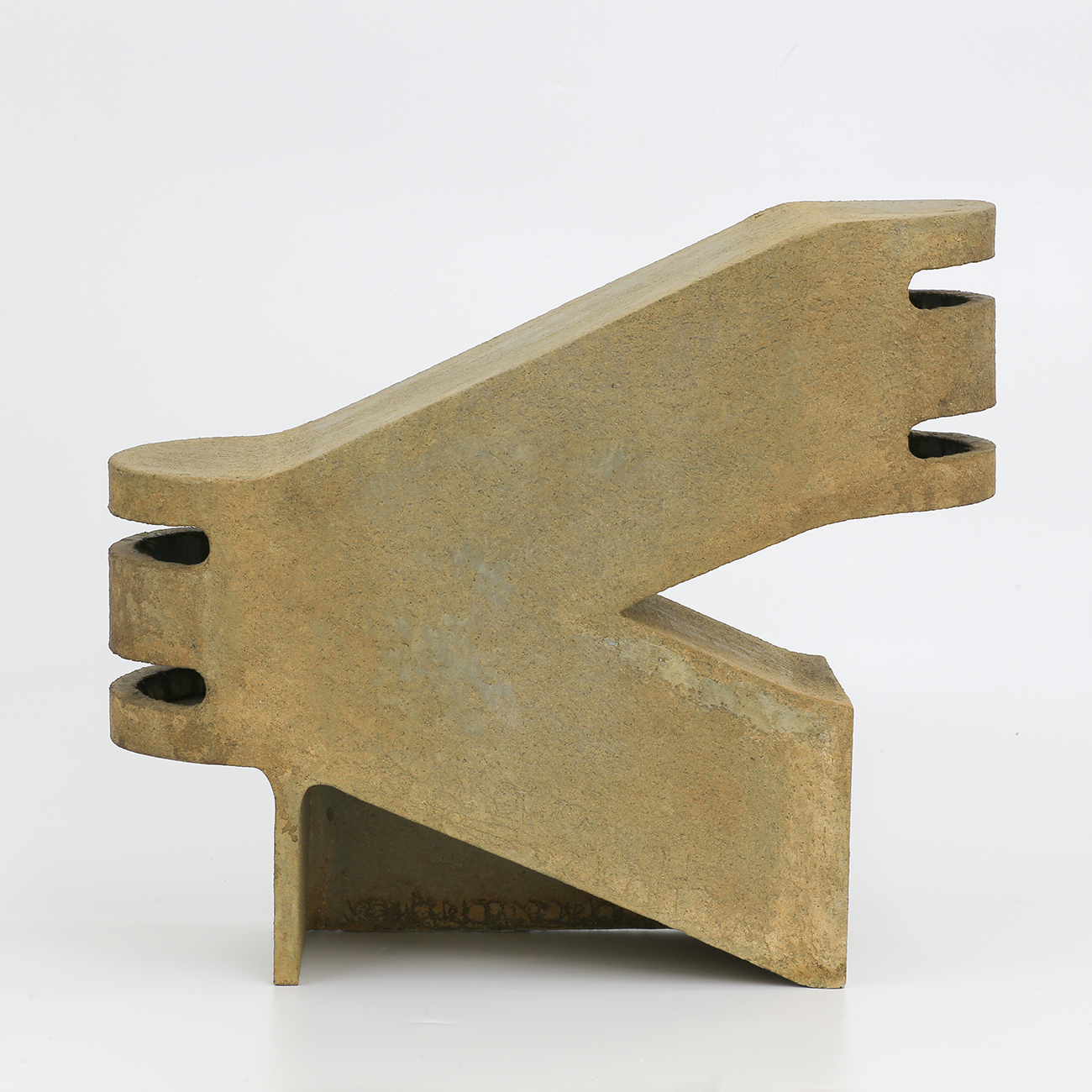
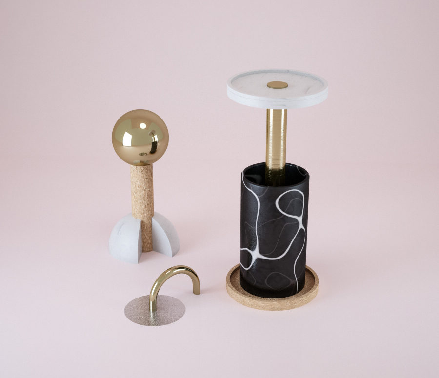
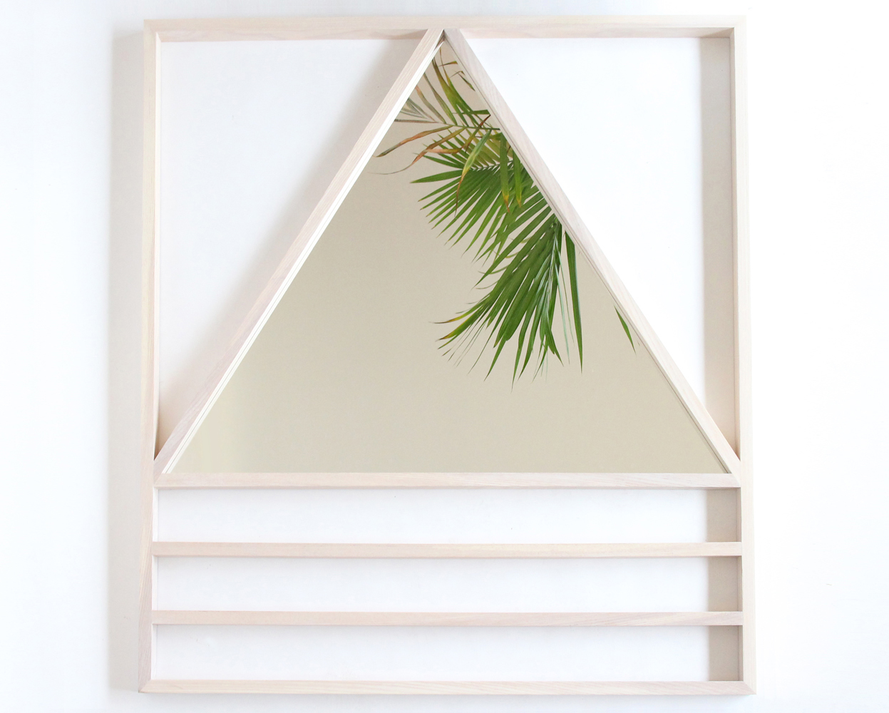
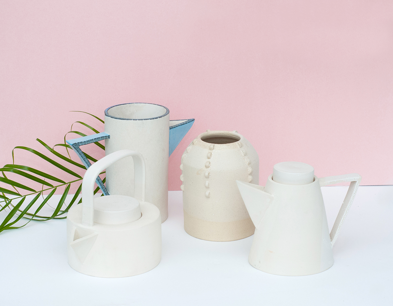
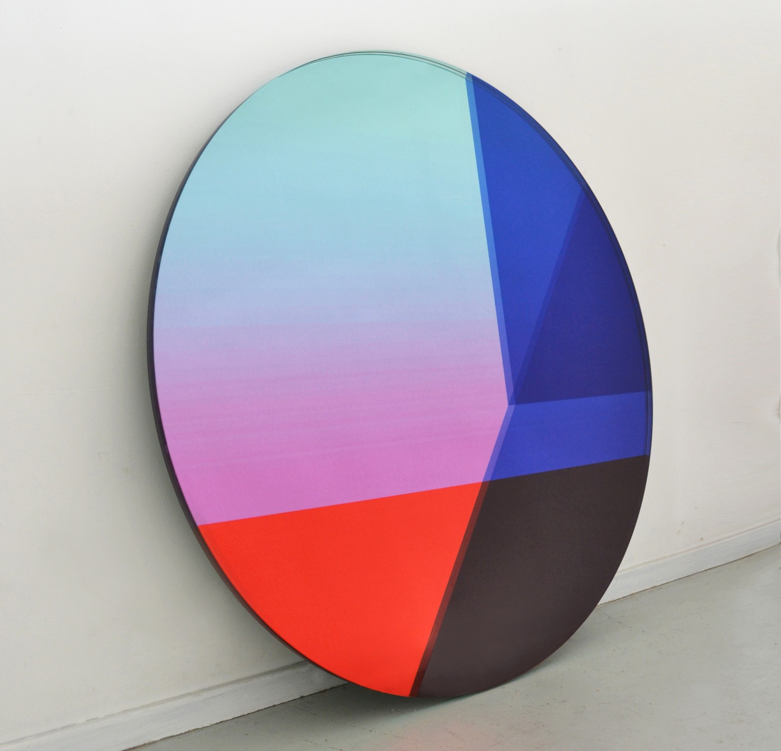
Another year, another Milan. Every year we attend the behemoth furniture fair known as Salone expecting to come away with something smart to say about the current state of design. But the truth is, you spend the week bombarded with so much stuff that you're often left with just a few fleeting mental images of your favorite things, whether it's a colorful chair sheathed in Flyknit-esque sneaker material or a particularly delicious gnocchi you nearly licked off the plate. Luckily, that's what cameras are for. We shot nearly everything we saw this year, whether it was for an immediate Instagram, a file-away-for-later trend, or to share with you here, in our best of the best round-up from last week.
More

Aelfie x Studio Proba Rugs

For the rest of this week, we'll be bombarding you with our favorite finds from last week's Milan furniture fair, but we'd be remiss if we didn't first highlight one of the best things to recently launch on our shores: A colorfully graphic series of limited-edition rugs, pillows, and prints that represent a powerhouse collaboration between two Brooklyn designers, Alex Proba of A Poster a Day, and rug designer Aelfie Oudghiri. The two designers have strangely similar backgrounds — both attended medical school in Europe before finding their way to Brooklyn's collaborative design community — as well as a complementary aesthetic that's heavy on geometry and asymmetry.
More

Week of April 6, 2015

A weekly Saturday recap to share with you our favorite links, discoveries, exhibitions, and more from the past seven days. This week brought a bounty of our favorite things: oxidized metal, iridescent leather, lenticulars, mini-sized fruit and furniture, and a special appearance by a Bucky Fuller–inspired Jell-O mold.
More

Ben Peterson’s “Nebraska”

On this site, we don't tend to feature exhibitions once they've already closed, but this one retains one of the most incredible visual archives we've seen to date, a record of objects that were as beautifully displayed as they were constructed. Ben Peterson's "Nebraska," which was on view at San Francisco's Ratio 3 gallery from January 17 to February 28, featured a series of architectural ceramic sculptures by the Oakland-based artist, painted in different, natural hues to erase traces of their clay past and to resemble something more like weathered and patinated concrete. Almost Brutalist in form, the sculptures were installed on site-specific pastel plinths, an extreme juxtaposition that somehow seemed just right.
More

Forma Anticum

Part of the joy we take in creating content for Sight Unseen every day is the delight we get from telling the stories behind the makers and the images we publish. But what happens when there is literally no story to be found? That's exactly the position we found ourselves in the other day when we stumbled across these images on Pinterest.
More

Week of March 23, 2015

A weekly Saturday recap to share with you our favorite links, discoveries, exhibitions, and more from the past seven days. This week: two amazing but different geometric mirrors (including this beach house–ready one by Alex Drew & No One), a digitally rendered interior that has us ready to move in, and vintage napkin rings that look like cool-girl jewelry — by none other than Nathalie du Pasquier.
More

Jacqueline Klassen, Ceramicist

Jacqueline Klassen didn’t grow up around design; her father was a therapist and her mom a case management worker, and their family’s greatest joy was good food. She didn’t study it either; she holds an undergraduate degree in English literature and was often told, “Go to school! You’d be a great teacher!” But rather than teach, Klassen instead signed up for more classes herself — only this time it was a six-week course in ceramics. “I immediately was in love,” Klassen remembers. “I was always grasping for something that would be a good fit for me; I was trying to make something work, but I hadn’t yet found it.” Over the next year, she toyed with the idea of going to grad school for art history. But when she found herself in the studio, at the wheel more often than not, it became apparent that perhaps she should listen to her gut.
More

In a Philly Photographer’s Hands, Photos That Look Like Digital Collages

We've been familiar with Philadelphia-based photographer Roxana Azar's work for some time now (last summer, she took the snaps for our story on fellow Philadelphian Page Neal of Bario-Neal (where Azar also works). But the second she sent us the latest personal series she's been working on, we knew we had to share. Azar digitally manipulates her photos to make them almost painterly or collage-like, but in the series we're sharing today, many of the images began as photographs from gardens where Azar spent her childhood. "I am really interested in using the photograph as a starting point to layer, erase, rebuild, and obscure an image, turning the image into something ambiguous yet playful," Azar says.
More

Jesse Moretti Editions for Little Paper Planes

We've been huge fans of Cranbrook grad Jesse Moretti's work ever since her solo show at Patrick Parrish gallery (then Mondo Cane), way back in 2013. There's something about the palette Moretti uses, the saturated gradients she employs, and the way she zigzags back and forth between spare, geometric marks and full-bleed patterns that is absolutely perfect to us. The only problem with the pieces she made for Parrish was their ever-so-slightly out-of-reach price tag. So it was with great excitement that we stumbled upon Moretti's latest edition — a series of seven small works on paper (either 8.5 x 11" or 17 x 22") for the San Francisco–based shop and publishing house Little Paper Planes, ranging in price from $35 to $130. (Yes, we already put in our order!) We're posting images from that collection here today and also excerpting a brief interview Moretti did with LPP. Read all about here, then hop on over to the shop to make these beauties yours!
More

Week of March 9, 2015

A weekly Saturday recap to share with you our favorite links, discoveries, exhibitions, and more from the past seven days. This week: Three different projects that push the boundaries of glass, one photograph that suspends your belief in reality, and two books that subvert your expectations of what a book can do or be.
More

Think Big! Our First LA Pop-up, at Space 15 Twenty

If you've been following our Instagram, you know that we've been spending an awful lot of time in Los Angeles lately. Last Thursday, we finally revealed why (aside from an obvious need to escape New York's subzero temps and un-meltable snowdrifts). Our latest pop-up — and our first-ever venture in LA — opened last Thursday at Space 15 Twenty, the Los Angeles Urban Outfitters concept shop and sister store to Brooklyn's Space Ninety 8, where we hosted a similar event last fall. Called Think Big!, the pop-up is inspired by a 1980s-era Soho store of the same name, which featured scaled-up versions of everyday objects.
More

A Designer’s Eye: Paul Rand

If there's anyone we'd trust to put together a beautiful book of ephemera, it's JP Williams, the New York–based graphic designer whose collections — of baseball cards, of balls of twine, of Swiss office supplies, and the like — are legendary. But Williams's first book doesn't in fact catalog his own accumulations from years past but rather those of the iconic graphic designer Paul Rand, who Williams used to visit at his home before Rand's death in the late 1990s. But, Williams writes, "it was not until visiting Mrs. Rand that I discovered Mr. Rand's cache of items that he had saved from his travels. A large variety of items: packages, shopping bags, dolls, toys. So many were unfamiliar to me. As soon as I saw them I asked then and there if I could have them photographed. I asked the photographer Grant Peterson to shoot all of these items in hopes of doing a book. Well, 18 years later, here it is."
More