02.04.14
Excerpt: Exhibition
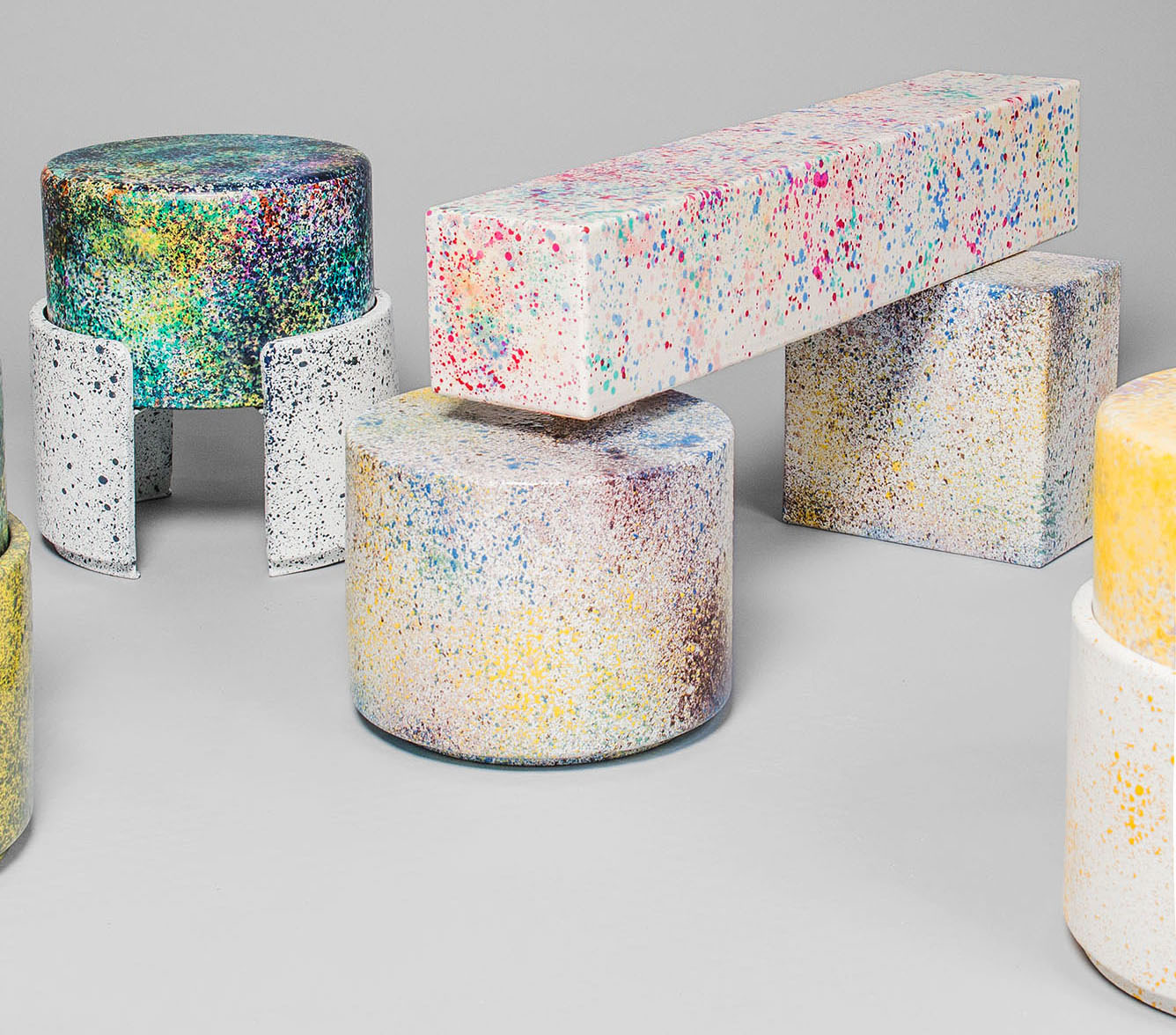
Kueng Caputo: Never Too Much at Salon 94
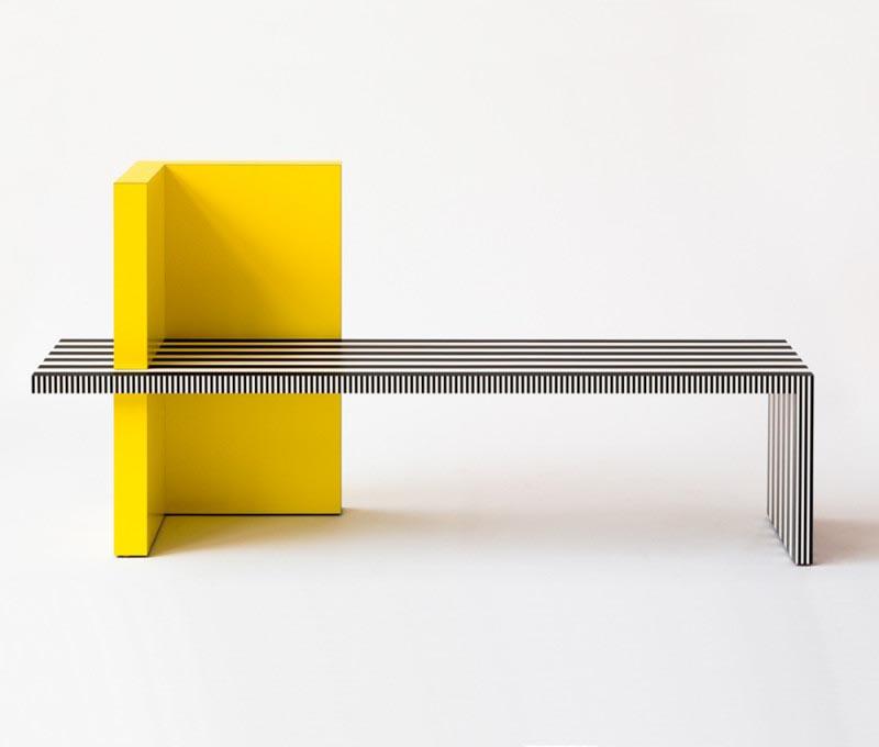
Kueng Caputo’s first moment of fame came a few years ago from a series called “Copy,” where the two design-school friends would purposefully mimic a recently released work from a major talent by creating an exaggerated or distilled fakery of that piece. The process was meant to be a tongue-in-cheek homage to the original artists as well as a way for Sarah Kueng and Lovis Caputo to explore how those pieces had acquired their specific character or value. Whatever lessons they learned from that experiment must have stuck, for in the last two years, the Swiss design duo have released two collections that seem predestined for design greatness.