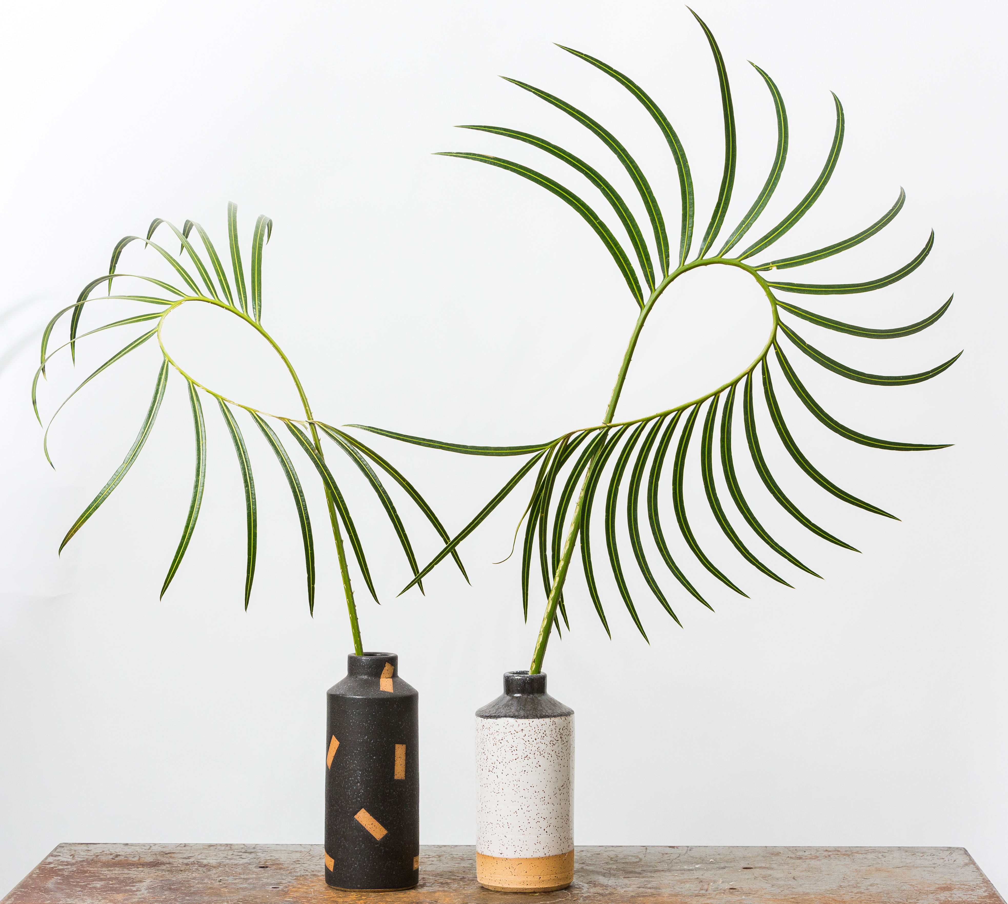
Moss: Dialogues Between Art & Design Auction

Yesterday at Phillips de Pury in New York, the auction "Moss: Dialogues Between Art & Design" raked in more $5 million and smashed records for work by the likes of Maarten Baas, Hella Jongerius, and Patricia Urquiola. But while we're always pleased to see design taken a bit more seriously, it wasn't this auction's star power but rather its conceptual conceit that intrigued us so. Curated by Murray Moss — with many of the selections coming from Moss's own personal collection — the auction paired art and design pieces that seemed to share a common DNA, whether by virtue of material, technique, or appearance. The pairings were surprising and lovely, with the curves of Mattia Bonneti's plump purple velvet sofa echoing Luciano Castelli's reclining red nude, or the colored striations of Julien Carretero's To Be Continued bench causing the same sense of vertigo as Doug Argue's obsessive lines in (Untitled): Strata, 2011. (You can view the full catalog for yourself online here.) Perhaps best of all, the catalog was prefaced by an unusually personal story from Moss himself, who can seem a bit of a cipher to those not in his inner circle. We found the whole thing so interesting we've reprinted it in full here. Read on below, then follow our slideshow to see some of the highlights from last night.
More

Kiosk’s Obama 2012 Souvenirs

In 1960, there was a noisemaker that said “Click with Dick,” endorsing Richard Nixon for President. In 1964, a canned novelty beverage promoted Barry Goldwater's candidacy (“Gold Water: The Right Drink for the Conservative Taste”). But these days, with Shepard Fairey’s once-inescapable "Hope" poster on the wane, you’d be hard-pressed to find an election souvenir of note beyond the usual bumper stickers, commemorative mugs, and buttons. Enter Kiosk, New York’s go-to retailer for quirky housewares and objects from around the world. This week, Kiosk owners Alisa Grifo and Marco ter haar Romeny released a collection of five pro-Obama souvenirs, which sport cheekily retrograde slogans and riff on American-made objects the shop already had in stock.
More

Isabel Wilson on Freunde Von Freunden

There must have been something in the air back in 2009, because Freunde Von Freunden, the Berlin-based website whose voyeuristic, photography-based interviews are of a piece with our own obsessions (i.e. barging in on people's home and workplaces and showing ourselves around) — started just a few weeks before Sight Unseen's launch at the end of that year. "We never look for apartments but for people," they say, and that's always been our mission as well — to get at the personality behind the product, and the narrative behind each new release. To that end, since we introduced you last week to Isabel Wilson's textile and jewelry line with Chen Chen — and considering we've more than covered her partner in crime — we figured it was high time to get to know the RISD grad's incredible,intricate work. Luckily FvF beat us to it, with a gorgeously photographed editorial by photographer Brian Ferry, which appeared on the site just last month, and which we're excerpting on Sight Unseen today.
More

Kyouei’s Dish of Light and Random Musical Box

When the latest projects from the Japanese design company Kyouei came across the transom this weekend, we felt a bit like grandmothers. Which is odd, because we're not old enough to be anyone's grandmother, much less a Japanese product designer and sound producer who's nine years our elder. But there was still a burst of "my how you've grown" pride bubbling up, considering we discovered Kouichi Okamoto's firm back in our early I.D. magazine days, when he was still doing clever little Droog-ish housewares like light bulb–shaped paper lanterns and bowls that imitated crater lakes — before the vast majority of our fellow Americans even knew Kyouei existed. And look at Okamoto now! Making sophisticated sound machines, musical tables, and these amazing iron lamps that evoke modernist sculpture.
More

A 20th Century Palate in The Gourmand Issue 00

In the summer before starting Sight Unseen, one of us had a very brief flirtation with the idea of attending culinary school. Along with design, food is our great love, so we were pleased this week — and maybe even a little bit jealous — to stumble upon a new magazine out of London that unites the two disciplines in the most fantastic of ways. Called The Gourmand, the first issue tackles subjects ranging from David Shrigley's new cookery-themed opera to Jeff Koons's recipe for apple dumplings. But our favorite feature — plucked from the site's website, which has a sprinkling of teasers for the print edition as well as practical food recommendations from artists, contributors and London's culinary cognescenti — has to be this collaboration between art director Jamie Brown and photographer Luke Kirwan, which depicts 20th century art and design movements in foodstuffs like American cheese and pink wafer cookies.
More

Study O Portable’s Neon Alphabet

Whereas most of us may never fully grasp the meaning behind the testicular descension metaphors and self-referential glyphs woven throughout Matthew Barney's Cremaster Cycle, the message behind his Drawing Restraint series — which has seen the artist challenge his creation process with obstacle courses and 270-pound dumbbells — couldn't be more relatable: creativity flourishes in any struggle with limitations. Many designers, for example, profess to do their best work under the pressure of client briefs; then there are those, like the London duo Bernadette Deddens and Tetsuo Mukai of Study O Portable, who in the absence of such briefs will invent their own rules to work around. Since they started their studio in 2009, the couple have been using the alphabet as a testing ground for aesthetic and material experiments, producing letter sets in various combinations of wood, leather, and plastic that must conform to strict, self-imposed standards of size and legibility. "It's really satisfying to work on the puzzle an ABC poses depending on one's materials and techniques," says Deddens. Their most recent is the Neon Alphabet, "a cross between signage, jewelry, and a font" that debuted at Design Miami/Basel this June with Belgian gallerist Caroline van Hoek.
More

The 2012 Parsons Thesis Site

As curatorial hunter-gatherers, we're always on the lookout for new and unseen talents, and there's no better place to spot them than at school thesis shows. But as workaholics who seldom have time to leave our home offices, much less attend these shows, they all too often remain off-limits to us. It's a rare yet celebrated occasion any time we're either sent a clear, comprehensive accounting of projects by graduating students, or become aware of a website that successfully catalogs them. Last week, we received an email from Parsons with just such a treat — the new multi-disciplinary Parsons thesis site, part of the two-year old Parsons Festival which flings open the doors of the school to the public each May for three weeks of exhibitions, workshops, and fashion shows. Grateful to have access to the event's couch-potato version, we sifted through all the projects on the site and found the six we liked best: humorously cloying photographs of weird dollar-store finds by Antonia Basler, a series of poured-concrete side tables made in fabric molds by Isaac Friedman-Heiman, dresses that pay homage to Muybridge and Noguchi by Kaoru Oshima, photos by Charlie Rubin that blur the line between the real and the artificial, and minimalist versus maximalist origami garments by Yingshi June Lin and Si Lu. Have a look at the slideshow here, which is annotated with selections from the students' thesis statements, then clear your calendar for next May so you'll have no excuse not to join us at next year's festival.
More

Jerpoint Irish Glass for Makers & Brothers

Anyone who was in New York for our annual Noho Design District event this spring should be familiar with the Irish online homegoods brand Makers & Brothers; they would have been the ones making a beautiful mess on the floor of the Standard East Village hotel, as their woodworker James Wicklow carved stools made from Catskills-grade green ash by hand over the course of four days. But most of what namesake brothers Jonathan and Mark Legge do to showcase their particular brand of native handcrafted goods takes place a bit closer to home — which in their case is a shed located on the same property as their parents' home and architectural practice in Dublin. Since founding their online retail venture less than a year ago, the two have made a point of visiting and documenting the workspaces of the people who create products for them — the basketweaver who grows her own willow on the banks of the River Boyne, the Irish RCA grad who knits stool covers from a warehouse in East London, and, most recently, a family of glassblowers in Kilkenny whose Jerpoint brand drinking vessels the brothers grew up with. When we wrote Jonathan to ask if we could reprint some of their text and photos on Sight Unseen, he confessed he hopes to collaborate soon with Jerpoint — so perhaps a follow-up story will be in the offing for fall. Until then, if you're in Dublin, you can pop by the brothers' shed this weekend for a summer opening. If not, live the Makers & Brothers life vicariously through our excerpt after the jump.
More

New Work By My Bauhaus Is Better Than Yours

From the start, the young Weimar students behind My Bauhaus Is Better Than Yours gave themselves a crushingly large reputation to live up to. Not their alma mater's creative legacy, mind you, but those tote bags, given away when the collective-turned-production company launched in 2009. Bearing its name in a thin block print, the bags made for the perfect product even before you saw the group's actual work, and for awhile you couldn't turn a single corner at a design event without running into someone wearing one. But to the credit of the now Berlin-based company's founders — graphic designers Manuel Goller and Daniel Burchard — each furniture collection continues to hit the proverbial nail on the head, combining appealingly graphic shapes with just the right dose of functionality. Earlier this week, My Bauhaus re-launched its webshop with a new design, lower prices, and new products, some of which debuted earlier this year in Milan. We asked three of the designers behind those works to send us a list of five things that inspired their piece, from Bret Easton Ellis to solitaire.
More

Tools for Everyday Life, by the Designers in Residence at Northumbria University

It seems ironic that the design school at Northumbria University's two most famous graduates would be Max Lamb and Jonathan Ive. At one end of the spectrum is Lamb, a designer so consumed with the act of making and the transparency of process that he films himself fabricating each piece from start to finish and posts the results on his website. On the other is Ive, who’s responsible for an object that’s more of a cipher, one that conceals its mechanics within and successfully erases any questions about how the way it works or the context in which it was made. But perhaps the difference between the two designers is as simple as the difference between their concentrations at university: Ive graduated from a Northumbria program known as Design for Industry, which focuses on consumer experience, while Lamb finished a course called Three-Dimensional Design, where the act of making is as paramount as the artifact itself. It’s the latter program that's yielded the Designers in Residence who have exhibited at ICFF, for two years running, a collection of products known as Tools for Everyday Life, and it’s in Lamb’s footsteps that those designers follow.
More

ROLU’s Settee X Three at Sit and Read Gallery

It's fitting that the boys from ROLU would choose to introduce the show they opened this past Saturday at Williamsburg's Sit and Read Gallery with this quote from American sculptor Richard Artschwager: "Everything matters. An itchy nose, scratching it; a distant train. A bit of coffee left in the mug. My hand grasping the mug, the thumb providing guidance. Every encounter with another person... etc." Beyond being a mantra as of late for the Minneapolis-based studio, its core message — everything matters — could easily describe the approach they and most of our other design friends took to ICFF weekend: Why do one show when you can cram in three, or four? Thus while Sit and Read's Kyle Garner was installing his hand-dyed Sling Chairs at our Modern Craft show at the Merchant's House Museum, he was also prepping his gallery for the exhibition with ROLU, who were also installing new pieces at the Boffo Show House and at the No Frontier show with Volume Gallery at Mondo Cane in Tribeca. As a working method, everything matters may actually be dangerous to one's health, but when applied to a single design project, it turns out the results are pretty stunning — in this case, a series of furnishings and experiments that will be on view at Sit and Read through July 1. Click through to see what ROLU co-founder Matt Olson had to say about the project, and watch a video documenting how one part of it came to life.
More
Roll & Hill Jonah Takagi Silk Road

An Exclusive First Look at Roll & Hill’s 2012 Collection

Three ICFFs ago, when we launched the Noho Design District, our biggest exhibition was the debut of Jason Miller's highly anticipated new lighting company Roll & Hill, which took over the top floor of our beloved former lumber building (RIP) and cozily lit its dilapidated interior with a string of gorgeously modern chandeliers. It's hard to believe how far both of us have come since then. With the imminent redevelopment of the NDD's former hub at 45 Great Jones, we went hunting for a new home, and instead found two. And Roll & Hill — in addition to showing its new collection at the Javits Center — will join up with us once again in Noho, this time spreading out over 3,500 square feet on the ground floor of 2 Cooper Square, where a monthlong showroom will showcase the brand's full collection in addition to its new products for 2012.
More