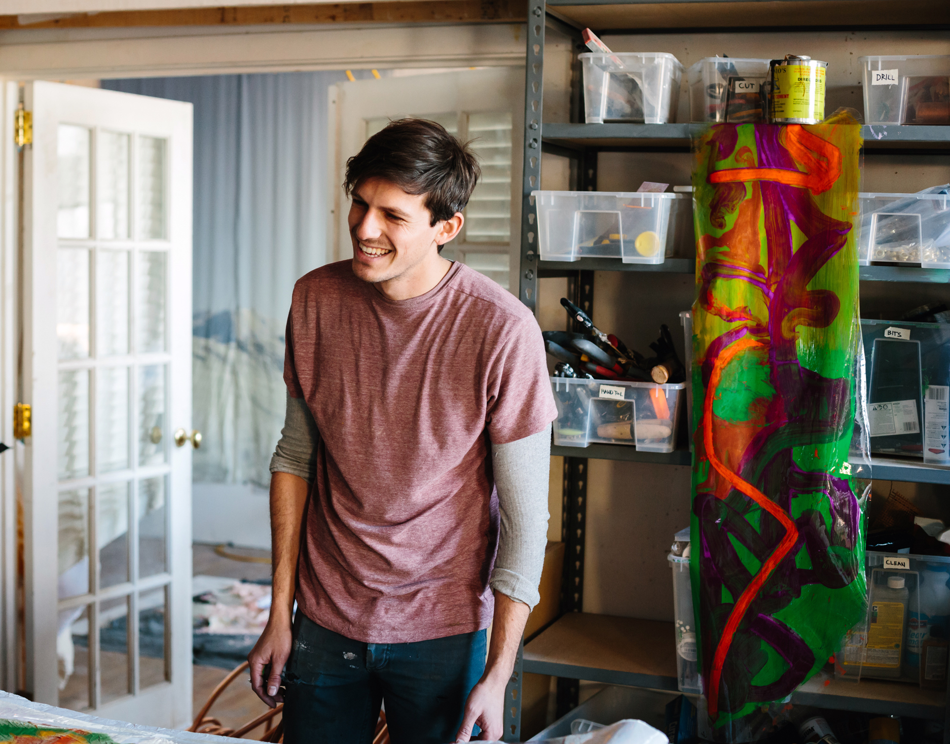
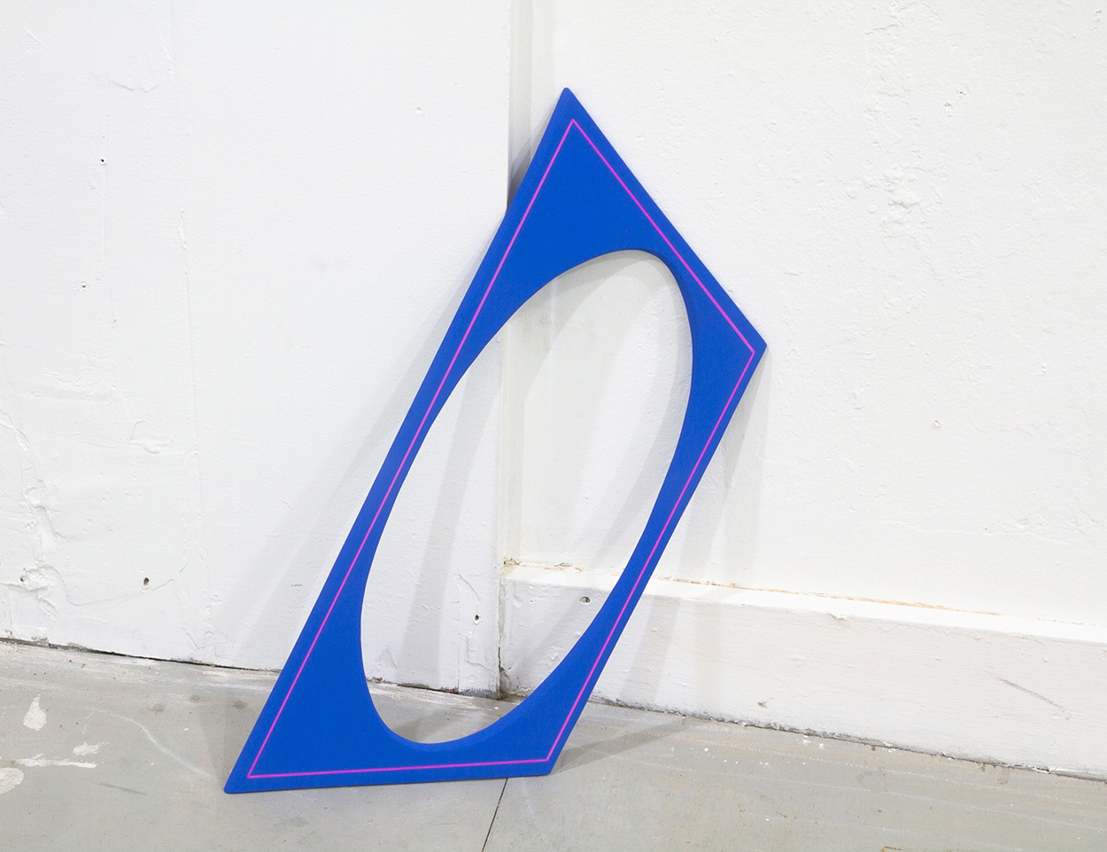
Week of July 20, 2015

A weekly Saturday recap to share with you our favorite links, discoveries, exhibitions, and more from the past seven days. This week: Nerding out on the science of chemical reactions, finding new uses for tie dye, and professing our love for iridescence and copper (yes, we’re predictable!). Discoveries We’ve always said that the only bad thing about the incredible roster of products made by Australian duo Daniel Emma is how few of them are available Stateside. Perhaps that will change now that their amazing Cherry on the Bottom light is being produced by the French company Petite Friture. In 2013, Daniel Emma first showed a self-produced edition of the lights in more fanciful colors, like baby blue and red; we much prefer the more sophisticated iterations shown here and at the top of this post, particularly (natch) the black and iridescent. The brand-new Museo del Design 1880-1980 is now open in Milan, tracing the history of Italian design from Art Nouveau to Memphis. As you might imagine, the permanent collection includes lots of chairs but our favorite might be this 1969 Mies seat, which was given by one member of Archizoom to the other as a wedding present. Not shown is the A+ illuminated footstool that typically accompanies the chair. An update from the Greece- and New York–based architecture firm LoT arrived in our inboxes this week, filled with lots of great new built work but also alerting us to their range of small goods, which they create under the name Objects of Common Interest. We’re especially partial to these copper table mirrors, whose bases are CNC milled from blocks of aerated concrete. Speaking of copper, we also got word this week of these beautiful copper bowls by Vancouver designer Ben Barber. Spun from solid copper sheets, the exteriors are powder-coated; “as the powder is baked into the copper, the copper undergoes a blooming process, giving each bowl a pearlescent hue; no two bowls are the same,” explains the designer. These ceramic bowls by Portuguese designer Sara de Campos are also the result of a relatively cool chemical reaction. Their blackened exteriors are formed using a dying Portuguese process called barro negro, in which the pieces are placed with burning firewood into a hole in the soil in the ground and covered with moss, leaves, or straw. East Village gallery Ed. Varie is leaving its 9th Street digs at the end of this month in search of artier surroundings, and before they leave, you should absolutely stop in and see the excellent exhibition on view, which includes one of our favorites, Malin Gabriella Nordin. … Continue reading Week of July 20, 2015
More
designer dominos

Top 5: Designer Dominos

A periodic nod to object typologies both obscure and ubiquitous, featuring five of our favorite recent examples. Today the subject is dominoes, which no longer resemble those black and white, polka-dotted celluloid tiles of yore.
More
80s art Tumblr

A Tumblr Devoted to 80s Art

Here's the thing about the '80s: Some of us actually grew up in them. And for us, seeing a Tumblr full of art from that decade doesn't so much trigger an Internet-age wet dream as a blast of straight-up nostalgia — for the kinds of things we remember hanging in our rich friends' parents living rooms, or on the walls of our orthodontist, or in fancy department-store furniture displays.
More

Node Lights by Amsterdam’s Odd Matter

The young Amsterdam-based duo Odd Matter, who we mentioned today in a separate post dedicated to their new work at Aram Gallery, have been busy bees lately. In addition to that project, the Dutch and Bulgarian designers recently launched a series called Node, which includes four highly expressive, sculptural lamps in copper and Jesmonite with forms designed to underscore their functions.
More

Till Wiedeck of HelloMe, Graphic Designer

If you're wondering why we chose to kick off a story about a graphic designer with a series of objects that fall squarely in the art/furniture realm, there are two reasons: First, they were our first introduction — via Pinterest — to Till Wiedeck's work, and second, they illustrate perfectly what's so great about the Berlin-based talent. Though he refers to himself as a hyper-functionalist, preoccupied with detail and simplicity and too serious to answer our sillier interview questions about Google searches and fictional characters, somehow he's still the kind of guy who would take a sizeable chunk of time out of his client schedule to build a suite of semi-useless objects like these. You'll find the same juxtapositions in the portfolio of his graphics studio, HelloMe, where he might pair spare typography with lush hyper-color flower arrangements, creepy Photoshop smears, or experimental acid-trip paintings he and his cohorts have made by hand. It all comes together in our interview with Wiedeck, who has a thing for both Bauhaus and Memphis, modernist chairs and tchotchkes. Whatever it is, it's working.
More

3D Objects Made of Everything From Cement to Jell-O

Plenty of designers who work primarily in two dimensions translate their patterns and images to textiles, but up-and-coming London designer Lucy Hardcastle's oeuvre is particularly diverse — a former textiles student, she creates three-dimensional objects, sets, and artworks made of everything from cement to Jell-O, then draws on those creations to make prints for clients like Nike and Alexander Wang.
More

Stephanie Specht, Graphic Designer

People always ask where exactly we find our story subjects, and for the past two years, the most frequent answer has invariably been Instagram. And it’s true, in the case of Belgian-born graphic designer Stephanie Specht, we were fans of her @spechtstudio handle long before we ever knew who was behind it. But our interest was piqued even further in recent months after Specht got the imprimatur from two friends with an impeccable knack for collaborations: Sandeep Salter of McNally Jackson Picture Room, where Specht released an edition earlier this year, and Alex Proba, with whom Specht created this series of plant-inspired posters. 
More

Week of July 13, 2015

A weekly Saturday recap to share with you our favorite links, discoveries, exhibitions, and more from the past seven days. This week: very on-trend iridescent flatware and terrazzo coasters, gorgeous oil-slick vases from a recent RISD grad, and the debut of the booksleeve (pictured above), an innovation we never realized we needed until now.
More

Lottie Hughes, Artist

London-based Lottie Hughes graduated with a Bachelor's degree in fine art only two years ago but she’s already on our radar, thanks to an exceedingly well-kept Tumblr. “My designs were initially a way for me to come up with compositions for my paintings but the more I learned, and the more confident I became with Photoshop, these have now become the main body of my work,” says the 24-year-old designer. Hughes primarily takes inspiration from artists like Camille Walala, Atelier Bingo, Trudy Benson, and Klaus Merkel, as well as from everyday life in London. "My designs are abstract versions of what I see on a day-to-day basis — colors clashing, angles of buildings interlocking, movement and light."
More

Yonatan Vinitsky at Rome’s Frutta Gallery

"Loose Ends," an exhibition by Israeli artist Yonatan Vinitsky was on view at Rome's Frutta Gallery from March until May of this year, but it will be a long time before we get these rightly amazing images out of our heads. For his solo show, the young Haifa-born, London-based artist created eight coiled-metal sculptures, which hung suspended from the ceiling, as well as eight wall-based works that represented blown-up reproductions of the kind of backseat storage pockets you find on public transportation.
More

Dutch Artist Thomas Raat

Unlike most of his contemporaries, Dutch artist Thomas Raat — whose colorful and intricate compositions recall the great European modernist graphic design tradition — isn't particularly concerned with the emotional aspects of art but instead focuses purely on the visual techniques and functionality of the medium. Referencing a deep and thorough understanding of modernist philosophy and analytical thinking, Raat creates large-scale paintings and sculptures that employ the use of symmetry, repetition, and other basic principles of design to create pleasing and visually stimulating compositions.
More

Michael Wilkinson’s Decay-Inspired Landscape Series

Much of the collage-based work of Glasgow artist Michael Wilkinson, according to his New York gallery Tanya Bonakdar, "examines notions of power and resistance through an intricate web of political, cultural, and personal references" — among them the "histories of art and political radicalism, Marxist theory, popular music, and punk subculture of the 1970s and 1980s" — incorporating things like survival gear and vintage photographs. Yet his new gridded Landscape pieces, which we spotted in Bonakdar's booth at Frieze New York in May, take a more subtle (and visually beautiful) approach.
More