Study O Portable’s Neon Alphabet

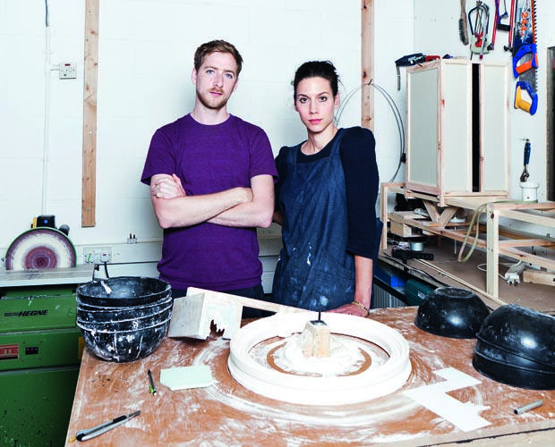
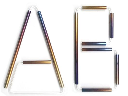
Whereas most of us may never fully grasp the meaning behind the testicular descension metaphors and self-referential glyphs woven throughout Matthew Barney's Cremaster Cycle, the message behind his Drawing Restraint series — which has seen the artist challenge his creation process with obstacle courses and 270-pound dumbbells — couldn't be more relatable: creativity flourishes in any struggle with limitations. Many designers, for example, profess to do their best work under the pressure of client briefs; then there are those, like the London duo Bernadette Deddens and Tetsuo Mukai of Study O Portable, who in the absence of such briefs will invent their own rules to work around. Since they started their studio in 2009, the couple have been using the alphabet as a testing ground for aesthetic and material experiments, producing letter sets in various combinations of wood, leather, and plastic that must conform to strict, self-imposed standards of size and legibility. "It's really satisfying to work on the puzzle an ABC poses depending on one's materials and techniques," says Deddens. Their most recent is the Neon Alphabet, "a cross between signage, jewelry, and a font" that debuted at Design Miami/Basel this June with Belgian gallerist Caroline van Hoek.
More

Hilda Hellström, Swedish Sculptor and Designer

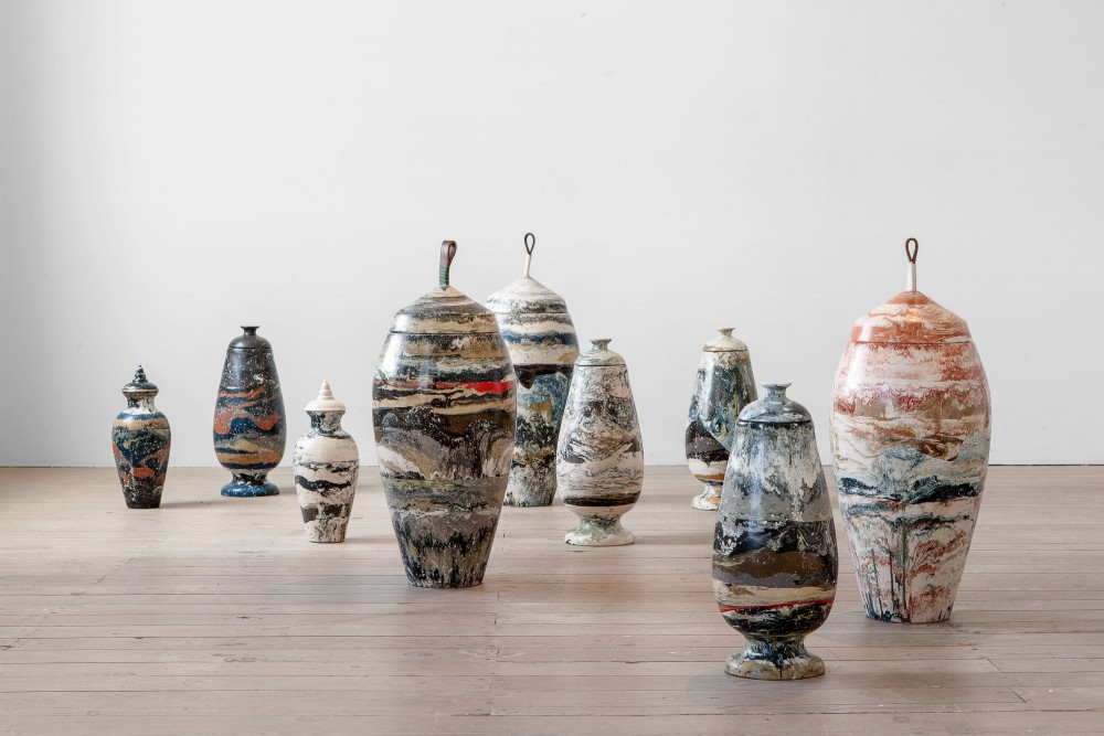
In any designer’s career, there are hundreds of split-second decisions that conspire to create the precise conditions under which good work can emerge. For the Swedish-born, London-based designer Hilda Hellström, it came down to this one: When she was asked to create a project for this year’s Royal College of Art exhibition at the Milan Furniture Fair, she says with a laugh, “the wood workshop was quite busy, but the resin workshop was nice and quiet.” Of course, there’s more to the recent grad's breakout Sedimentation vases than that; Hellström is obsessed with the idea of imbuing her objects with a myth and narrative of their own. But in many ways the vessels — which are made from layers of pigmented Jesmonite, a non-toxic acrylic-based plaster often used in ceilings and restoration work — are a reaction against something else. “My father was a carpenter, so I was used to working with wood, and I was bored of how you have to consider that it’s a living material,” she says. “Wood tells you what to make, but working with a moldable material like Jesmonite is almost like playing God.”
More

International, furniture designers

Brian Eno is playing, green tea is brewing, and there are half-finished projects and prototypes stacked up ’round the place. I could be in any East London live-work space. But as I talk more to my hosts — Marc Bell and Robin Grasby of the emerging London design firm International — I realize there’s something simple that sets these two Northumbria grads apart from the thousands of hip creatives populating this corner of the city. They started the studio a year or so back, with the intention of doing something a little out of fashion in the design world: “Our approach is quite commercial,” admits Grasby. “We are looking to create a mass-produced product.” Yes, he’s used the c-word — and it wasn’t crafted. By opting for production, rather than taking advantage of London’s buoyant collectors’ market, the two are aware they’re taking a tougher route. Bell puts it plainly: “Rather than shapes we enjoy making or colors we like, our designs really are function-led.” Their work always seems to boil down to intended use, and at this stage they aren’t interested in seeing their pieces in galleries. But while there have only been a handful of designs released to date, International have been getting the right kind of attention.
More

The Sight Unseen Shape Shop at Creatures of Comfort

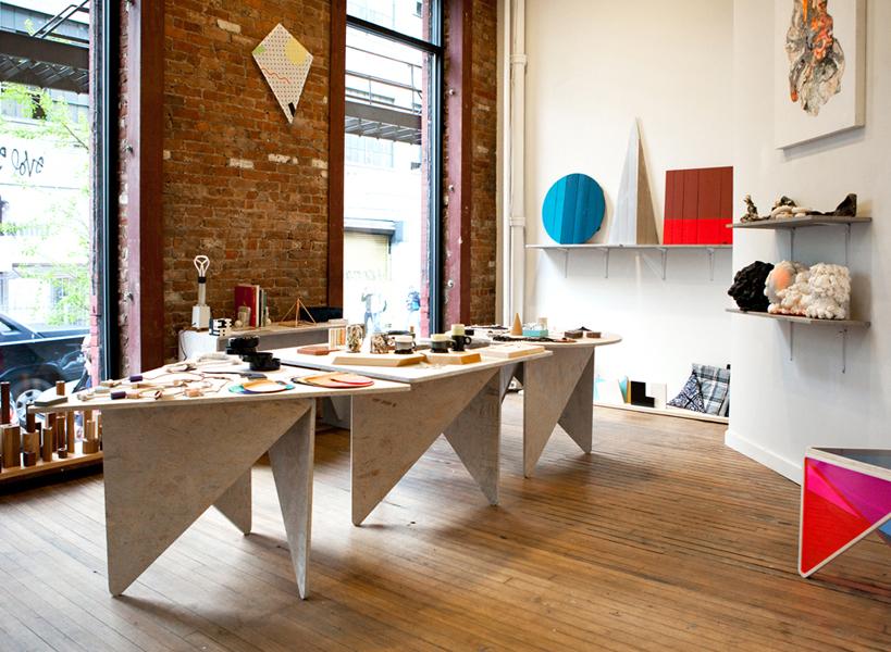
By the close of Sight Unseen's four-day pop-up during the Noho Design District last year, we'd come to realize a few things. One: that we quite enjoy being shopkeepers — the merchandising of objects, the banter with the public, the satisfying swipe of each credit card through our handy Square readers. And two: that four days was not nearly enough. As we watched the objects we'd put so much effort into procuring move on to more permanent retail homes, we felt a vague sense of deflation, almost like a break-up, and we immediately began plotting for pop-up number two. Never, though, did we dream what would happen next: We were approached by Jade Lai, owner of the impeccably curated Creatures of Comfort store in New York and Los Angeles, to create a Sight Unseen pop-up in the gallery space of her New York store, which had previously played host to temporary outposts from the likes of Confettisystem, Textfield, and the Japanese housewares shop Playmountain. After months of planning, we finally debuted the Sight Unseen Shape Shop this Tuesday at a blowout party.
More

Max Lamb Outtakes from Paper View, Launching Today

It's official: Sight Unseen's first printed edition, Paper View, is finally out, and we've held it in our very own hands. Today, we've prepared something special for you in honor of the occasion, a series of outtakes from one of the articles published in Paper View: A catalog of Max Lamb's personal collections, which first ran on Sight Unseen early last year.
More

Studio Glithero in Icon Magazine

Though we often travel the world searching for stories and meeting subjects for Sight Unseen, the UK-based design duo Studio Glithero has somehow always eluded us. We were first introduced to their work in 2008, when they created a massive site-specific installation at Milan's Nilufar Gallery during the annual furniture fair. After traveling through the gallery's labyrinthine hallways and courtyards, we ended up in an eerie basement space where a series of motorized wicks hung from the ceiling, methodically dipping in and out of metal cans full of hot wax arrayed in a circle on the floor. But the pair was nowhere to be found. That's why we were particularly excited to find a recent interview with the studio on the British magazine Icon's website — not only for the article itself, which we're reposting on Sight Unseen today, but also because it led us to Glithero's Vimeo channel, where a vast archive of process videos has all the while been hiding in plain sight. The pair have been using film to document their work for years, which makes sense when you realize that they often use time as an integral material to their process.
More

DIY Furniture: A Step-By-Step Guide

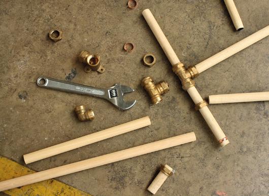
As lovers of and writers about design, there’s one question we’re constantly asking ourselves: How can we get designers to make us their amazing pieces at cost? But what we nearly always fail to wonder is: Would it actually be possible to make these pieces ourselves?
More

Despina Curtis, Stylist

Despina Curtis is in her early 30s, and yet when she talks about her college days, it sounds a bit like one of those stories your grandparents tell about having to walk shoeless through the snow to get to school every day. Curtis studied printed textile design at the University of Manchester, and it was only when she left that the program’s first-year students were beginning to use digital design and printing tools — she had to do everything analog, even when it came to her eventual focus on huge 6-by-6-foot canvases layered with painting and screenprints. And yet, unlike hyperbolic ancestral poverty tales, hers had an obvious upside: All that drawing and hands-on work primed her for her current career as a stylist for the likes of Wallpaper and Casa Da Abitare.
More

Foraging for Lunch in the Garden With Martino Gamper

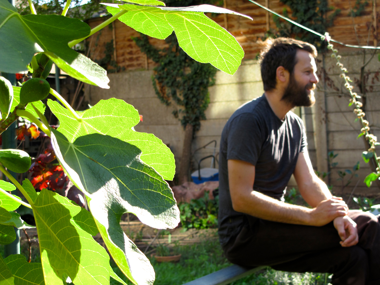
Martino Gamper and I are neighbors. His studio sits just across the road from my flat in east London, and he and his wife garden in the communal plots out the back of my block. Their autumn planting — beets, kohlrabi, winter salads, and the last of some impressive tomatoes — was turning me green with envy, so when Sight Unseen suggested I ask Martino for a tour of the plot to talk about both his working and gardening methods, I was secretly hoping to gain a little insight myself, so as to turn my dirt patch into an edible wonderland.
More

David Saunders of David David, Fashion Designer and Artist

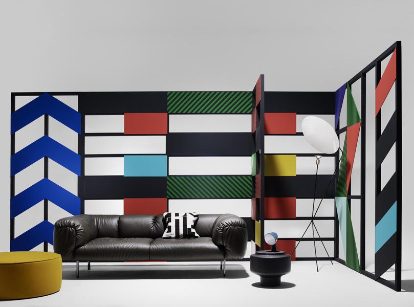
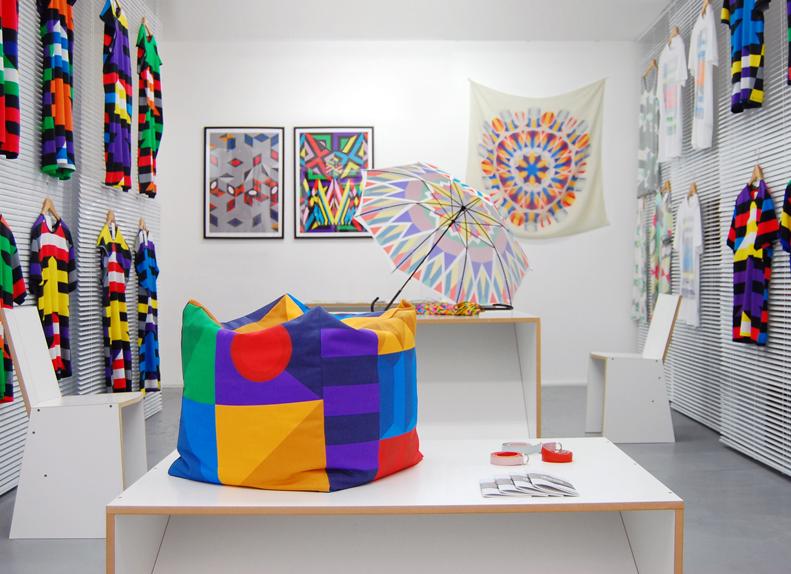
If you were somehow unfamiliar enough with the London fashion scene that you’d never encountered the work of David David, née David Saunders, a primer in his background certainly wouldn’t help much. Saunders is best known for a whirlwind rise to prominence that began with a job as head sculptor in YBA Tracey Emin’s studio, stumbled into a fashion line that won him a coveted spot in London’s Fashion East runway show, and now entails an obligatory mention of fans like Kanye West, Agyness Deyn, and M.I.A. each time it comes up in conversation. It’s not that it’s much ado about nothing — we were huge admirers of Saunders’s line by the time we ended up in his flat last February, a block away from our favorite London boutique Darkroom — but all that star power conveys very little about a charmingly blithe collection consisting of a handful of wearable silhouettes festooned with hand-drawn kaleidoscopic graphics, except maybe how he ended up with it in the first place.
More

At the London Design Festival, Via Dan Rubinstein of Surface

We at Sight Unseen are very busy people. We have babies to nurse (congratulations, Jill!), articles to write for other publications, subjects to spend hours and hours interviewing for this publication, and designers to hassle about finishing their submissions for our still top-secret online shop, set to launch in a little over a month (trust us, it's going to be good). Thus, we sometimes don't have the chance to attend events like the London Design Festival, even as we cringe with regret watching invitations roll in for Established & Sons and Phillips de Pury dinners, friends' exhibition openings, and dozens more chances to take the pulse of one of our favorite local design scenes. When that happens, we reach out to folks we trust and ask them to report back on whatever highs, lows, and drunken blurs they may have witnessed on the ground. Here, Dan Rubinstein, the intrepid editor of Surface magazine — both Jill and I are contributing editors — shares some of the details and moments he was privy to during last week's LDF, which he somehow managed to take time out of his own busy schedule to attend. As for us, you know what they say: There's always next year.
More
Faye Toogood Assemblage 3

Faye Toogood on Assemblage 3, for Phillips de Pury

When we — and the rest of the design world — were first introduced to her at the 2009 London Design Festival, Faye Toogood already seemed like Superwoman: Having just left her post as a stylist at the UK shelter magazine World of Interiors and cast out on her own, she'd engineered a coming-out party for herself that included a collaborative installation with Gallery Fumi featuring designs made from corn, a Memphis-inspired playroom with an Arabeschi di Latte egg bar, and a temporary shop for Tom Dixon that showcased how she'd begun to transform his brand image. Just seeing her do it was enough to make us feel stressed, and that was before we knew that she was about to reinvent herself again, this time as a furniture designer. Her first collection, Assemblage 1, was inspired by modernist sculpture, British craftsmanship, and her childhood growing up in the English countryside; it gave way to Assemblage 2 in Milan earlier this year, which took a darker, edgier turn. Finally, with Phillips de Pury last week, Toogood unveiled the third chapter in the series, and the most ambitious to date — it's based around her fascination with iridescence, and it took a motorcycle fabricator, a gun maker, and a studio full of assistants in gas masks to complete. I was asked by Phillips to conduct an in-depth interview with Toogood to appear in the show's catalog, and so Sight Unseen received special permission to reprint that interview here. It's lengthy, but it offers a good deal of insight into the mind of one of the most intriguing and ambitious personalities working in design right now.
More