03.26.24
Sighted
In Julie Richoz’s New Mirrors for Vitra, Color Theory and the Tiniest Details Work to Change the Way We See
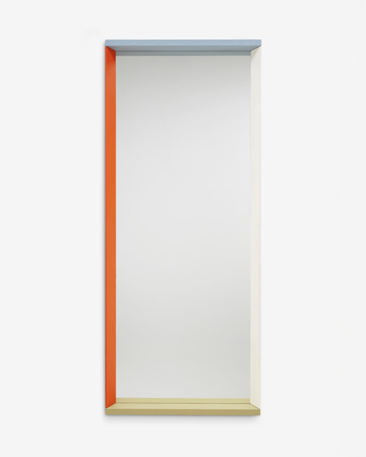
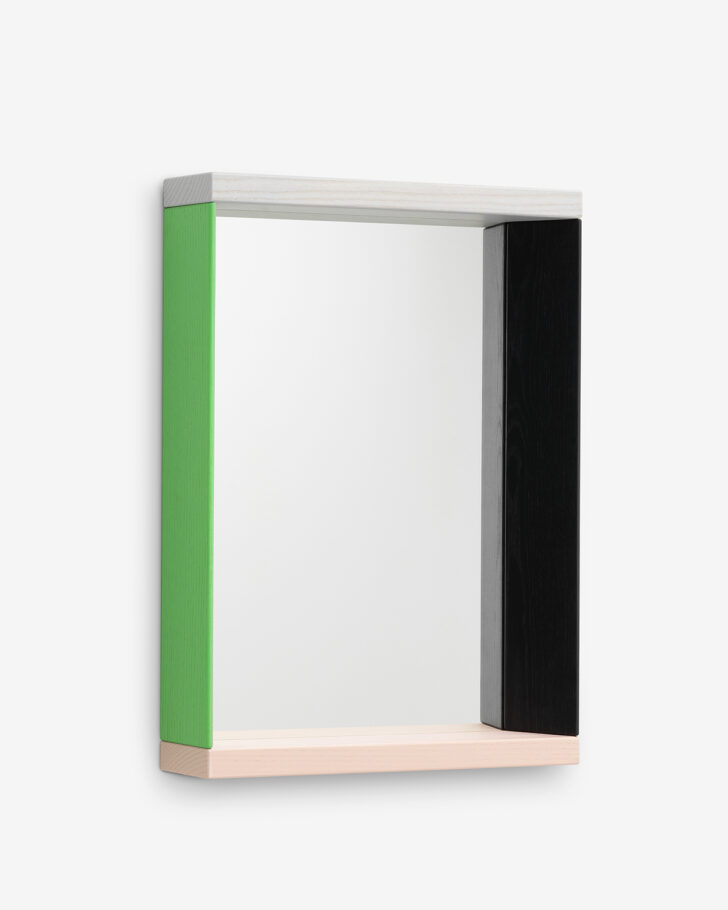
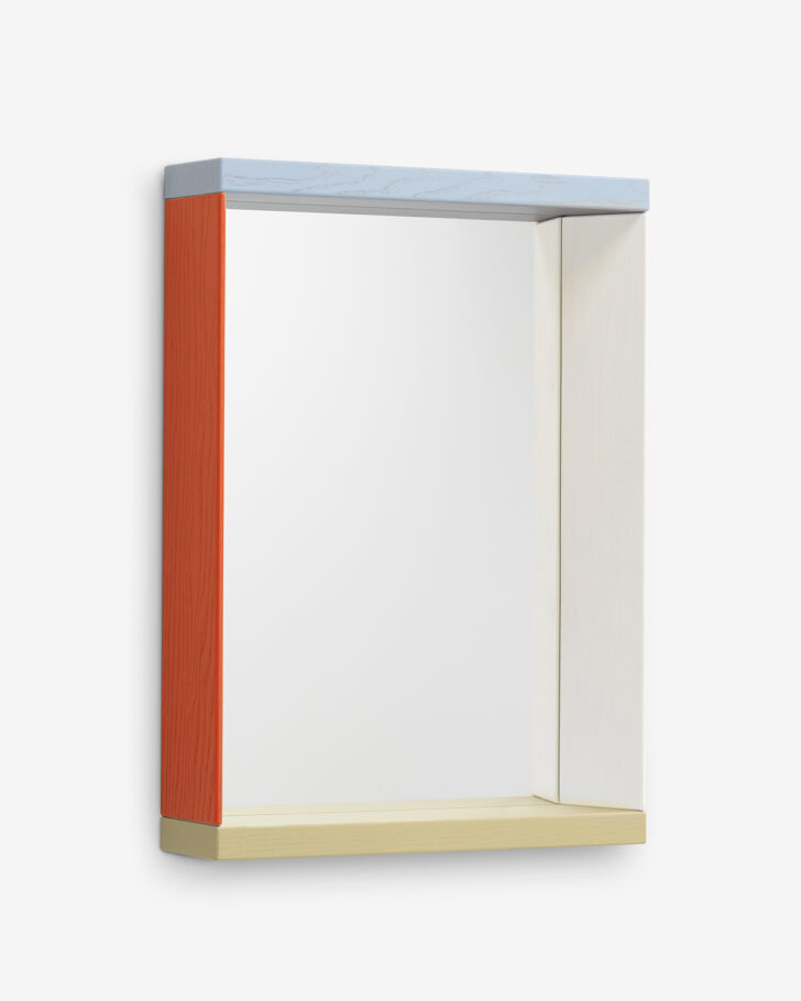
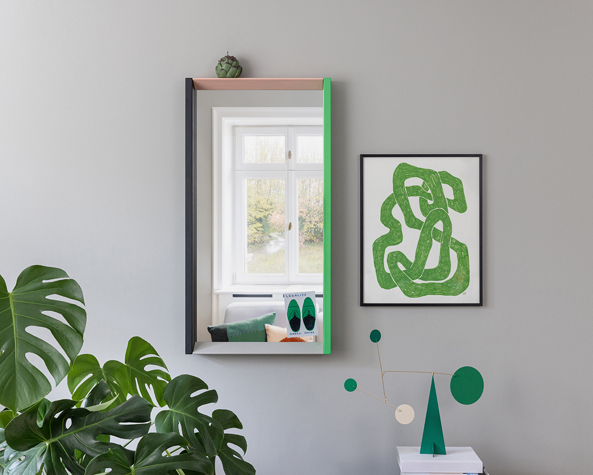
When Julie Richoz, a Swiss-French designer in Paris, was envisioning her new Colour Frame Mirror for Vitra, she was drawn to elemental forms, inspired in part by wooden building blocks and toys, those staples of childhood. “I like the innocent gestures they refer to — the simple pleasure of playing with colors and shape,” she says. But even as her mirror references those basic objects, it also moves beyond them. There’s a fun lightness here, but there’s also a high degree of sophistication, precision, and intent.
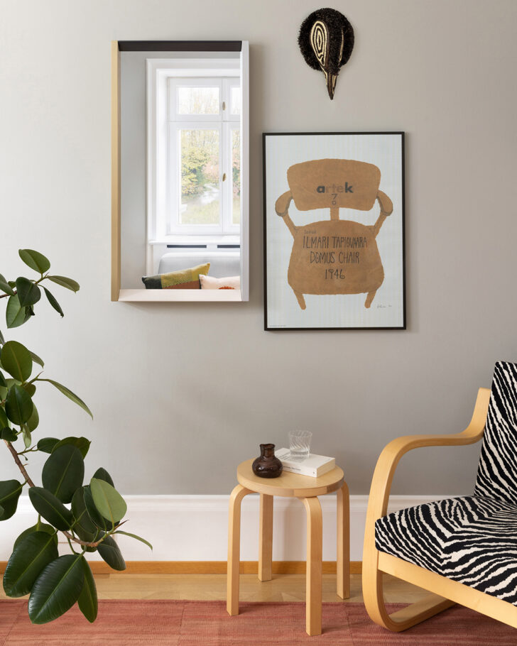
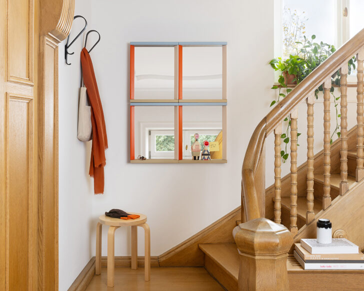
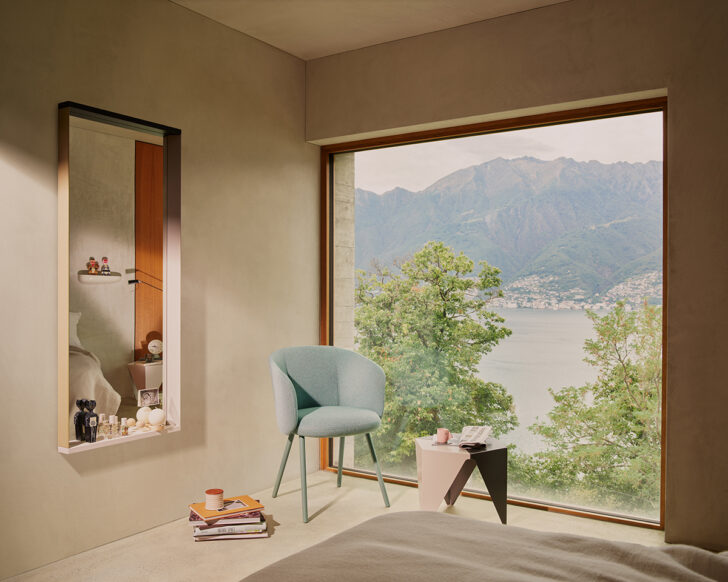
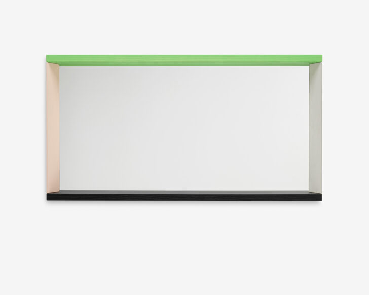
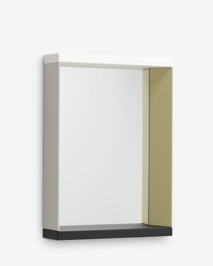
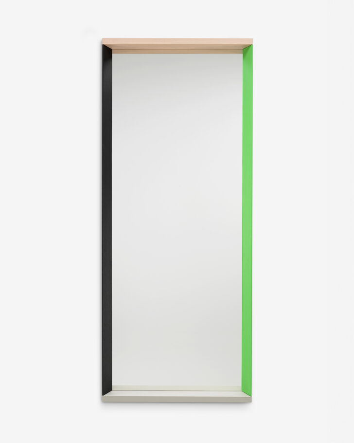
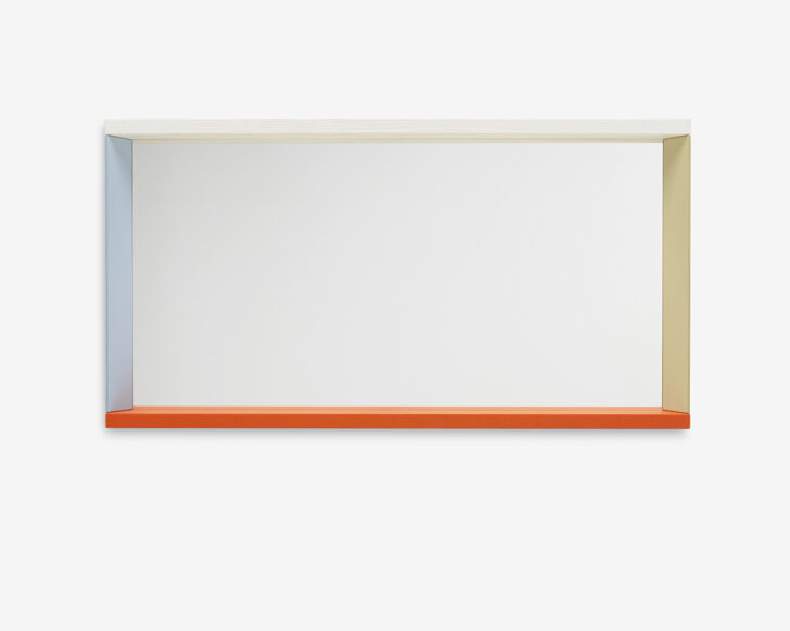
“I’m very intrigued by the relationship between color and shape, and how they are deeply connected with the material,” says Richoz, whose work comprises everything from furniture to textiles and glass. In the case of the Colour Frame Mirror, lacquered wood was a clear choice, especially with “the kind of painted finish we find in either wooden toys or wooden decorative objects, where the grain of the wood remains visible.” With its gently rounded edges and tactility, the wood adds both softness and solidity to the piece. Angled cuts give it a more complex geometry — Richoz likens it to a window, which can be positioned vertically or horizontally to different effects. The mirror is available in three sizes and three combinations of color per size: green/pink, blue/orange, and a subdued-but-not-boring neutral version with gray and taupe-y beige. “I’m interested in how an object can be a support for color combination,” she says. Of course, the mirror is also functional, not only as a reflective surface but also in the depth of its solid ash frame, which provides a shallow shelf. The sizes are designed to work together, creating a larger composition when multiples are hung on the wall.
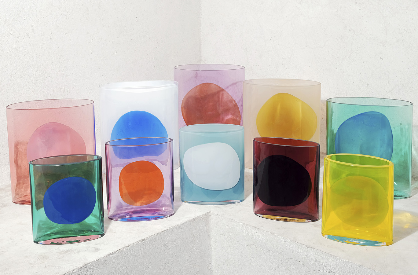
It’s a theme in Richoz’s work, the way colors and shapes play off each other in concert, and something she’s explored in her glass projects, like the Oreilles vases she created as a designer-in-residence at CIRVA/Research Center on Art and Glass in Marseille, and the Isla vases for Nouvel, “where each individual vase shows an interplay of colors, and where the overall group of vases is experimenting with a wider palette.” So, how did Richoz arrive at the particular shades of the Colour Frame? Initially, it was “very instinctive; then, we rationalized,” she says. “The solution is quite mathematic” —pairing complementary colors, contrasting saturated and toned-down colors, cold and warm hues. “I wanted to offer each individual mirror a real personality of its own, but also to make sure they can all be combined harmoniously. It started very spontaneously but at the end it was quite a bit of work.” At the same time, it needed to fit the Vitra “brand vibe,” she says, which doesn’t shy away from bold color. “I have the feeling there is a certain modernity in the colors we created — something I think both quite ‘new’ but that has the potential to last for a while.”
In a way, that’s her approach to design in general. “I’m interested in exploring how to design objects that are referring to the history of furniture and object design, but that are also from today (without being too much on trend).” And how to do that within the constraints of brand collaboration, bringing character to pieces that are well-manufactured and made to last in a considered and thoughtful way? Richoz sees her role as “part of an ecosystem” in which quality and aesthetic considerations are valued as much as the “desire to make things right — from a human perspective and from an environmental point of view,” she says. It’s an ecosystem that also includes the interiors and personal spaces where these mirrors end up. “I look forward to seeing which environment people are going to use them in.”