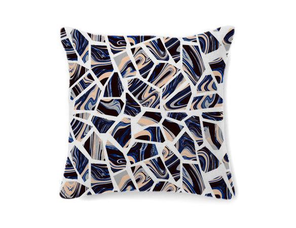
At the London Design Festival, Part II

Just as everyone else is arriving in London, our time here is winding down — we have one last day today to take in the sights and sounds before flying home tomorrow, and we'll be spending most of it at one of the more newsworthy events of the week, Designjunction. There's going to be quite a few new releases happening at the Central London hub, but if you want to know the truth, we're most excited about seeing the building, a 250,000-sqft. industrial complex that should make a sublime backdrop for our humble photography efforts. Meanwhile, we've documented the last two days' worth of events and shows here, from a trip to the Mint gallery where we spied the marbled stools above to a plop onto the motley mix of benches arrayed around the V&A courtyard, all made by various design superstars. There's no way we'll make it to everything by tomorrow, but we've got a lot more to share, so keep coming back to visit us please!
More

At the London Design Festival, Part I

The first time we attended the London Design Festival, five years ago now, it became something of a benchmark for us — the design event against which we not only measured other design events, but would come to measure our own, the Noho Design District. That's because when you attend the LDF, you feel like you couldn't be anywhere else but in London; the spotlight is resolutely on emerging homegrown talents (thanks in part to the RCA) and there are always brand new projects and product launches to see (thanks in part to the fact that, unlike ICFF, the festival takes place halfway between Milan fairs). LDF has such a good reputation, in fact, that even the coalition behind New York City's official efforts to organize an as-yet-unnamed New York design week are looking to it for inspiration — can you imagine Tom Dixon giving away 500 free lamps in the middle of Times Square? It may happen sooner than you think. In the meantime, three years after our last trip to our favorite fair, we've returned, and we'll be making the rounds all week reporting on who and what we see here. After arriving on Friday morning, we had a bit of a slow start, poking around Shoreditch and hanging out with the incredibly gifted duo behind Silo Studio, whom we'll introduce in depth in the coming weeks. Check out the images here, and stay tuned for many more.
More

New Friends, Weavers

Back in 2009, Kelly Rakowski was a graphic designer at Todd Oldham in New York, and Alex Segreti was living in Philadelphia, working in the textiles department at Urban Outfitters. In her free time, Rakowski ran a blog called Nothing is New, for which she scoured image archives on the web, unearthing old exhibition catalogs, classic spreads from magazines like Domus, and vintage ceramics and textiles. Segreti had a blog as well, called Weird Friends, where she documented similar obsessions: craft, pattern, art, ceramics, textiles, and dogs. The two had never met, but when Rakowski emailed Segreti on a whim one day to tell her how much she liked her site, they began to bond; when both expressed a desire to learn how to weave by hand, they decided to embark on an experiment. They shipped each other yarn, so they’d have the same palette to work from, and a few months later Rakowski made the trip to Philly. They had dinner, retired to Segreti’s apartment, and showed each other their weavings. “They kind of looked the same,” Rakowski remembers. “It was crazy. Now we always come up with the idea together but work separately, and when we meet, we forget who did what because everything magically works.” The two eventually made their design partnership official, merging the names of their online identities into a fitting moniker: New Friends.
More

PUTPUT, artists and photographers

In some ways, the work of the Danish-Swiss duo Putput could be considered a response to sites like this one: If we're constantly bombarded by scrolls of images, the two designers seem to ask, how can we be convinced to reconsider objects that at first glance seem so quaintly familiar? Projects like their Popsicle series (above), which found the icy treats replaced by scrubbing sponges, or Inflorescence — for which the two employed the visual language of still life to depict cleaning implements as potted plants — play with subverting our expectations in a way that could seem cliché if the resulting images weren't so exceedingly lovely. The two work at an increasingly trafficked intersection where photography, styling, art and design meet, which allows creators to control both the product and the way it's presented — both the input and the output, as it were, which is where their clever studio name comes from. We recently caught up with the two recent grads as they were dipping a toe into the contemporary art world and looking for new studio space.
More

The Fundamental Group, Architects and Furniture Designers

The Fundamental Group's designs may be inspired by geometric principles, but the burgeoning Berlin studio owes its existence, at least in an abstract sense, to another realm entirely: physics, ie, the field in which opposites attract. As architecture students at Berlin's University of the Arts back in 2003, Gunnar Rönsch and Stephen Molloy worked as assistants to rival department chairs, which in the world of academia, meant that they were automatically rivals, too. "If you sign up with one, you hate the other," Rönsch explains. "Mine was building construction and detail design, while Stephen's was based on a programmatic approach to structure — my chair basically had to solve all the problems created by his." In time, however, the pair realized the inevitable -- that by joining forces, they'd be stronger. First they became roommates, noticing how smoothly their collaboration on the apartment went, and then they began working together professionally, on projects like a friend's house remodel. Their only other major conflict came when it was time, in 2010, to choose a name for their new company: Rönsch & Molloy, or Molloy & Rönsch? "A mathematician friend of ours was sitting in our kitchen talking about the fundamental group — a term from algebraic topology that describes very complicated 3-D surfaces," says Molloy. "It was the perfect compromise."
More

Kyouei’s Dish of Light and Random Musical Box

When the latest projects from the Japanese design company Kyouei came across the transom this weekend, we felt a bit like grandmothers. Which is odd, because we're not old enough to be anyone's grandmother, much less a Japanese product designer and sound producer who's nine years our elder. But there was still a burst of "my how you've grown" pride bubbling up, considering we discovered Kouichi Okamoto's firm back in our early I.D. magazine days, when he was still doing clever little Droog-ish housewares like light bulb–shaped paper lanterns and bowls that imitated crater lakes — before the vast majority of our fellow Americans even knew Kyouei existed. And look at Okamoto now! Making sophisticated sound machines, musical tables, and these amazing iron lamps that evoke modernist sculpture.
More

Future Eyes on I’m Revolting

When we first began following the inspiration blog mysteriously known as I'm Revolting, we knew we'd found a kindred spirit, at least aesthetically. (If you're even the slightest fan of our Pinterest, you should know that many of our posts originate with I'm Revolting's boards, or result from tumbling down the internet rabbit hole after reading one of her posts.) But it was only when we asked the Los Angeles–based blogger — whose real name is Su Wu — to pen one of our Q&A columns that we truly knew we'd stumbled upon one of our own: A former journalist who threw the contents of her interior world online after the publication for which she was writing folded, Wu is an image collector, a thinker, and a fantastic writer to boot. Today for Sight Unseen she interviews Brent Pearson, the artist behind a heavy, handmade pair of kaleidoscopic glasses known as Future Eyes.
More

Ian McDonald, Artist and Ceramicist

To understand what it was like for Ian McDonald growing up in California’s Laguna Beach, it helps to refer back to one of the greatest television dramas of all time. Not, mind you, MTV’s reality show of the same name, but the heart-wrenching high-school football epic Friday Night Lights — McDonald’s hometown being pretty much the diametrical opposite of Dillon, Texas. “Laguna was founded as an artists’ colony,” he says. “Our school mascot, The Artist, ran around with a brush and palette and a beret. Even the football stars took art classes.” In fact, one of McDonald’s earliest run-ins with the medium that would eventually become his life’s work happened when his own sports-star brothers brought their ceramics projects home from school, where their art teacher was a local studio potter.
More

Ryan Wallace, Artist

To get an idea of how Ryan Wallace approaches materials, look no further than one of the walls of his studio, paneled with the kind of slatboard that a Chinatown souvenir shop might use to stack metal shelves full of I ♥ New York T-shirts. When Wallace found the studio last year, it was perfect otherwise — a clean, well-lit space above Paulie Gee’s pizza in Greenpoint, Brooklyn, right near his apartment. “At first I thought the wall was kind of gross,” he says. But he slowly began to accept it on a purely functional level; the way things could be hung at different heights was ideal for a painter. “I thought, ‘What can I do with this?’ A thing like that gets planted in my head, and eventually it finds its way into the next thing I’m doing.”
More

mono.kultur #32: Martino Gamper, All Channels Personal

It took me 16 issues (Miranda July) to discover the Berlin-based magazine mono.kultur, after seeing its pull-out poster on my friend's wall a few years back. "Dear life," it read, "do you want to hang out tonight? I should warn you that I will not be wearing any make-up and my hair is dirty. If you can handle that, call me. Yours, Miranda July." Five issues later (Tilda Swinton), I was obsessed: Here was a publication that, with each issue dedicated to a single long-form interview, was less about collecting personalities for front-cover bragging rights and more about truly, painstakingly, and intimately getting to know them. Which is all any of us dream about when it comes to our cultural idols, even those of us who, from time to time, have the honor of crossing their paths ourselves. So even though we've profiled Martino Gamper on Sight Unseen before — our lovely London contributor Claire Walsh having toured his home garden and secured us his favorite pasta recipe — we still jumped at the chance to excerpt mono.kultur's new sit-down with the Italian RCA grad, who talked to its editors about his latest public design projects, his feelings about Ikea, and the use of humor in his work. The interview runs to 10,000 words and — in print — comprises three booklets hand-assembled into one exhaustive artifact that stretches far beyond the small sample presented here. After reading it, scroll down to learn how to get your own copy before it — like most of the issues this cult favorite has produced — sells out forever.
More

A 20th Century Palate in The Gourmand Issue 00

In the summer before starting Sight Unseen, one of us had a very brief flirtation with the idea of attending culinary school. Along with design, food is our great love, so we were pleased this week — and maybe even a little bit jealous — to stumble upon a new magazine out of London that unites the two disciplines in the most fantastic of ways. Called The Gourmand, the first issue tackles subjects ranging from David Shrigley's new cookery-themed opera to Jeff Koons's recipe for apple dumplings. But our favorite feature — plucked from the site's website, which has a sprinkling of teasers for the print edition as well as practical food recommendations from artists, contributors and London's culinary cognescenti — has to be this collaboration between art director Jamie Brown and photographer Luke Kirwan, which depicts 20th century art and design movements in foodstuffs like American cheese and pink wafer cookies.
More

Study O Portable’s Neon Alphabet

Whereas most of us may never fully grasp the meaning behind the testicular descension metaphors and self-referential glyphs woven throughout Matthew Barney's Cremaster Cycle, the message behind his Drawing Restraint series — which has seen the artist challenge his creation process with obstacle courses and 270-pound dumbbells — couldn't be more relatable: creativity flourishes in any struggle with limitations. Many designers, for example, profess to do their best work under the pressure of client briefs; then there are those, like the London duo Bernadette Deddens and Tetsuo Mukai of Study O Portable, who in the absence of such briefs will invent their own rules to work around. Since they started their studio in 2009, the couple have been using the alphabet as a testing ground for aesthetic and material experiments, producing letter sets in various combinations of wood, leather, and plastic that must conform to strict, self-imposed standards of size and legibility. "It's really satisfying to work on the puzzle an ABC poses depending on one's materials and techniques," says Deddens. Their most recent is the Neon Alphabet, "a cross between signage, jewelry, and a font" that debuted at Design Miami/Basel this June with Belgian gallerist Caroline van Hoek.
More