06.24.16
Sighted
Crystals, Stones, & Scrap Metal: Sam Amoia’s New Collection Expertly Mixes High and Low
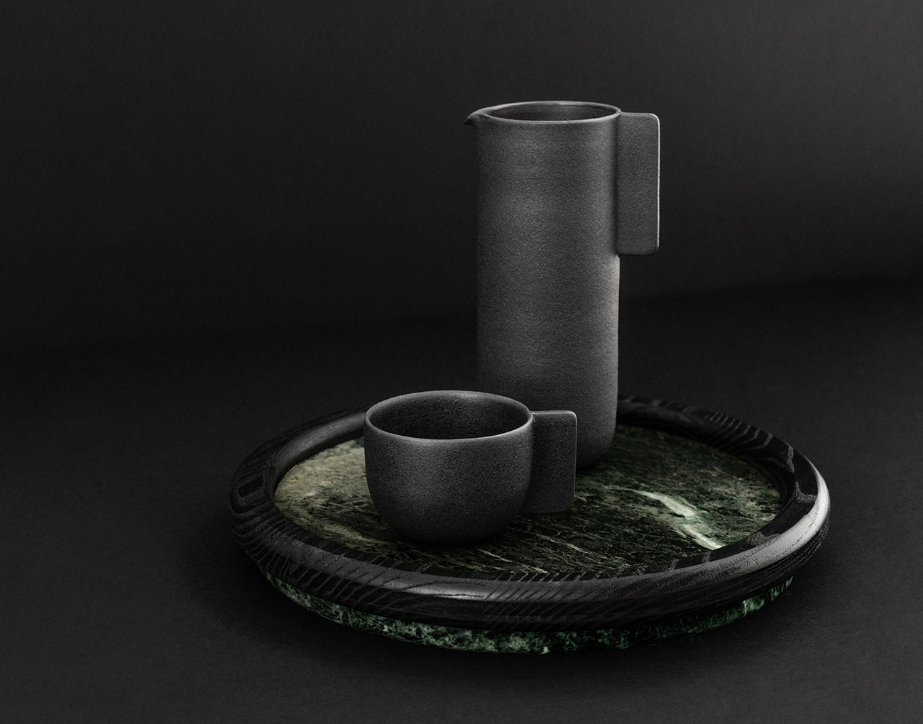
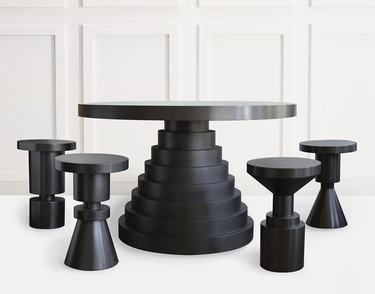
For his debut collaboration with the uptown New York gallery DeLorenzo, designer Sam Amoia was determined to combine traditional casting materials with precious stones and minerals including malachite, lapis lazuli, pyrite, and black tourmaline. It’s a collection born of a mutual affinity for modernity and an eye towards timelessness, assembled by hand in Amoia's Brooklyn studio.