10.29.14
Excerpt: Exhibition
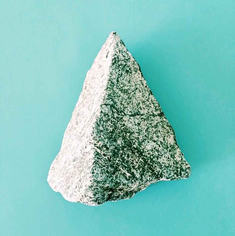
The I’m Revolting Stone Show at Kiosk
A few weeks ago, I got an email from our friend Su Wu at I’m Revolting, asking if I’d be part of a show she was putting together for Kiosk. “Will you send me a stone?” she asked. “The show is of rocks; everybody loves looking at rocks! Me too: you know I move slowly on beaches. It can be a pebble from your morning walk or a pretty specimen, craggy or river-smooth, petrified, funny holes.” As someone whose daily routine hardly deviates from a straight line through the East Village, I didn’t have anything particularly suitable. But starting this week at Kiosk (and on Instagram at #stoneshow) you can find out who did. The results were delightfully inventive and weird: Albert Chu from OTAAT sent hot-pink Pop Rocks; Doug Johnston sent a solid piece of aluminum made from melted beer cans that people had thrown into a campfire; and Bari Ziperstein’s rock crystal, which dissolves in water, can only be cleaned with smelly vats of brine. Some of them were also surprisingly moving: “Lauren Ardis found her rock in Bolinas; it has a heart shaped indent in the back,” Wu says. “She used to make fun of her mom for collecting heart-shaped rocks; now, she laughs about getting more sentimental with age.” The rocks will be exhibited at Kiosk’s new location at 540 LaGuardia Place and placed at the base of a tree outside the shop when the exhibition ends. Here’s a snapshot of the submissions.