11.07.13
Travel
Shinola’s Daniel Caudill in Detroit
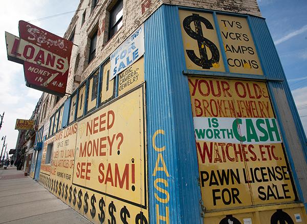
It wasn't too long ago that bringing up Detroit made people feel sad. For decades it was America's most downtrodden city; the first and only time I visited, 15 years ago, at age 19, I gasped dramatically upon arrival that it looked like its downtown had literally been bombed out and abandoned. But two or three years ago, Detroit got a brand new narrative, unfortunately by way of an annoyingly over-baked media frenzy that branded it the next hipster haven, complete with coffee shops, urban farms, and its first Whole Foods. The arrival of Shinola — which opened a watch factory and bicycle workshop there last year — quickly became a part of that narrative, even moreso when it opened its second retail location in New York a few months ago and began introducing the East Coast to its $2,000 artisanal bicycles and handmade leather goods. And yet the company is playing an important part in what's really going on in Detroit, beyond all the coffee shops and organic foods, which is that it's in the process of replacing parts of its failed industrial economy with a creative one, and that its residents and legislators are counting on that renewal to get the city back on its feet.