02.08.10
Invitation
A Color Study by Raw Color
It’s not unusual for a designer to become synonymous with a single project. Think of Konstantin Grcic’s galactic-looking Chair_One, or Stefan Sagmeister’s AIGA poster carved into his flesh with an X-Acto knife. For Christoph Brach and Daniera ter Haar, it’s more like eponymous: A project called Raw Color gave their studio its name (though the project’s since become known as 100% SAP so as to avoid confusion) and it has consumed them by varying degrees since they graduated from the Design Academy Eindhoven in 2007.
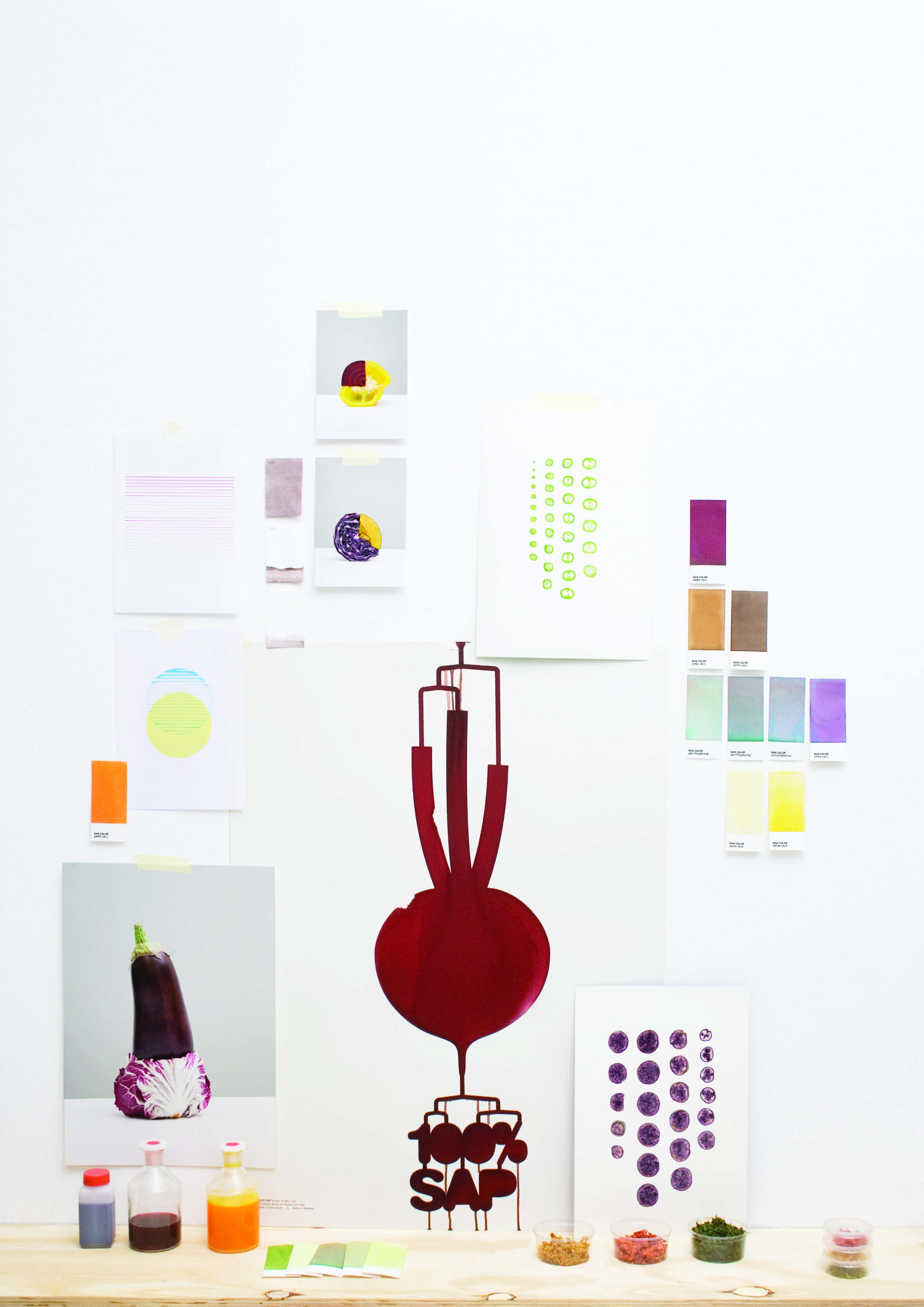
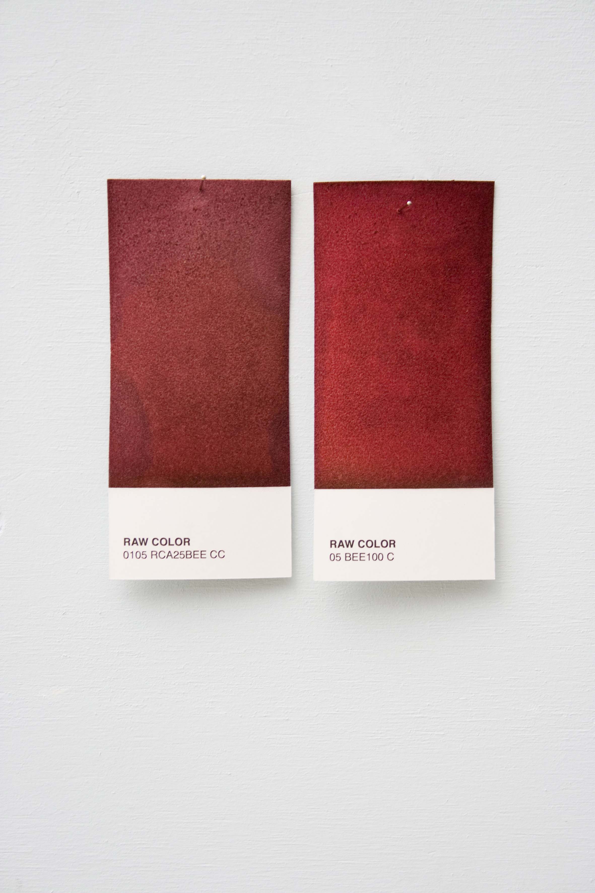
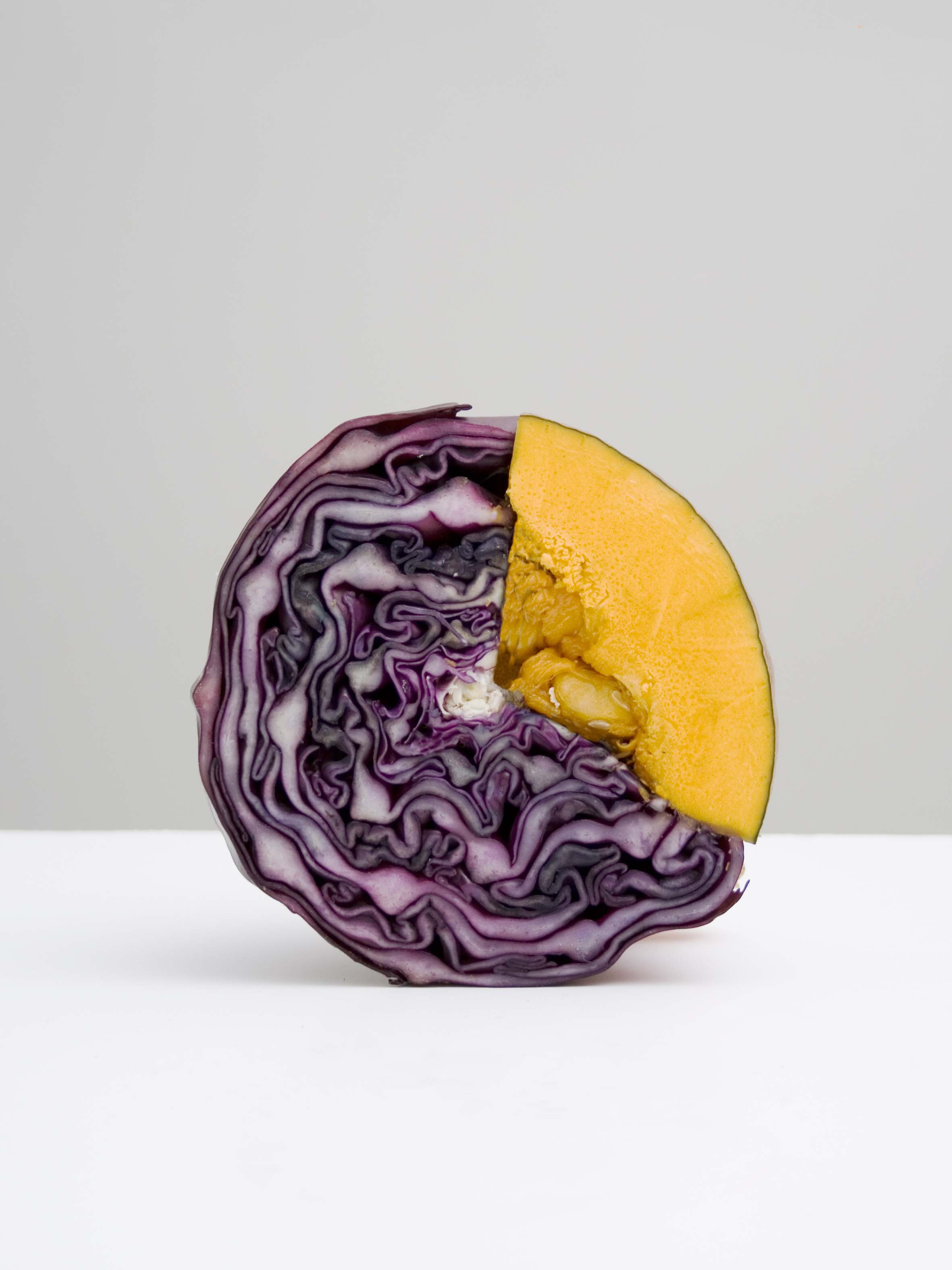
In the fall of that year, Raw Color was invited to create an installation for the exhibition NAT: Designing Nature, at their alma mater’s MU Gallery. They silk-screened a pattern in special absorbent fiber onto a sheet of paper, ran a few raw beets through a juicer, and waited as the liquid seeped slowly through the fibers, in effect printing the pattern with a dark red “ink.” That winter, they were invited to take the project a step further, setting up shop in the kitchen of the now-defunct Amsterdam-based design incubator Platform21. There, they created a coded Pantone-like system with vegetable dyes, extracting intense aquatic blues from the juicing of a red cabbage, say, or a dove gray from a white beetroot, and combining vegetables to create new colors and shades. When they realized the three strongest pigments — red cabbage, beetroot, and pumpkin — were remarkably similar to Cyan, Magenta, and Yellow, they filled the cartridges of a Canon printer with the natural dyes and in a performance created a series of striped inkjet prints. Most recently, Brach and ter Haar were contacted by a Dutch fashion label asking if the duo could use their vegetable tints to dye textiles for an upcoming collection.
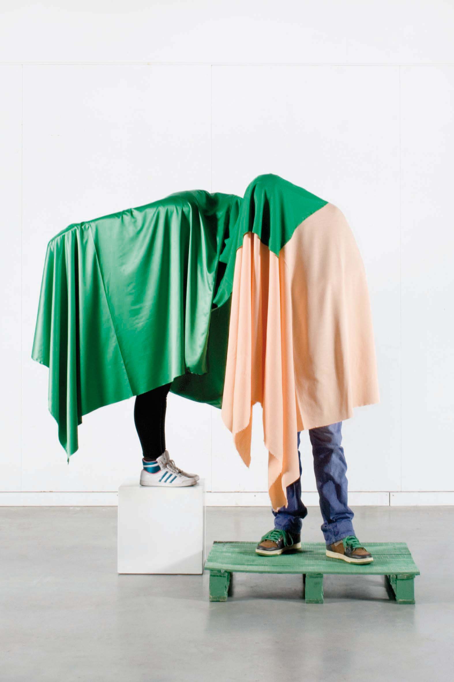
What connects each stage of the 100% SAP project — and what unites Raw Color’s work in general — is a steadfast devotion to the exploration of color. “White isn’t wrong,” says ter Haar, “but it does mean you don’t have to make a specific choice.” Their work incorporates fashion, photography, styling, and graphics, and as Brach points out, “Color is a really nice connection between those disciplines. We use it almost as a material, and it’s transformative the way it can make something seem hard or light or heavy.”
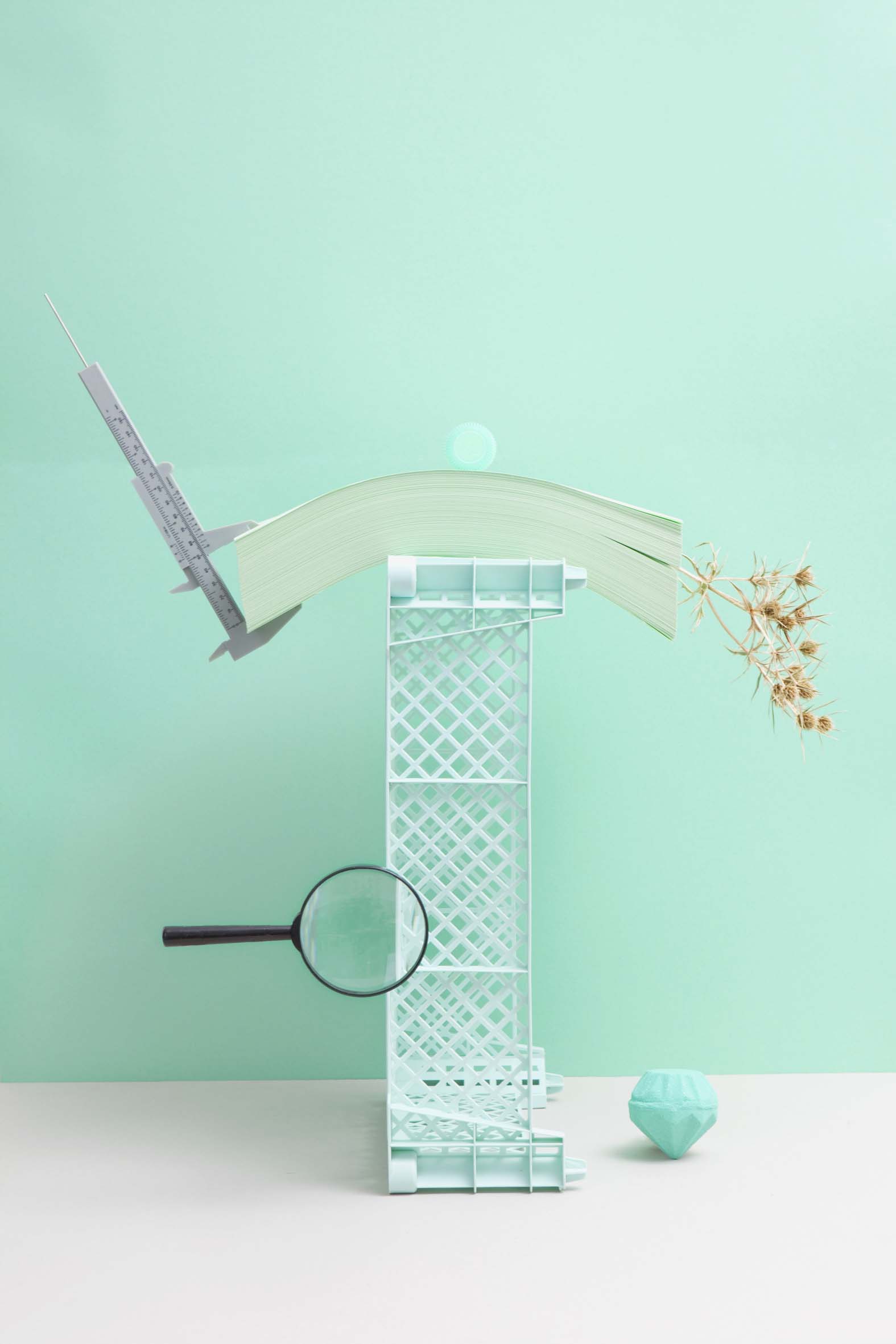
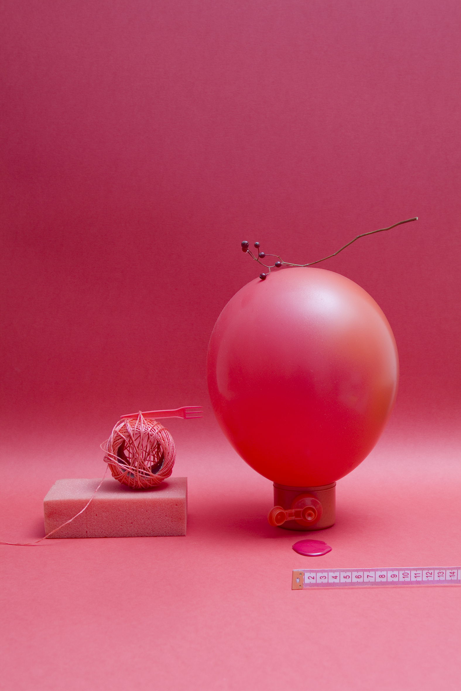
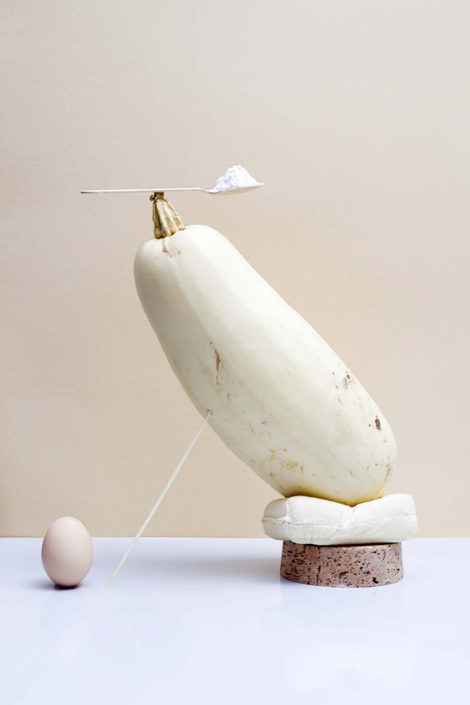
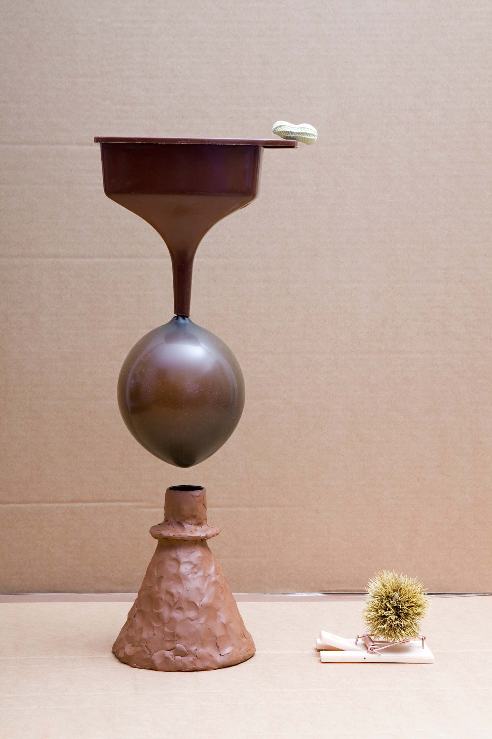
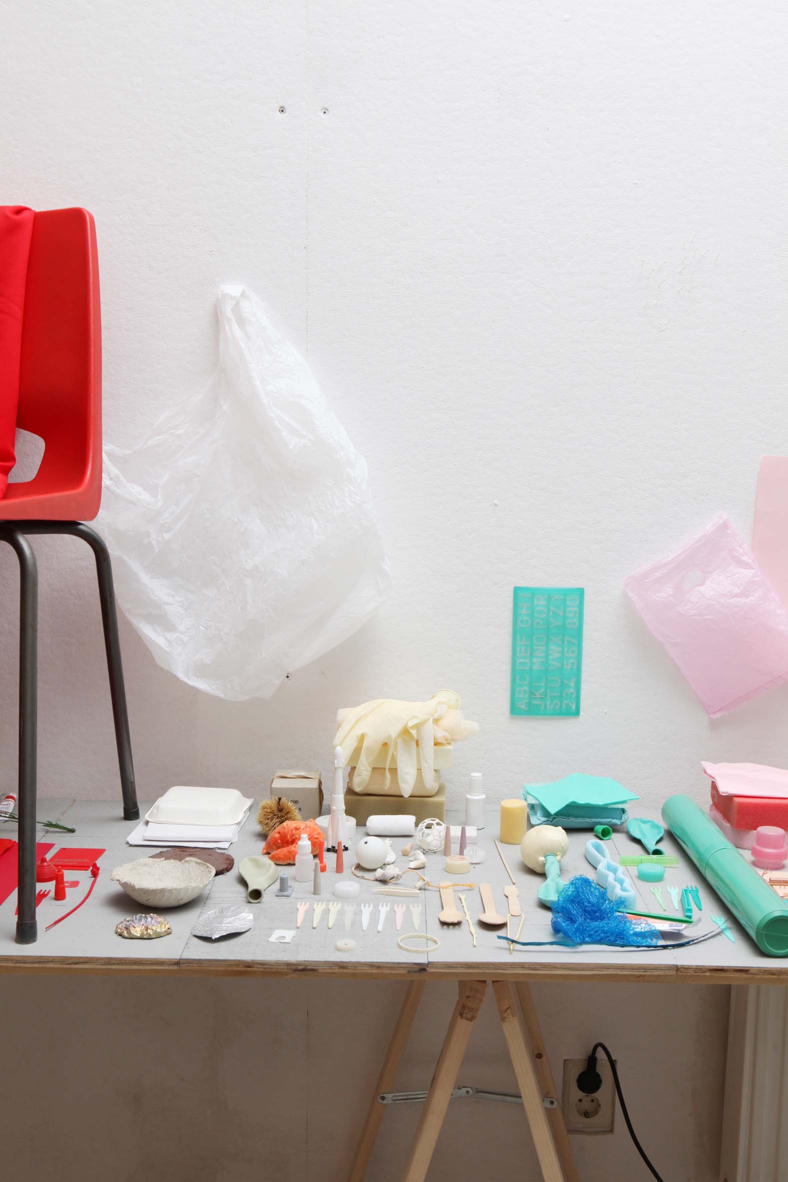
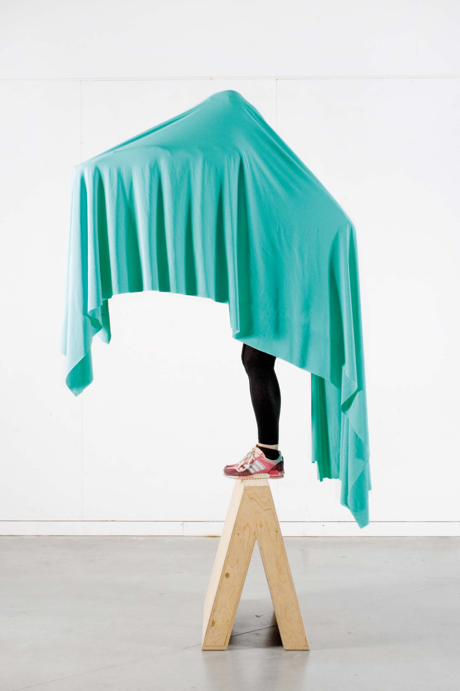
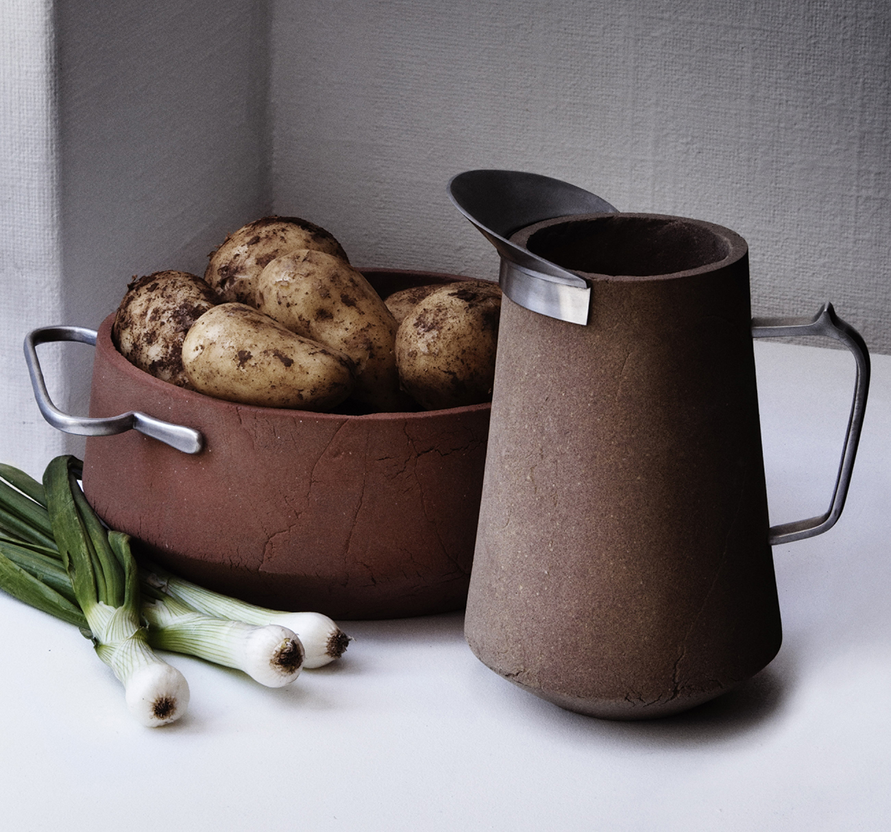
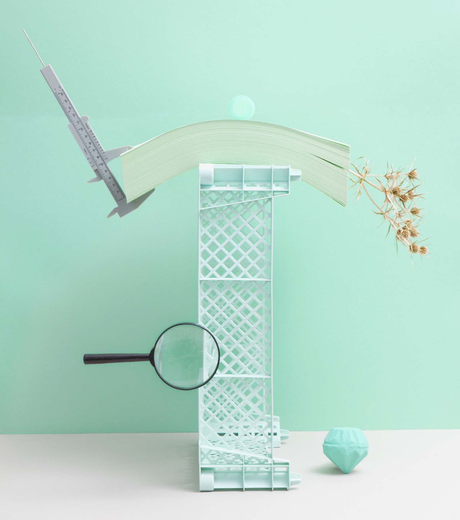
When we visited Raw Color’s studio last fall, we fell in love with the duo’s polychromatic portfolio, and we invited them to create a special series for Sight Unseen, open to interpretation but somehow exploring for us their love for color. They came back with a series of still-lifes — the first four images in this slideshow — that offer insights into the essence of each hue. Brach explains: “Our whole studio is filled with inspirational objects we’ve never really used. For this photo series, we tried to tell stories and reveal the nature of certain colors through these set-ups.”