07.26.14
Saturday Selects
Week of July 21, 2014
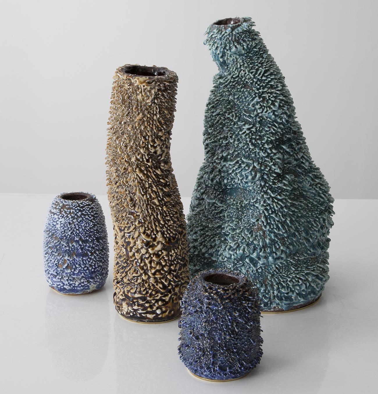
A weekly Saturday recap to share with you our favorite links, discoveries, exhibitions, and more from the past seven days. This week: ceramic vessels with Dimetapp-like drips (above), lamps in geometric stone, and a color chain reaction on Instagram that was the highlight of our week.
Discoveries
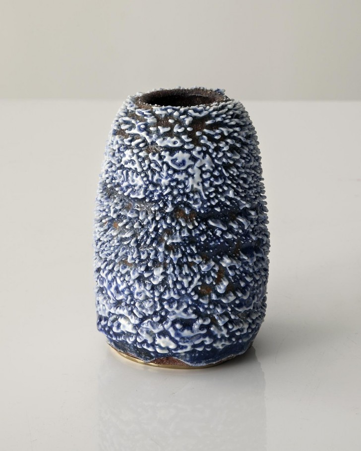 The work of the Los Angeles–based Haas Brothers can sometimes be a bit too bestial for us — which may be why it took us so long to figure out how wonderful their ceramic Accretion vases are (shown here and at the top of this post). Each one is hand-painted with a clay and water mixture to achieve a surface texture that resembles mini-stalactites (or dripping cough syrup, as their fanciful glaze names suggest).
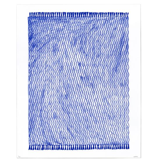 We stumbled across Brooklyn illustrator Rachel Domm‘s work on the Instagram of McNally-Jackson art store offshoot Picture Room. Domm has created illustrations for outlets like J. Crew, The New Yorker, and The Believer, but we love her personal work best, for which she finely renders everyday household objects, like rugs and baskets, in pencil and paper. Bonus: the flyer for her current solo show at Picture Room was created by the always awesome Benjamin Critton.
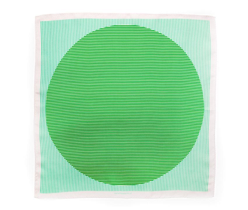
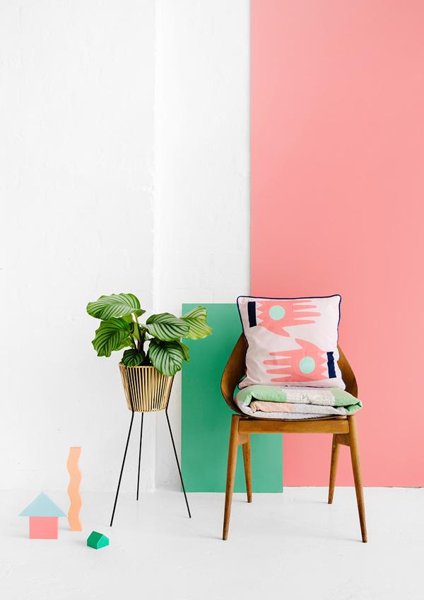 We’ve seen images of the brand-new Australian housewares brand Arro Home in a few different outlets now — Cool Hunting and The Design Files, from whom we snagged the image above — and we’re seriously digging how colorful and fun the patterns are. Creative directed by Beci Orpin, the collection is available for pre-order now.
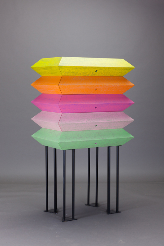
One of the best things we saw in Milan this year was an exhibit curated by Martino Gamper called From-To. But we were thwarted in our attempts to share its amazingness as images were embargoed indefinitely, mostly due to the fact that each item was a prototype and the artists wished to prevent copycatting until production agreements were underway. Luckily, some of those items are starting to surface, including this chest of drawers by RCA grad Lucia Massari. “For this cabinet I used a very popular technique which in Italian is known as decapato, a process of removing superficial material creating a pattern that reveals the wood grain, giving the surface a sort of drawing-like look,” Massari writes. “The colors and stains that are usually used in this process always give furniture a ‘country’ look. By using very bright colors, instead, I gave this technique a new revisited look.” We’ll be featuring more of Massari’s work this fall; stay tuned!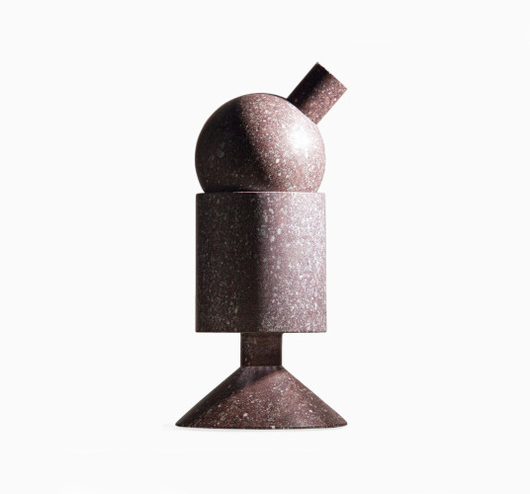
Speaking of things from Milan that we can’t get out of our heads even three months after the fact, this Porphyry stone lamp by photographer and sometime designer Stefano Galuzzi popped up on L’Arcobaleno this week. Part of the Luce Continua collection of six lamps, the halogen light can be adjusted by moving or removing the sphere up top.
Links
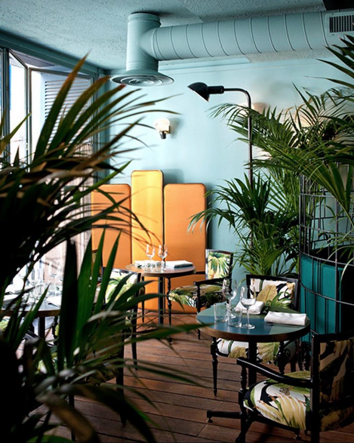 The Milan-based Dimore Studio was featured on 1stdibs earlier this week. Like their gallery, which we fell in love with when we visited earlier this year, the interiors featured in the story are almost too traditional. But then there’s something that throws them off, which makes them right up our alley.
 We came across a very like-minded entity this week in the form of Madesmith, an online shop that creates beautiful editorial pieces to accompany its maker’s wares. The image above was taken from a photo essay on Brooklyn ceramicist Helen Levi, who created five exclusive editions for the shop.
 Los Angeles–based designer Jonathan Olivares this week unveiled a new website — or as he calls it, a web-based project — called Viewmaster. It allows visitors to view a sampling of Olivares’s own projects and research materials as well as host contributions by former collaborators. The format was designed by Harsh Patel, and while usually we hate non-straightforward web design, there’s something pretty addictive about flipping through the seemingly unconnected photos.
Openings
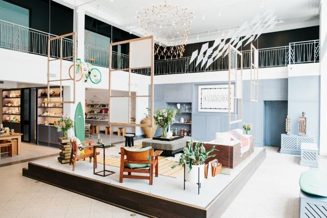 Another housewares shop opened this week on Brooklyn’s Atlantic Avenue, but this one is different by virtue of its no-fail Partners & Spade imprimatur. Boerum House & Home was designed and curated by the Andy Spade / Anthony Sperduti–helmed consultancy in collaboration with architecture and development firm Flank. The store is meant evoke the modern Brooklyn home (this is the living room) and hosts goods from more 130 artisans and makers.
Exhibitions
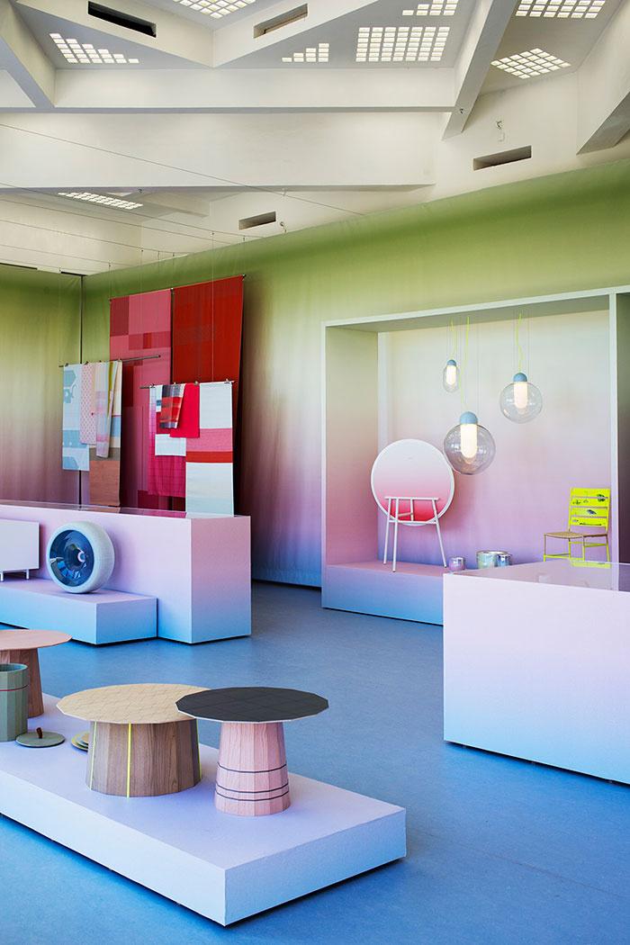 On view until September at the French arts center Villa Noailles is a mini-retrospective of Scholten & Baijings colorful work, appropriately titled “Over the Rainbow.” The work, including sheets for Hay and lights for Established & Sons, is set against an ombre backdrop that looks even better in these photos for French AD by photographer Olivier Amsellem.
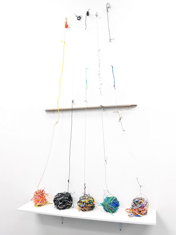 Closing tomorrow at Lynch Tham gallery on New York’s Lower East Side is a solo show by conceptual artist Ryan Garvey, who filled the gallery, like some sort of urban archaeologist, with foraged materials from the neighborhood including keys, pill bottles, security envelopes, padlocks, glassine baggies, and these electrical cords. “As I spend time in a space that interests me patterns emerge, and these patterns are the evidence of human interactions,” Garvey explains. “The finished pieces are composed entirely of their own subject matter. In a way I see them as serving the same function as a geologist’s soil samples.”
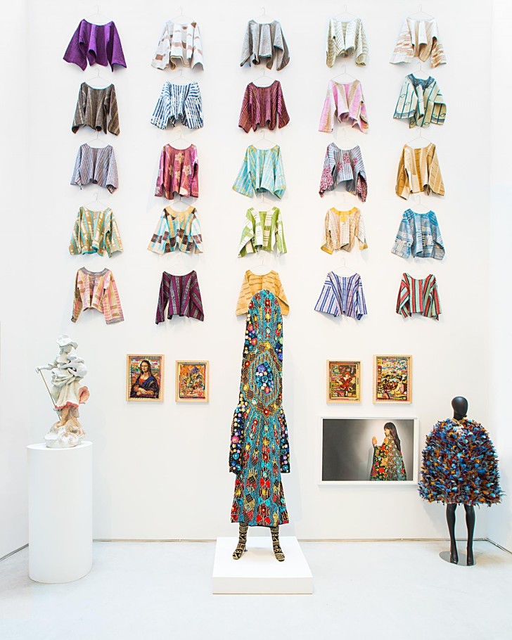 And closing next Friday at Salon 94 Bowery is an incredible group show and shop we’re not quite sure how we missed: “More Material” is a sequel to London-based fashion designer Duro Olowu’s 2012 installation at the gallery, and presents a selection of contemporary and vintage art and photography, textiles, furniture, ceramics and objects, including the capes by Olowu shown here, Nick Cave soundsuits, Caroline Achaintre tapestries, and a selection of ceramics by Matt Merkel Hess we’ll be featuring more in-depth next week!
Instagrams
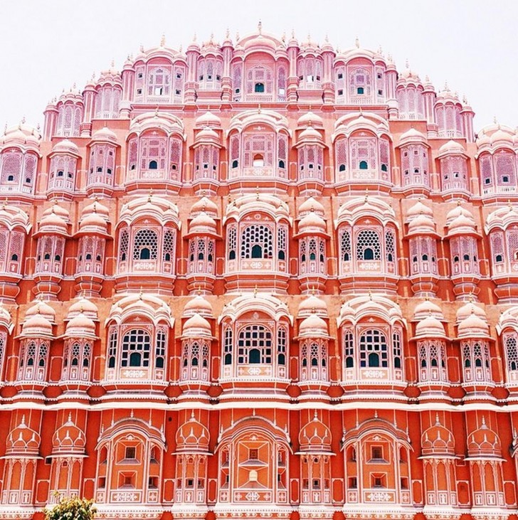 The prettiest color story unfolded on our Instagram this week, like some sort of bizarre photography chain letter. It began with this image, taken by the Los Angeles–based Block Shop Textiles, of the Hawa Mahal palace in Jaipur, which we now have at the top of our list to visit.
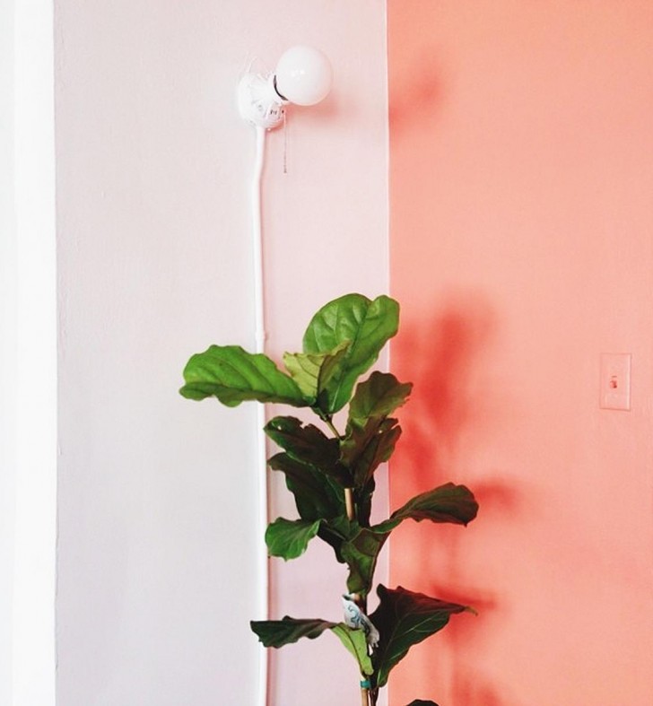 We’d found the India image through the account of Lily Stockman, one of the sisters behind Block Shop, who was trying to recreate the perfect Jaipur peach in her office back home.
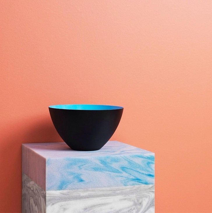 That same peach showed up in a still life by one of our favorite brands, Normann Copenhagen, along with the prettiest blue peeking out of their Krenit bowl.
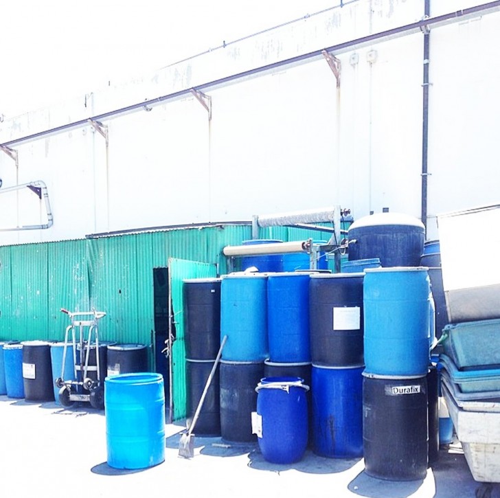 That blue exploded into a million different aqua hues in this photo by former Helmut Lang print designer Pascale Gueracague, who was visiting a denim factory in Los Angeles.
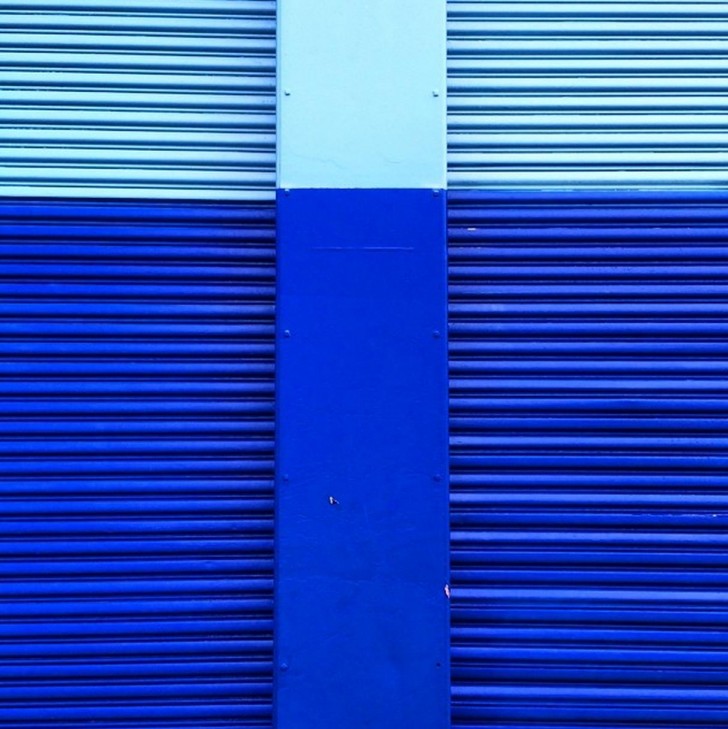 And then distilled into three perfect ones in this random photo of some random gates on the Hudson River by creative director Pieterjan Mattan. All accounts worth following, if only to make your feed as inspiring as ours was this week!
