Peter Nencini’s Instagrams

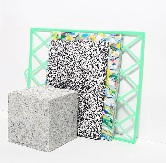
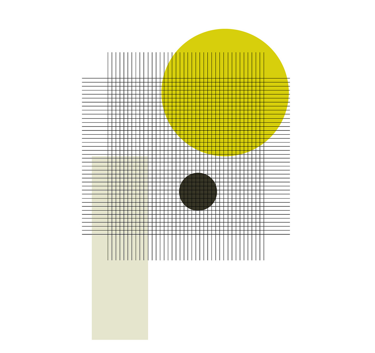
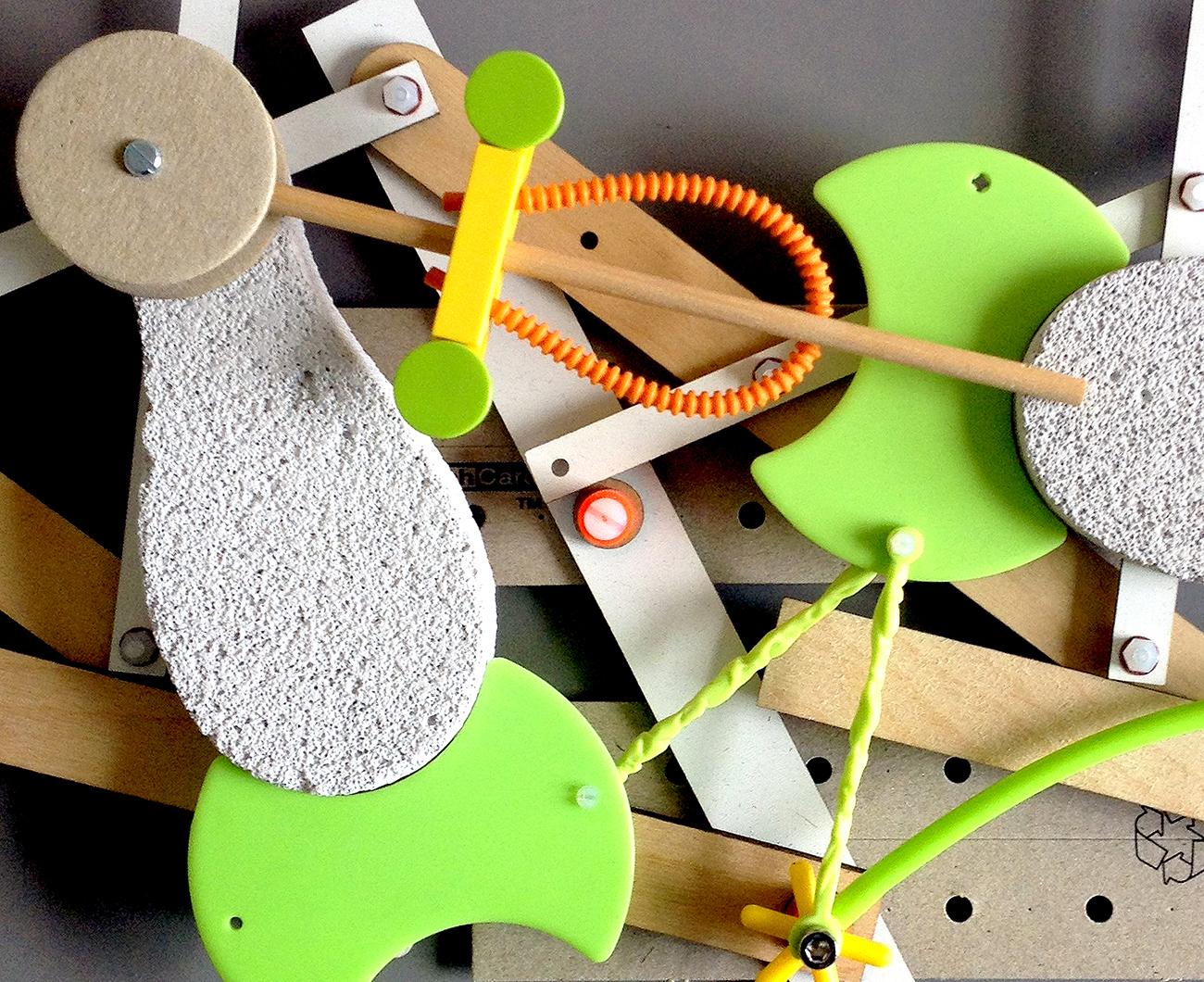
Lots of people on Instagram tend to stop us dead in our tracks as we slavishly scroll through our feed, but Peter Nencini has been one of those arresting image-makers since before the app even existed. An illustrator by training, Nencini did away with the confines of pen and paper after graduating from London’s Royal College of Art in the 1990s and today creates everything from typefaces to ad-hoc sculptures. A keen photographer, he has always recorded the stages of his process, first with a point-and-shoot and now with his iPhone, and has long been the proprietor of one of our favorite inspiration blogs. So when I suggested he walk me through 8 Things for Sight Unseen, the stipulation was that it had to be images from his Instagram, and we’d be digging into his thoughts on the app. He asked me to choose the shots, and then he explained them: That is how it went down.
More

Hazel Stark’s New Textiles

It was only just last year that we were wondering what brilliance Hazel Stark would produce if ever she turned her attention to designing and making full-time, and already we have the answer. Having left her job with Ally Capellino earlier in the summer, Stark initiated work on her new collection, Naturally Dyed #1, with a long period of research into materials.
More

Charcolor Furniture, by Louie Rigano and Avantika Agarwal

Our first introduction to Louie Rigano, a New Jersey-born, RISD-educated designer who's now studying in the Design Products program at RCA, was a piece he'd made for the American Design Club's Trophy Show, back in 2013. Called Glittering Urn, it was a neo-classical form made slightly punk-rock by virtue of its material: a resin that had been almost entirely suffused with glitter. So it came as no surprise when we received an email last week from the designer — who describes his process as a "search for moments of unexpected accord between the spectacular and the practical" — of a new furniture collection he'd created in collaboration with fellow student Avantika Agarwal, which paired relatively simple wooden forms with an audacious coloring process. To create Charcolor Furniture's seared rainbow effect, CMYK pigments are literally burned onto the wood.
More

Week of September 8, 2014

A weekly Saturday recap to share with you our favorite links, discoveries, exhibitions, and more from the past seven days. This week: marble, fake marble, and a marbled painting made with a broom. Plus, select highlights from the London Design Festival, which started today.
More

Ricky Swallow vs. Matt Paweski, for Herald St London

As much fun as it is, as journalists, to the pick the brains of the artists and designers who inspire us every day, there's something we enjoy even more: being a fly on the wall as two of our favorite creatives spar back and forth about their craft. It's something we'll never understand as intimately as those who are makers themselves, and when those makers are as thoughtful about their work as Los Angeles artists Ricky Swallow and Matt Paweski are, it makes for a most excellent Friday read. Swallow interviewed Paweski in advance of the latter's solo exhibition, opening tomorrow at Herald St gallery in London, and we were lucky enough to nab a transcription of that Q&A. Read on to find out what makes a Matt Paweski, which direction his work is going in, and what the heck a "kerf" actually is.
More

Fruits of Labor by Bethan Laura Wood

Sighted this week on Pin-Up magazine's website, making-of images from the latest project of London talent Bethan Laura Wood, a series of summer window displays for Hermès UK called "Fruits of Labor." Pin-Up's editors call the project, which consists of classical still lifes full of oversized fruits and vegetables, "Henry Rousseau in 3-D." Says Wood of the project: "I really wanted these large-scale sets to be hand-painted in order to highlight the layers handcrafted at every stage that make up final Hermès products.”
More

Marine Duroselle, graphic designer

For the young, French graphic designer and Royal College of Arts grad Marine Duroselle, a relationship to pattern and shape is both instinctive and intuitive, owing in large part to the vast array of objects she was exposed to as a child. Growing up in Peru, her mother an anthropologist specializing in pre-Colombian textiles, Duroselle was continually surrounded by rich fabrics, threads and other types of South American crafts; a period of post-adolescence spent living in New York, on an exchange program at the School of Visual Arts, only further emphasized her interest in textiles and color.
More

Week of August 4, 2014

A weekly Saturday recap to share with you our favorite links, discoveries, exhibitions, and more from the past seven days. This week: vases made from plastic bags, lamps made from plant pots, art made from police tactics, and three new emerging designers we discovered via Instagram.
More
Peter Judson Memphis Design

Peter Judson’s ’80s-Inspired Illustrations Are A Playful Homage to Memphis Design

With all the talk of Memphis Design suddenly in the air — Gizmodo and L'Arcobaleno both recently name-checked Sight Unseen in stories about its not-so-recent resurgence — we thought that sharing these '80s-influenced illustrations would be a fun way to start the week. They're by recent Kingston University graduate Peter Judson, whose work is a playful homage to Sottsass and the gang but has been compared to everything from Nickelodeon cartoons to “a cheap rip off of the latter works by Roy Lichtenstein.”
More

Week of July 14, 2014

A weekly Saturday recap to share with you our favorite links, discoveries, exhibitions, and more from the past seven days. This week: experimental materials made from chalk and coal (above), a new Book/Shop annex in New York, and our first-ever radio show interview, with Design Sponge's Grace Bonney.
More

Suzanne Antonelli, Print Designer

On her Tumblr, Suzanne Antonelli self-identifies as a printed textile designer. But in truth, the Norwich, UK–based designer's graphics have taken on such a life of their own that Antonelli has begun to be more widely known for the patterns themselves. In her webshop, those patterns are applied to vegetable ink–printed recycled paper notebooks, or, more simply, to giclee A1 posters — the better for adorning the walls of your house, which you're going to want to do in spades after perusing these images. Of her interest in print-making — and particularly of the repetitive geometries that have become her signature — Antonelli has said: "I first became interested in pattern when I was doing my foundation in Brighton. There was hardly any room in the studio and desks were on a first come first serve basis; I think that the lack of space made me focus more and I produced a lot of really small detailed work on graph paper using tiny dots to make up different blocks of pattern."
More

Studio Uribe’s FW14 Collection

We spotted the new London-based jewelry designers Studio Uribe on the shelves of one of our favorite boutiques, Hunting and Collecting in Brussels. Helmed by couple Sion and Tiffany Phillips, the brand recently launched its first collection for FW14, which pairs sleek 18K gold-plated brass with abstract striped-enamel and lapis lazuli accents.
More