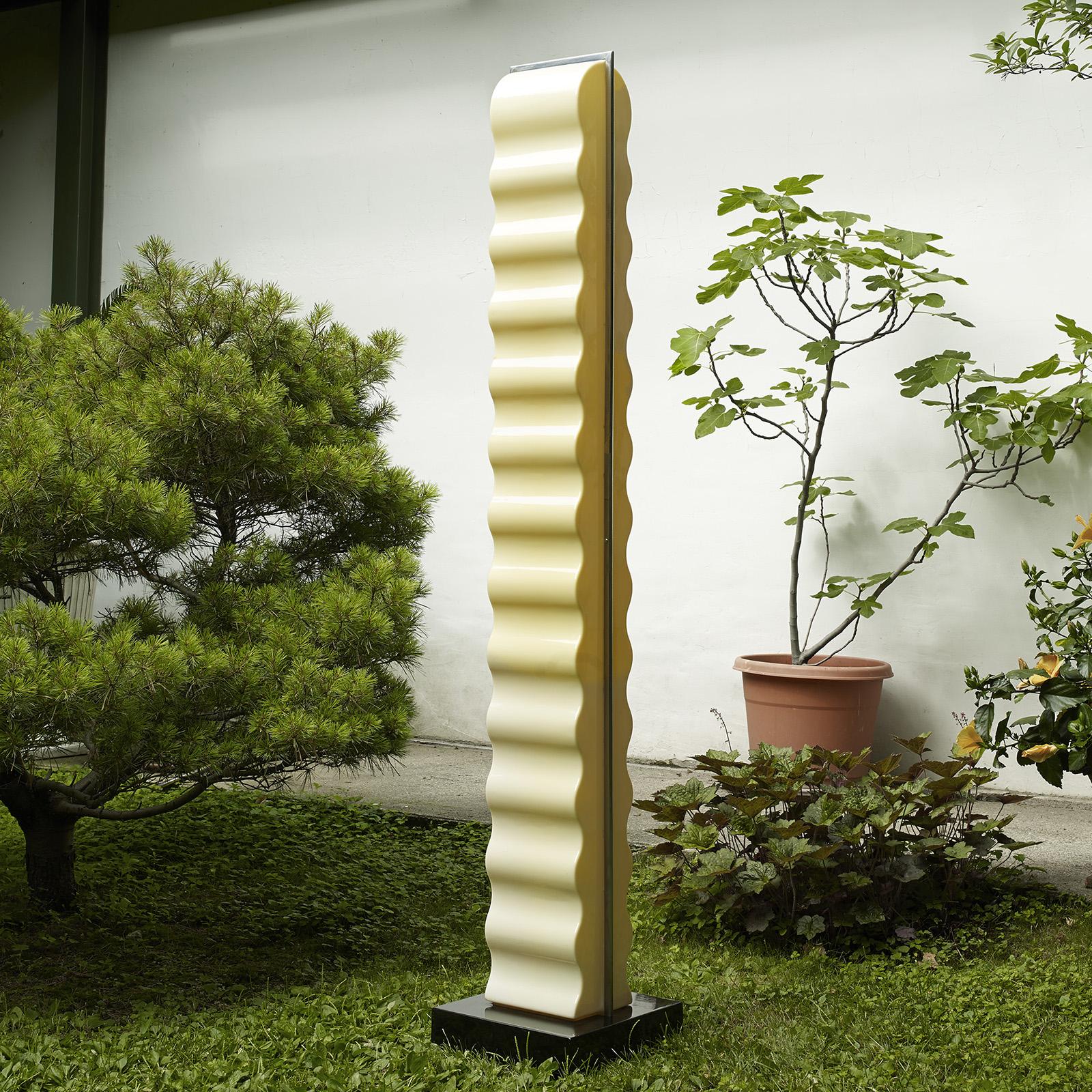
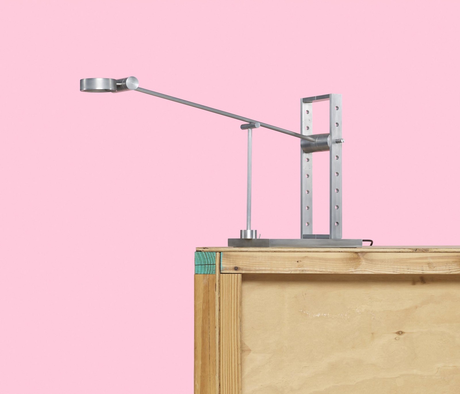
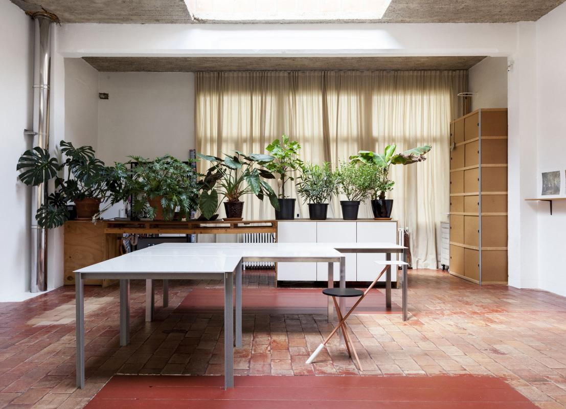
Week of August 25, 2014

A weekly Saturday recap to share with you our favorite links, discoveries, exhibitions, and more from the past seven days. This week: shockingly beautiful interiors, sophisticated student work, and a surprising new (Canadian!) design hub.
More

The Game’s New Online Shop

With Labor Day around the corner (we'll be taking off this Monday, along with the rest of America) we're allowing ourselves to get just a tiny bit excited about the impending fall. Sweaters, the color navy, and the smell of burning leaves are right up there among our favorite things. Fall is also the time when we stop spending our waking hours wondering when we can next get to the beach and start spending them a bit more inside on the computer, shopping for knickknacks that will make the homes we're about to spend a whole lot more time in even cozier. Our newest destination is The Game, a brand new shop that exists both online and in two Belgian outposts, founded and curated by Alexis Ryngaert, who's also behind of one of our all-time favorite design galleries, Victor Hunt.
More

Sigrid Calon, Visual Artist

For some reason, this is the week we finally put our money where our mouth is: First we took home one of Fort Standard's beautiful, mint-colored standing bowls, and then, on a whim last Wednesday, we picked up a risograph by Dutch visual artist Sigrid Calon, who we've had on our radar for quite some time. The hardest thing about buying Calon's work is narrowing down your options to just one — each print, which is based on the Tilburg artist's interpretation of an embroidery grid, is beautifully layered, using eight gradated colors, dots, and lines to achieve endless variations. Which one would you choose? See more after the jump.
More

Ian Anderson, ceramicist

If you find it at all impressive that Philadelphia-based ceramicist Ian Anderson is releasing the debut collection we’re presenting here at the tender age of just 23, consider this: Anderson has been developing the collection’s asymmetrical, highly sophisticated forms in his head ever since he was a high-school student back in Mission Viejo, California. He just never had the studio set-up to realize them until now.
More

Helen Levi in the American Southwest

Sometime in the past year, Brooklyn potter Helen Levi began making her popular Desert Tumblers, which evoke a kind of faded, windswept, Southwestern landscape by marbling white porcelain with sandy red clay. But the funny thing is, until this summer, New York–born Levi had never even been to the desert. "I’d been wanting to go to New Mexico since high school," she says. "That landscape has always been kind of a dreamy thought, but my tumblers were based on my imagination of a place I'd never seen." This summer, Levi decided to bite the bullet, taking a month off from work to road trip 7,000 miles — all the way to Albuquerque and back — making sure to stop along the way at places like the Pittsburgh factory where her clay is made and leaving enough time to simply wander off the road in search of this country's vast natural beauty.
More

Week of August 11, 2014

A weekly Saturday recap to share with you our favorite links, discoveries, exhibitions, and more from the past seven days. This week was all about next-level workplace decor: colorful benches for happy waiting rooms, amazing ceramics for air-freshening plants, and the coolest Christmas-colored desk we've ever seen.
More

Workaday Handmade

Like many creatives we’ve interviewed before, Forrest Lewinger began his Workaday Handmade ceramics label while in the employ of someone else. Having studied ceramics in college and promptly dropped it to focus on more video-based, site-specific work, the Virginia-born designer found himself a year or so ago back behind the potter’s wheel, working as a studio assistant to a ceramicist in New York City. “A lot of times, artists think of their day job as an obstructive force,” laughs Lewinger. “I started to think of it as something more generative.”
More

Ellen Van Dusen

If there's anyone who knows a little something about calibrating the perfect pattern, it's Ellen Van Dusen. The D.C.-born fashion designer is Brooklyn's reigning queen of prints, with nine seasons under her belt as Dusen Dusen, the line for which she creates flattering basics marked by colorful fruits, stripes, curves, dots, geometrics, and the like. So it made sense when we recently learned two things about Van Dusen: one, that she studied in college the psychology of design and the brain's reaction to visual stimuli; and two, that she has a pretty incredible resource library to back that major up. On a recent visit to her Williamsburg studio, we perused her stacks, which included the massive, Todd Oldham–designed Alexander Girard monograph from a few years back and some amazing old Esprit books that we already had planned to excerpt in the coming weeks. But it was this book on Yaacov Agam, an Israeli sculptor and experimental artist known for his optical and kinetic work, that seemed to best represent Van Dusen's joyful spirit. "As a textile designer, this is a huge source of inspiration," Van Dusen admits. "I have named more than one print after Agam!" Here she tells the story of how she discovered Agam's body of work and the long-lasting effect it has had on her own.
More

New Work by Matt Merkel-Hess

In our Saturday Selects column last week, we made mention of "More Material," the now-closed exhibition at Salon 94 Bowery in New York, curated by the London-based fashion designer Duro Olowu. What we didn't mention was the bonkers amount of new work Los Angeles–based ceramicist Matt Merkel Hess created for the show and shop (not all of which was included in the exhibition). Merkel Hess is best known for the ceramic copies he makes of everyday objects; for his 2013 show at Salon 94 Freemans, the designer rendered vintage Dust Busters, Super Soakers, stand mixers and the like in glazed porcelain. Here, he focuses on three distinct forms: porcelain novelty ears, flip-flops and West African water kettles.
More

Week of July 21, 2014

A weekly Saturday recap to share with you our favorite links, discoveries, exhibitions, and more from the past seven days. This week: ceramic vessels with Dimetapp-like drips (above), lamps in geometric stone, and a color chain reaction on Instagram that was the highlight of our week.
More

Joanna Williams of Kneeland Co

Last summer, we ran one of our favorite stories to date: a glimpse inside an 1980s-era Scandinavian design book that Seattle designers Ladies & Gentlemen Studio had unearthed while cleaning house. We'd intended to keep going with the column — ostensibly a place where people could show off the strange, beautiful, and mostly out-of-print volumes that populated their libraries — but somehow it fizzled out. We'd been talking this summer about resurrecting it, when at the same time we found out that Joanna Williams, the LA-based owner of the Kneeland textile studio and online marketplace was opening a third branch of her multi-faceted business: a research library, where clients could comb through the curated images Williams has amassed over the years or search through books or magazines focused on graphics, textiles, decorating, and more. We'd found our first subject.
More

Chad Kouri, artist

Chad Kouri took his first freelance design gig at the tender age of just 15, but like most creatives, Kouri had trouble at first striking a balance between paying the bills and pursuing his passions. “I moved to Chicago after high school to study design, but knew I didn’t have enough money to finish a four-year program. So I took as many classes as I could and then jumped out to work for a marketing firm, which was not at all fulfilling. I was basically designing junk mail for five years. After hours, I’d work on editorial illustrations or custom typography, but I quickly realized I didn’t enjoy being on a computer 16 hours a day. I started doing collage as a way to break away from screen time. I used to reference a lot of old ads and typography from the ’50s and ’60s, and I wanted to work larger but the pieces could only be as big as a magazine page. That’s how I transitioned to using flat shape and color, and that’s pretty much where I’m at in this experiment of an art career that I have.”
More