01.31.15
Saturday Selects
Week of January 26, 2015
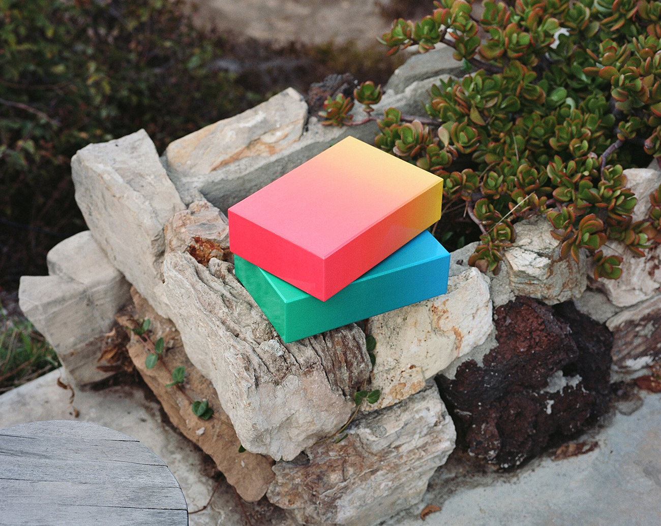
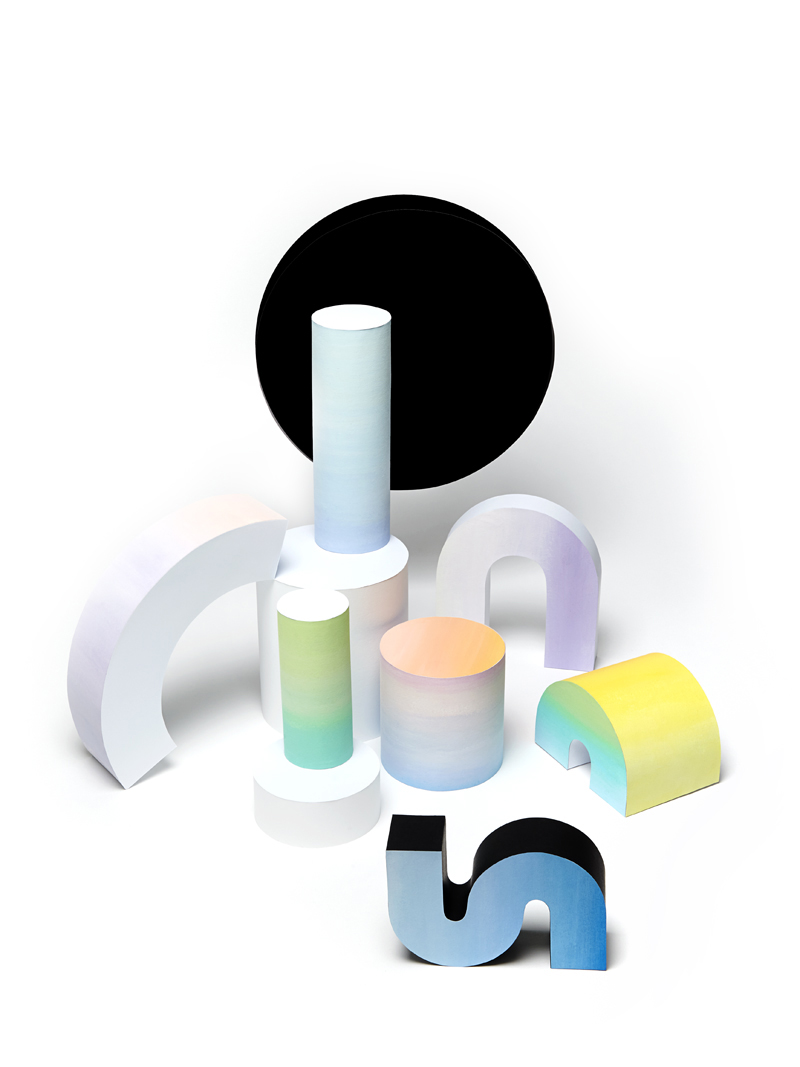
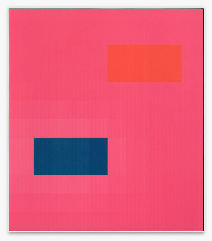
A weekly Saturday recap to share with you our favorite links, discoveries, exhibitions, and more from the past seven days. This week: Sorting the best of the rest from January’s design fairs, getting a crash course in great product photography, and hailing the almighty power of pink (not to mention colored gradients, as seen in Bryce Wilner’s design puzzle — yes that’s a puzzle — above).
Discoveries
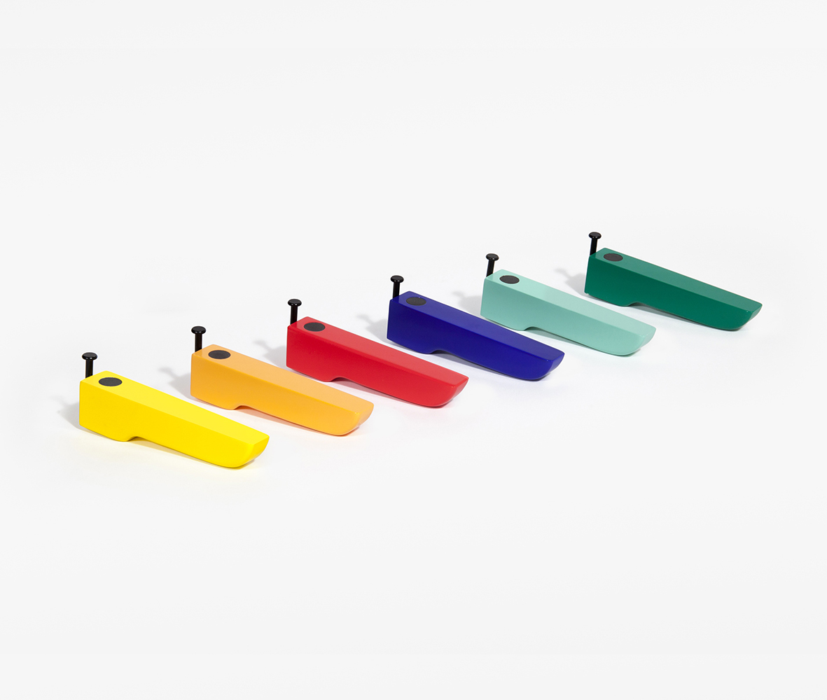
We’ll be scouring NYNOW for the best new products from some of our favorite designers next week, but we glimpsed a few sneak peeks from Areaware’s 2015 collection floating around social media, and we had to share. The new collection is more focused than in seasons past, with an emphasis on color (like Brendan Ravenhill’s bottle openers, above, now available in shades like ultramarine and jade) and a more sophisticated materials palette that includes glass, marble, and porcelain. The collection was photographed in the incredible LA home of Tracy Wilkinson by Stella Berkofsky, who makes objects like Bryce Wilner’s Gradient Puzzle (top of this post — yes, that’s a puzzle) appear even cooler than they already are.
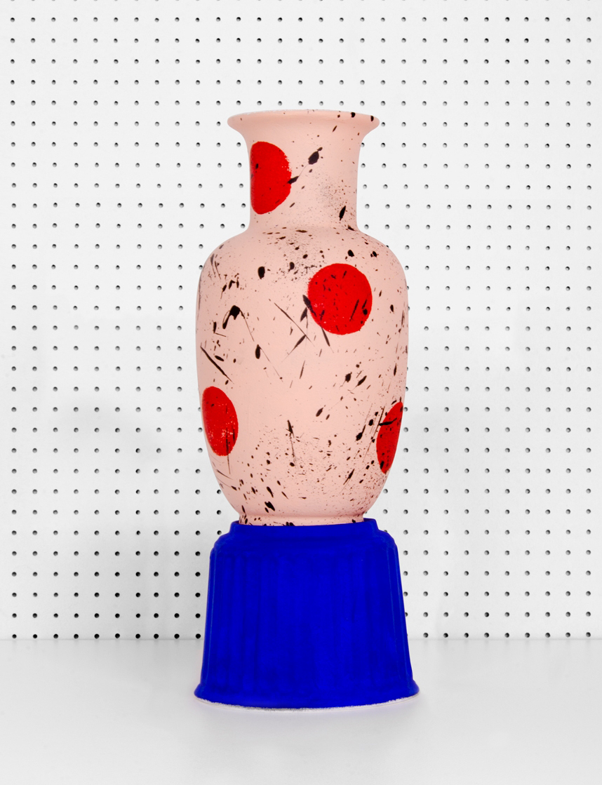
We featured the up-and-coming Barcelona studio Cocolia a year and a half ago, and since then, they’ve only gotten better at what they do — namely, art direction with wild color and patterning, with a touch of Surrealism thrown in for good measure. Their latest venture is an online shop, where they’ll sell limited series of hand-painted clothes, old vases turned into unique pieces (above), or posters of still lifes, printed in high quality paper.
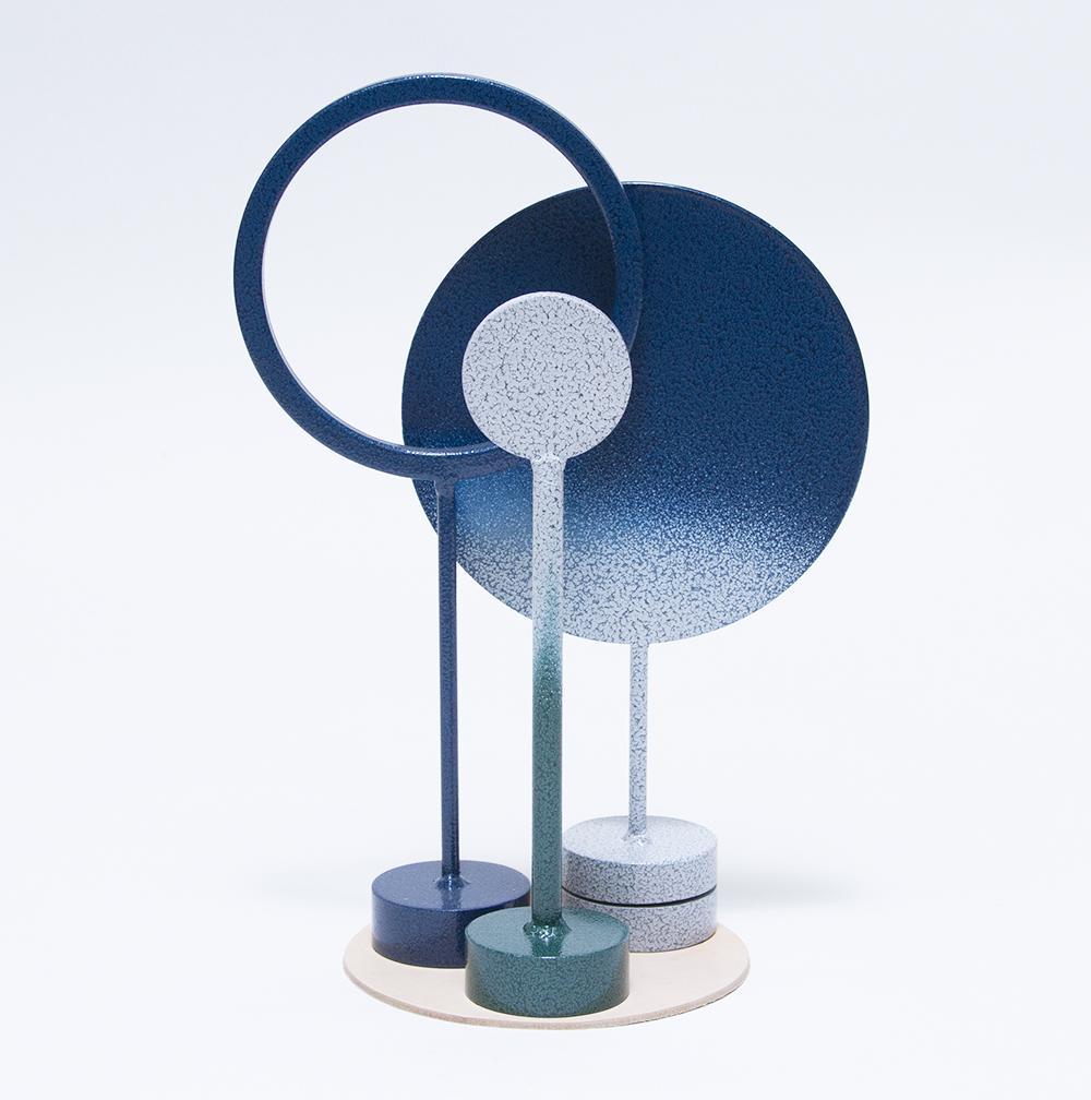
New sculptural work from London-based paper engineer and set designer Lydia Kasumi Shirreff, who’s better known for her editorial work for magazines like Elle and Tatler, as well as projects for clients like Lush. Watch this excellent video on the artist for more insight into her work and a peek inside her amazingly color-coded flat files.
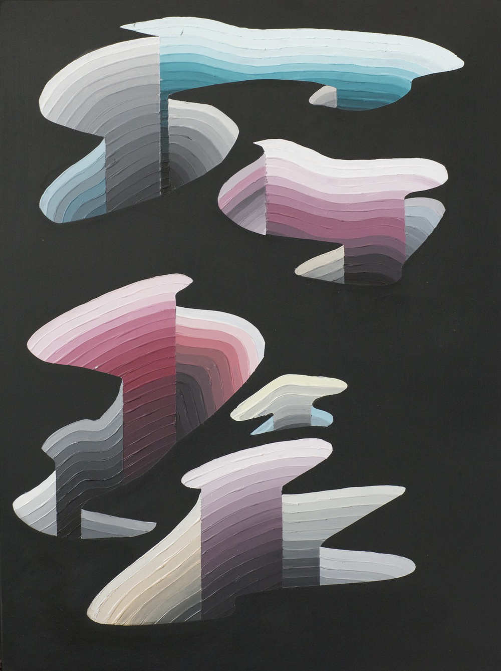
Our assistant editor Ryland tipped us off to the fantastic work being done by recent SCAD grad Will Penny. We love Gamut Relief, his series of geometric topographies made from acrylic on wood panels.
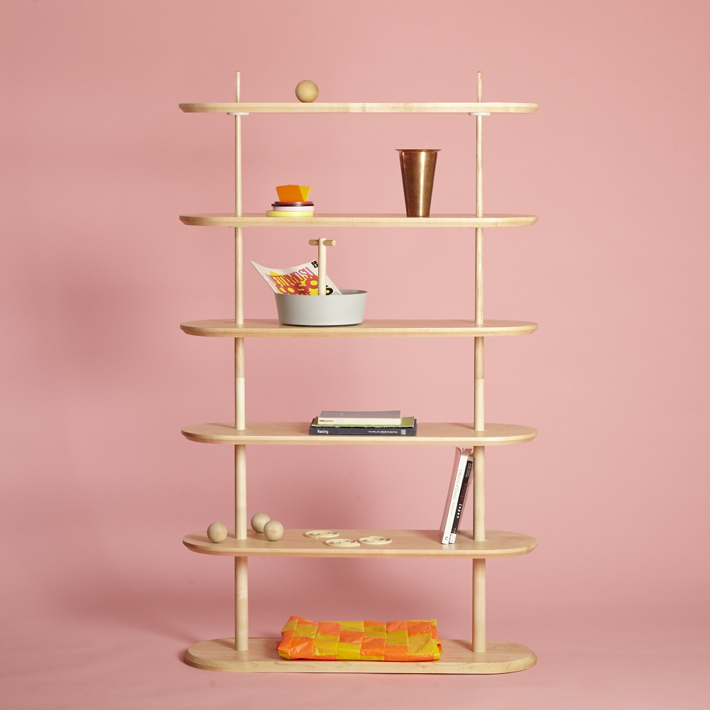
An old design that shows the power of pink. Brooklyn designer Jamie Wolfond’s flat-pack maple Graded Shelving Kit circa 2014; above, the same unit with upgraded lines, better styling, and cute pink background (as shown last week in Toronto for IDS)!
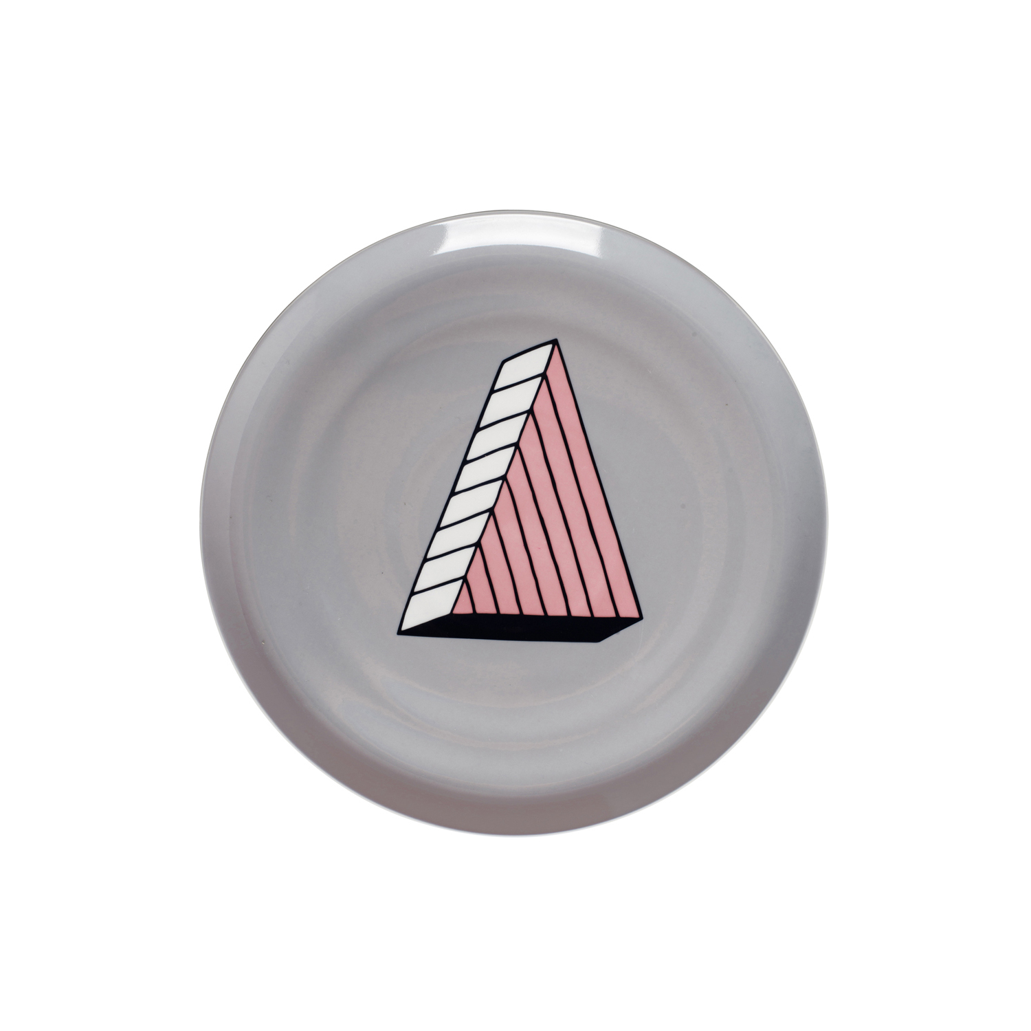
Speaking of pink, last year during the Milan furniture fair, beloved food-design group Arabeschi di Latte teamed up the Italian housewares brand Bitossi Home to create an all-pink watering hole called the Bitossi Pink Bar. This year, they’ve furthered their collaboration with an actual product line: Rio, a series of ’80s-inspired pizza plates, dessert plates, and beer glasses (covers all of the essentials, looks super cute doing it).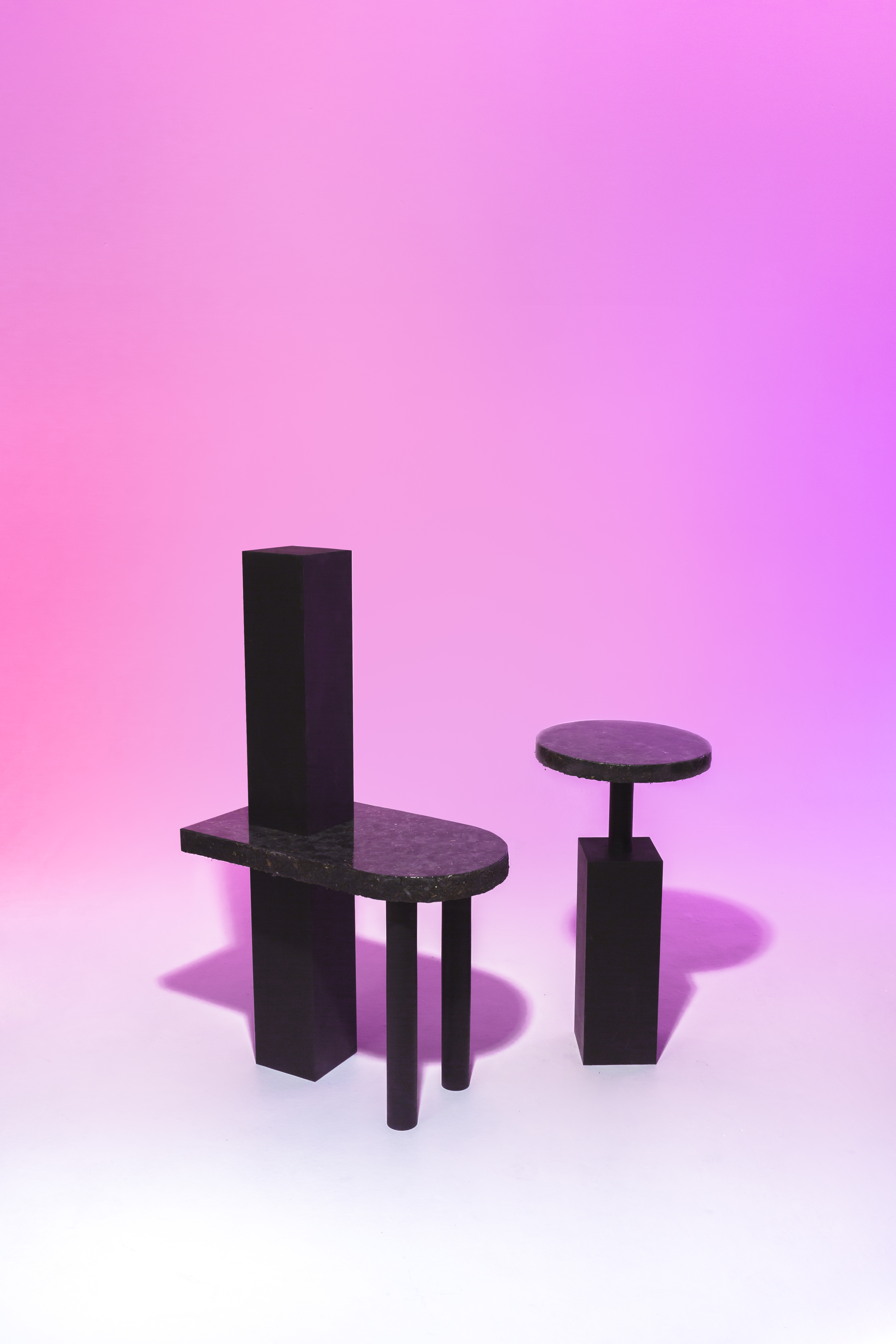
We don’t mean to beat a dead horse here, but the on-point photography game of students and up-and-comers has to be one of the best design-world developments in recent years. These shot is from the upcoming Beckmans School of Design exhibition at Stockholm Design Week, for which the students shot straightforward siloed images on white seamless, slightly kookier images with colored gradient backgrounds, and full-on smoke machined madness for the third set. This table and chair set by Matilda Beckman is made from a material created by mixing dust, glue and varnish.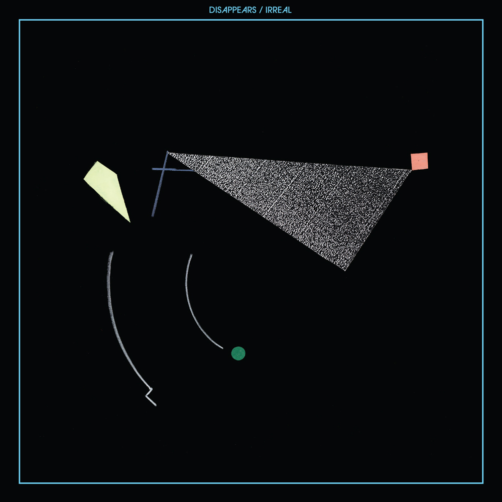
We don’t usually go scouting for new work on Pitchfork, but that’s exactly where you’ll find this great album cover for the Chicago band Disappears. Unfortunately we couldn’t find any information on who exactly designed the thing. If anyone knows, be sure to email us here!
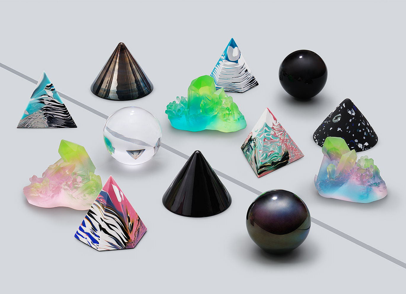
We featured the results of this year’s Ornsbergsauktionen yesterday on the site, which reminded us we ought to look into what some of the event’s amazing alumni are up to. We hit the jackpot when we found these crystals and gems on the website of Swedish artist Sara Lundkvist.
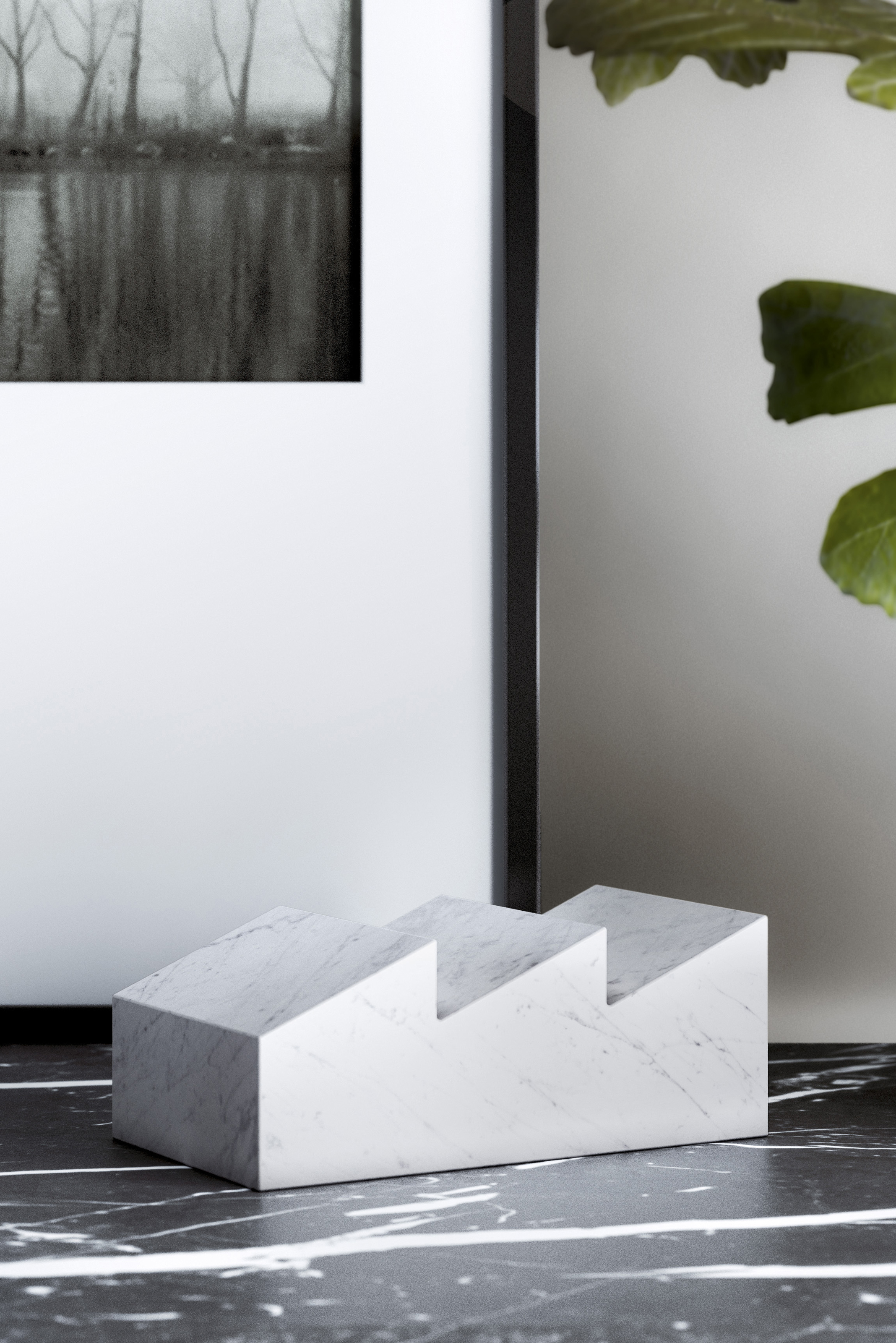
We covered Cologne, and we’ll be hitting up Stockholm Design Week next week, but we sadly missed the Parisian presentations at Maison et Objet. Luckily, we have friends like Sylvain Willenz, who sent us a link to all of the beautiful projects he launched at the fair, including these machined marble catch-alls for the French brand Retegui.
Links
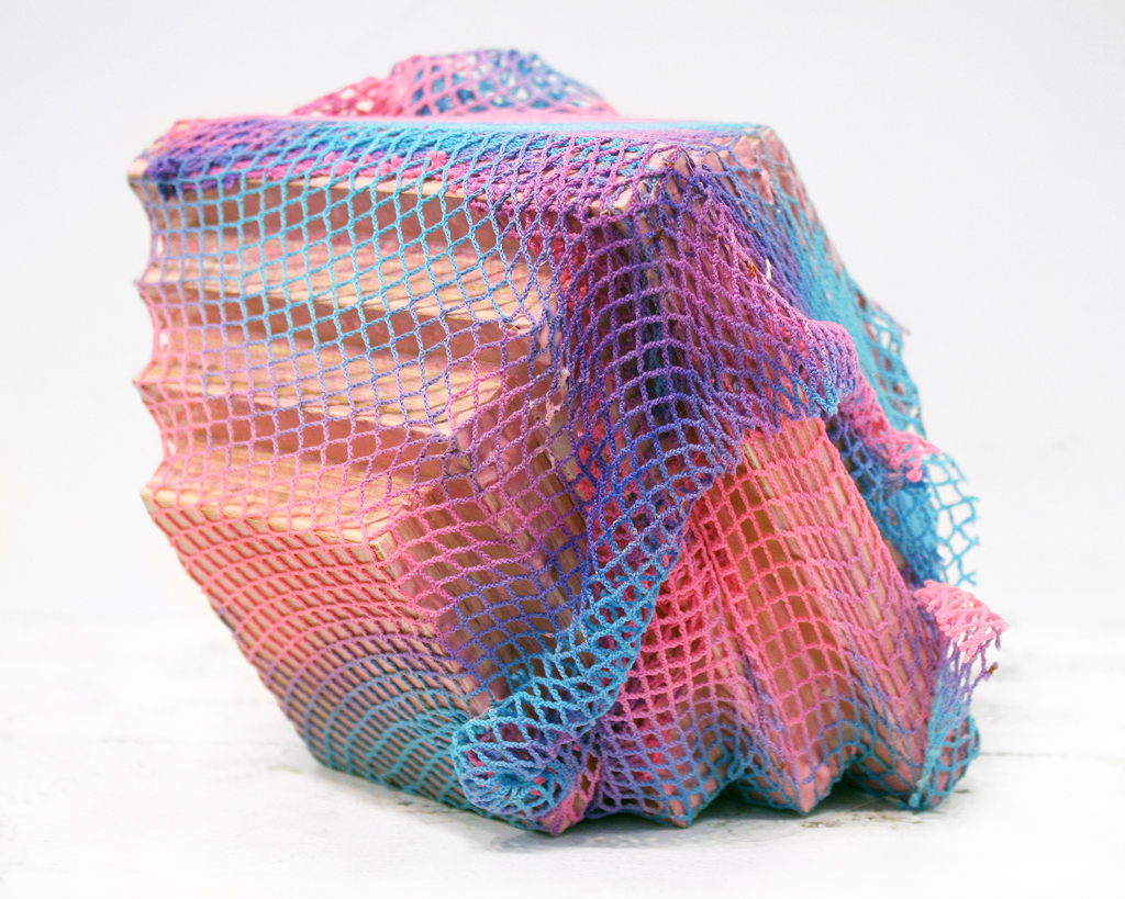
Kelly Jones of Little Paper Planes in San Francisco does it all — she has an online and brick-and-mortar shop, a small independent press, an artist residency, and a pretty great blog to cap it off, where this week we found and fell in love with the work of Brooklyn-based artist Matt James Stone. More on this artist for sure in the coming weeks!
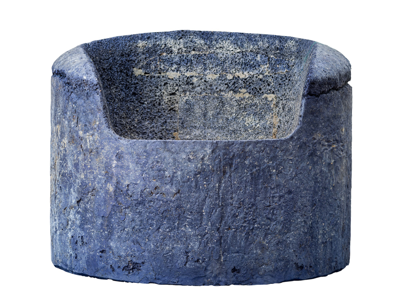
Though this looks like some uber-trendy stone or granite, it’s actually a manmade material fabricated by British-born, Hong Kong–based designer Michael Young for his collaboration with Hedge Gallery in San Francisco this month. Called “metal rock,” each piece is formed by injecting molten aluminum with high temperature gas under immense pressure, which results in rock-like, sedimentary formations. As seen on Designboom.
Exhibitions
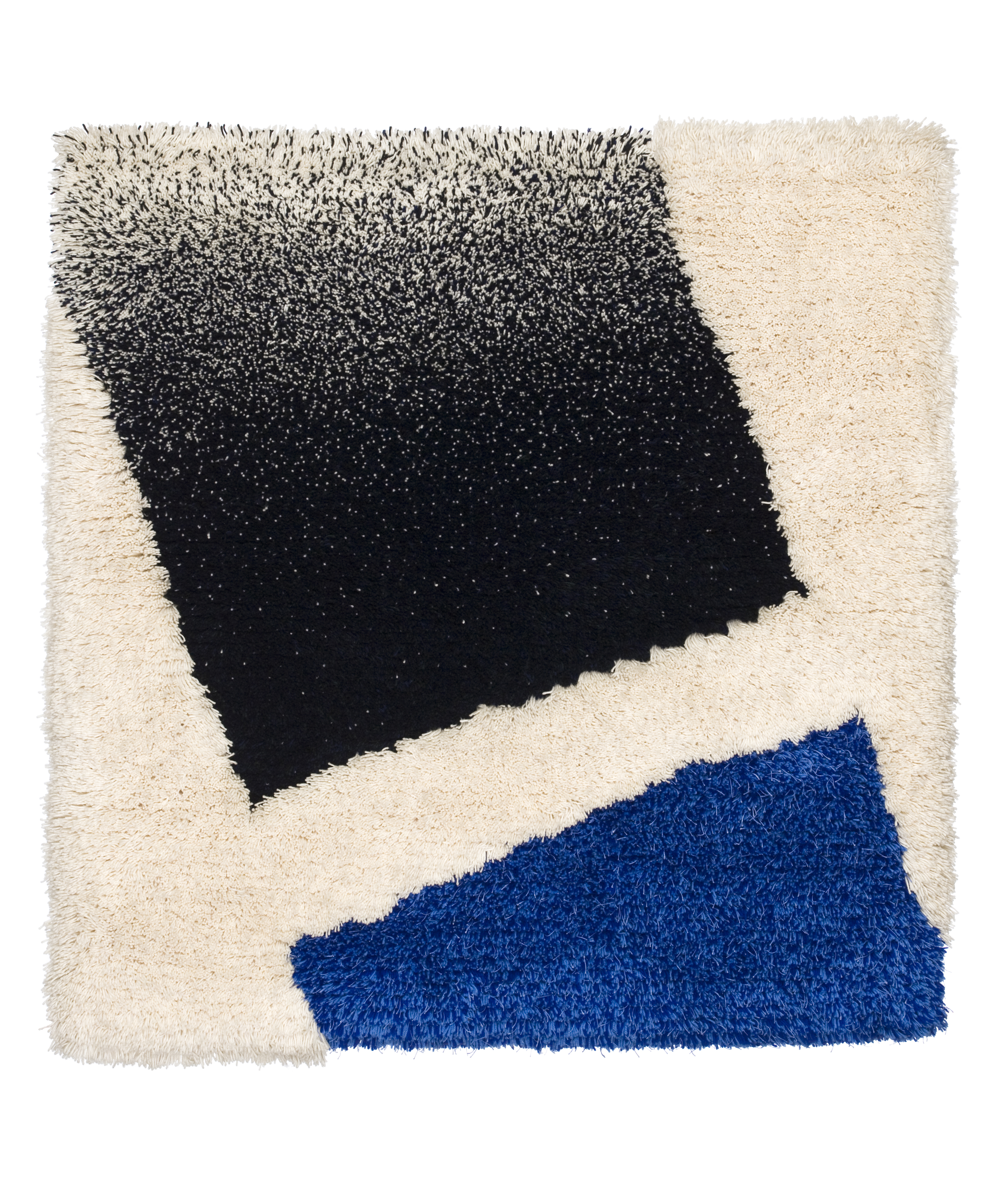
I actually visited the Helsinki Design Museum last month (see our full Finland recap here) and got to see the Kiss chair by Rita Taskinen, part of the museum’s permanent collection, in the flesh. Now if only I could transport myself back to catch the full Postmodernism exhibit, which started yesterday and which features standbys like Peter Shire and Ettore Sottsass as well as lesser-known works, like this beautiful 1988 rug by Jukka Vesterinen.
There’s kind of a lot going on in LA this weekend. Not only is the city hosting its second annual Art Book Fair, but it’s also Art Los Angeles Contemporary, now in its sixth year, at the Barker Hanger in Santa Monica. The line-up of galleries includes SU favorites ACME, Canada, David Kordansky, The Hole, and Peres Projects, who will be showing this awesome Mark Flood painting, among others.
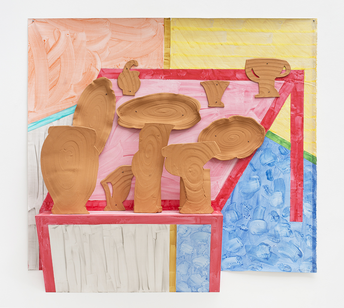
Speaking of David Kordansky, today also sees that gallery’s opening of an exhibition by Betty Woodman, for which the legendary ceramicist created an installation of new paintings and sculpture in glazed earthenware, unstretched canvas, and wood. The piece above appears to be terra-cotta affixed to a potentially 3-D canvas? Luckily we’ll be in LA soon to check it out in person!
Also on view in LA: At Moskowitz Gallery, an exhibition of new work by Bay Area artist Justin Margititch. His colored pencil and acrylic compositions remind us of a trippier Serena Mitnik-Miller (another Bay Area artist we have a fondness for).
Instagrams
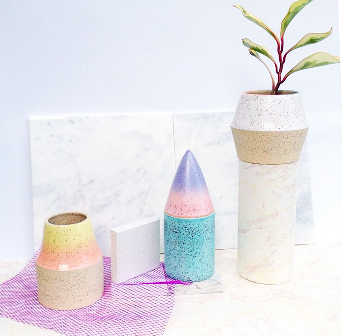
There’s pretty much nothing we love better than creeping on designers’ Instagrams, trying to figure out what’s coming up next for our favorite talents. This new, all-over pastel ombre glaze from Vancouver ceramicist Lindsey Hampton (as opposed to the more subtly glazed rims and handles she’s done previously) feels so fresh and happy to us right now.
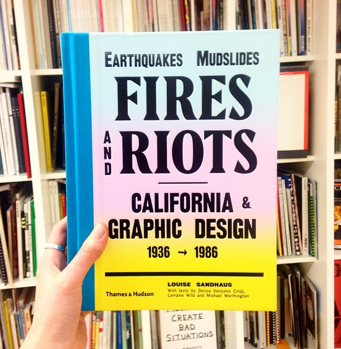
Can you tell we have California on the brain lately? This week, Monica’s headed to LA for a five-week live/work sojourn, and I’ll be joining the first week of March to help prep for our first-ever Los Angeles pop-up at Space 15 Twenty (opening March 5!). We’re gonna shake off this cold-weather funk and soak up the pastel gradient vibe that this awesome new California graphic design survey from Thames & Hudson — as modeled here on the Instagram of It’s Nice That — promises!